The Round
Place brand
All together now
The Round
Place brand
All together now
The Round is a London destination with the magnetic power to bring people together. We worked with Hines and Foster + Partners on the mixed-use development branding. Centred around human connection, we captured its mission in a rousing line: ’All together now’.
Good all round
In the central London neighbourhood of Bankside, where Tate Modern and Shakespeare’s Globe sit cheek by jowl, a new destination emerges. Our brief covered the place naming and brand to take it from unknown development to beloved public destination.
Revolving around a central public circle, we gave this destination a confident new name: The Round. It not only spoke to the specialness of the architecture, but also the positive power of gathering together.
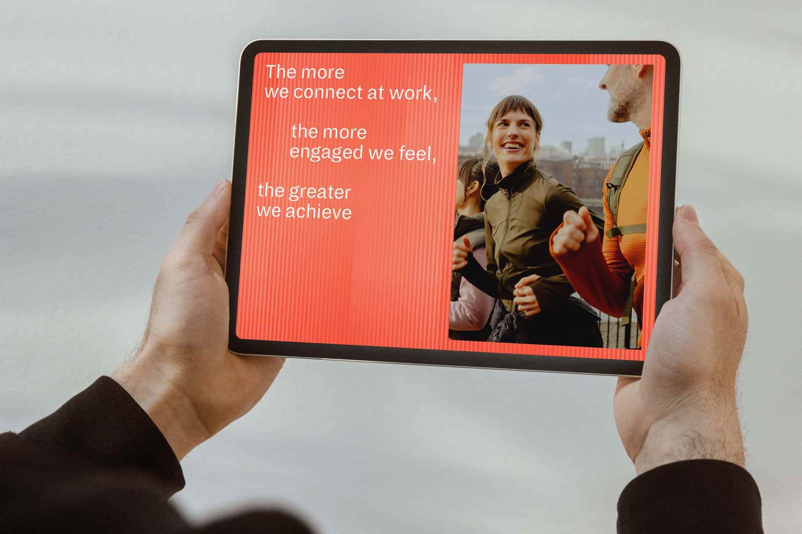
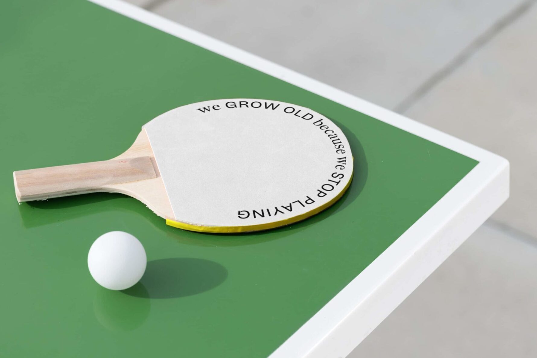
For millennia, we have gathered in the round — from fireside chats to exchanging stories and sharing food at the table. Science shows that human connection is a vital force, fundamental to longer and fuller lives — also known as ‘social wellbeing’. Here at The Round, we captured its mission in a rallying call-to-action: All together now.
A symbol of gathering power
The symbol is a powerful distillation of the story. It conveys a strong sense of togetherness and speaks directly to the name, creating a recognisable asset in its own right. Like a zoetrope, the animated symbol builds momentum and gathers pace, bringing a sense of dynamism to the destination branding.
We devised an energetic typographic system to deliver our new messaging with rhythm and punch. Taking our cues from architecture, lines of type are purposefully offset and staggered to match the unconventional angles of the buildings.
Well-rounded identity
We expand our distinctive symbol into a rich visual world. Large-scale patterns, curved panels to frame photography and interiors that embrace softer edges. Graphic elements are constantly in an orbital motion, echoing the active nature of The Round's central public circle.
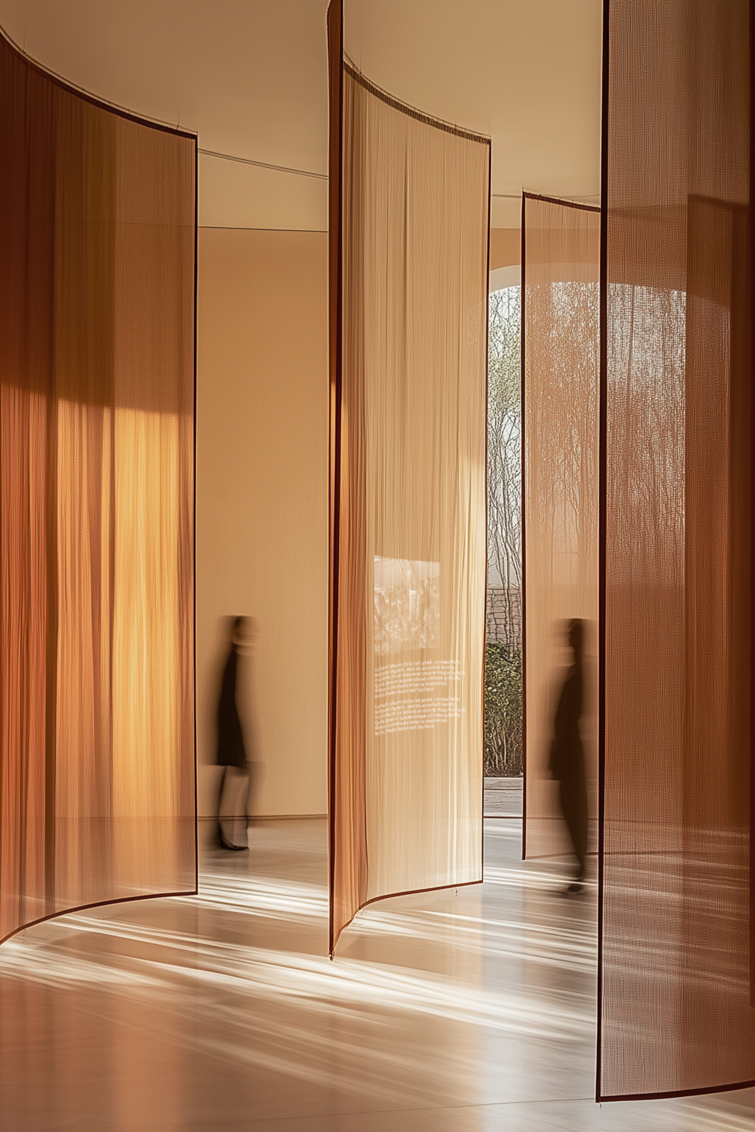
Warm tones
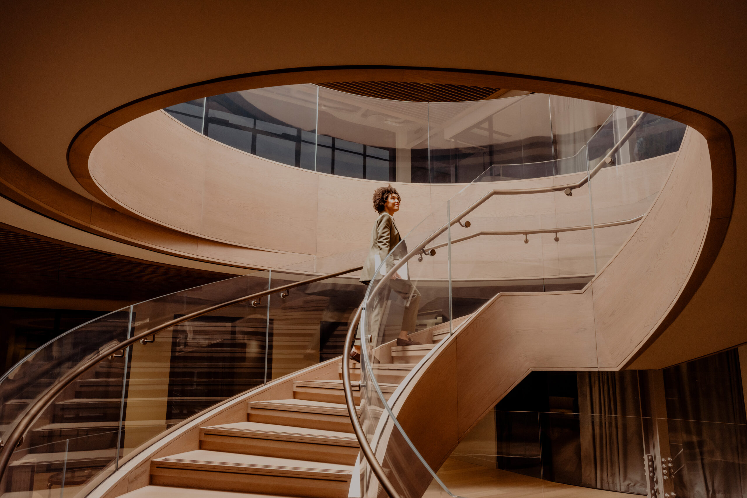
Expressive and playful or refined and sophisticated, our identity has the range to connect with a global audience. Newly commissioned photography by Max Miechowski and art directed by us, brings warmth and elegance, and a palette of bright hues create a vibrant identity. We helped Hines launch this brand to market with a website, a suite of marketing materials and exclusive events.
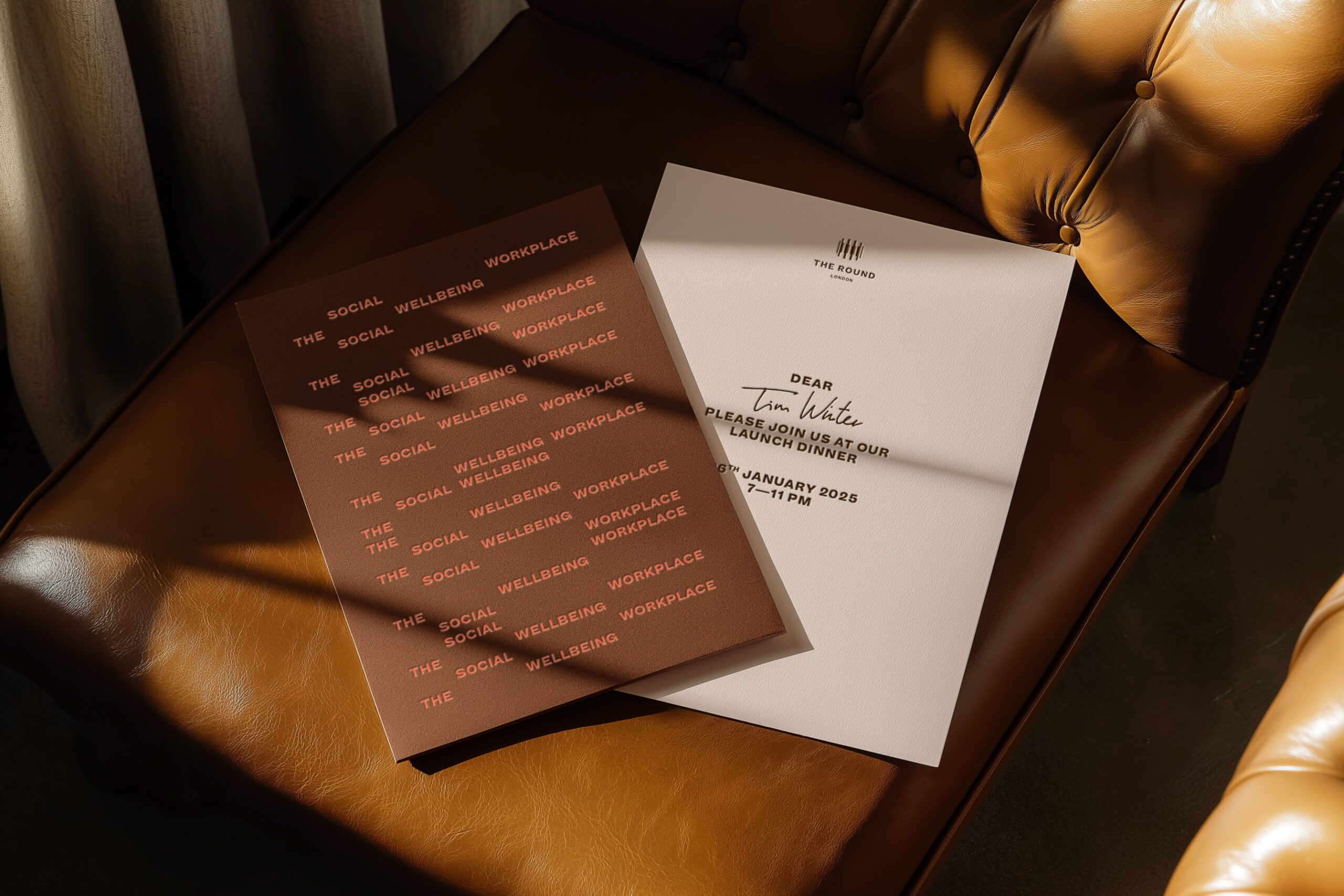
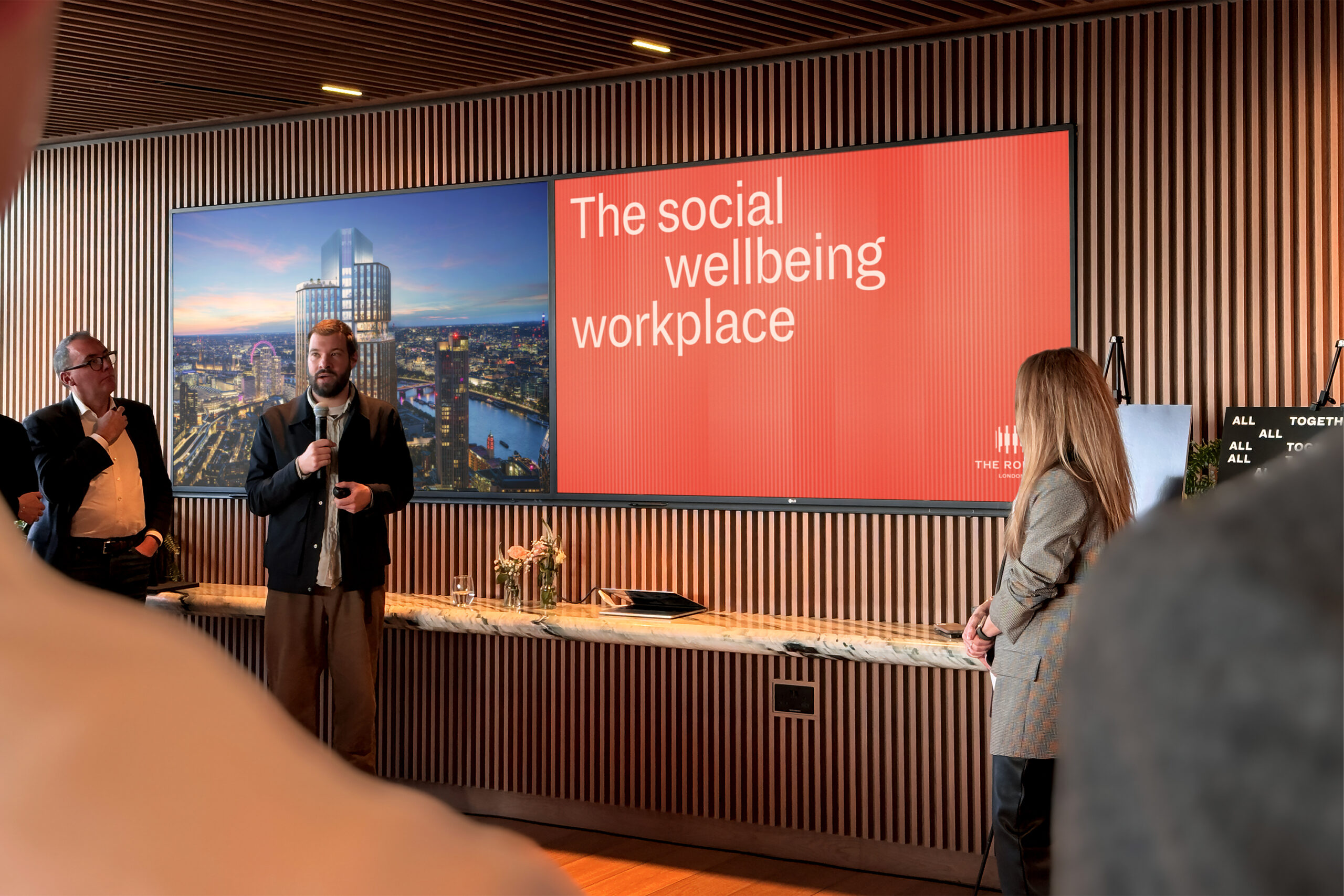
The social wellbeing workplace
Our workplace brand strategy drew on research that strong human connections at work fuel ideas and positive business culture. Offices at The Round are designed to do just that. Coupled with inventive floorplates that bring in 20% more natural light than a typical office block, we brought Hines's concept to life as: The social wellbeing workplace.
Following an exciting launch, we’re continuing to roll out brand activations, including a residential sub-brand. More coming soon.