Royal Docks
Place brand
Flying the flag for good growth
Royal Docks
Place brand
Flying the flag for good growth
The Royal Docks is London’s most important regeneration project, covering 1,200 acres and 12 miles of waterfront. But despite its proud past as the city’s gateway to global trade, it was lost from many people’s mental map of London.
With the Mayor of London and Mayor of Newham, we created a brand to celebrate its nautical past and created a platform connecting the communities living and working around the docks.
Decoding the brand
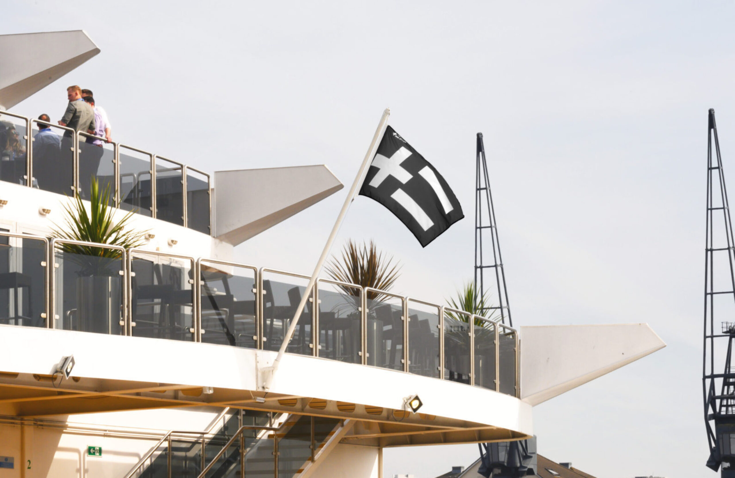
In the very year the docks welcomed its first ships — 1855 — the British Board of Trade drew up a maritime alphabet of flags for vessels to communicate in open water. Known as the International Code of Signals, you can spot these flags today helping ships from countries all over the world to send and receive messages in a common language.
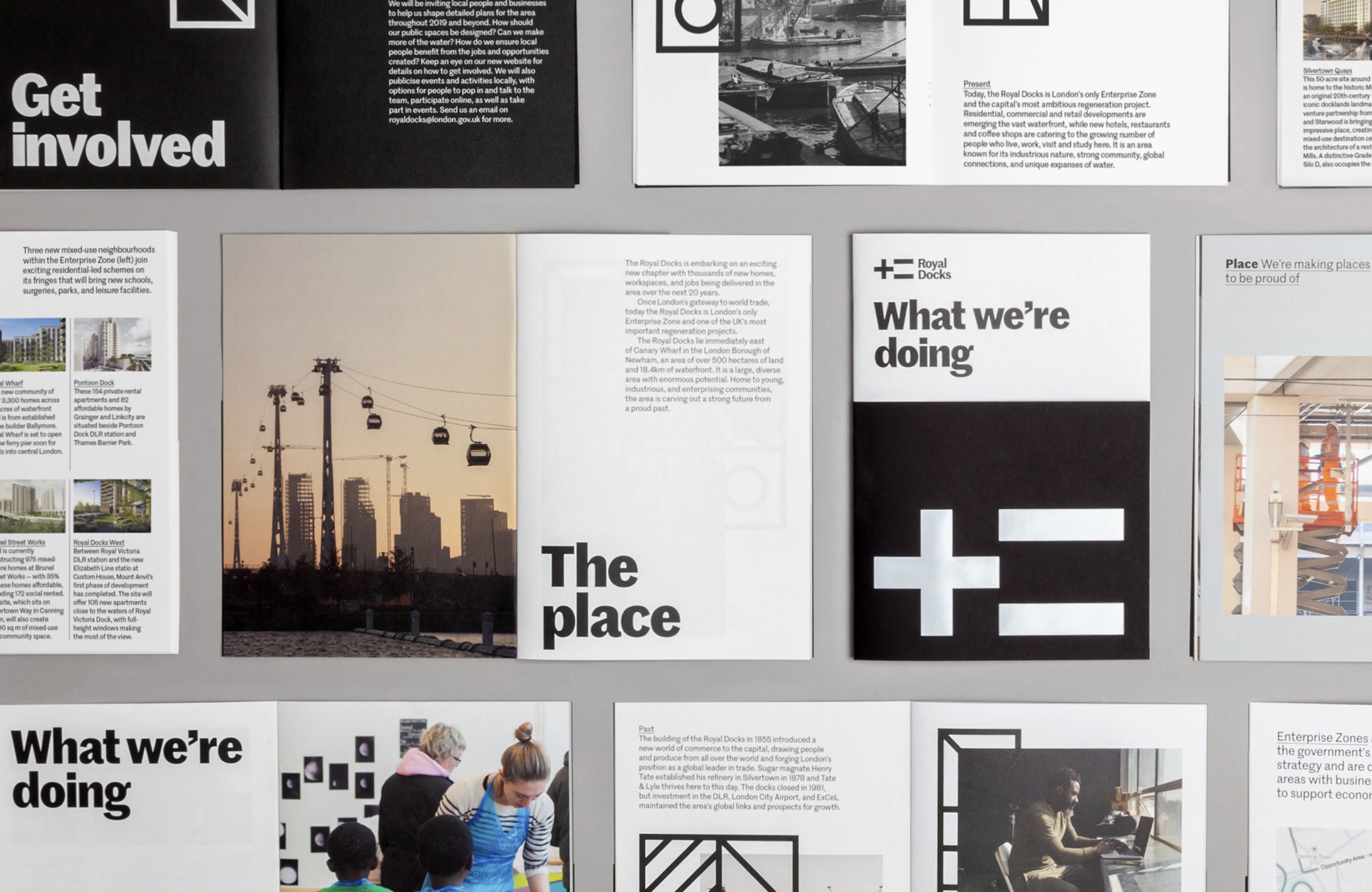
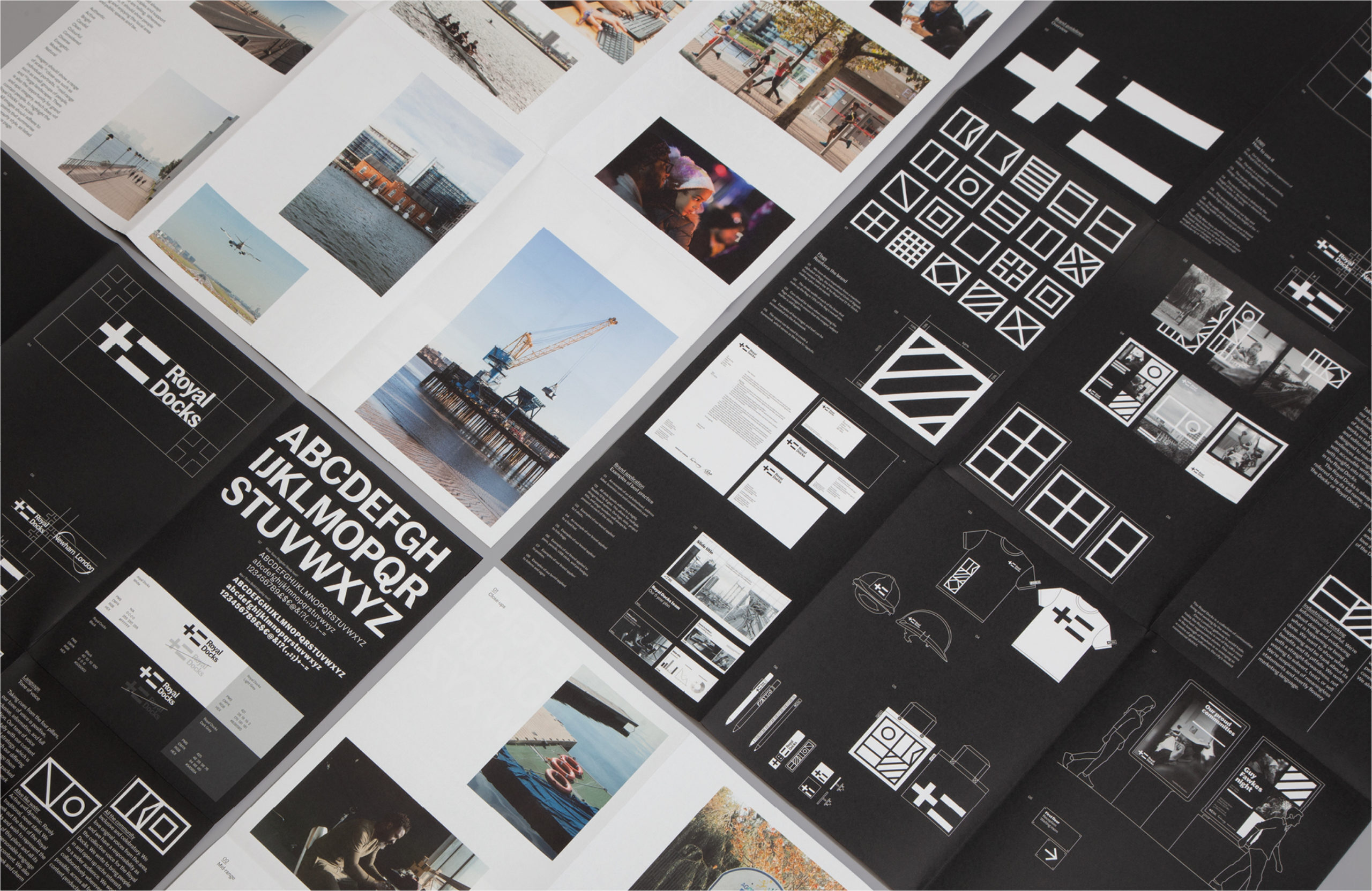
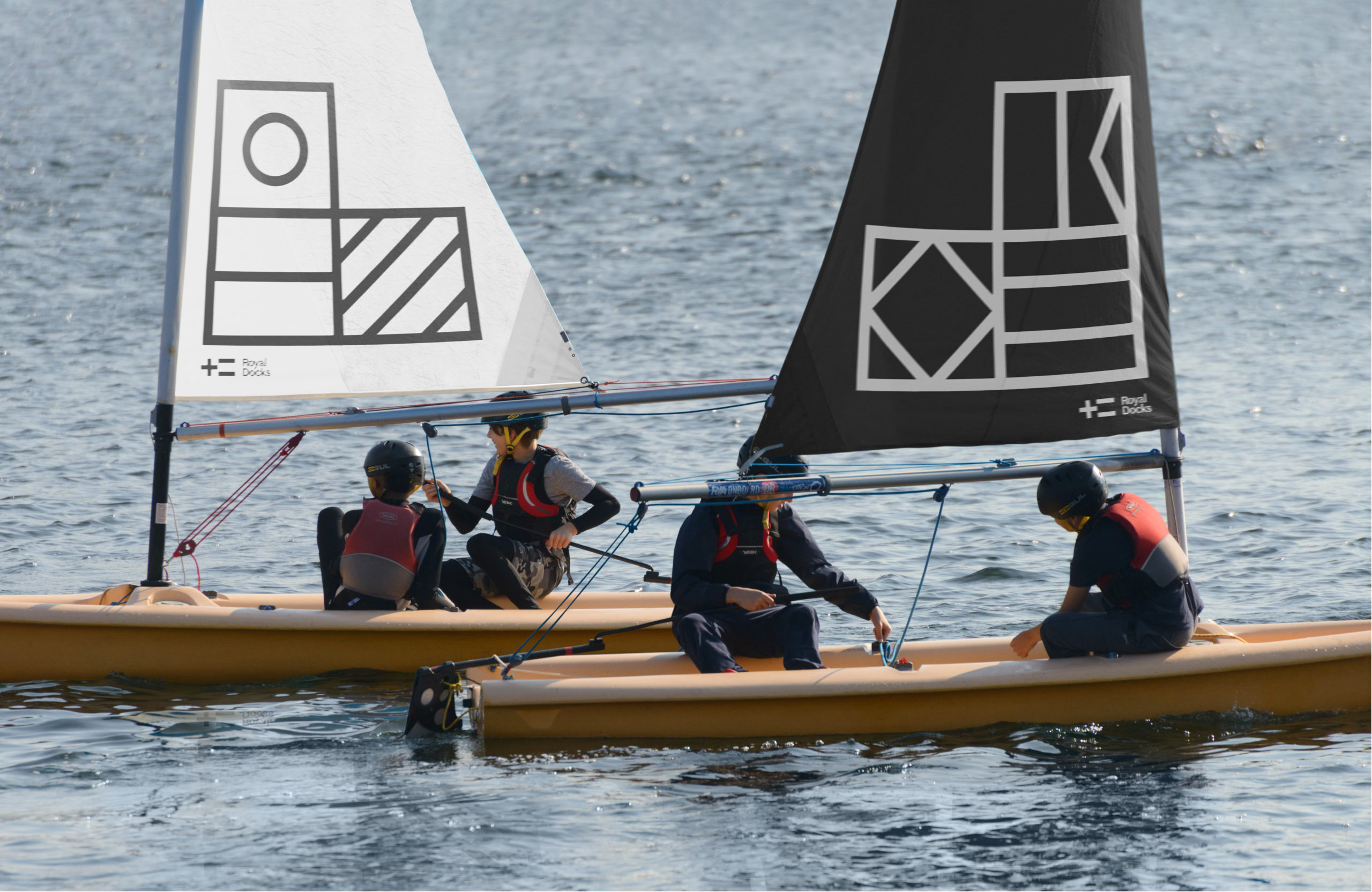
The Royal Docks logo takes the R for Royal and D for Docks from the code, making a plus and an equals. The plus is a symbol of positivity, addition, and togetherness. The equals signifies results, doings, and progress. Together, they encapsulate the Royal Docks’ past and future, both as an existing place and a regeneration project that's defining what good growth looks like.
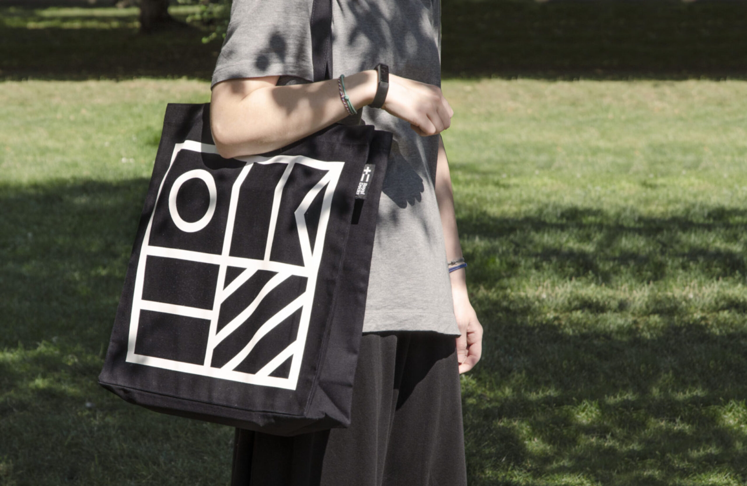
A dynamic graphic system
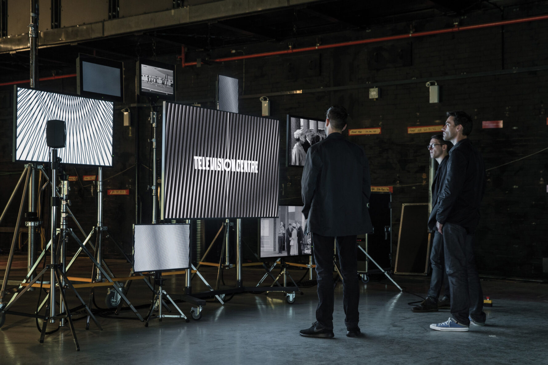
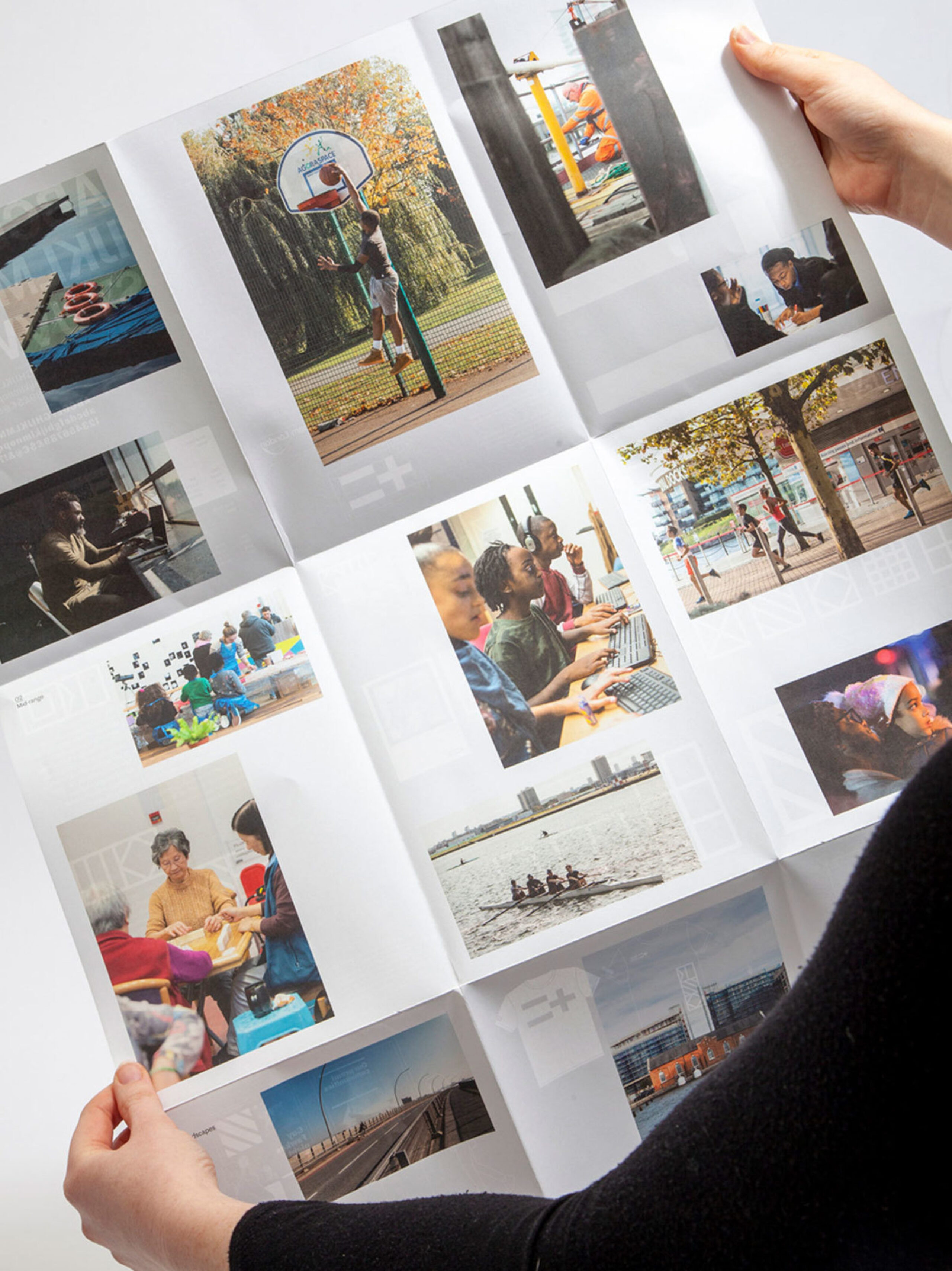
For an area that seemed stuck in visions and plans, the brand we created highlights and celebrates the very real activity happening in the Royal Docks. The monochromatic graphic system doesn’t interrupt or explain, instead it acts as a frame for the people and stories of the area. Even the usual 'vision' document is all about actions — entitled 'What we're doing'.
Altogether, the graphic containers create a pattern or tapestry, representing the stitching together of the dock's wonderfully diverse communities.
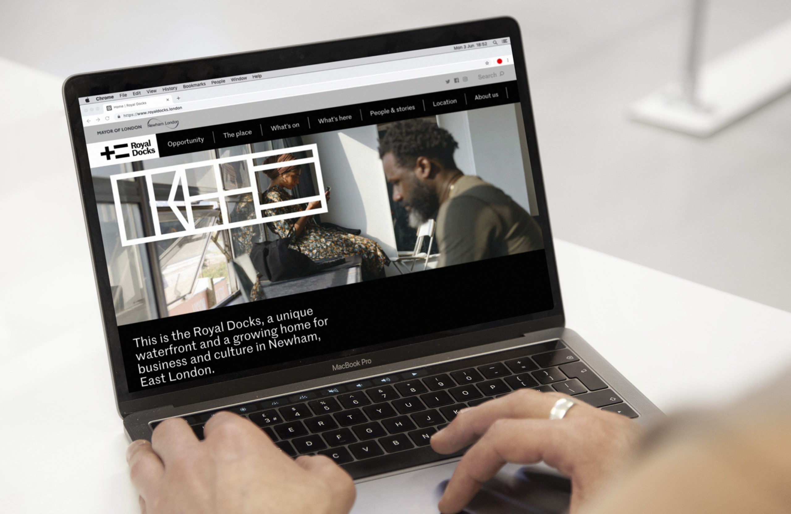
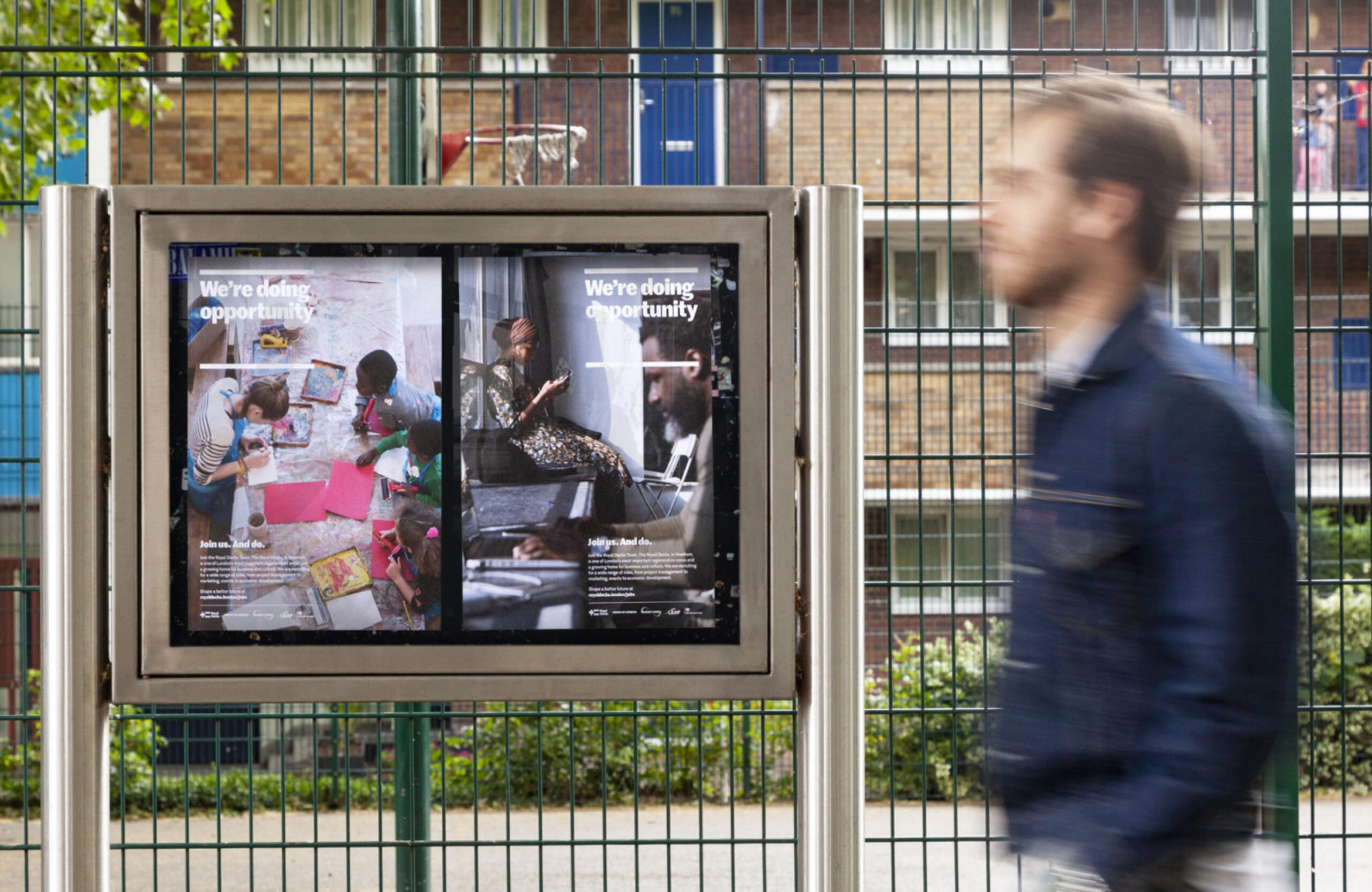
Website as conversation
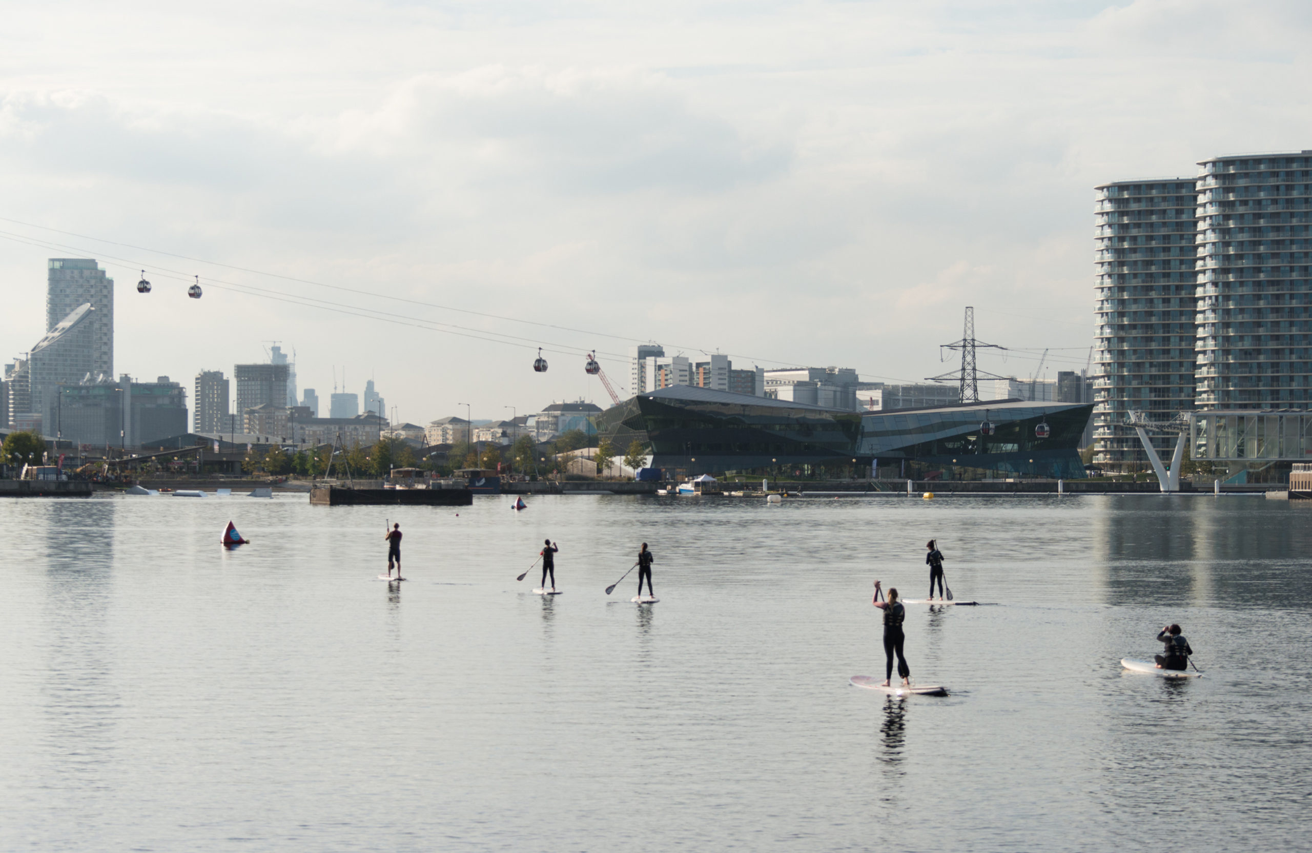
Map the Royal Docks onto central London and it stretches the distance from Hyde Park to Tower Bridge. This is also a place of contrasts, from the deck of the Sunborn luxury yacht hotel to the ships loaded with raw sugar cane from the Caribbean that still dock at the Tate & Lyle refinery.
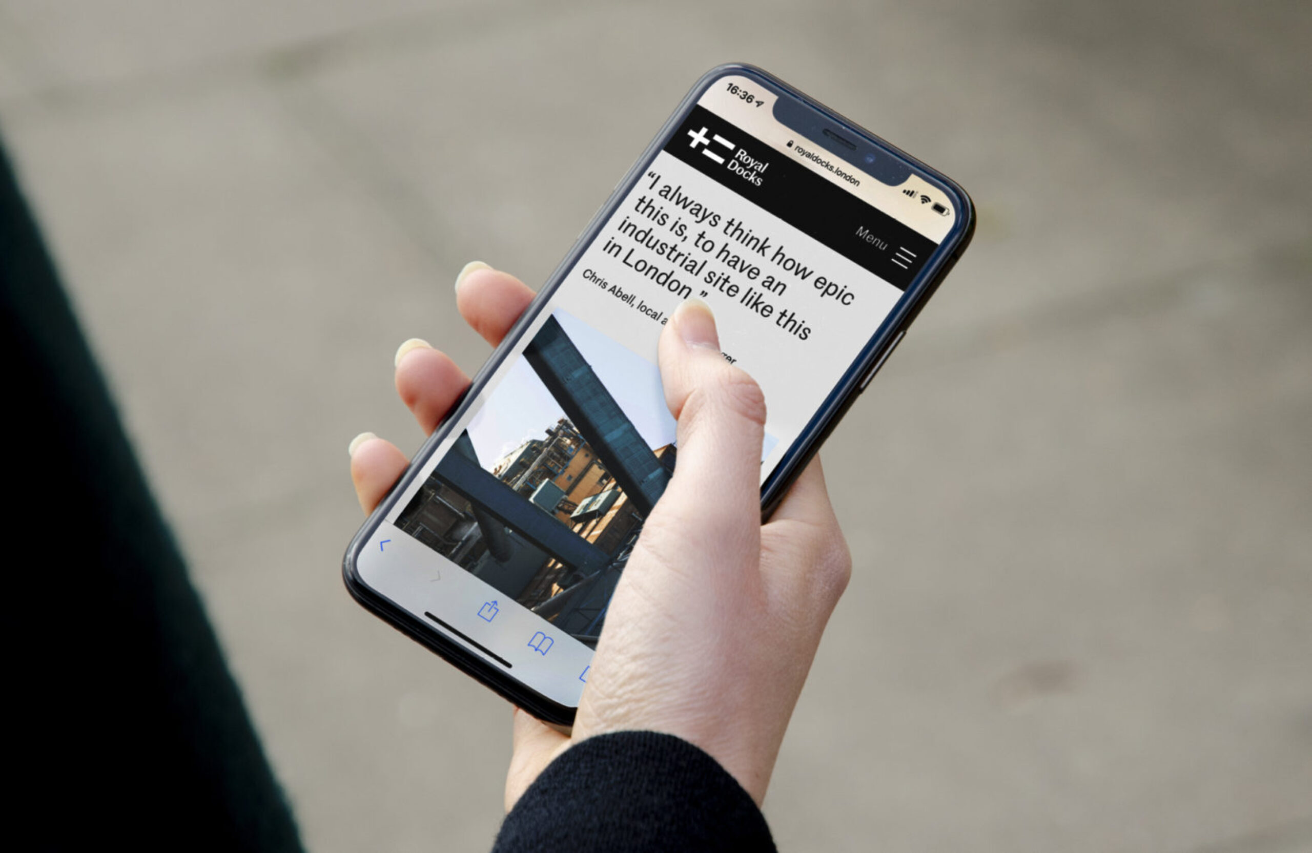
As complex as a city, we developed a brand and website that’s a platform for its communities, inviting them to share their stories, activities and products with London and the world.
Crucially for the Mayor of London Sadiq Khan and Mayor of Newham Rokhsana Fiaz, the website is helping to encourage local people and businesses to directly participate in shaping plans for the Royal Docks.
Locally-driven art direction
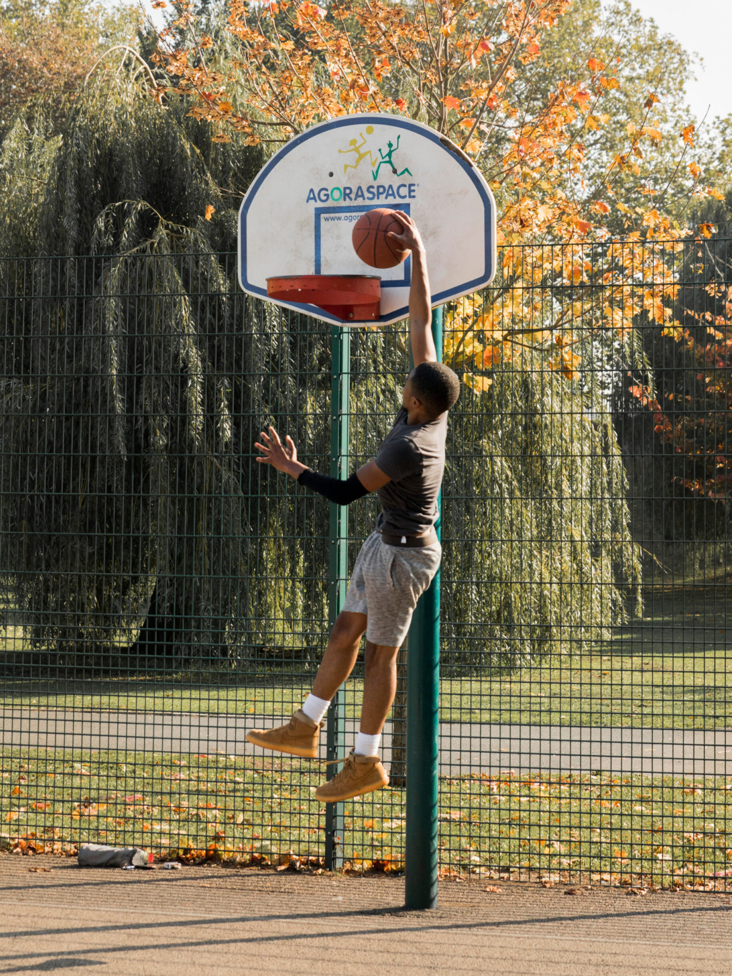
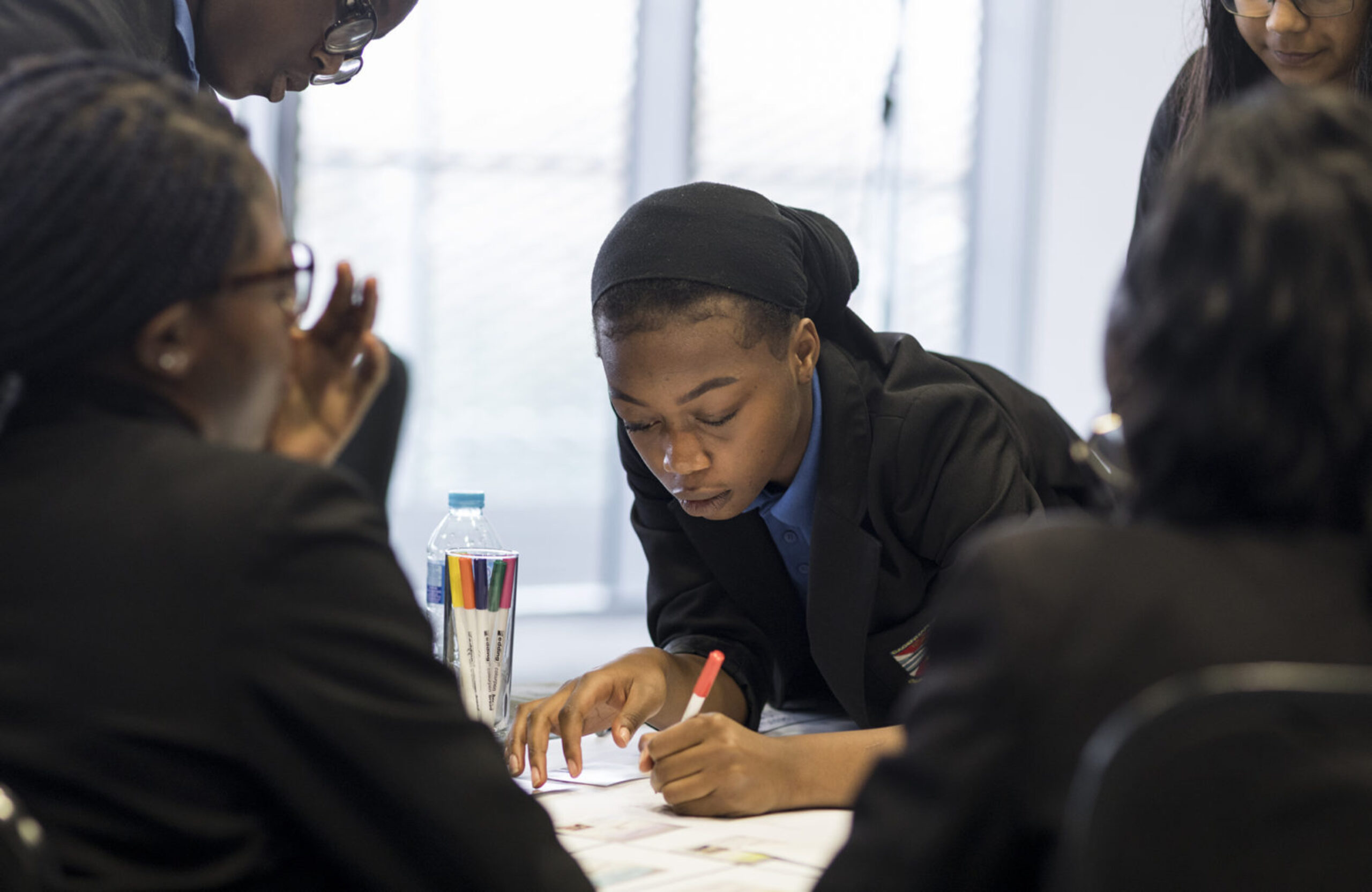
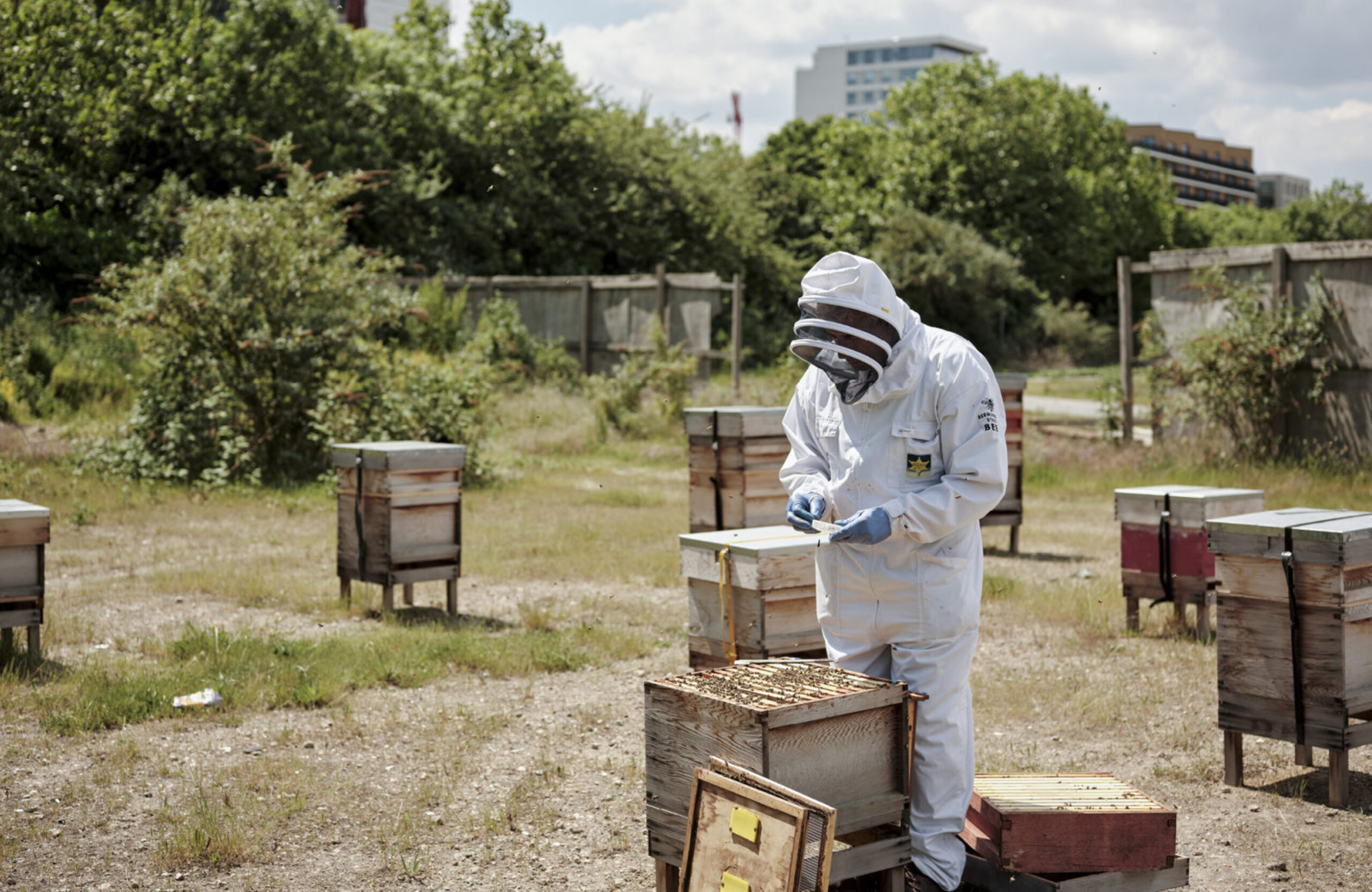
Through public engagement we got to know the Royal Docks as local people see it. We identified the four key aspects that really define what they love about the area — its unique water, its industrious culture, its global connections and its proud communities. Imagery captures these aspects while celebrating the area's special sense of scale, celebrating everything from its monumental stretches of water to the close personal ties in the area.
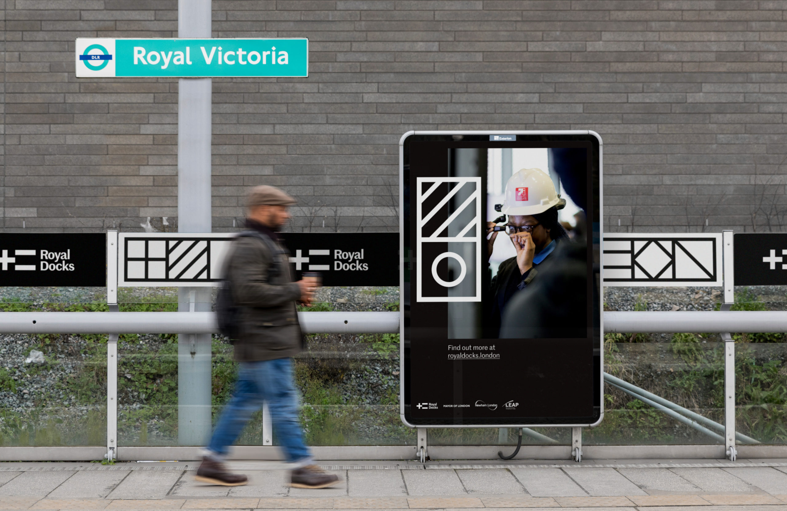
Signalling you've arrived
The brand is being implemented across the Royal Docks, signalling to new visitors that they've arrived and connecting existing communities through a sense of collective identity. Over the coming years, you will spot the brand at DLR stations, bus stops, waterside trails, event posters, festival flyers, exhibition graphics and area-wide signage.