Lucent
Wayfinding
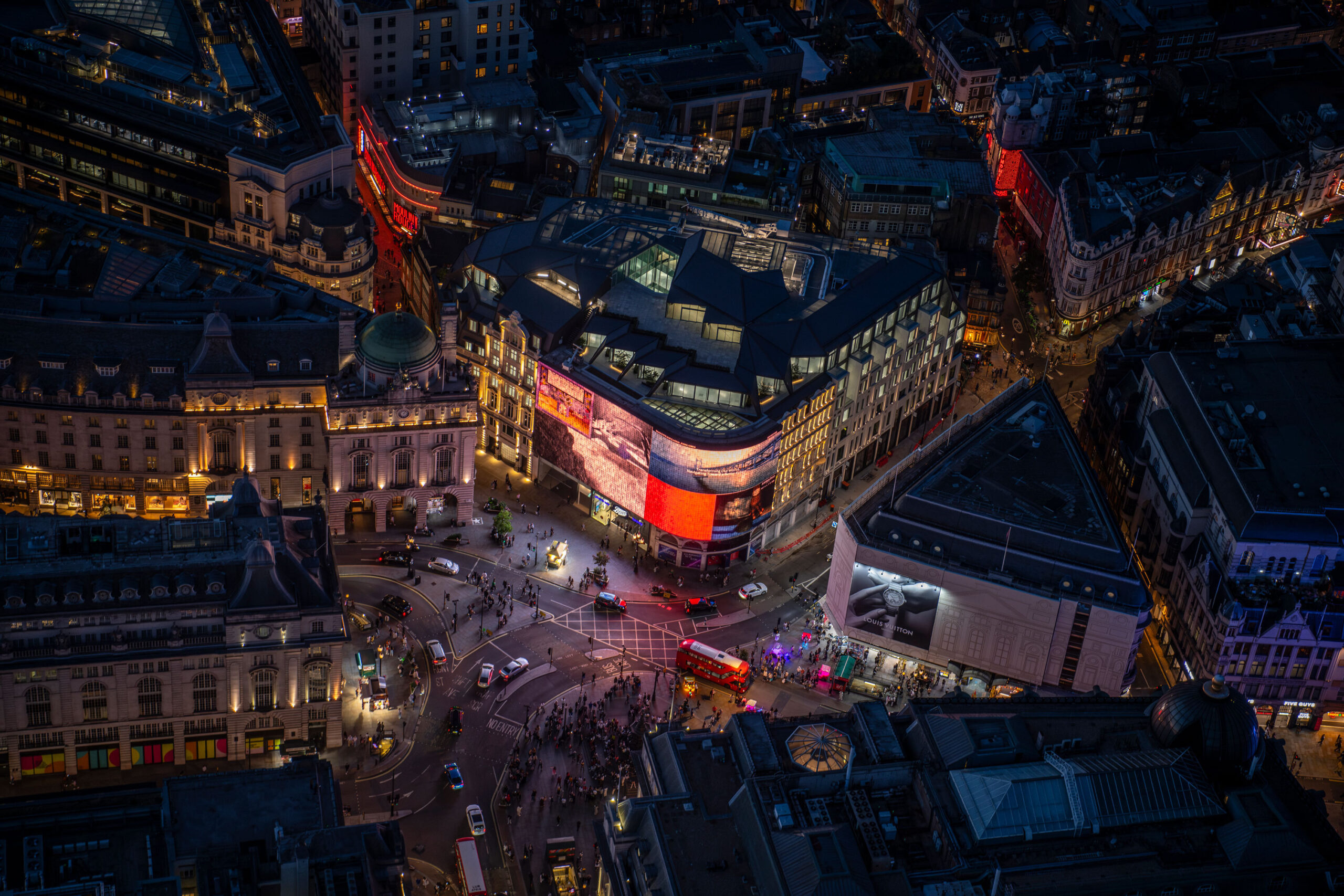
Playing with shadow behind Piccadilly Lights
Lucent
Wayfinding
Playing with shadow behind Piccadilly Lights

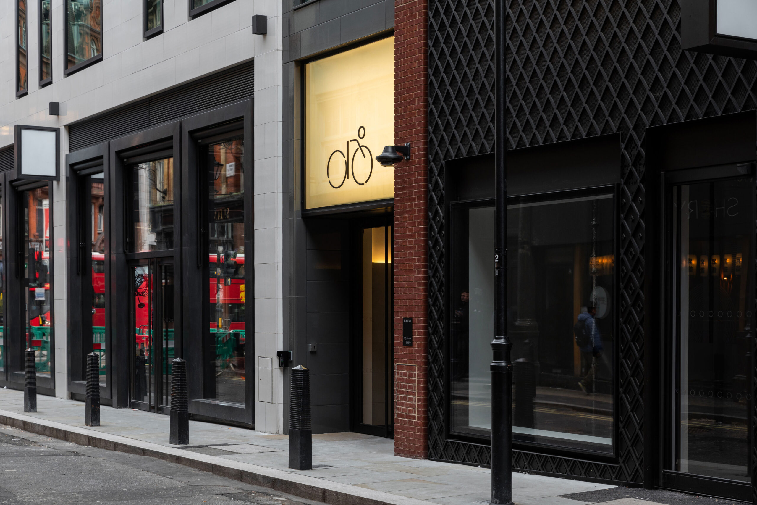
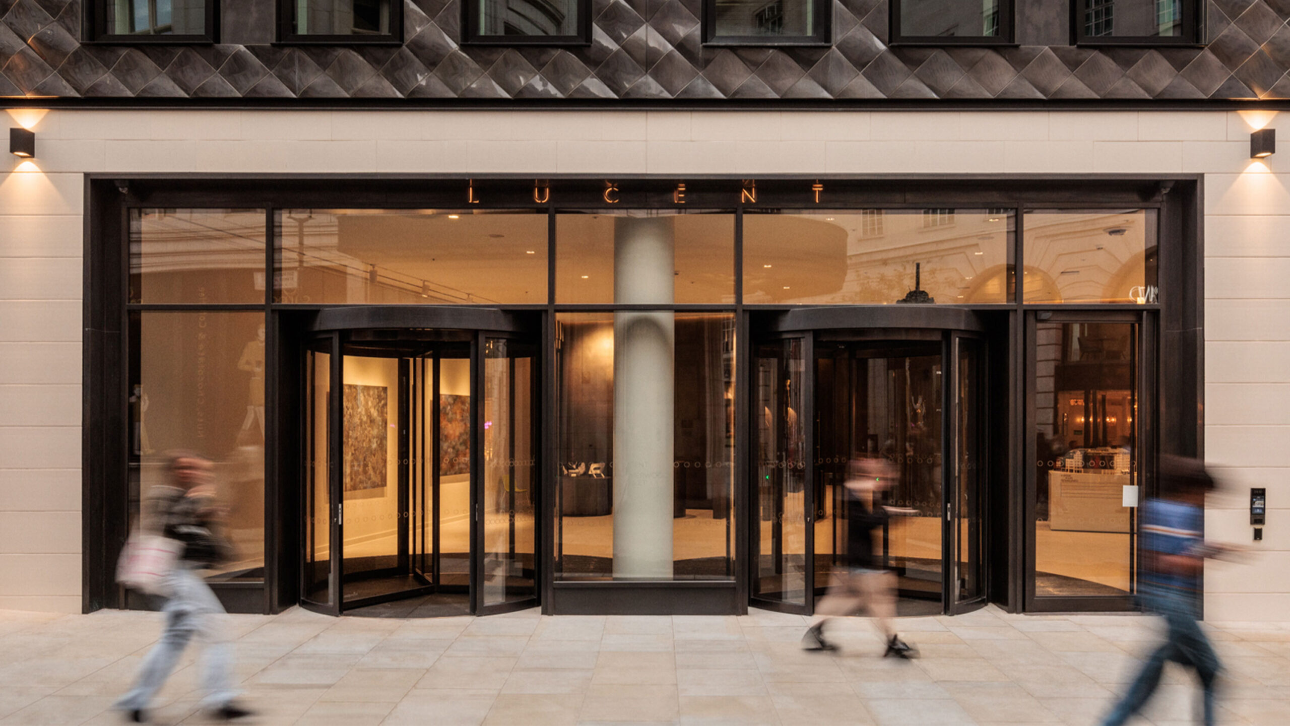
Lucent is the building behind London’s brightest landmark: the Piccadilly Lights, so it felt right to explore signage with illumination — but not perhaps as you’d expect.
Rather than add more lights we designed a system that played with depth and shadow — helping cultivate the sense of calm and elegance at the core of this project.
- Landsec
A beacon of calm
Newly reimagined by Landsec and Fletcher Priest Architects as an urban oasis in the middle of London, Lucent is a series of superb workspaces. Our entrance sign sets the tone for the experience with a softly glowing invitation amidst the London bustle. Understated compared to our brightly illuminated neighbours, it speaks directly to our sophisticated audience.
Responding to the architecture
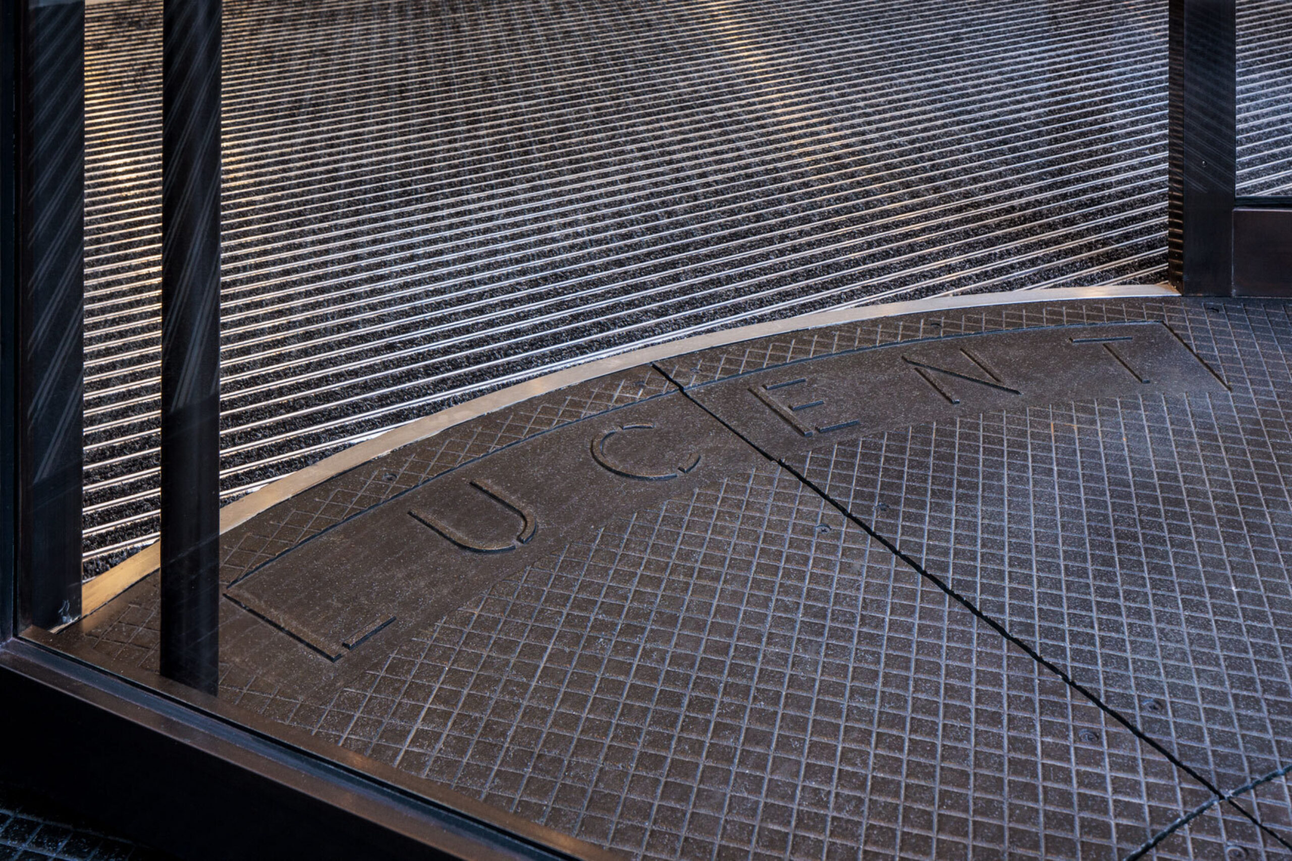
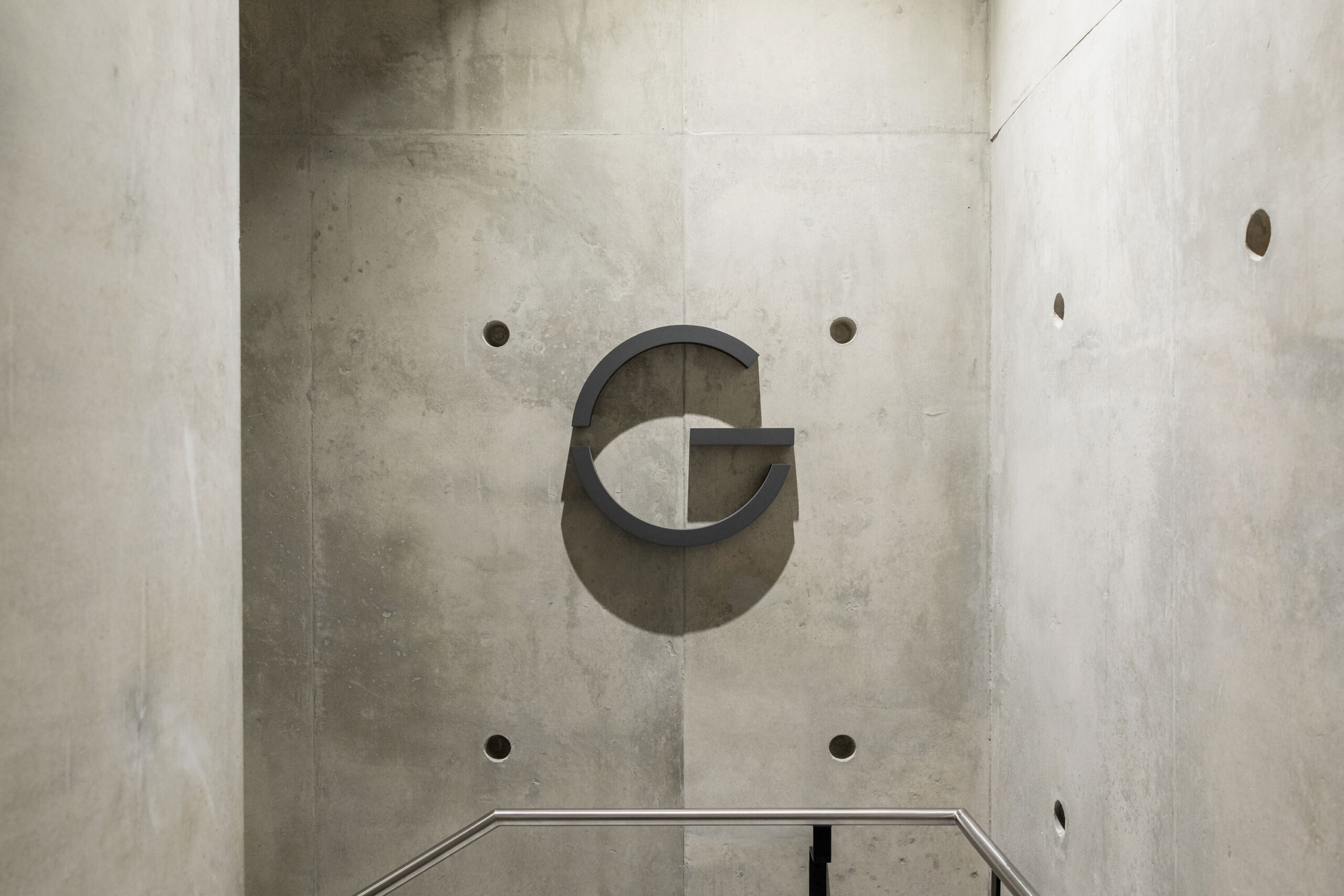
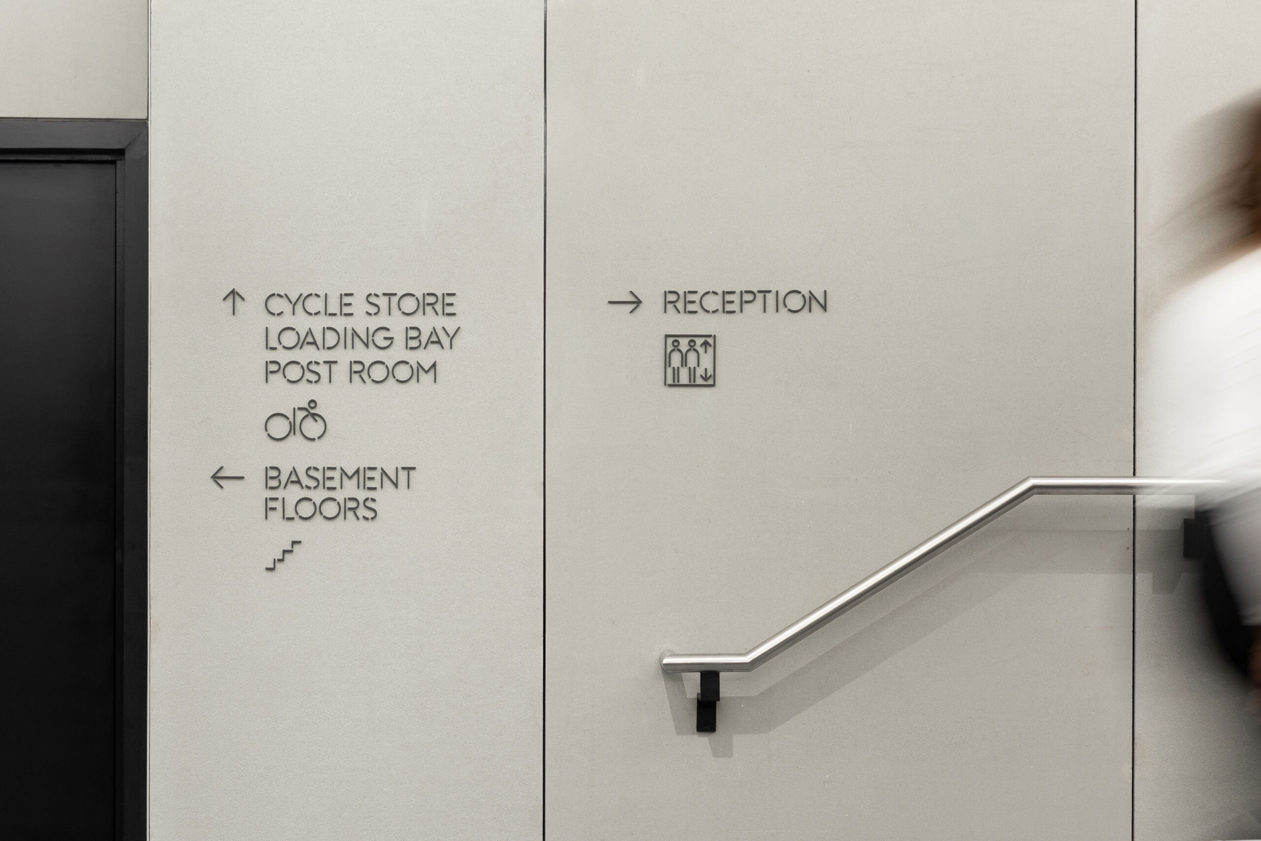
The interiors of Lucent are an evocative balance of industrial and elegant materials, from off-shutter concrete to beautiful bronze walls. We selected a stencilled typeface that celebrates the raw materials of the building — Vacant by Reserves has perfectly refined geometric forms and delicate cuts. The typeface is the basis of all the signage, including our bespoke icons.
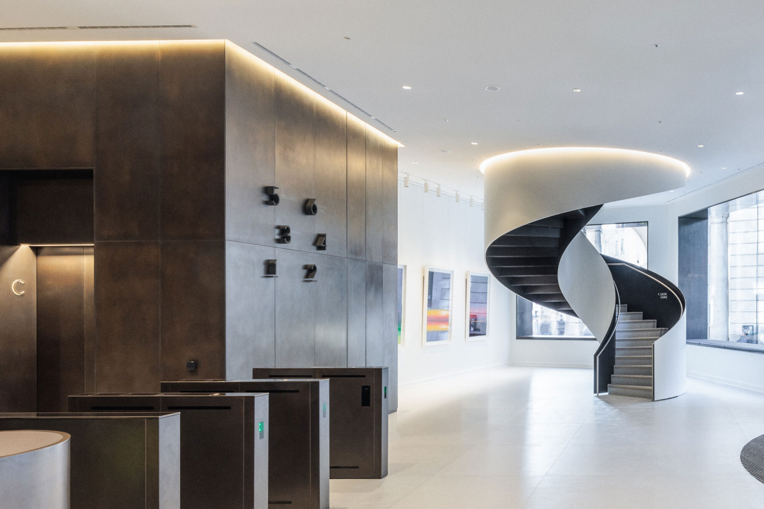
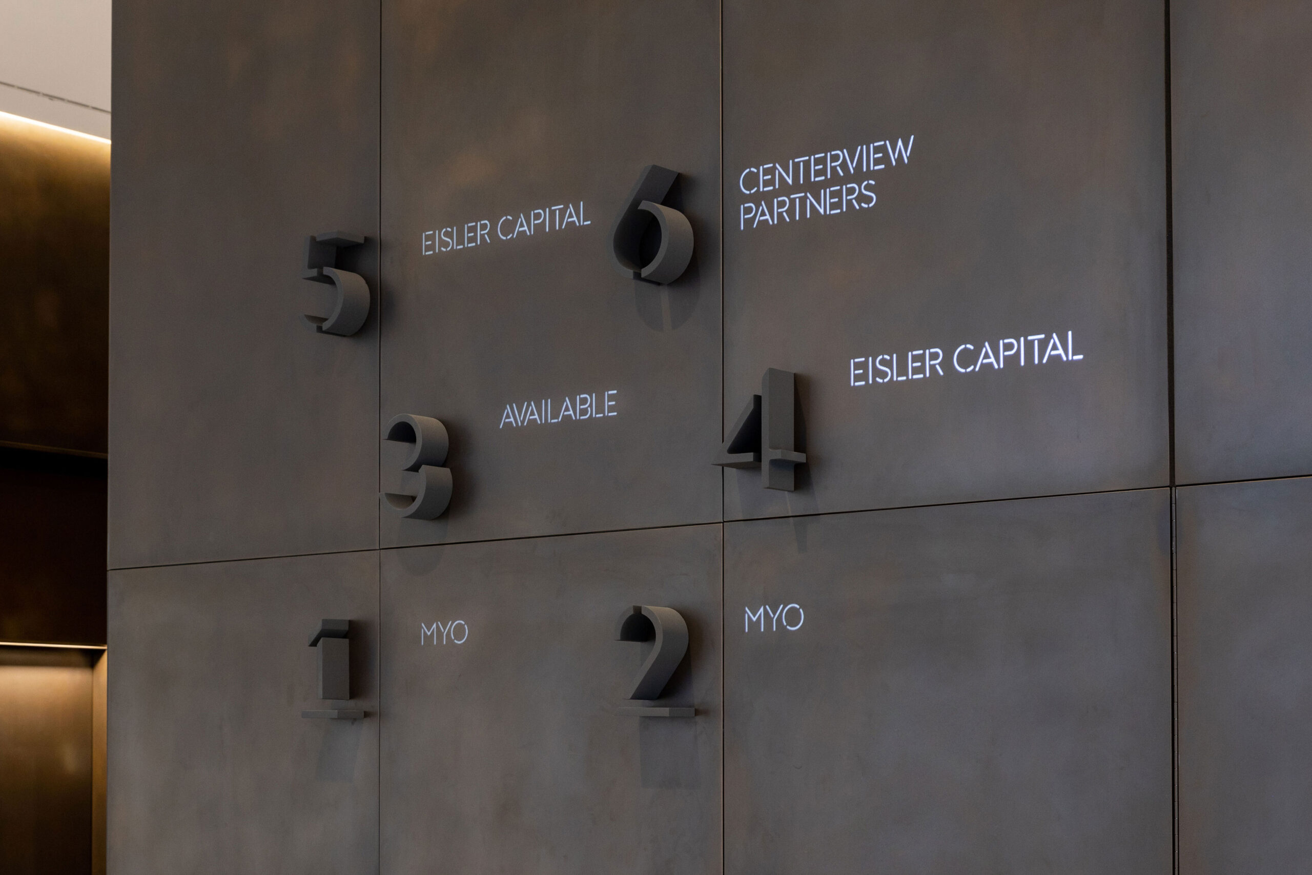
In the reception, tenant names are projected onto the wall — providing an entrance full of dramatic impact, while making changes effortlessly easy.
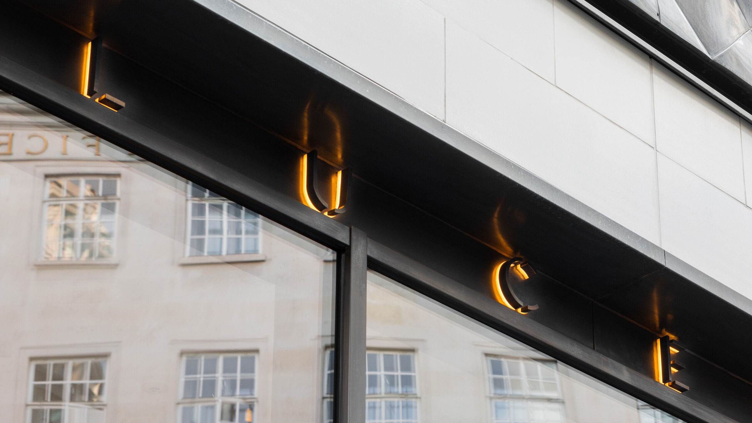
Under the spotlight
The stage was set with atmospheric lighting and dramatic downlights. Extruded suede-textured signs cast strong shadows across the building which means individual elements, like level signs, can become beautiful objects in and of themselves.
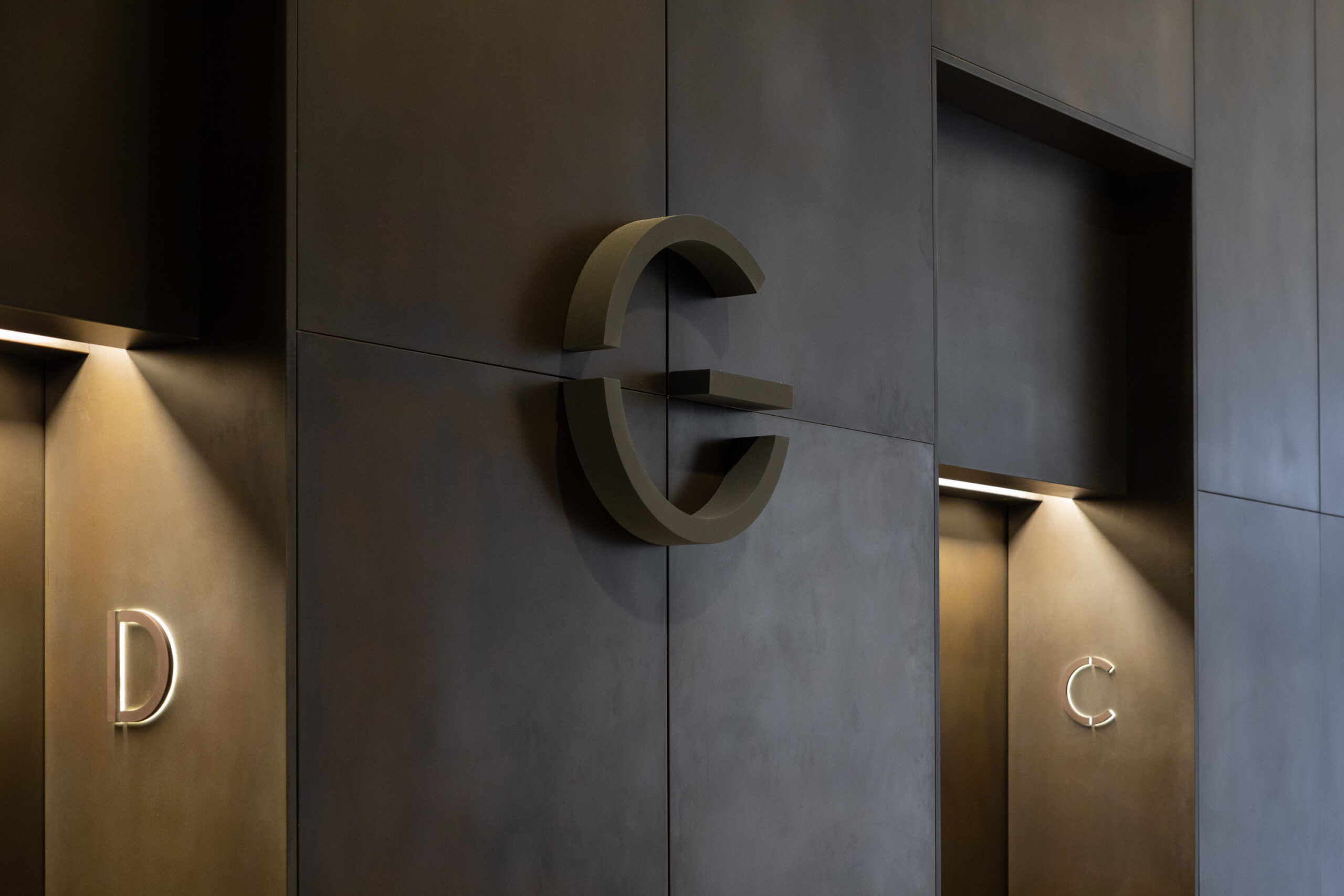
Magnets avoid fixings
To avoid negatively impacting the bronze walls the numbers are magnetic. We worked closely with the architect and on-site teams to ensure that steel plates were fitted to the reverse of the panels ahead of installation so that the numbers stay deftly in place without mechanical fixings.
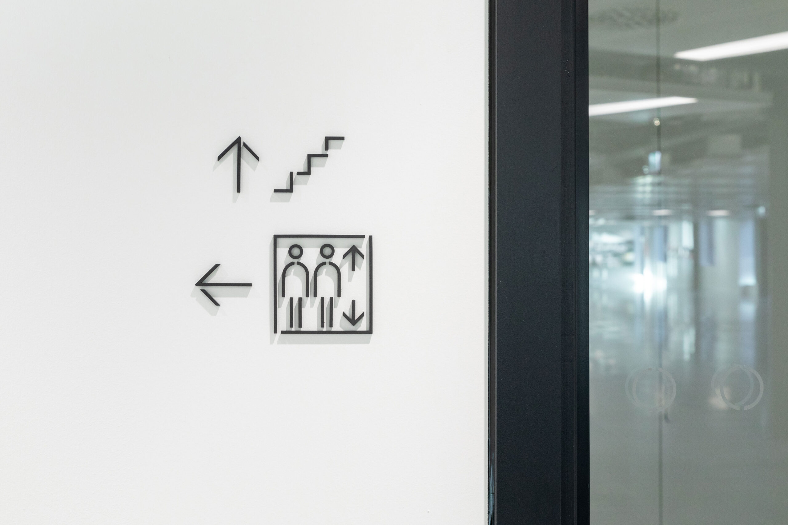
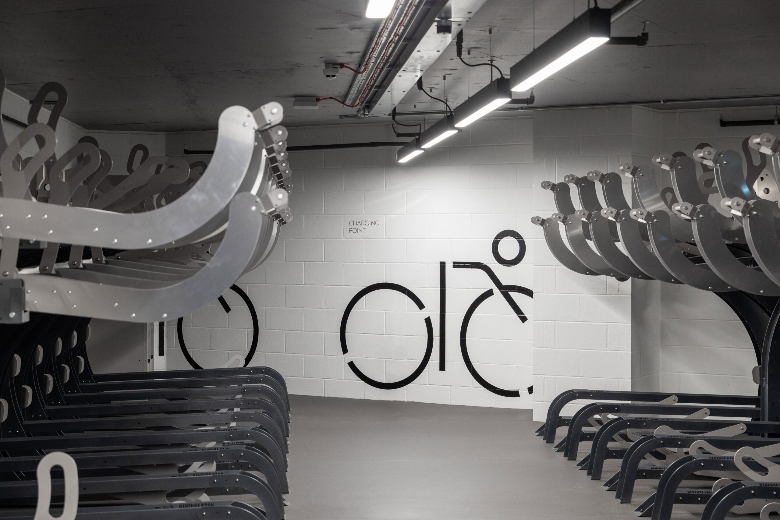
Lucent pictograms
We also built a fully functioning icon set from the typeface in order to create a coherent wayfinding language. This means that the icons can sit comfortably alongside the type — or stand happily alone.

Full of characters
Elements within the typeface lend themselves naturally to forming recognisable human figures.
Photography from Dirk Linder and Sam Bush