HUB Residential
Corporate brand
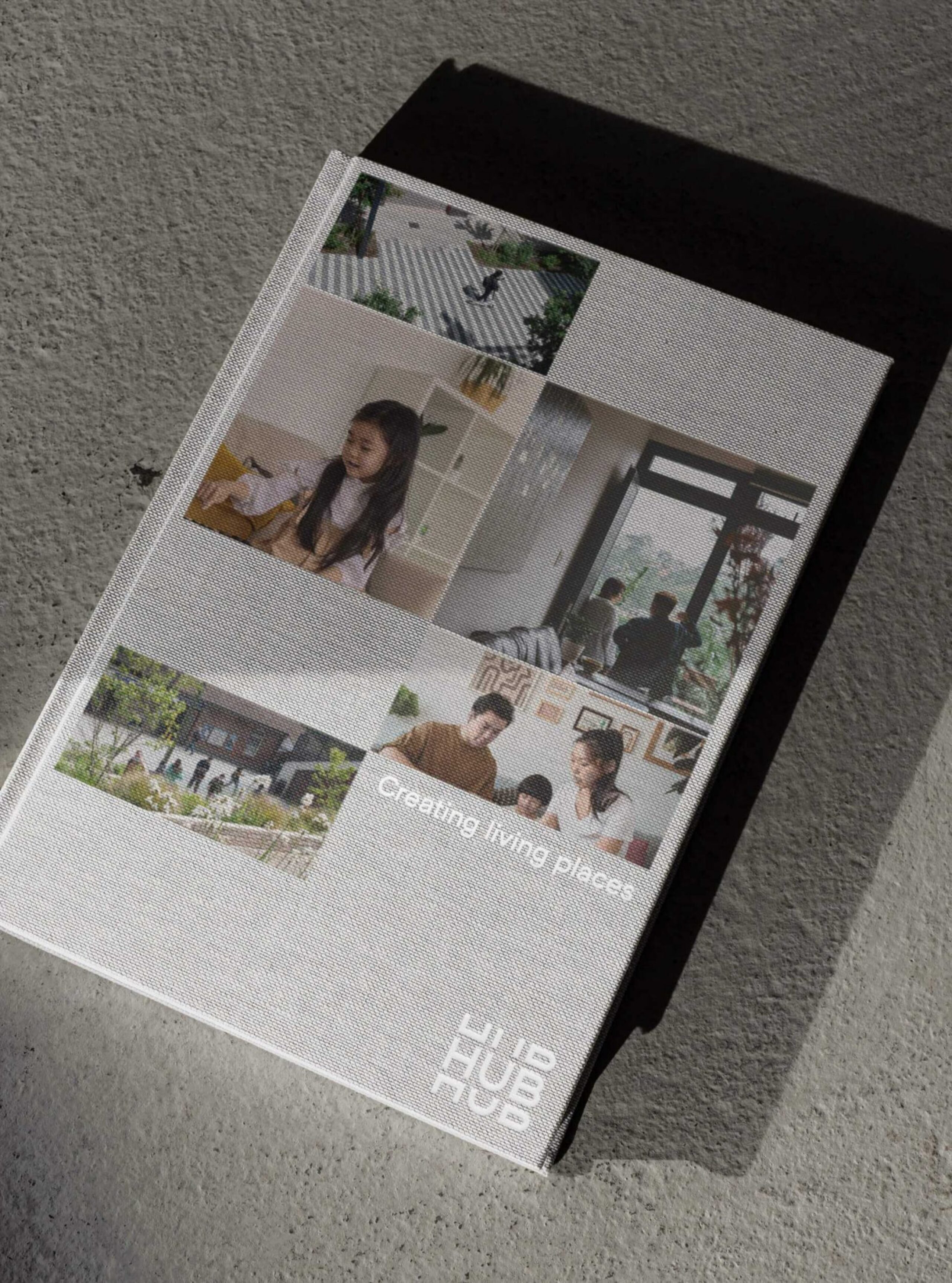
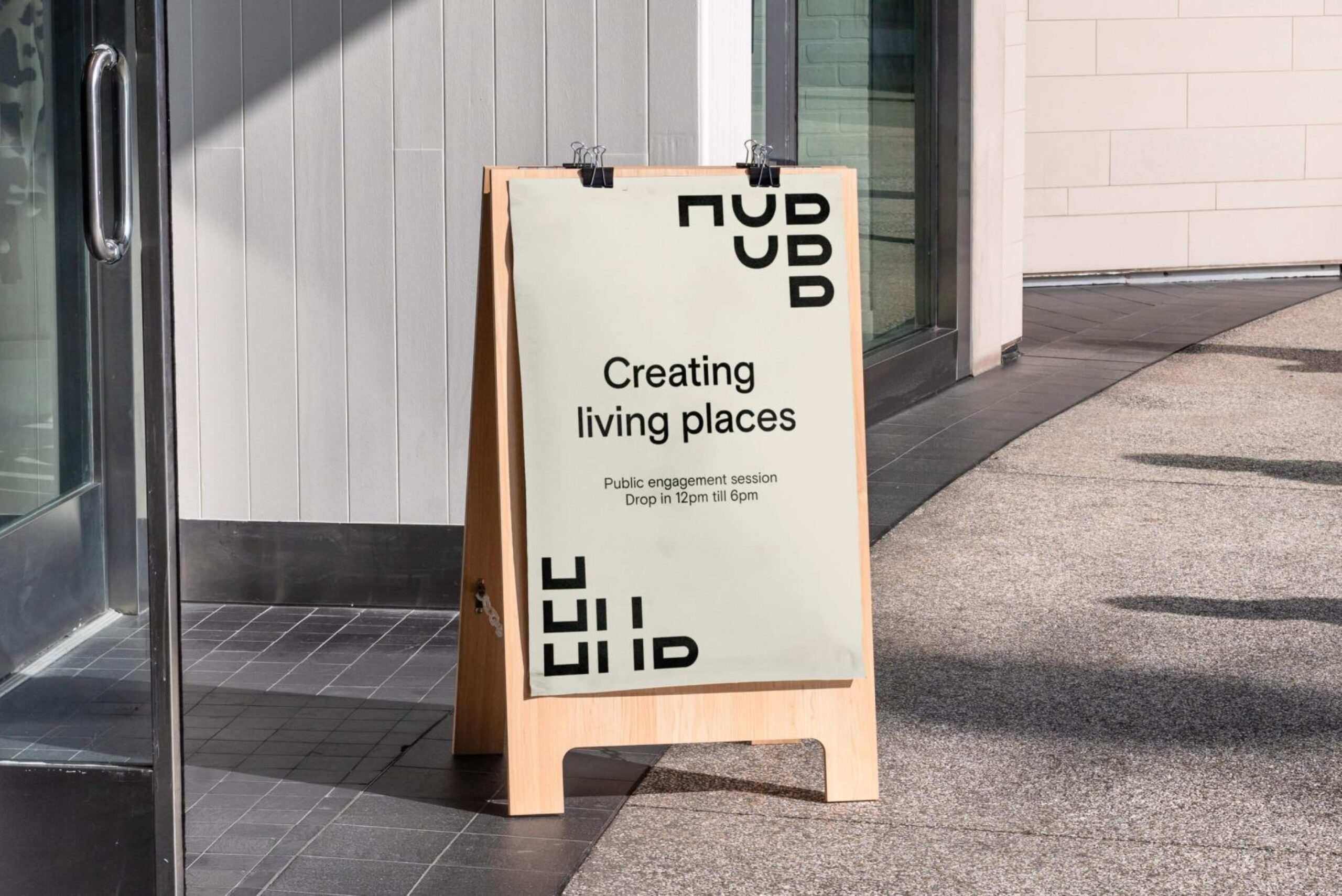
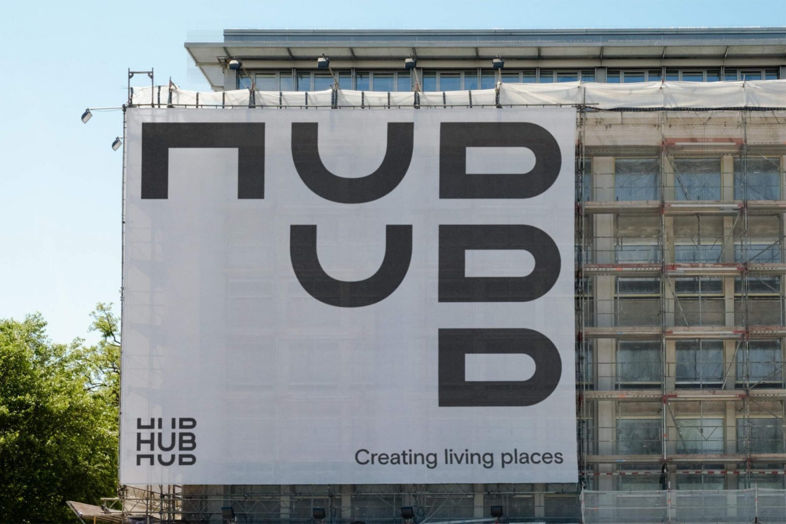
Creating living places
HUB Residential
Corporate brand
Creating living places

A new brand to reflect growth and ambition
The company came to us with a reputation that had outgrown its brand. From single buildings in London, HUB now delivers complex multi-phase places across the UK with a strong focus on build-to-rent. We were asked to develop a new brand that conveyed their energy and knack for nimble approaches, as well as their commitment to creating distinctive places. Above all, HUB wanted the team’s experience to shine through and maintain its experimental spirit as it grows.
Identifying a progressive ethos
We gave HUB a unifying purpose — ‘we believe that progressive development is vital to creating living places’. The world needs trusted developers like HUB to bring bold ideas to life, and take the inspiring action humanity needs right now.
This progressive ethos is underpinned by four essential principles. First, HUB builds relationships before buildings. Then, they seek progress by delivering maximum social impact. And no matter how complex a project gets, they believe in the power of great design. Finally, they foster trust by creating long-lasting value for all. Because progress is real action, never empty promises.
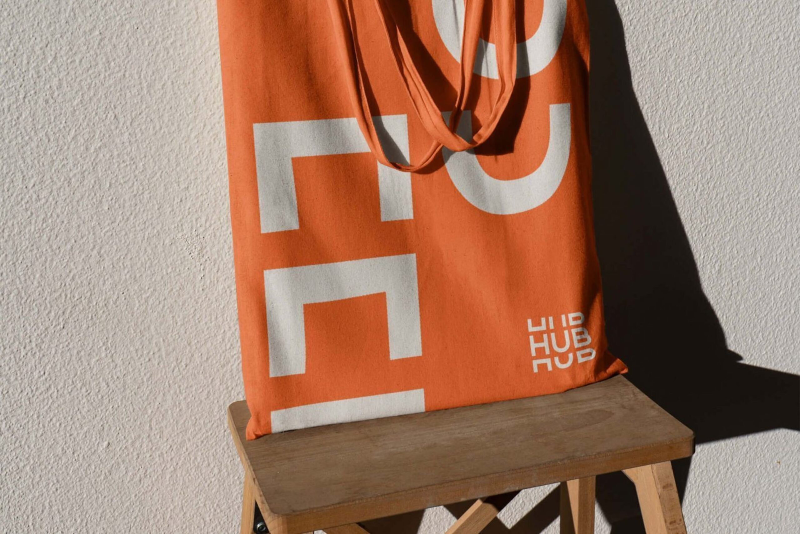
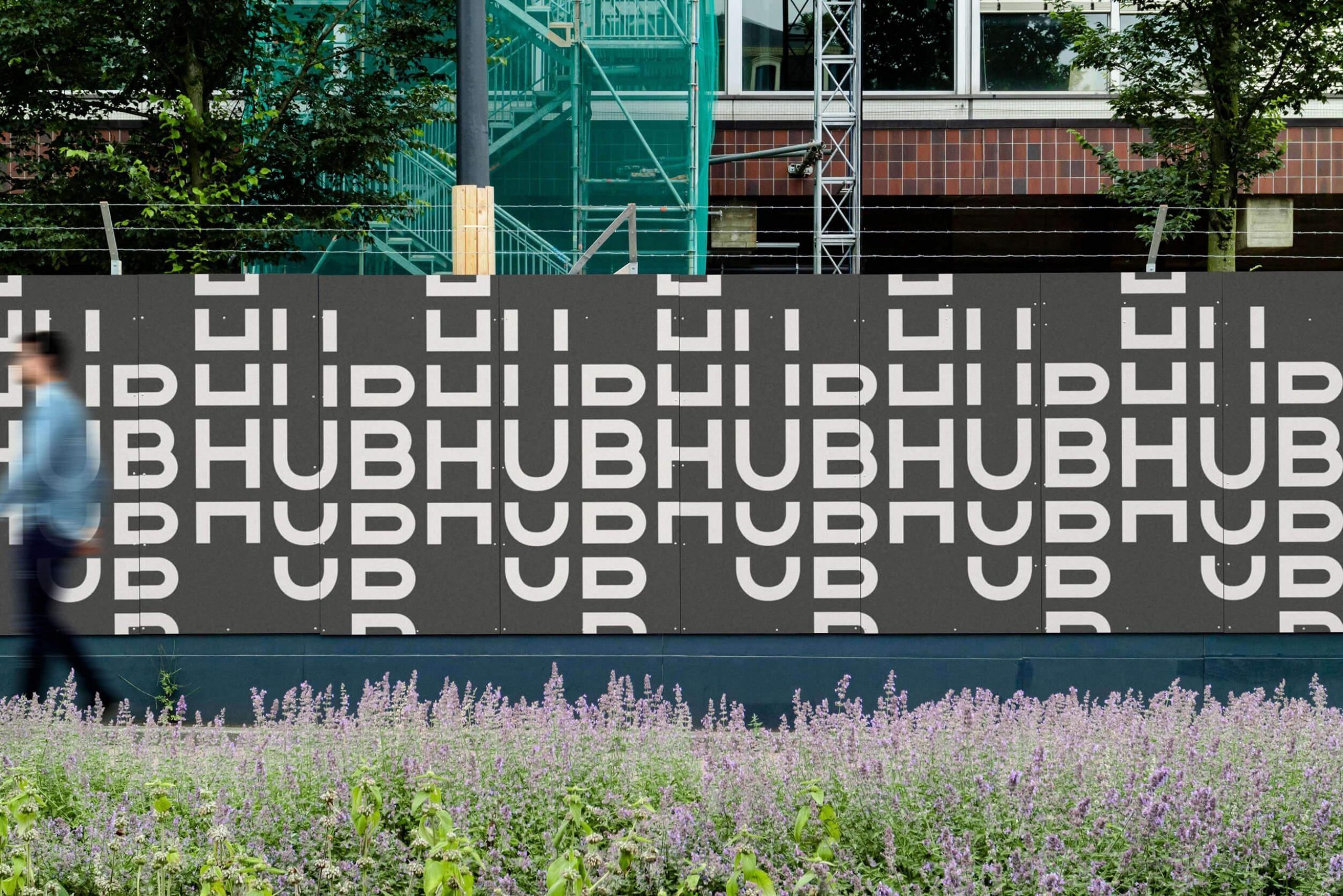
A dynamic logo and identity system
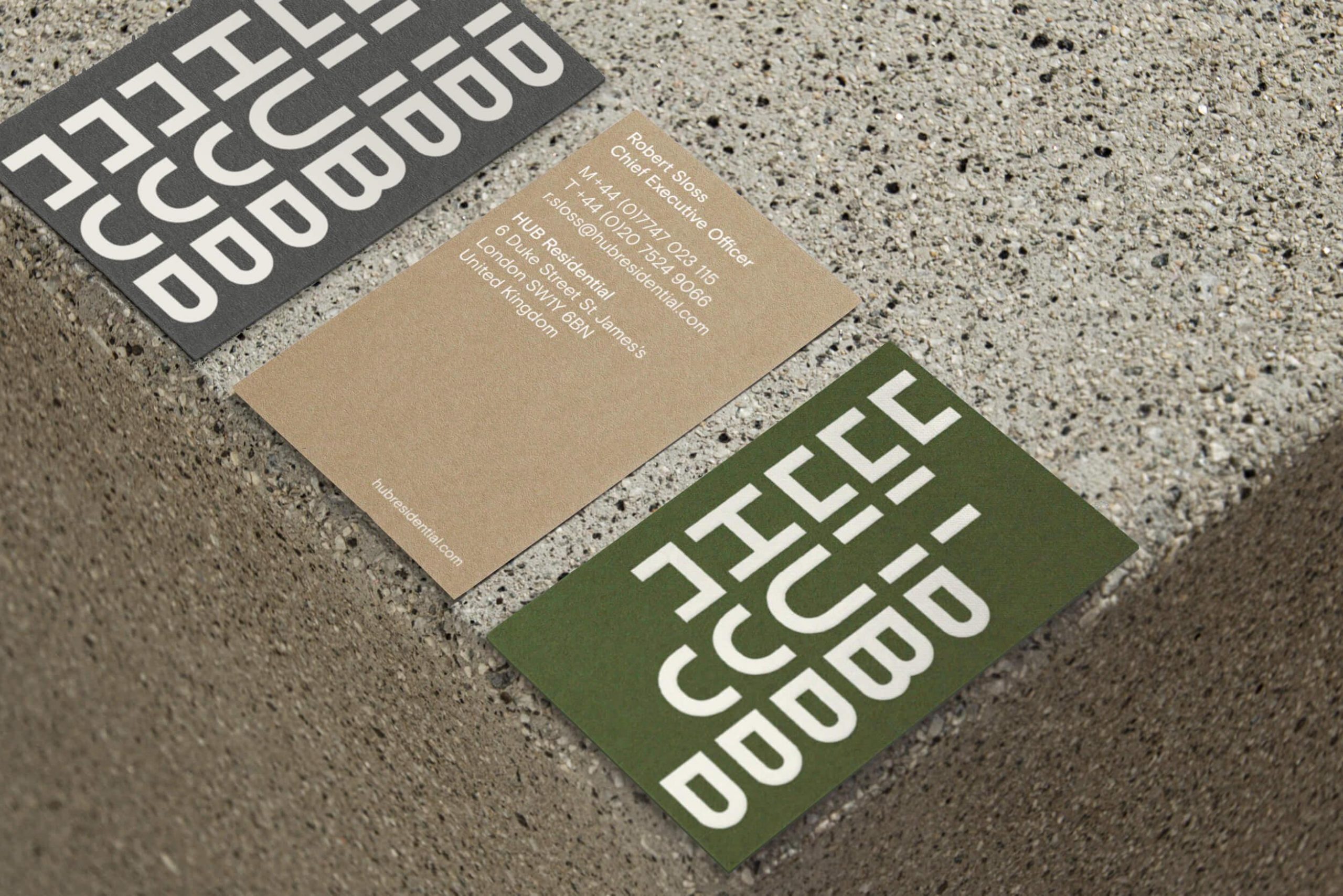
The new brand identity is striking, impactful and energetic. It captures HUB’s progressive spirit and reflects their relationships-driven approach to creating living places. We named this brand language “The dynamics of HUB”, and this dynamism is very much visible in every aspect — the logo and branding looks like it’s in motion, with the gears turning in order to look at things in different ways to inspire the best solutions.
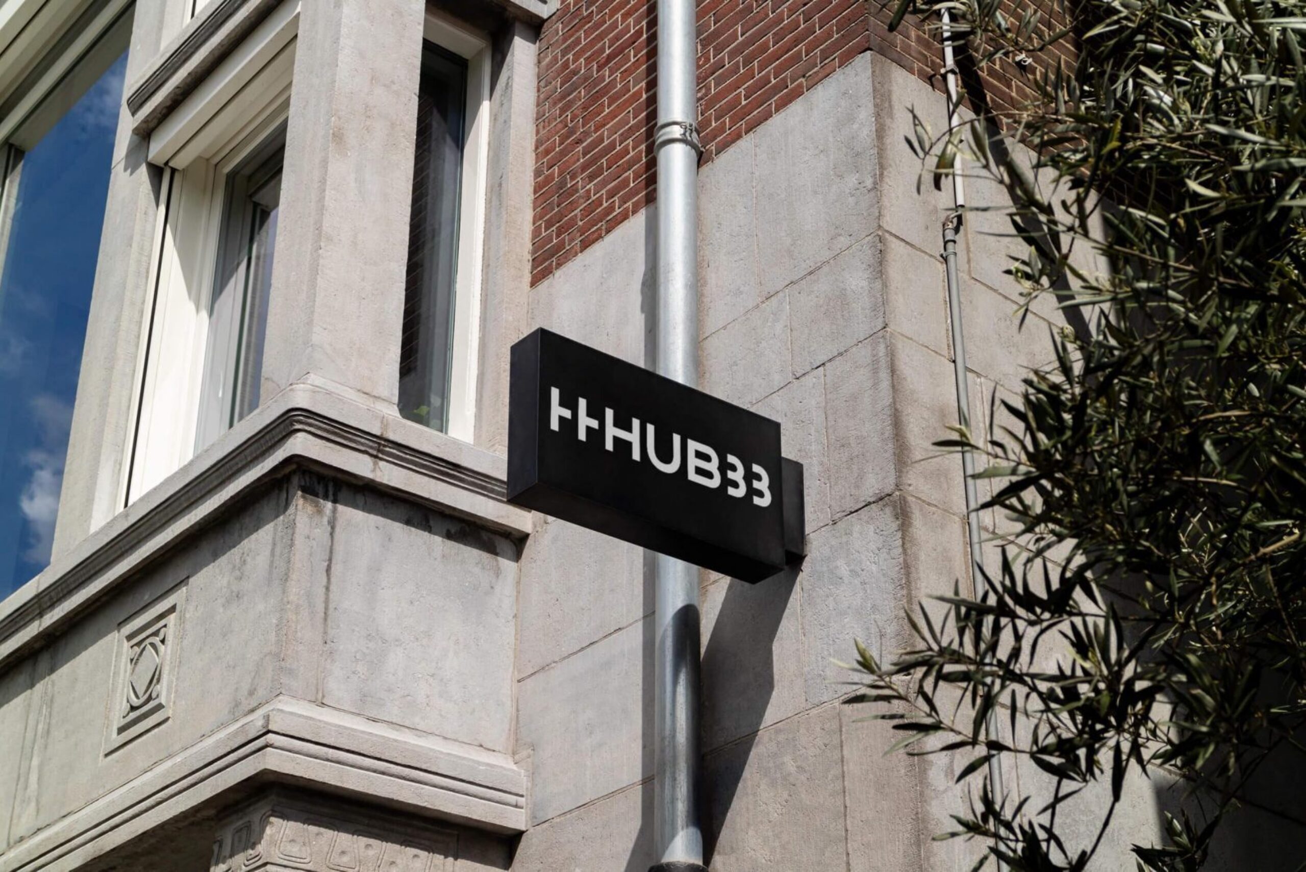
Flexing its new personality
We designed the identity to represent how different people come together and create something greater together than they can do on their own. It’s an expressive logo that’s immediately recognisable as belonging to HUB across web or social media. The repeating, staggered letters are full of personality and evoke openness.
The same values are reflected in the warm, honest and down-to-earth palette, which have come from HUB’s buildings and choice of materials. Film and photography add another human dimension to the brand, heroing imagery that feels real and natural. The elements of the brand come together in this new website we created, setting the stage for an exciting new phase of HUB’s journey.