CO—RE
Corporate brand
Collaborative real estate
CO—RE
Corporate brand
Collaborative real estate

Turning an obstacle into a powerful new concept
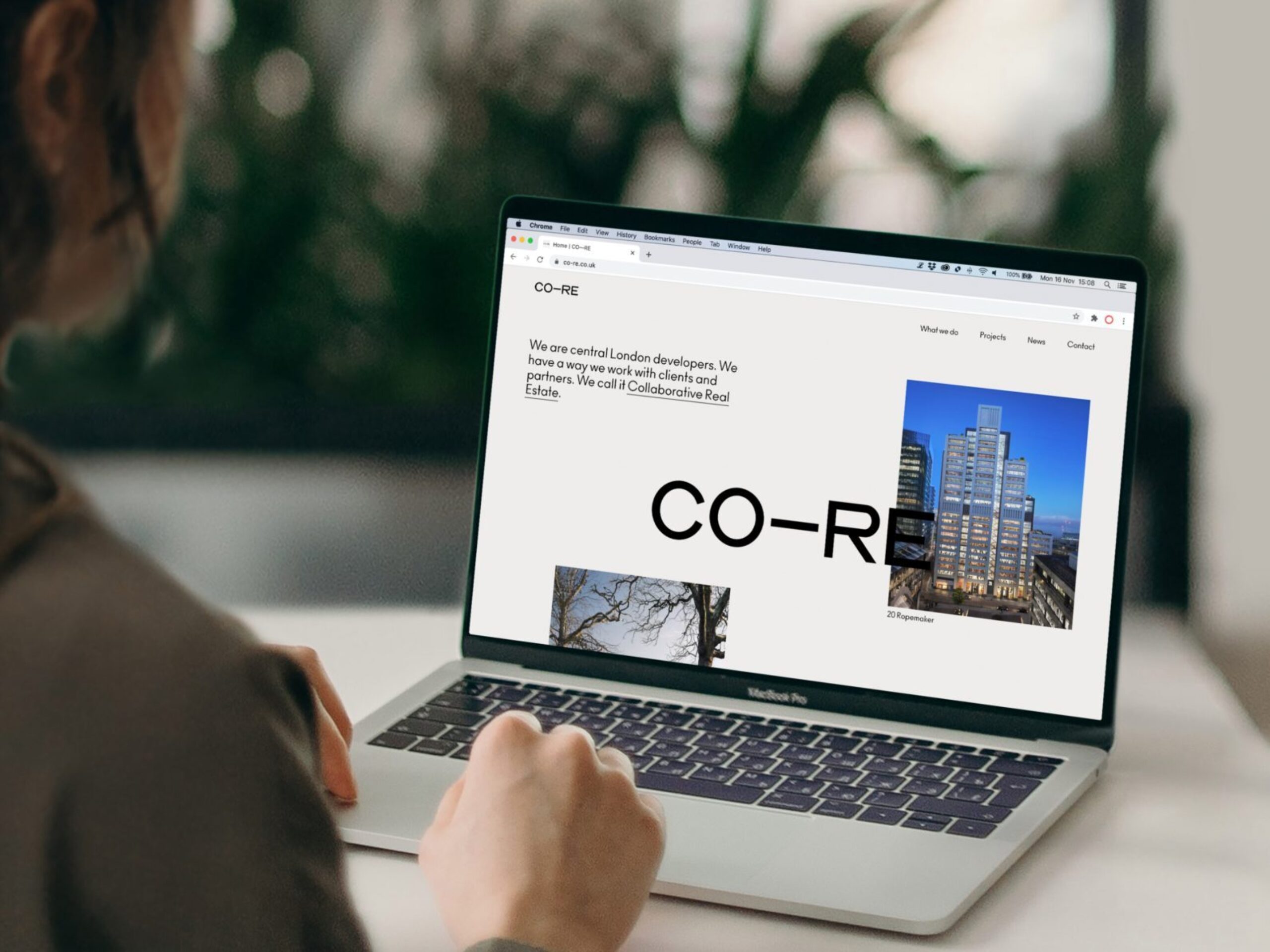
CO—RE is a business with an extraordinary portfolio of ambitious projects across London. But you wouldn’t have known that from their old website or identity. We proposed that they evolve from City Offices Real Estate to something more relevant to the company’s citywide portfolio and particular ethos of partnering with clients across the sector: Collaborative Real Estate.
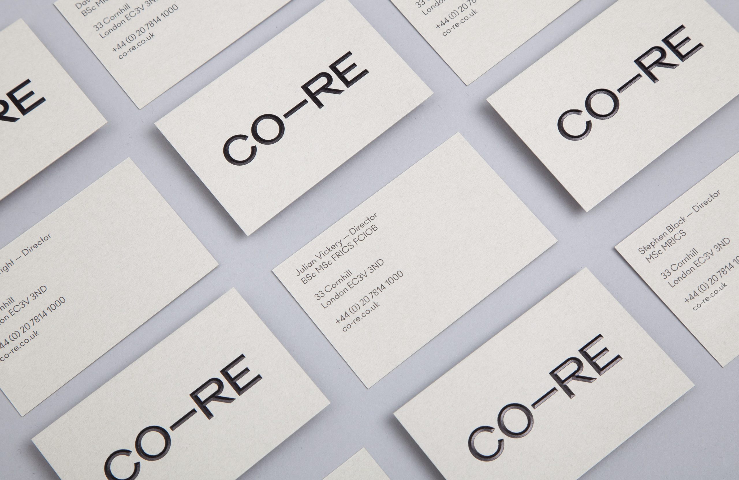
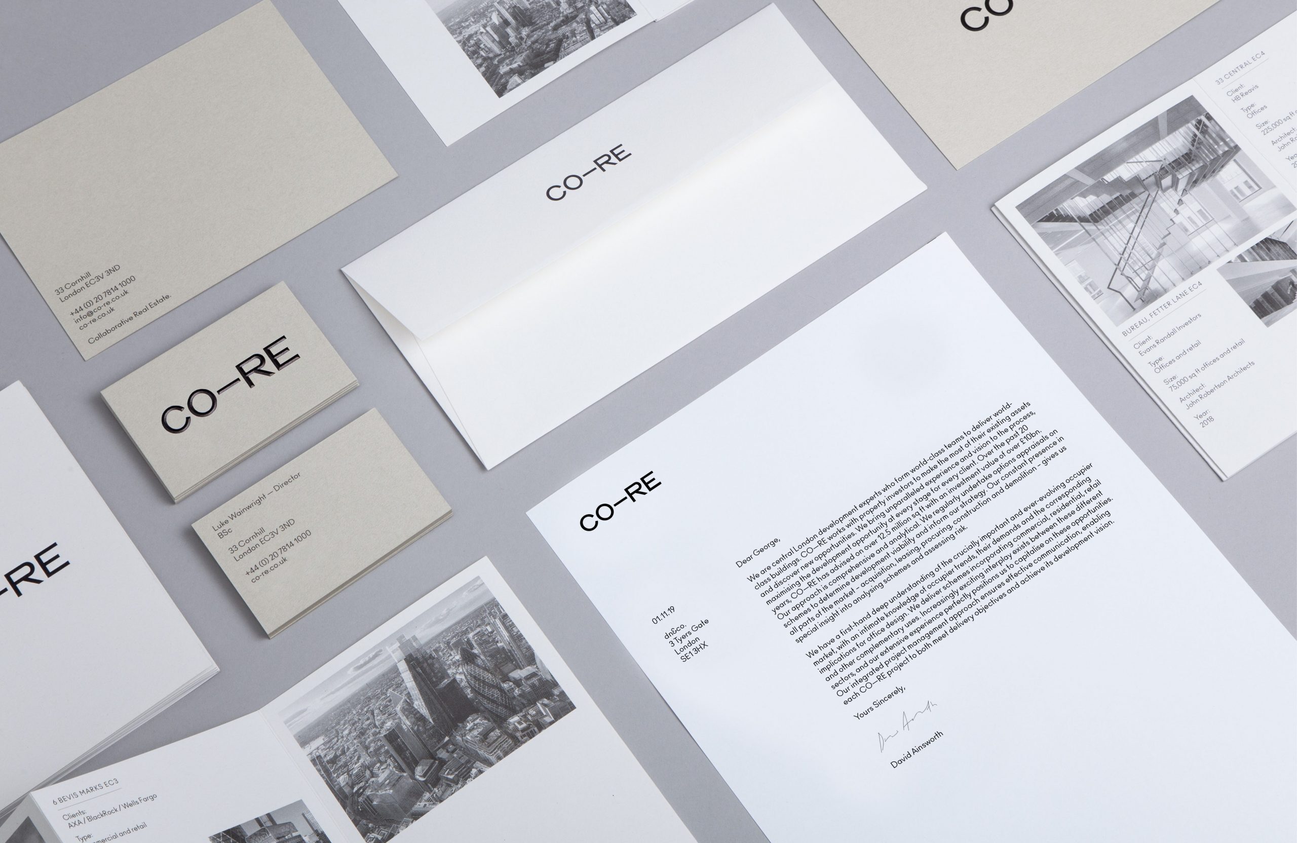
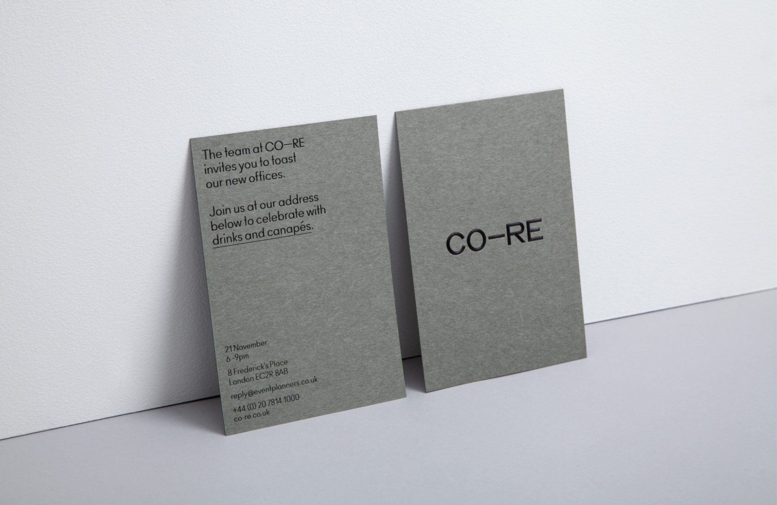
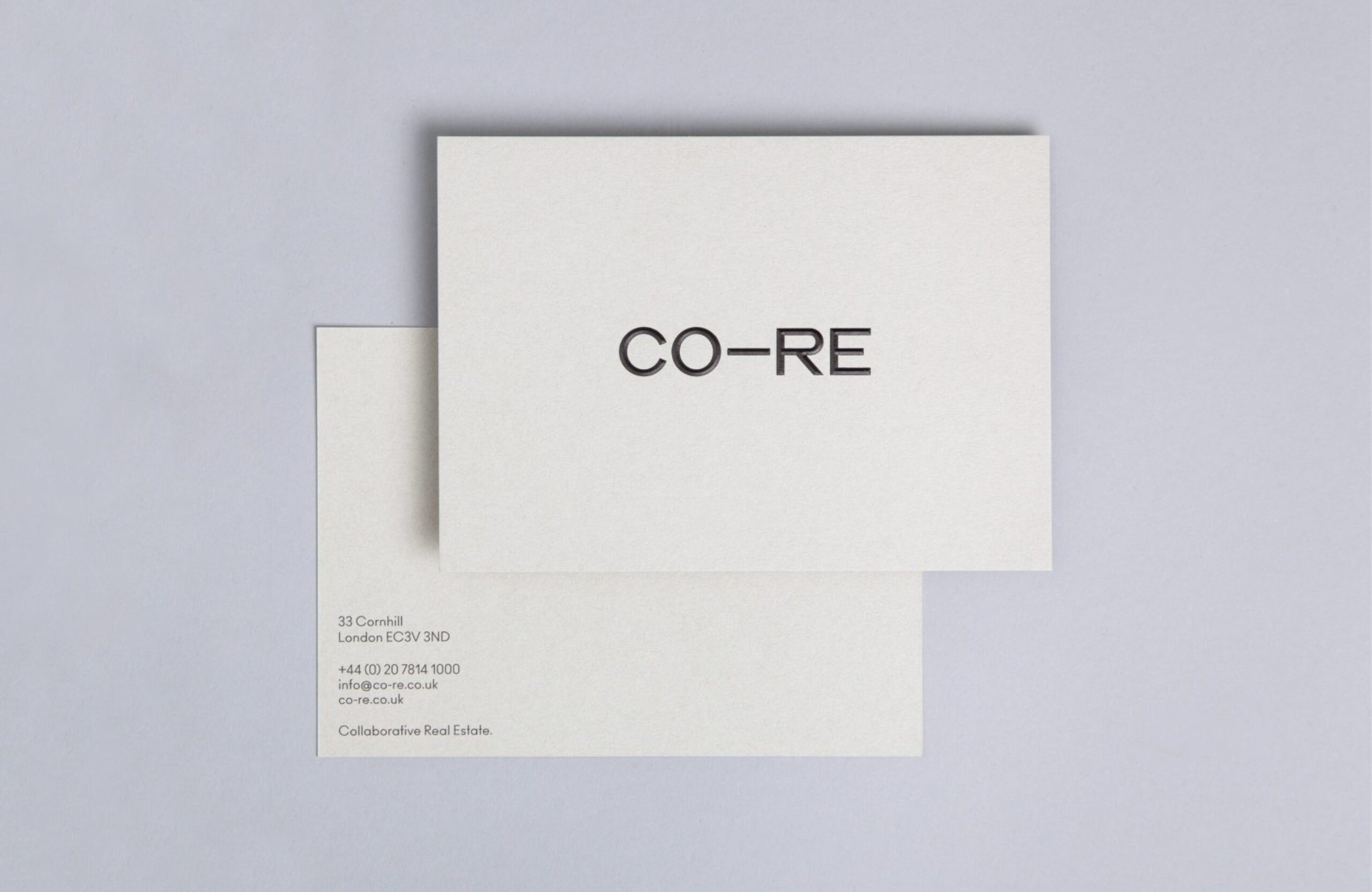
A particular concern for CO—RE was the hyphen in the middle of their web address. We rescued this unloved glyph, turning it into a new concept. Adding an unmissable em dash allowed the brand to maintain their URL, while moving their business forwards.
A smart and refined identity
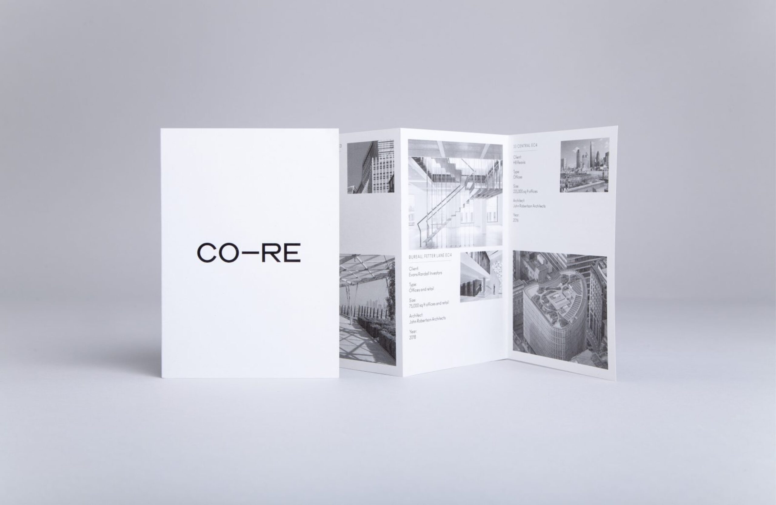
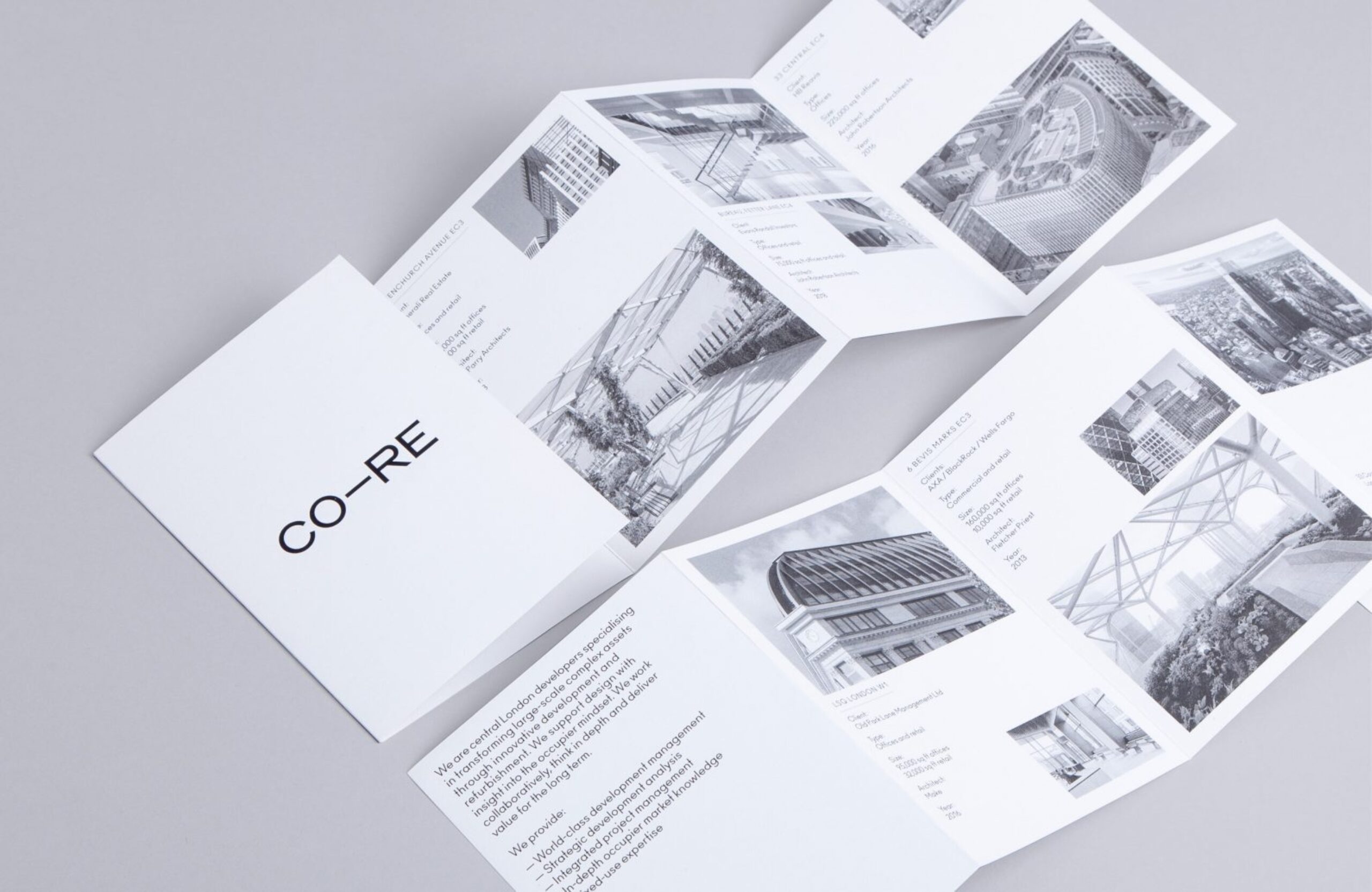
This is a textured identity that evokes the materiality of the construction world and allows CO—RE to stand out in the industry. Bold and clear, it draws from the language of architecture, with an elegant, polished finish. Print materials use Japanese papers in concrete greys, embellished with fluted sculptural foil; an ode to the materials that make up the places CO—RE create.
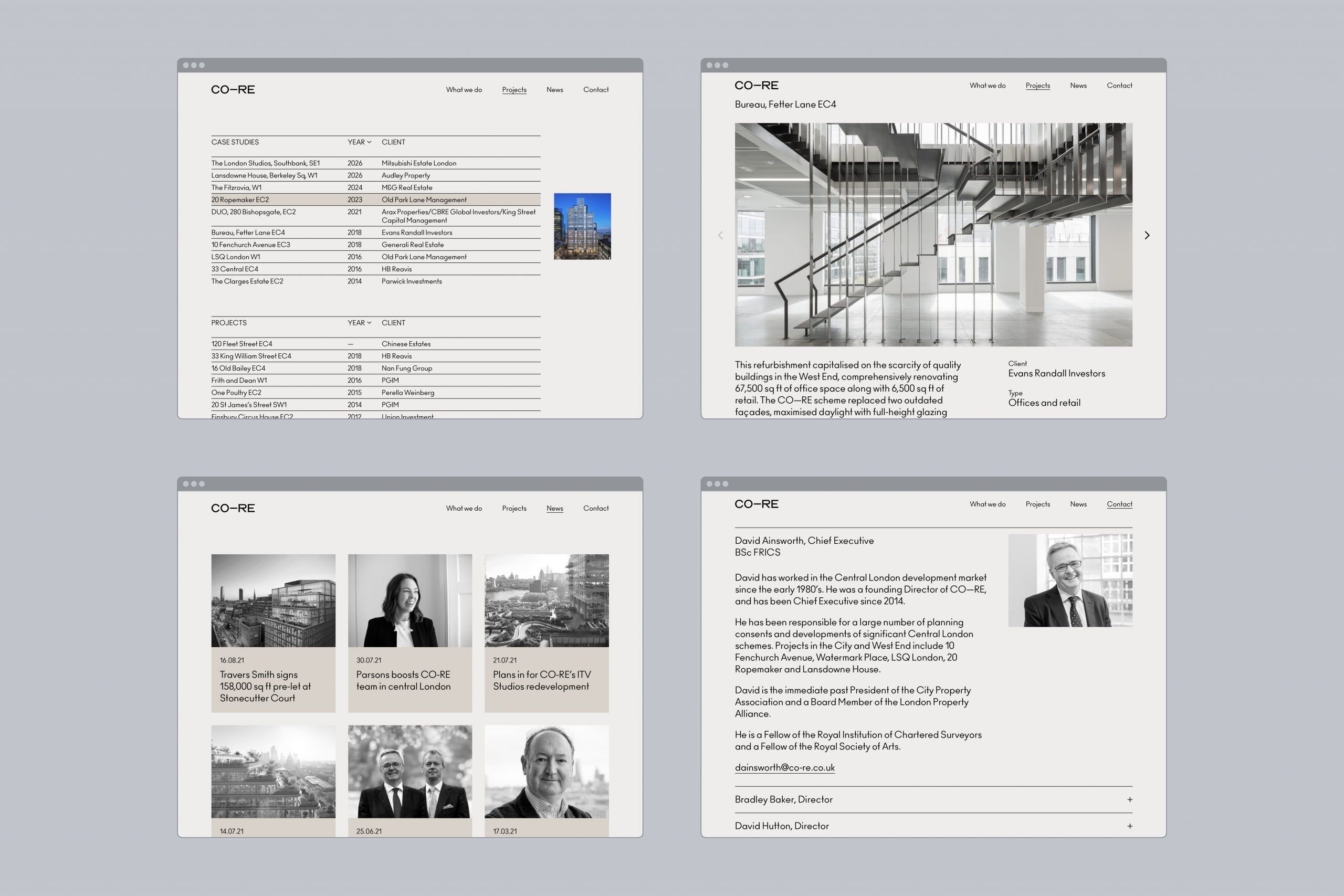
An elegant new website
We developed CO—RE’s new website to articulate the subtle yet powerful shift in their proposition; that of Collaborative Real Estate. The result is remarkable, transforming the company’s digital presence into something worthy of this distinguished business.