V&A
Wayfinding
Seven miles of discovery
V&A
Wayfinding
Seven miles of discovery

Getting lost in museums is part of the fun, but not when you can’t find the exhibition you’ve paid for.
Our wayfinding system for the V&A unifies seven miles of galleries across three interconnected buildings, helping opening up its treasures to more people than ever before.
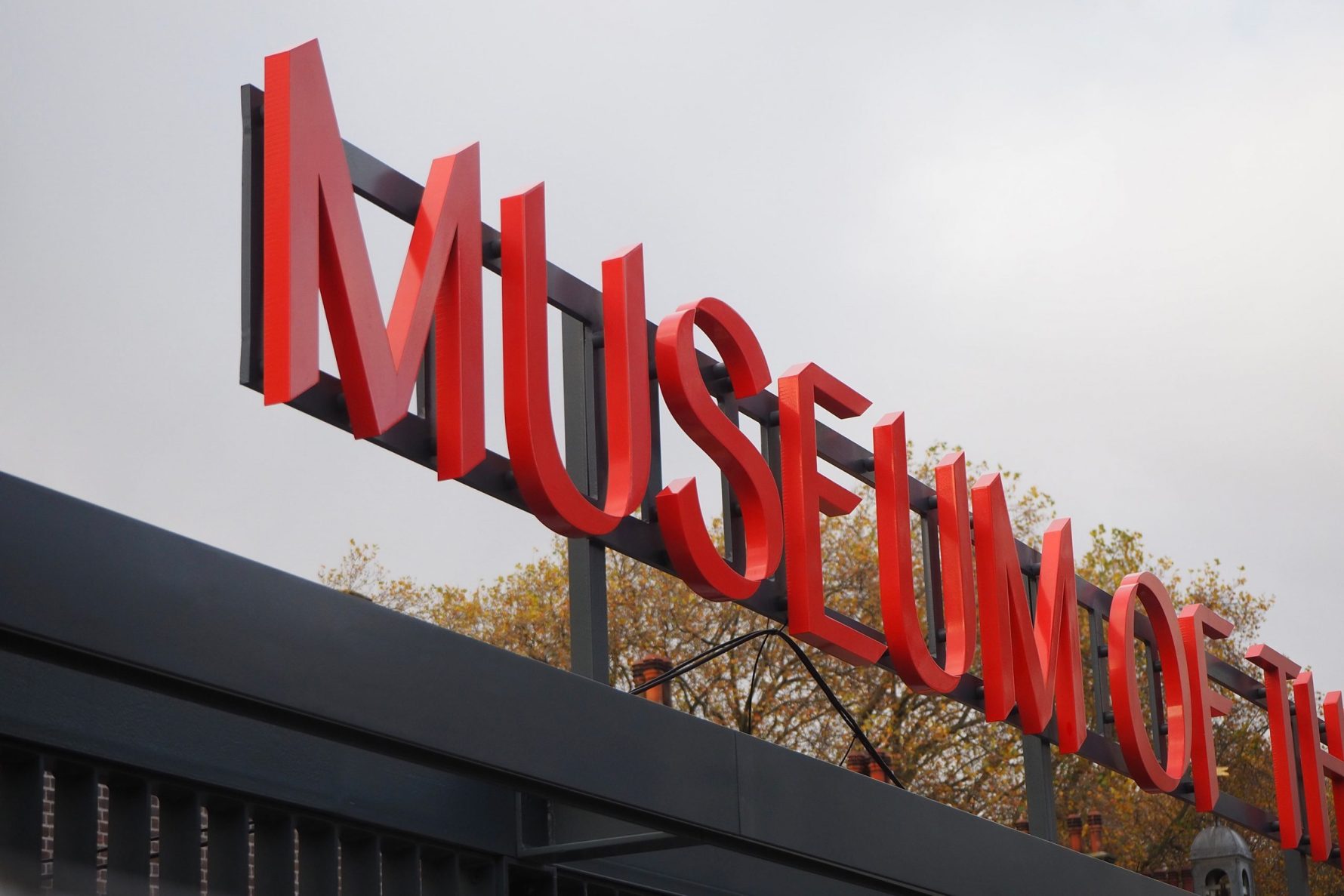
- Victoria & Albert Museum
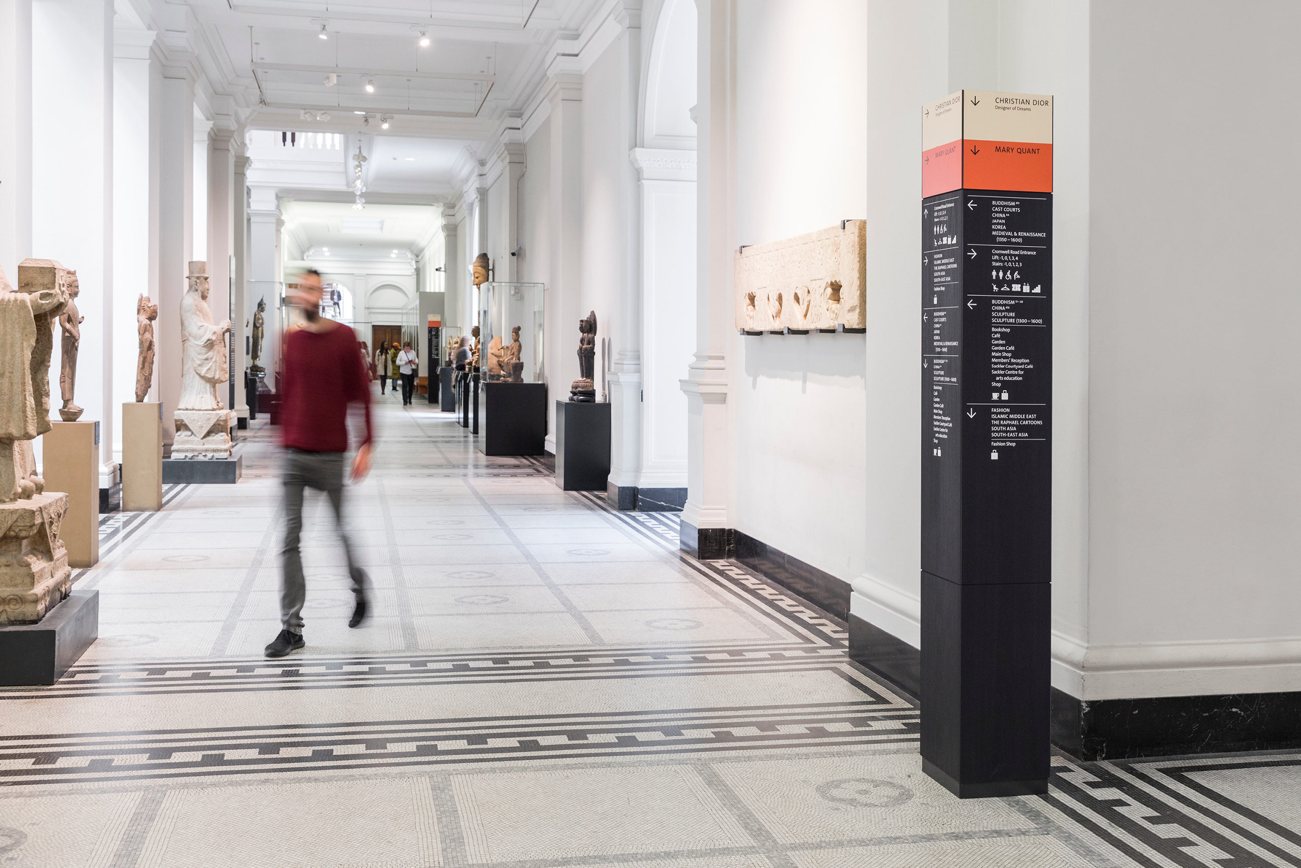
Follow the colour
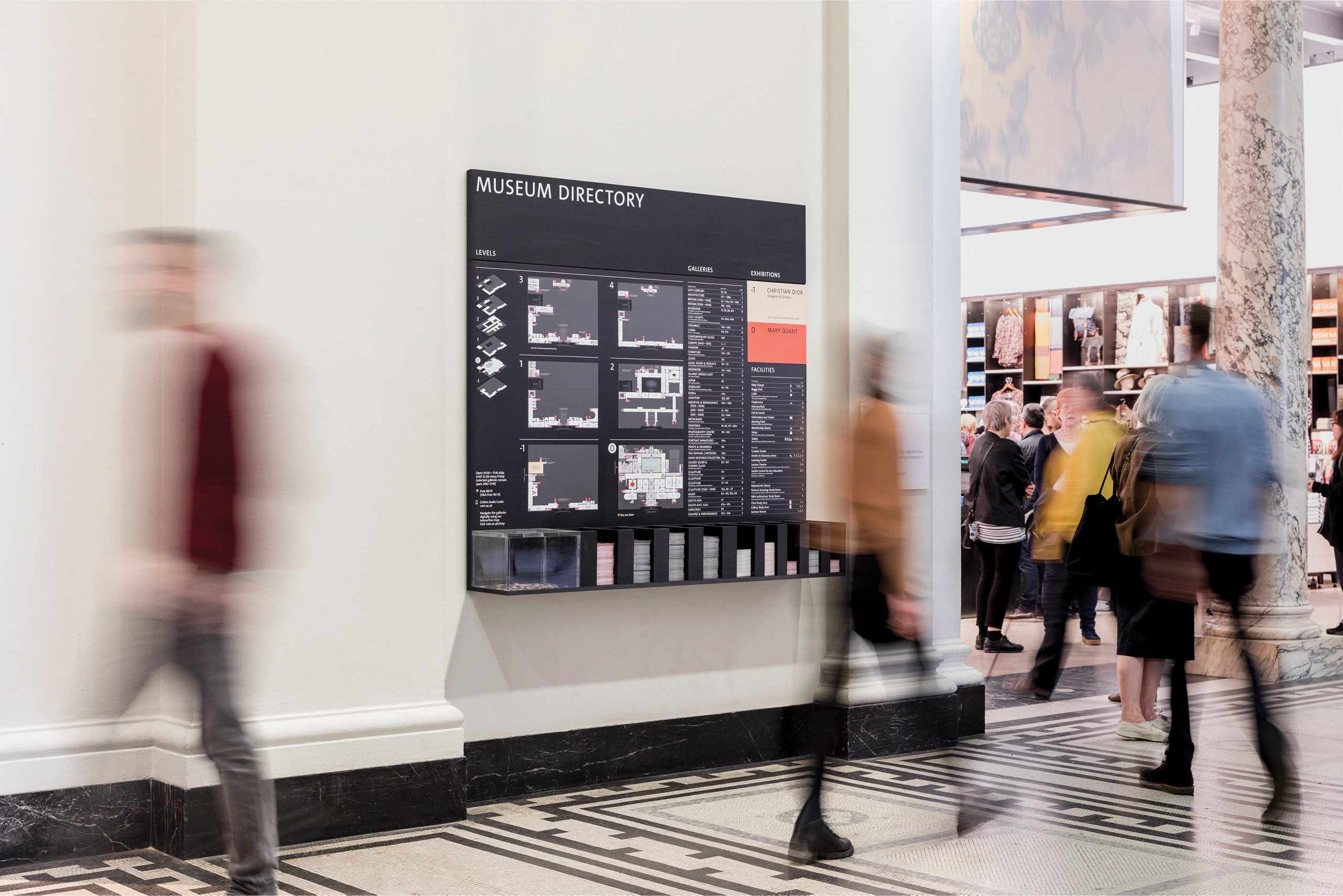
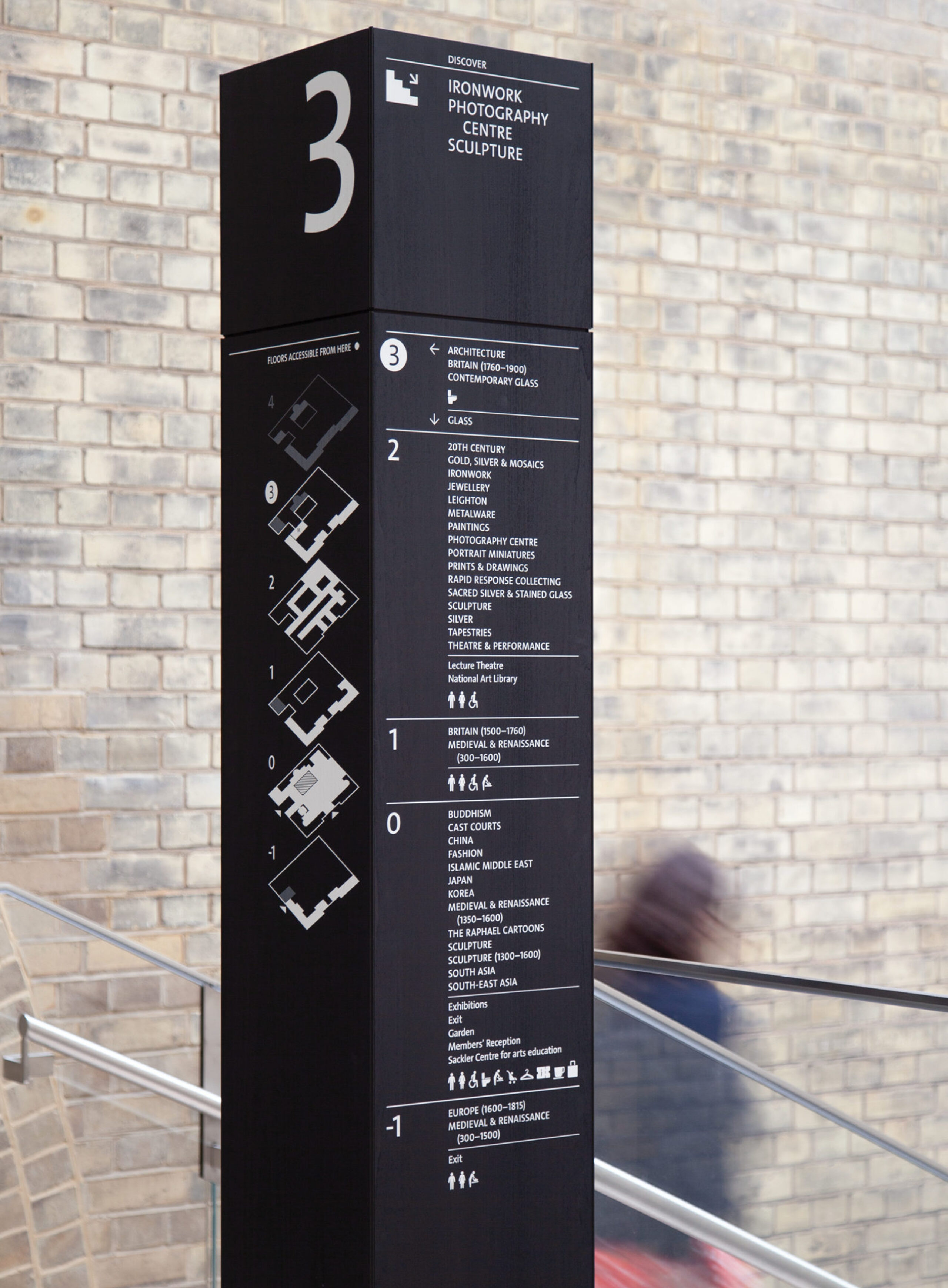
Over the last ten years, visitor numbers at the V&A have tripled. In order to protect its future, we were asked to create a comprehensive wayfinding system to enable the V&A’s four million annual visitors to explore the museum with confidence and curiosity.
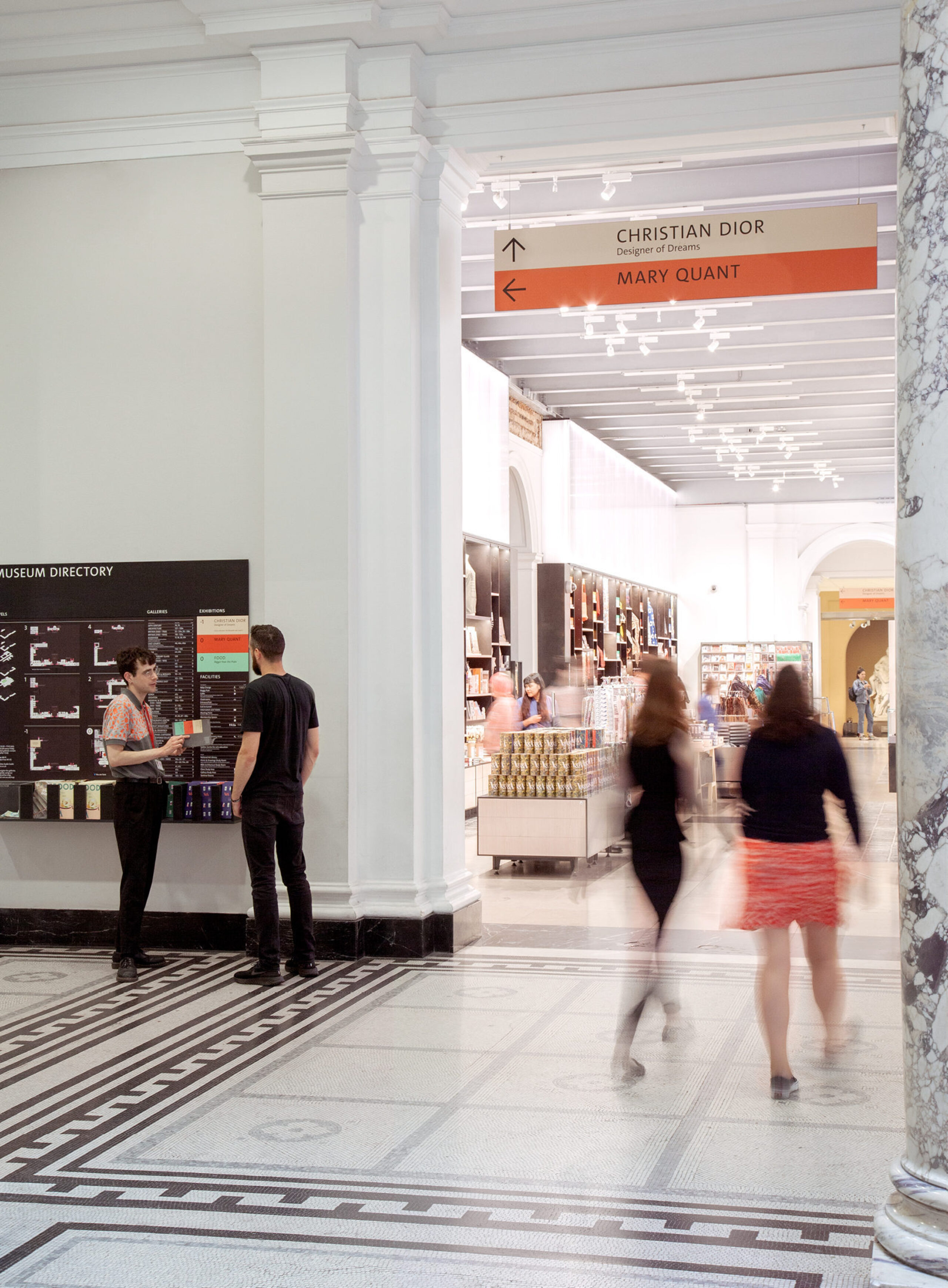
One of the most significant innovations in this system is the use of colour. Reserving it as a highlight purely for paid exhibitions, colour acts as a beacon drawing visitors through the busy ground floor and getting them to their destinations faster — thus protecting a core revenue stream that helps keep the permanent galleries free to explore. The colour is specific to each exhibition and is consistently used from tube ad to entry signage.
Encouraging exploration
Our brief was to facilitate an outstanding visitor experience: not just about getting people from A to B but encouraging them to discover lesser-known parts of the museum's collection, beyond the ground floor.
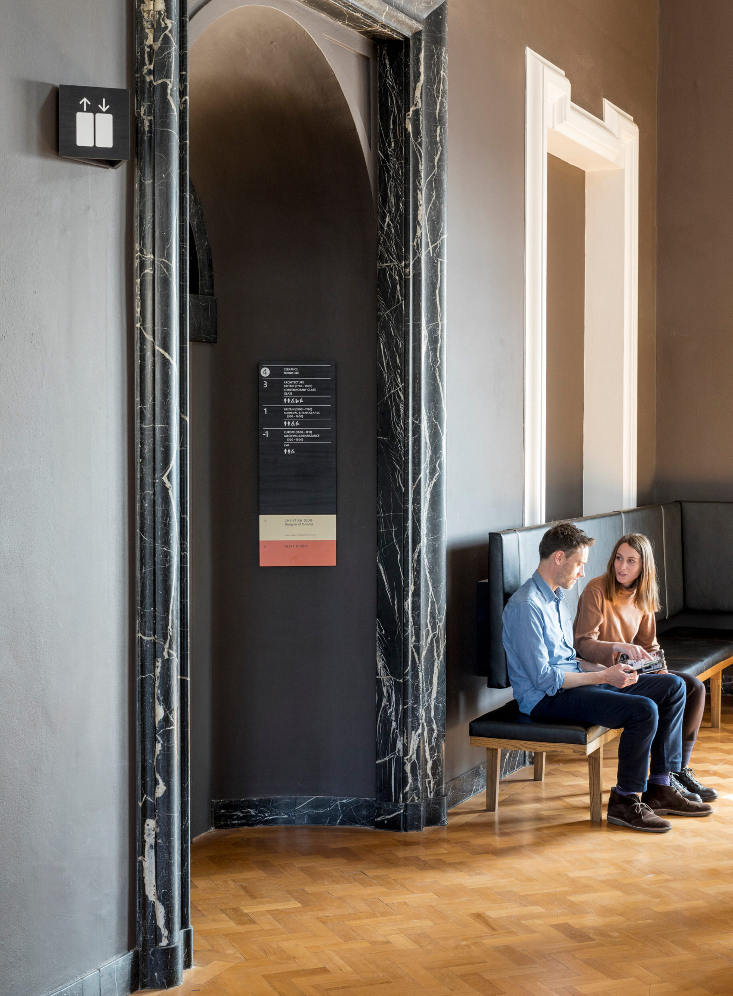
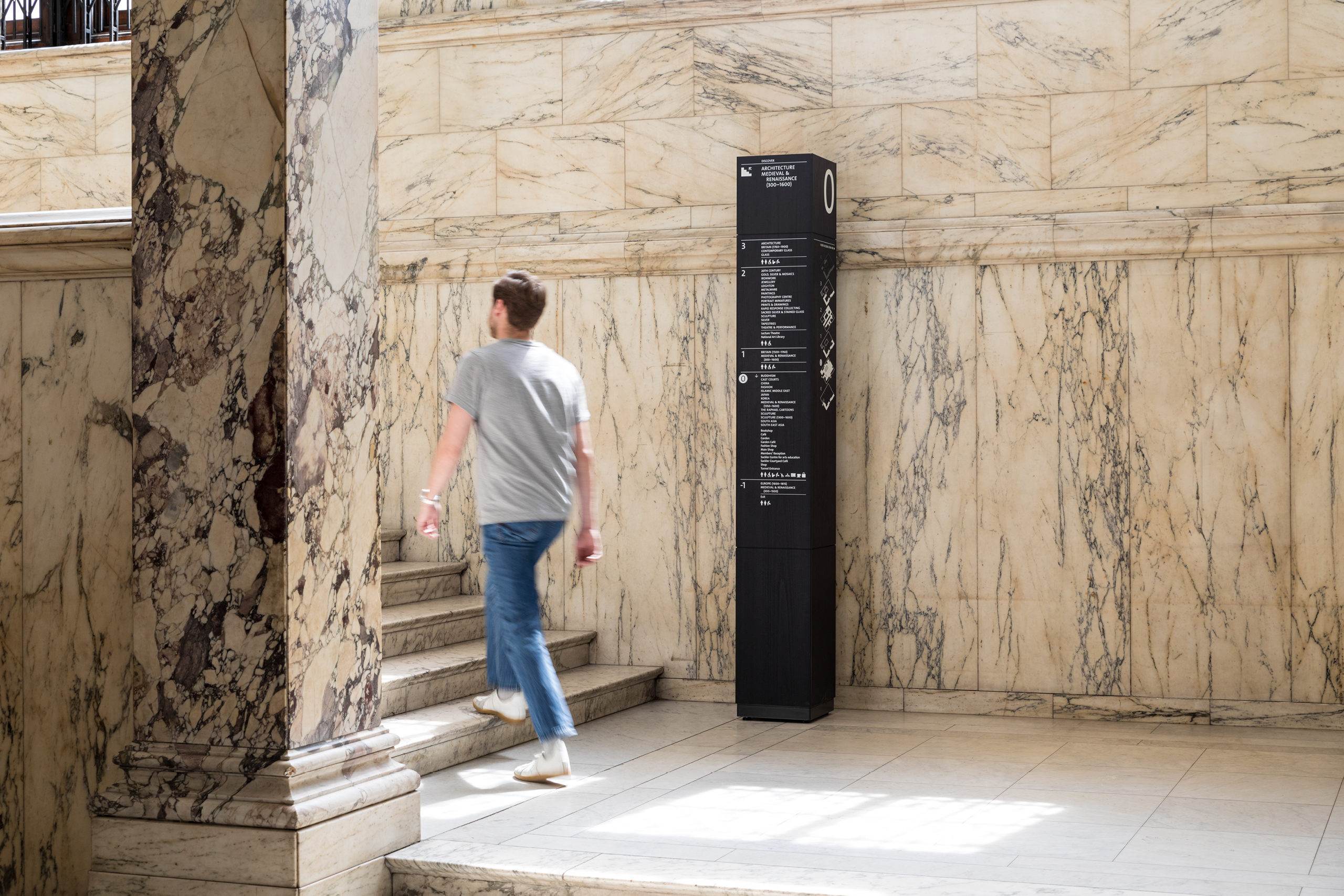
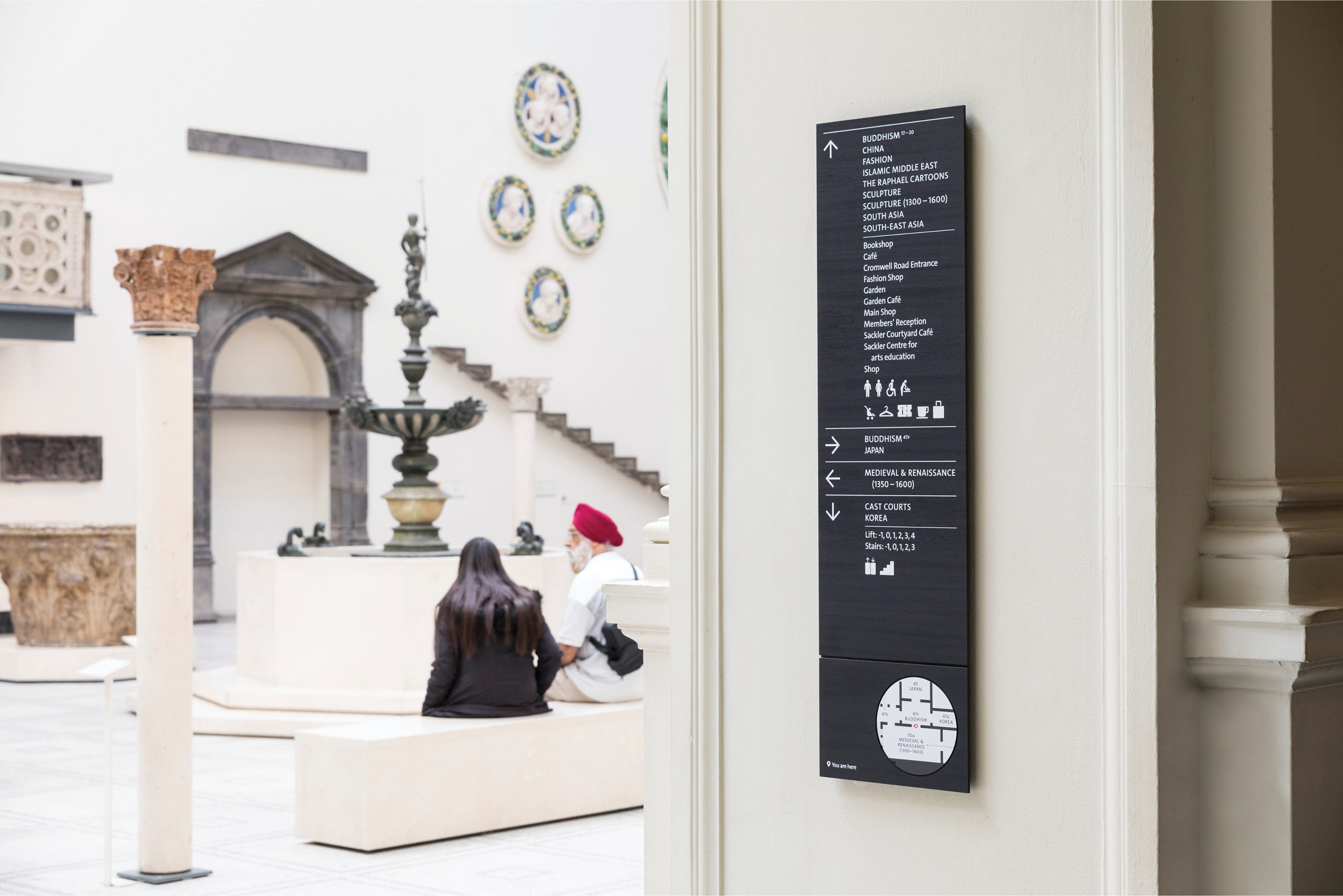
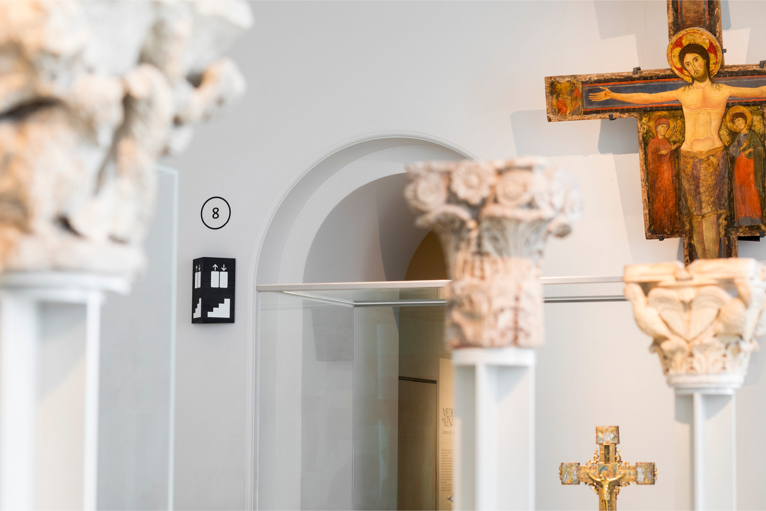
We devised a city wayfinding approach to this vast building, introducing signs at the thresholds between spaces to reassure visitors they were still on the right route. Much like a trail of breadcrumbs.
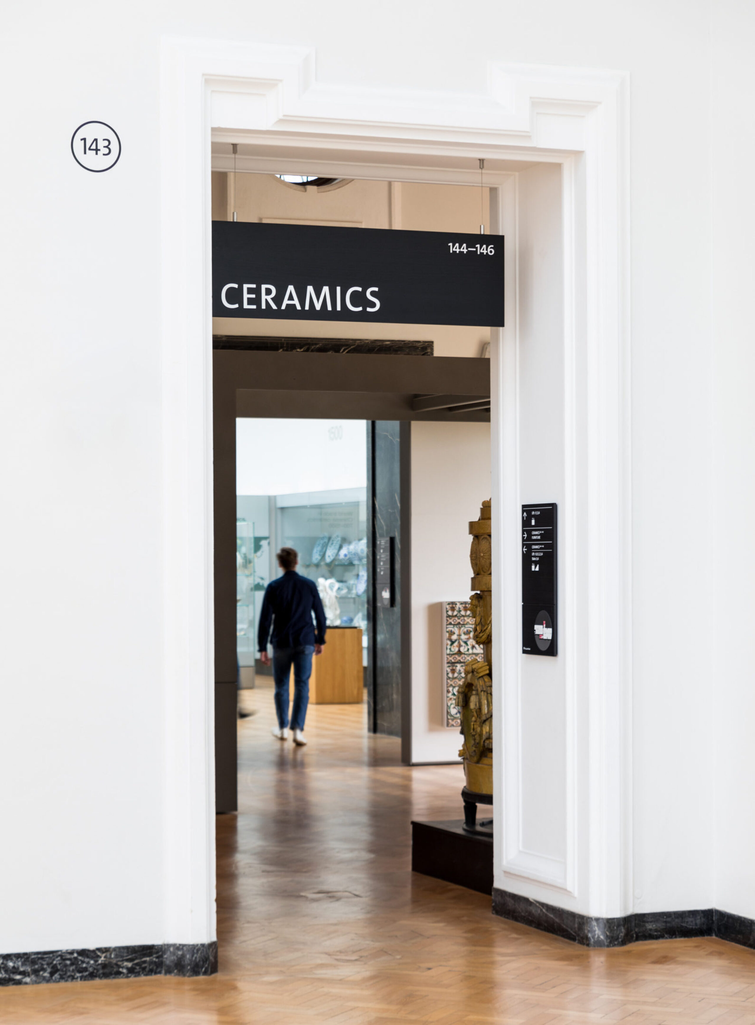
One of our most significant impacts was the re-numbering of the floors at the V&A. The result is that far-flung galleries at the outer edges of the museum are brought closer to the ground, making them feel more accessible and within easier reach. Ceramics appears to have moved from Level 6 to a much more comfortable Level 4.

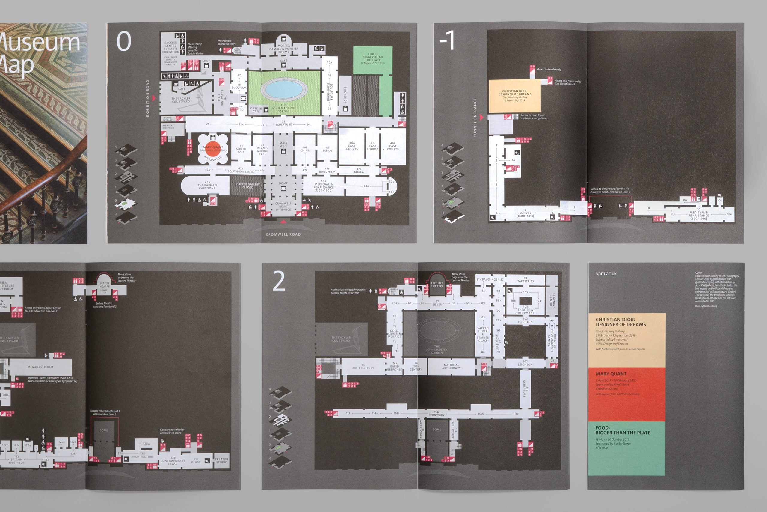
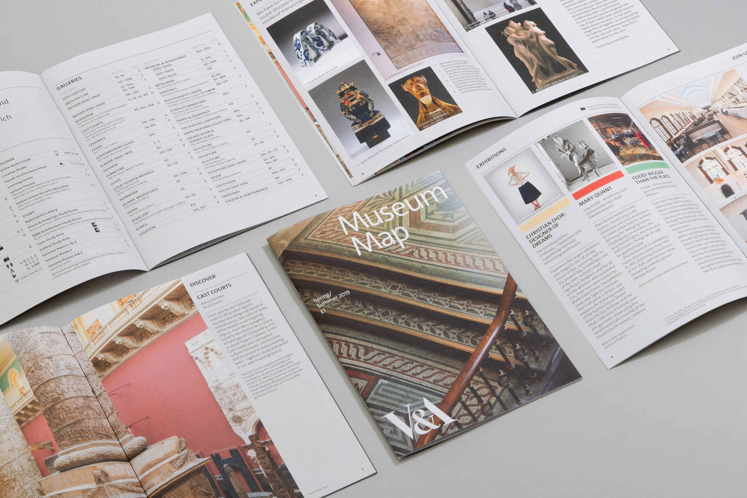
Redrawing the map
We re-conceived the printed map at the V&A making it more legible and approachable as well as more compact to carry around. Crucially we re-drew it with the knowledge that it was also to be used in a digital environment, so vertical circulation points all align across floors and icons were considered at multiple scales.
The material language of display
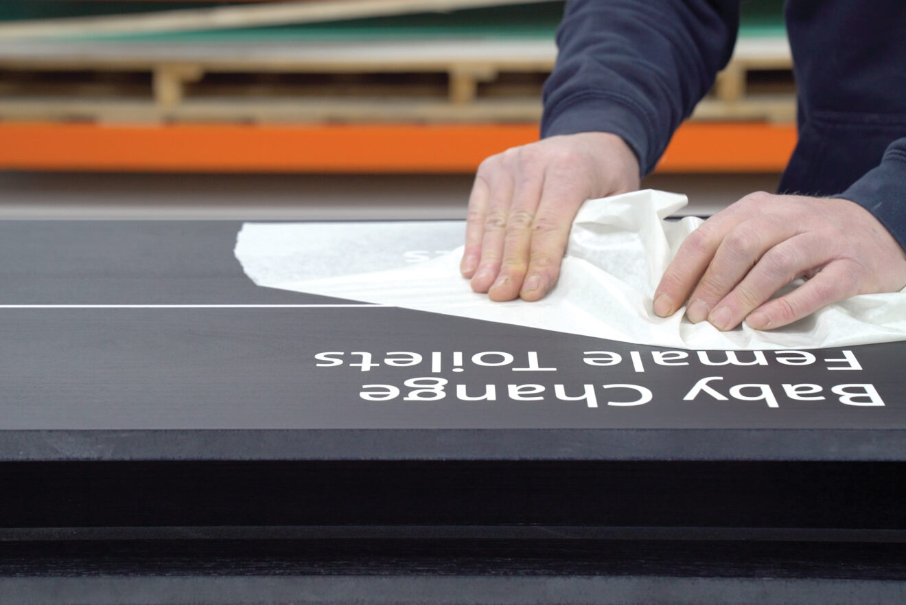
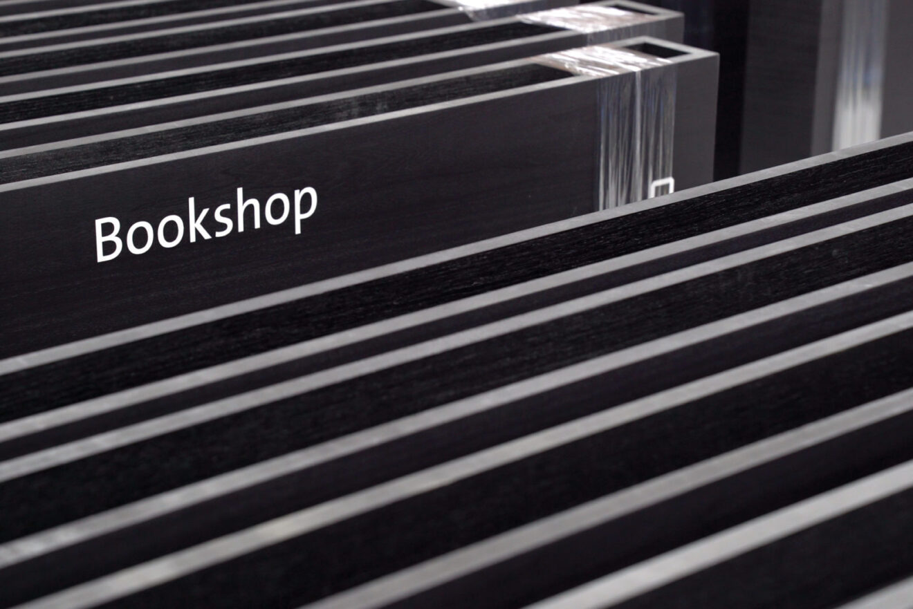
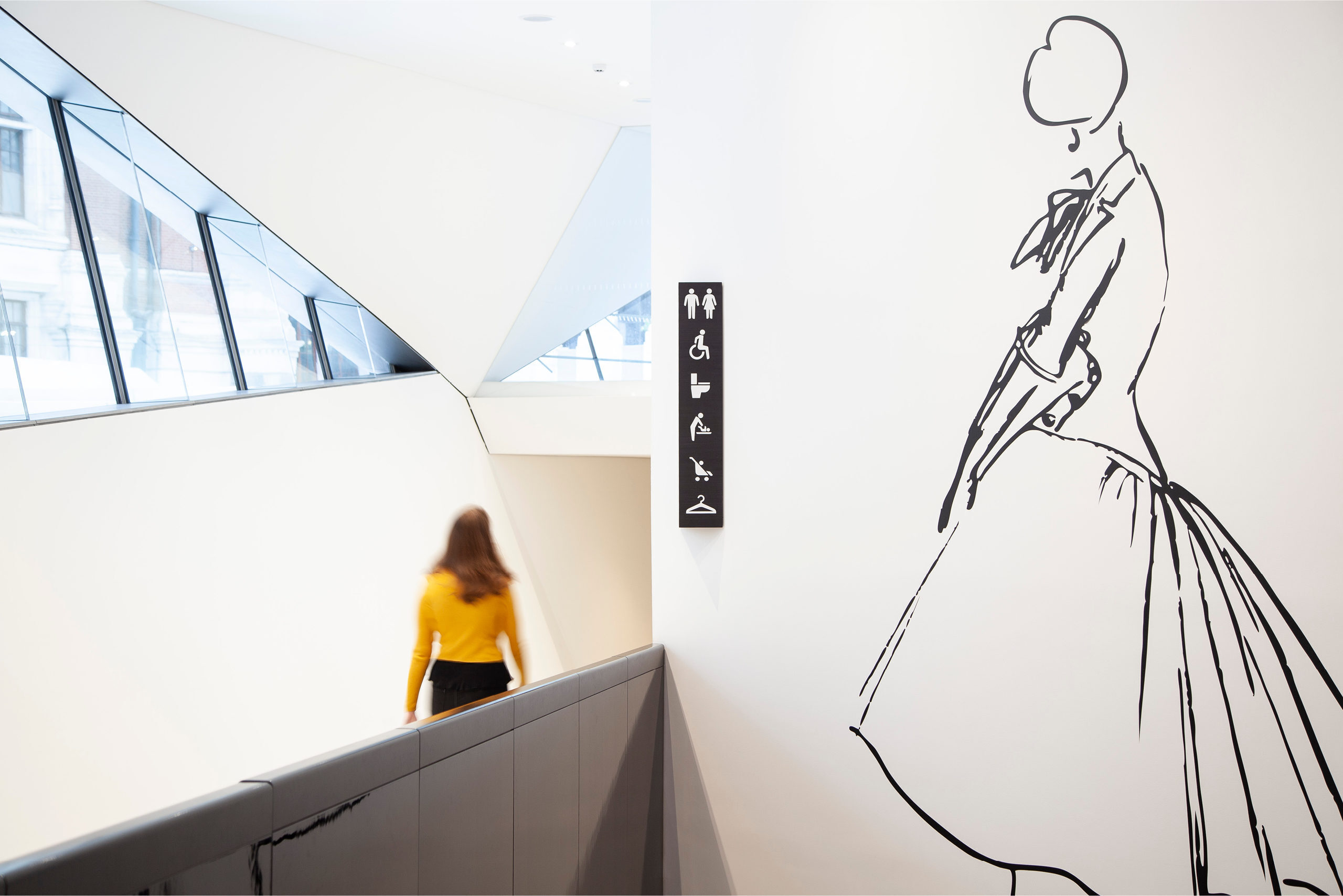
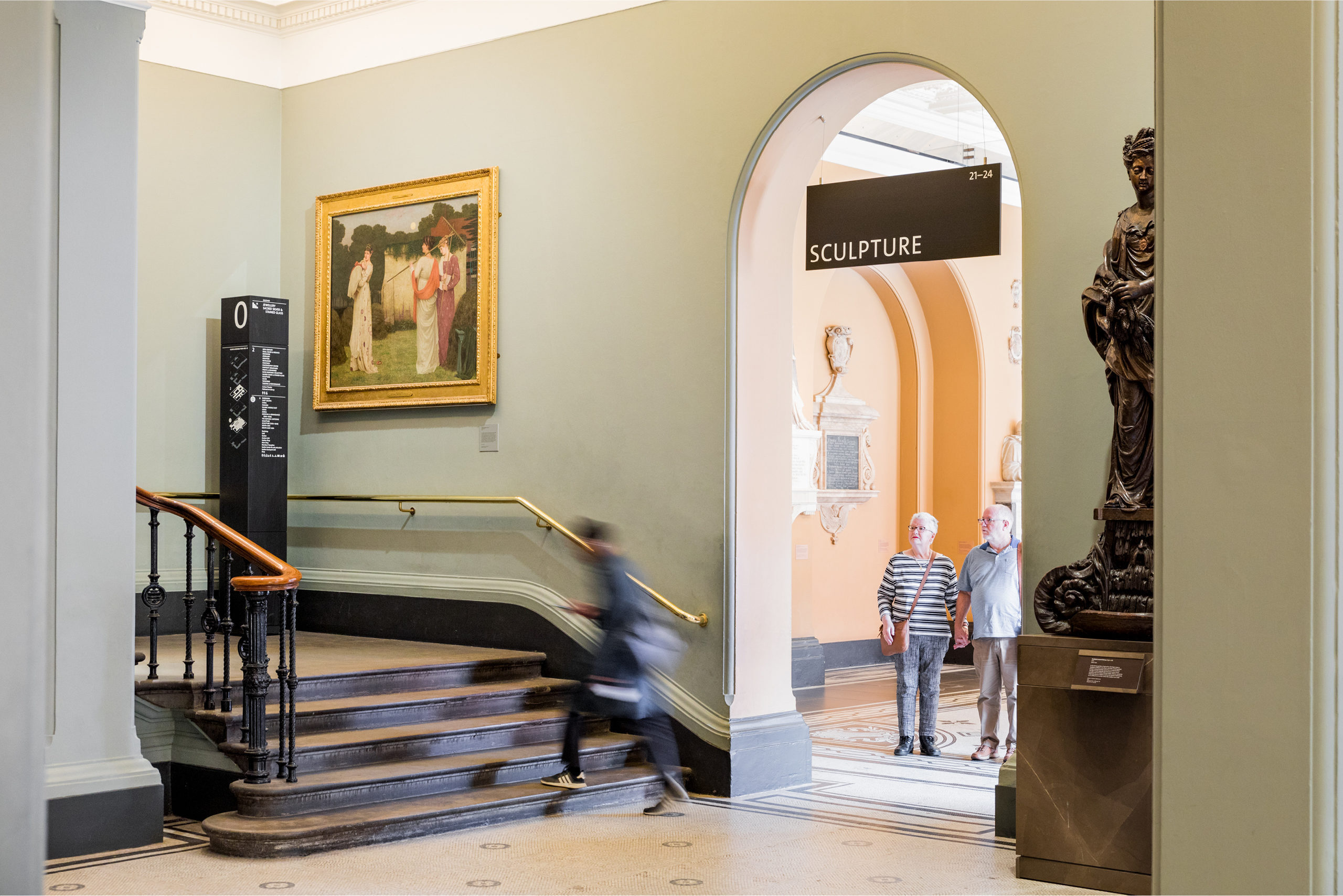
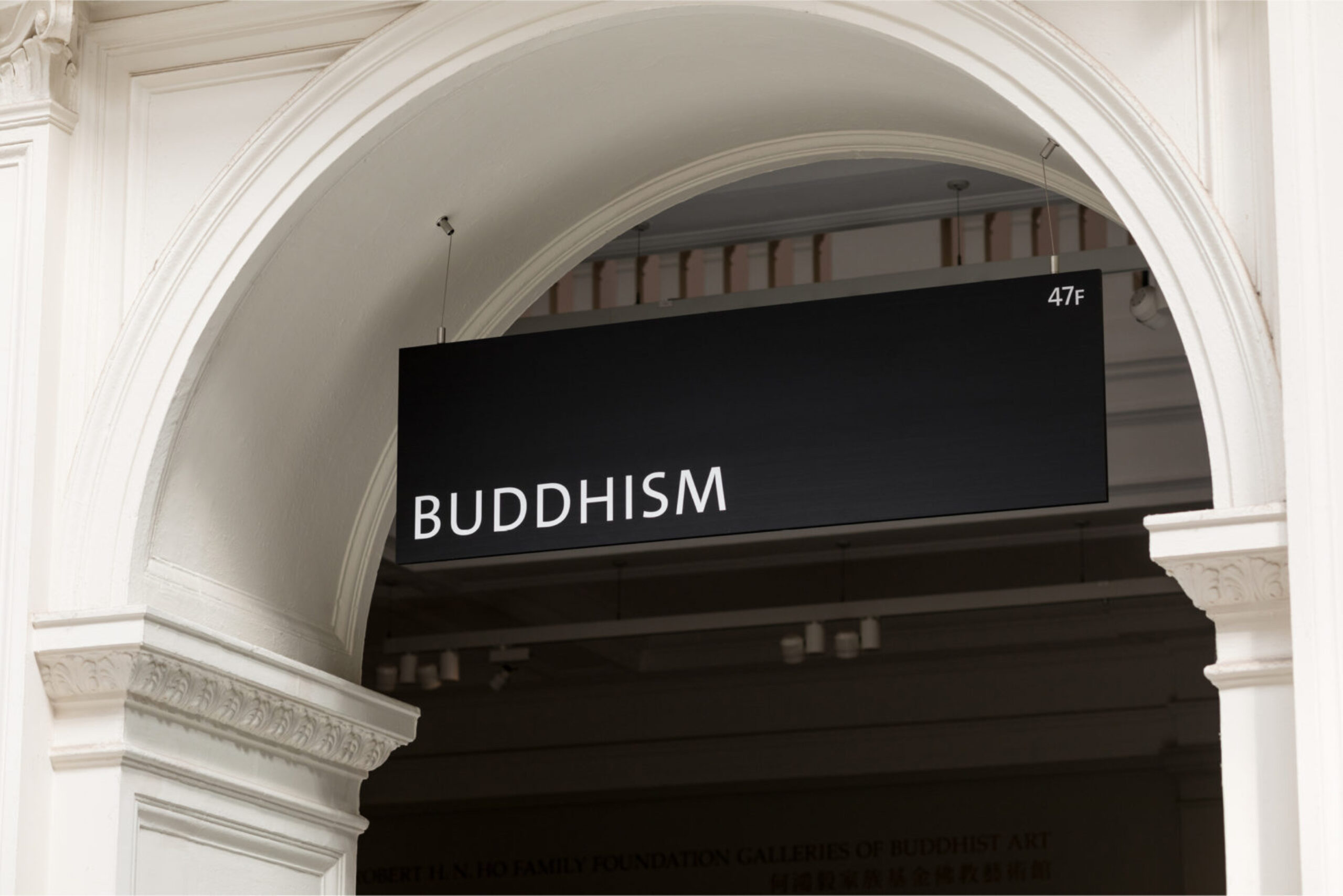
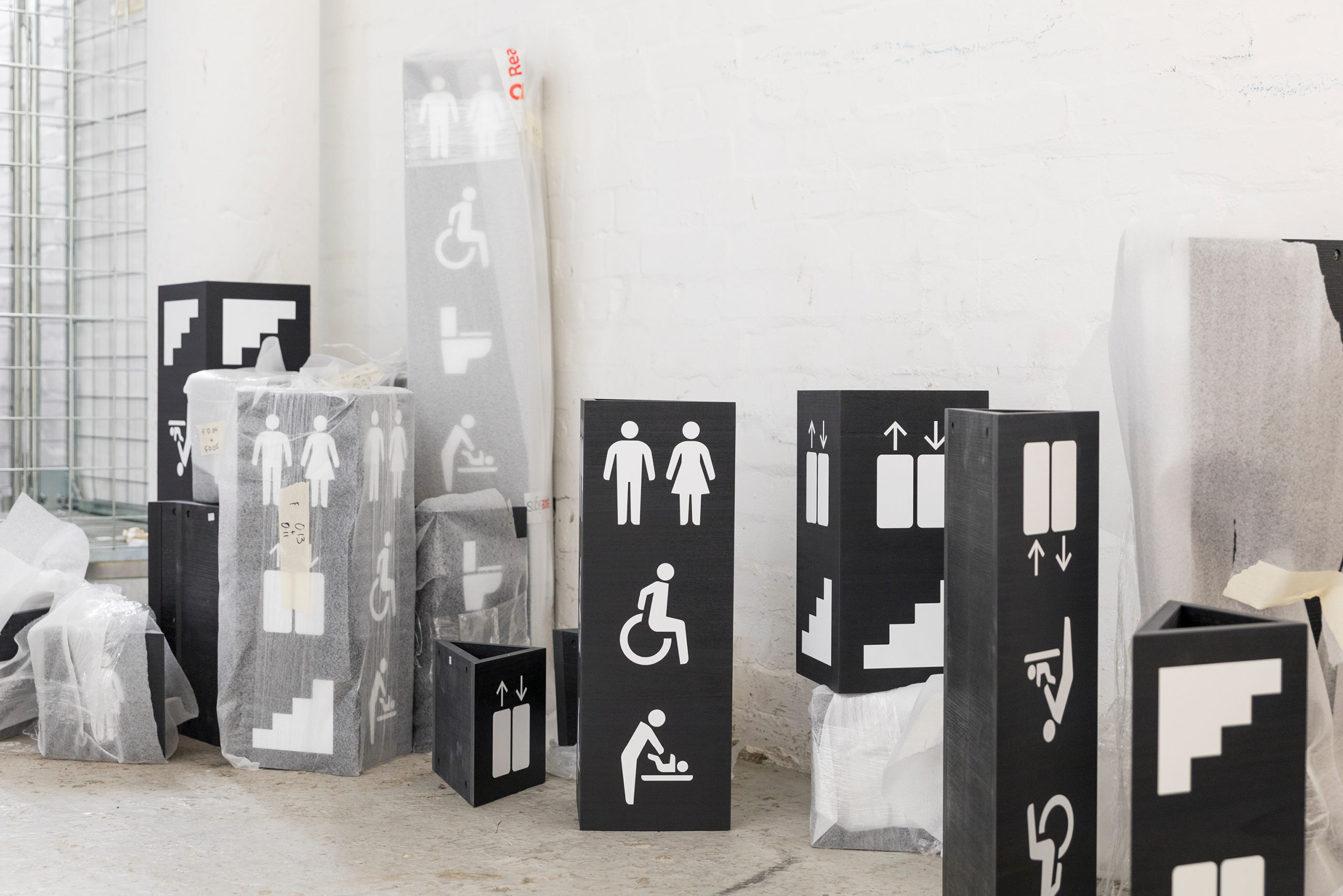
Importantly, we created a wayfinding system that is sensitive to the museum’s 60,000 objects, and there are almost no areas where these are not on display in the Grade I building. The signs needed to feel solid with a material permanence, while at the same time being discreet enough to hide in plain sight to let the objects take centre stage.
Signs are made from tulipwood to add to a sense of quality, and dyed black to harmonise with their surroundings, with bespoke icons punched out in white.
We have designed the system to work across multiple touchpoints and alongside the unsung heroes of any great museum — the gallery assistants — who are key to unlocking outstanding visitor experiences.
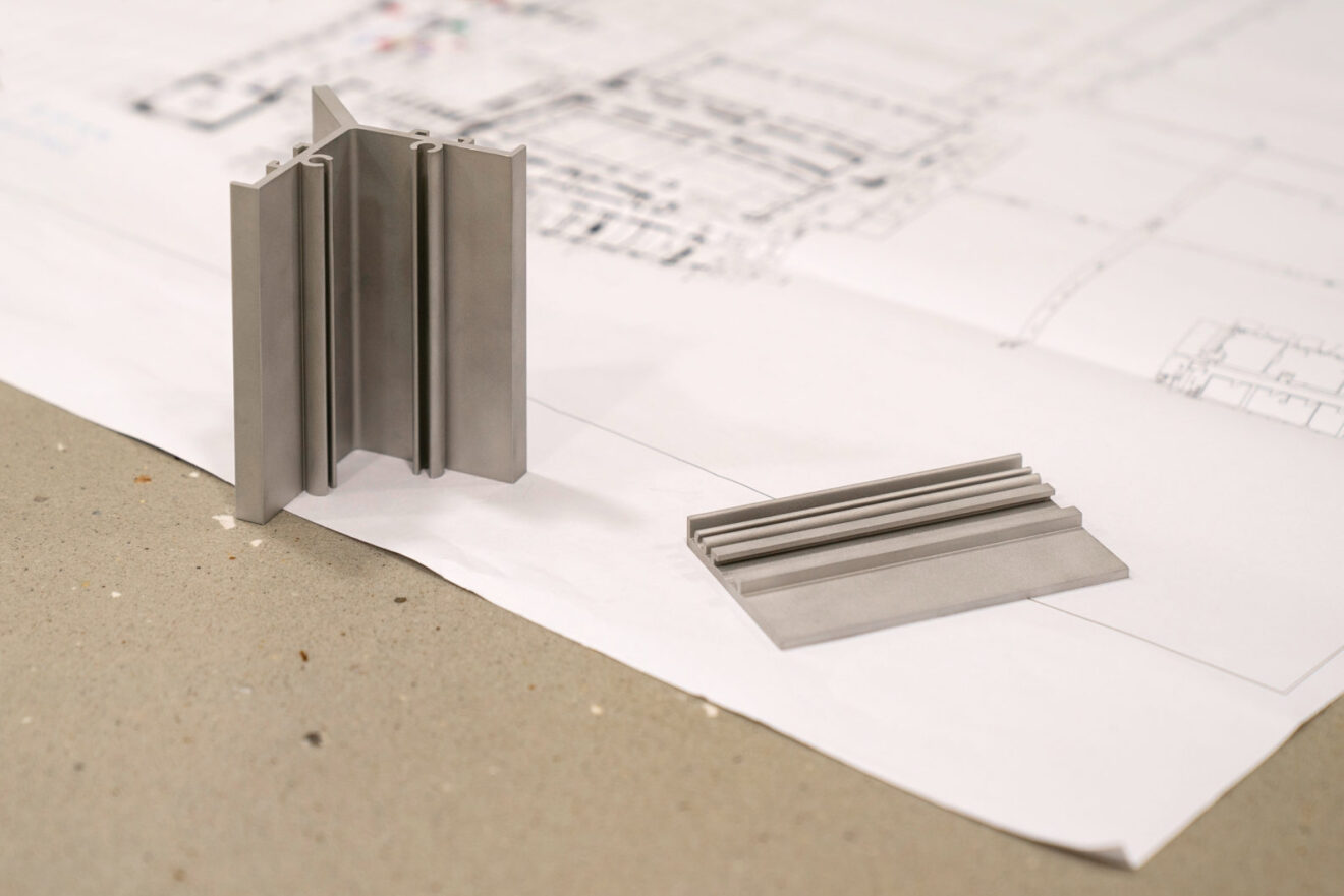
A sensitive approach to materiality
Creating wayfinding for a museum like the V&A meant that the design of the hardware had to be peerless