The Manufactory
Place brand
Crafting the work of tomorrow
The Manufactory
Place brand
Crafting the work of tomorrow
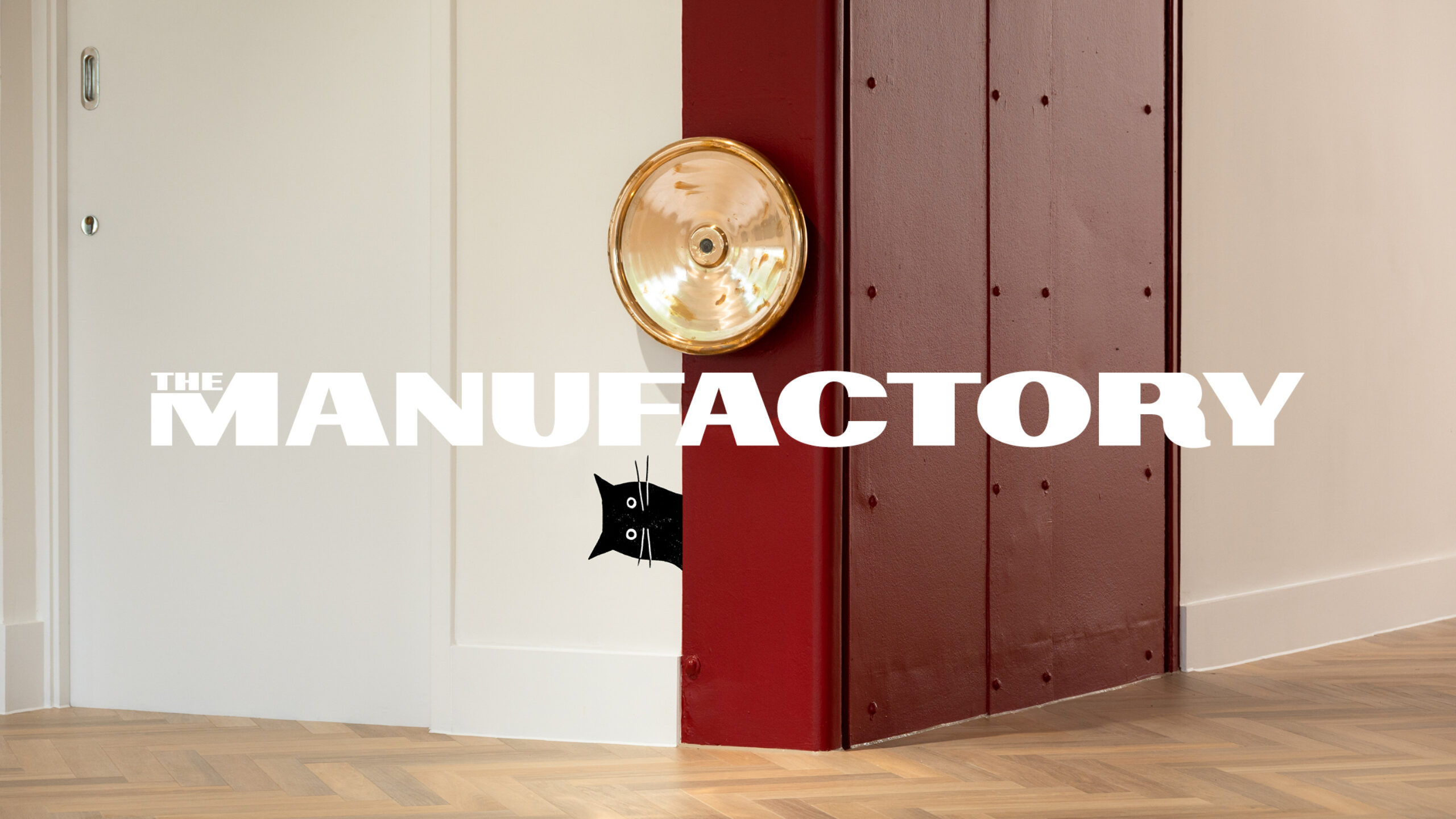
How do you turn a place of design legend into an equally exciting destination for work?
For 200 years, Heal & Son has been London’s furniture-making institution; now it’s becoming the place to craft the work of tomorrow. Introducing: The Manufactory
Our approach
Sitting beside an icon
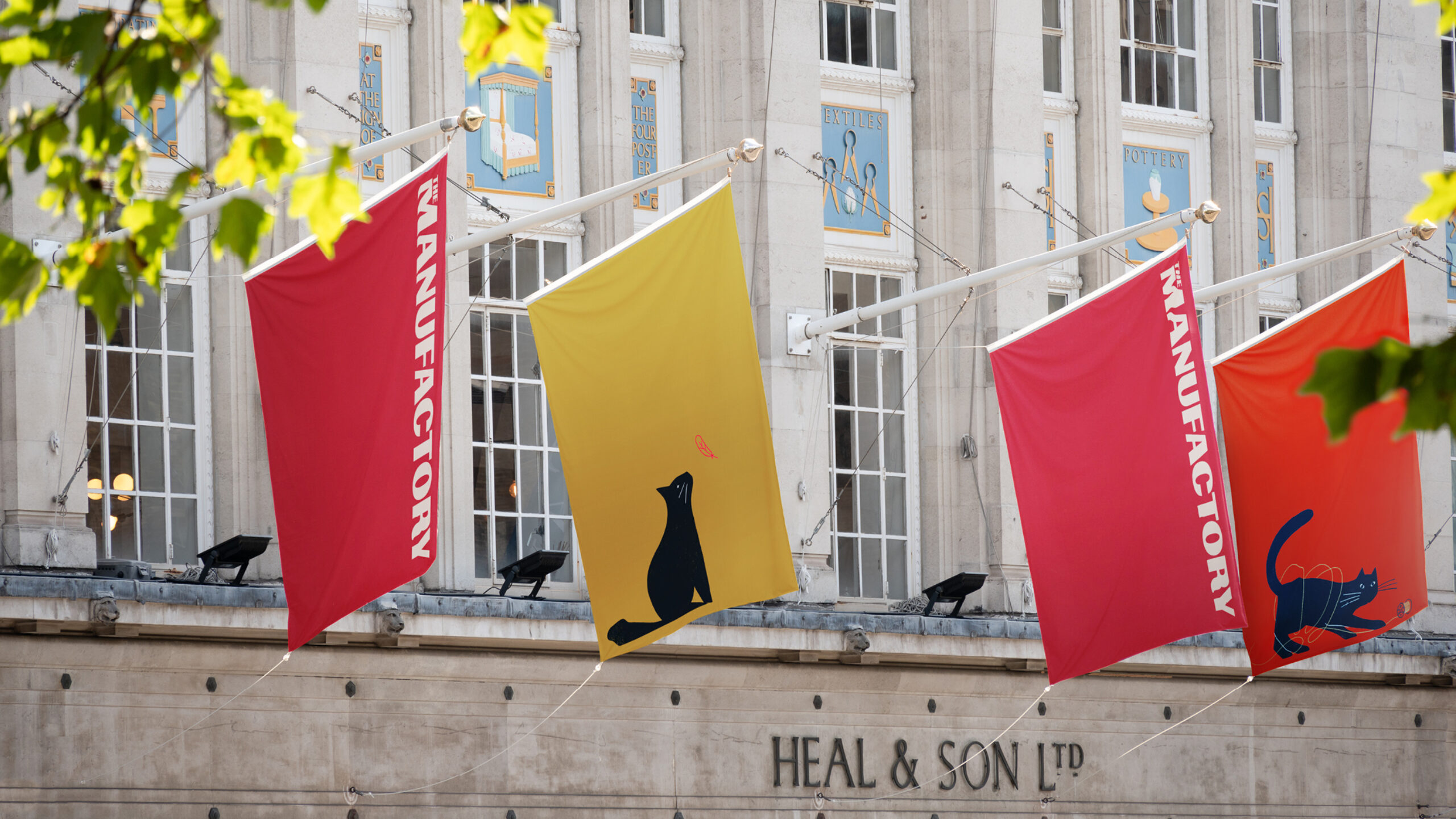
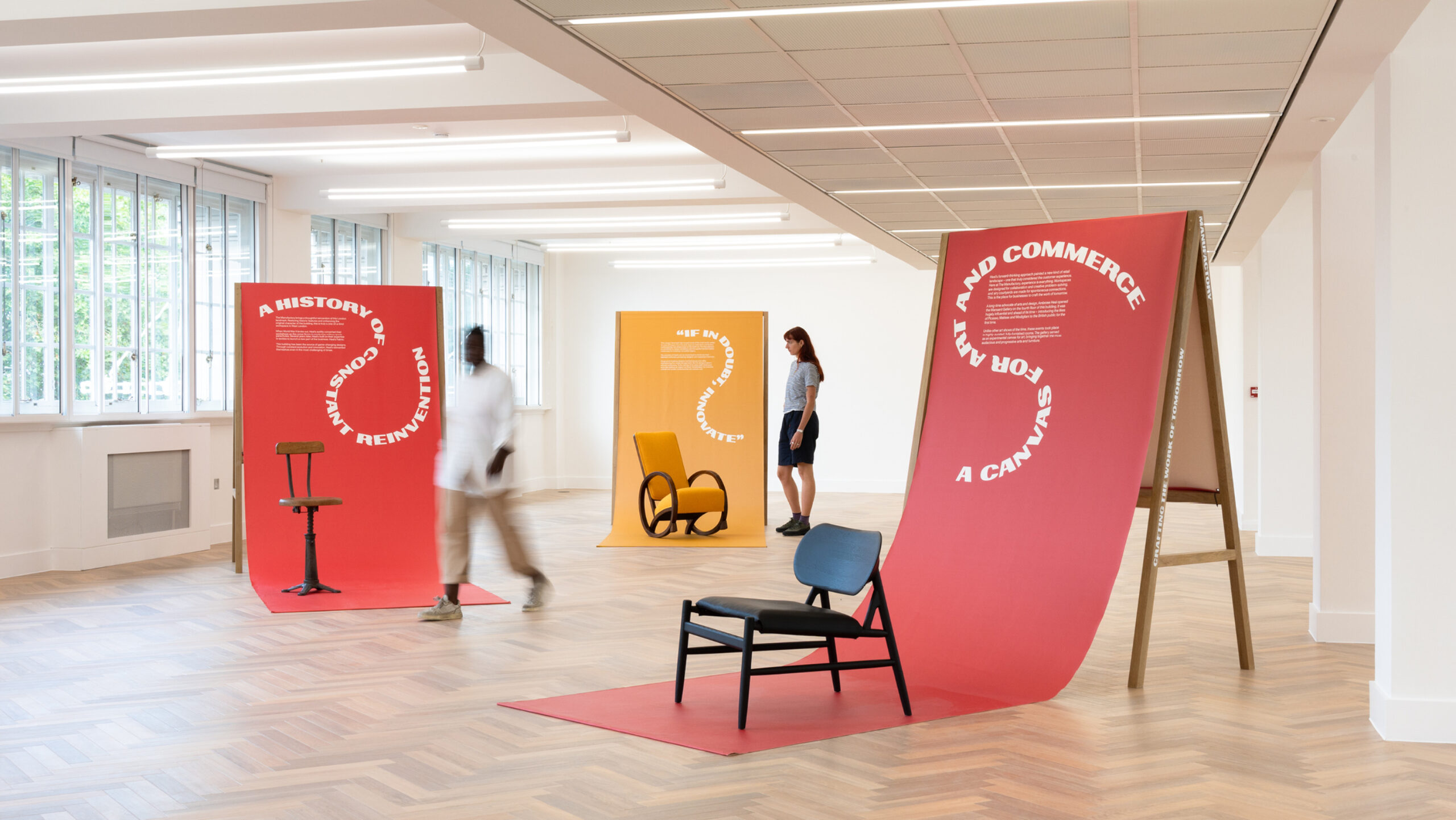
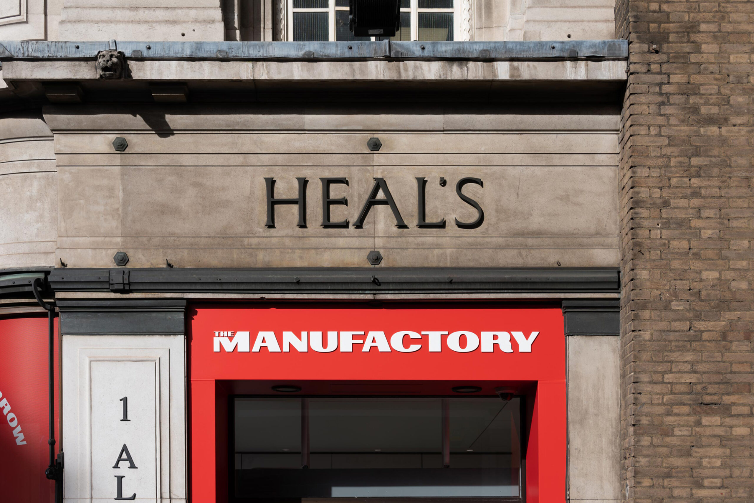
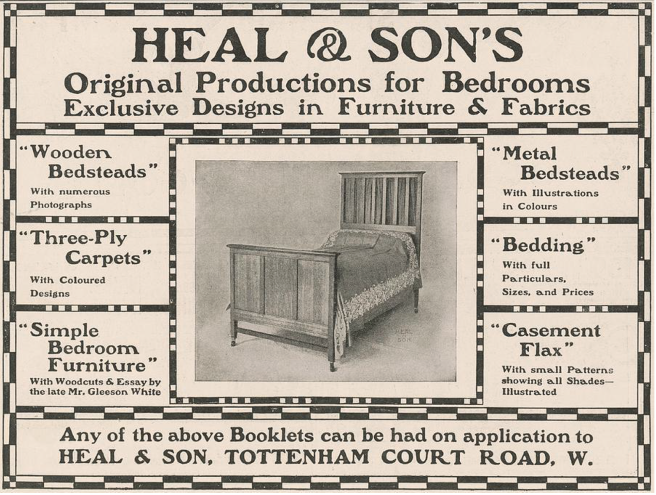
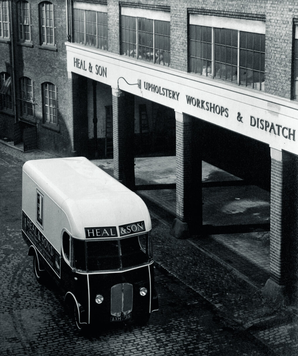
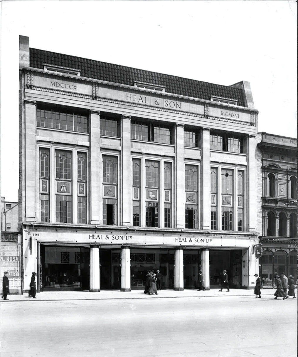
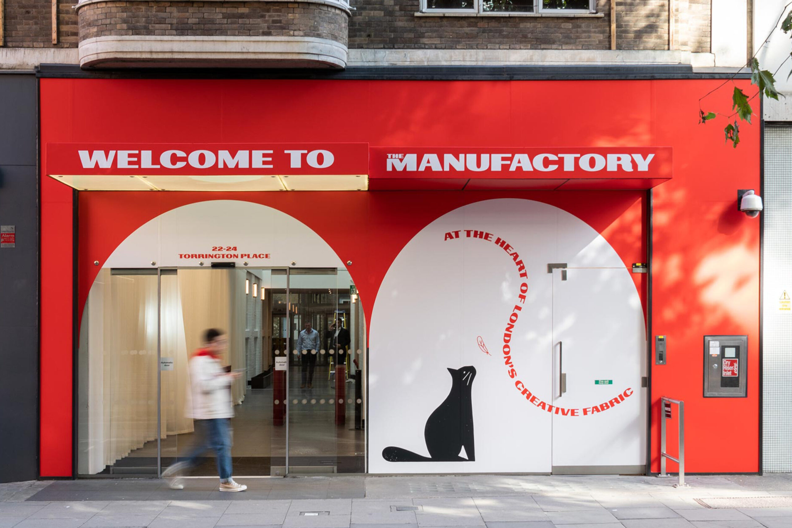
Heal’s retain the Tottenham Court Road shopfront, so The Manufactory brand needed to feel at home beside it — but also be distinctive enough to hold its own. Our solution was a strong and fluid typographic treatment that weaves itself through the building like a thread, drawing on the impactful type of Heal’s archival materials.
Ready for tomorrow’s Ambrose Heal
This will be home to London’s next generation of entrepreneurs: tech and creative businesses seeking spaces that are full of character and rich in story. Our positioning work crystallised this appeal into the strapline, ‘Crafting the work of tomorrow’. Taking an old Victorian word for factory, with the name ‘The Manufactory’, we honour the building’s past, convey its scale today and evolve this heritage for the future.
Animating the Heal’s cat
Our new visual identity honours and evolves
the deep design heritage of Heal’s,
weaving a thread between past and future
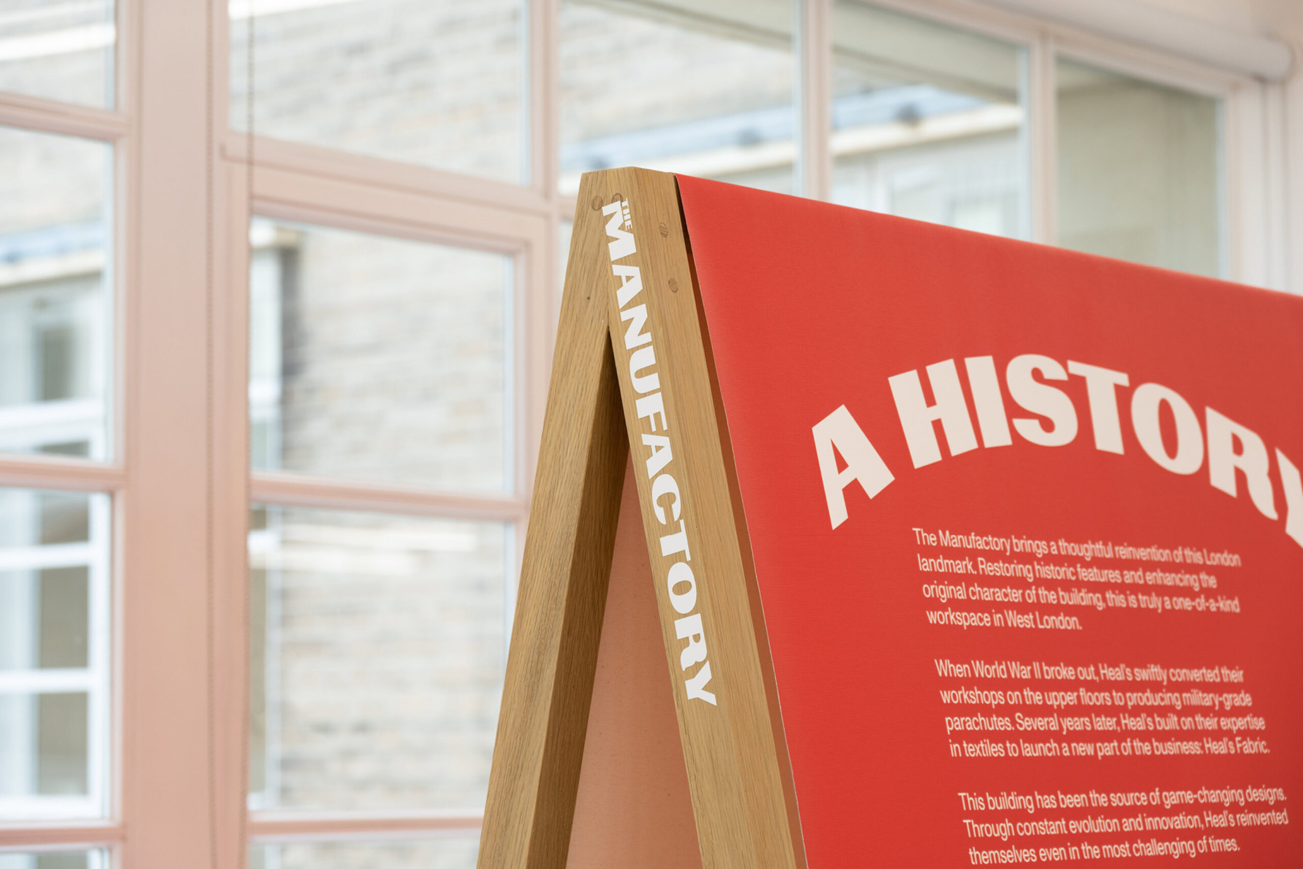
Our collaborators on this project were agile and playful — and we’re not just talking about the cat
A visionary developer
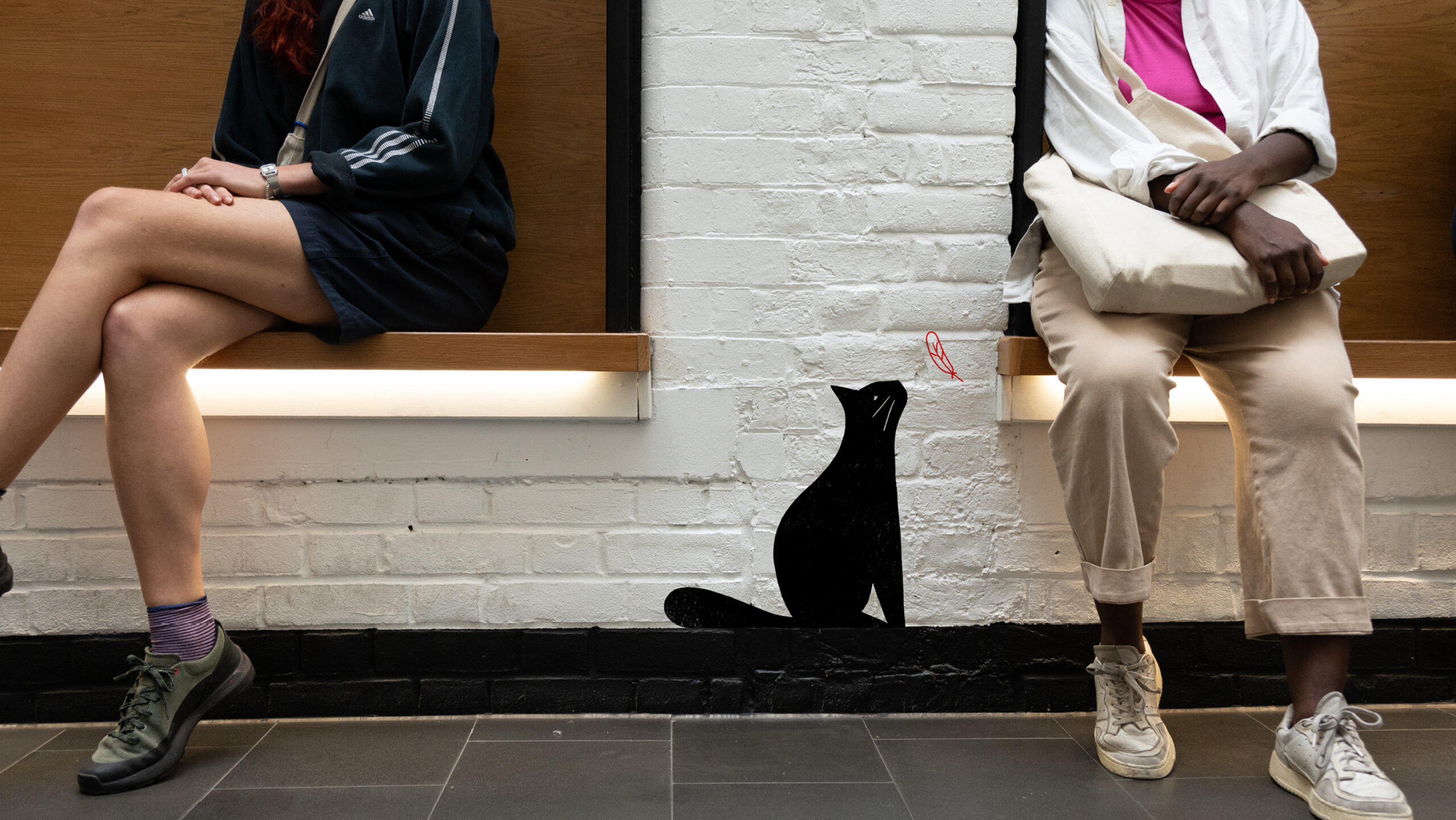
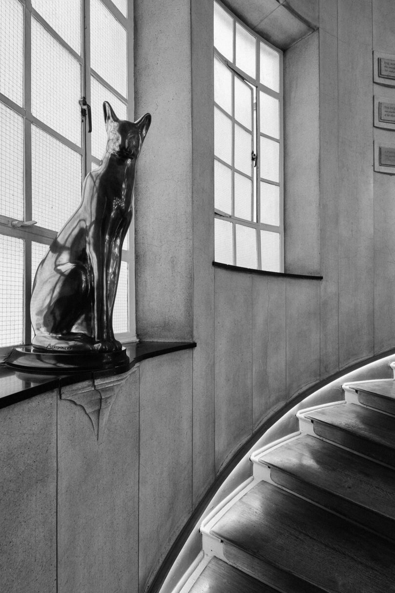
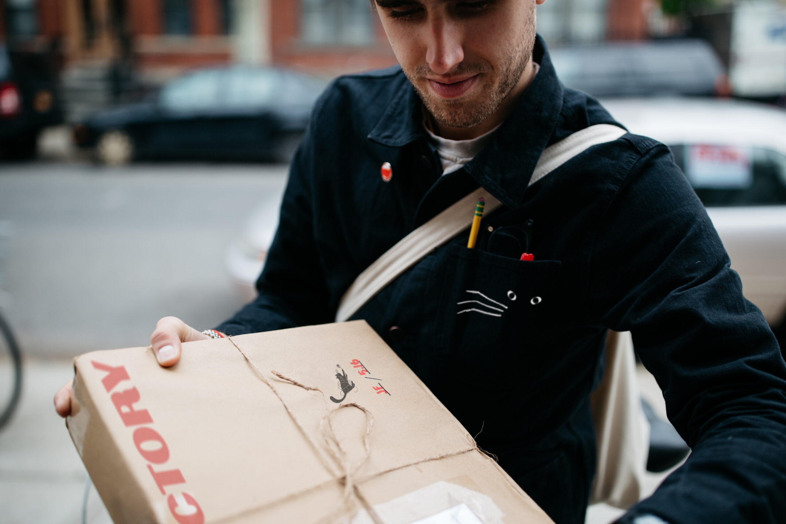
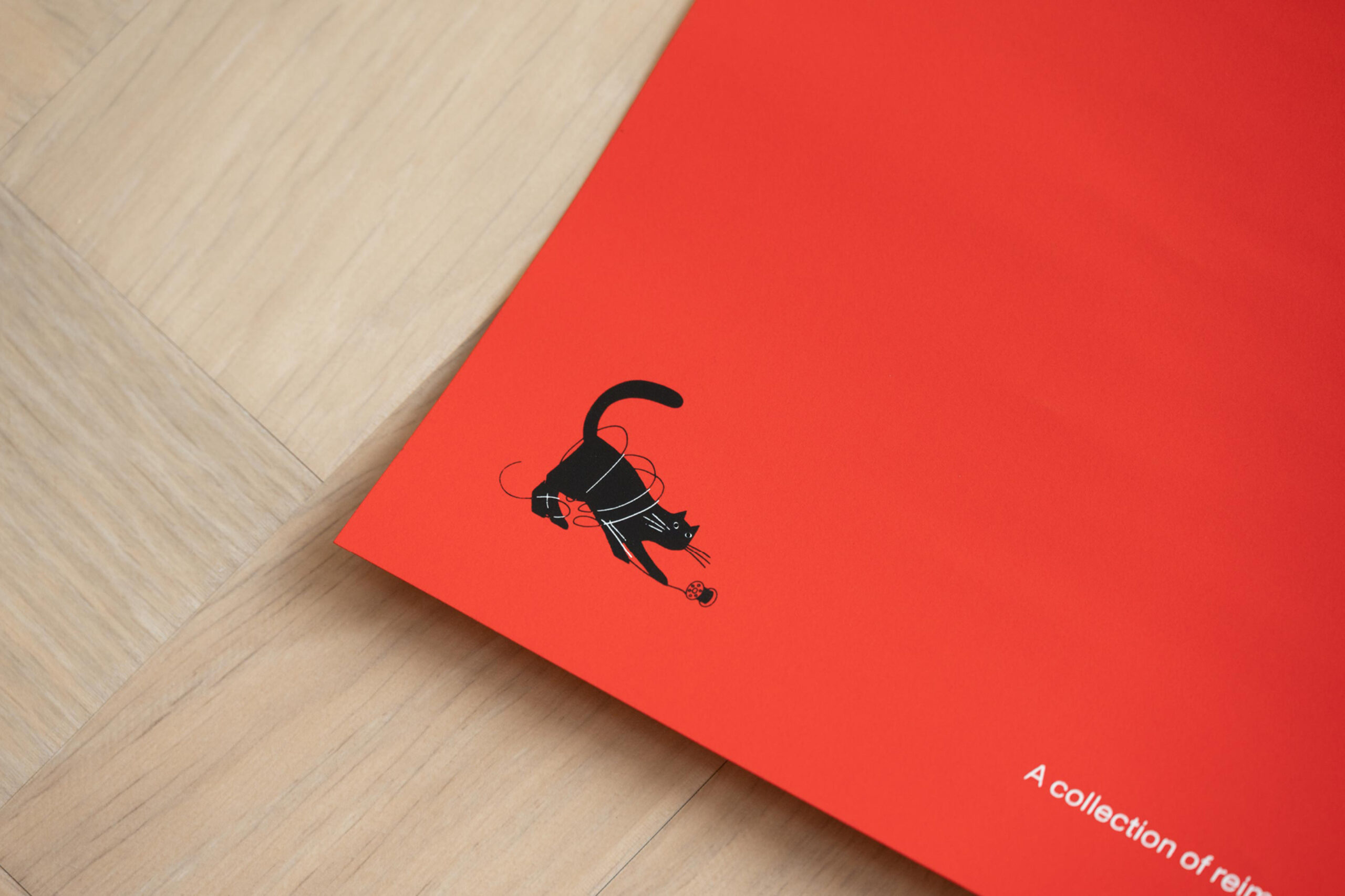
Known for their thoughtful and creative reinventions, our client, General Projects, wholeheartedly believes in the power of good design and the value in difference. It was clear that this was to be no ordinary brand. So we brought to life another piece of the Heal’s story: the bronze cat mascot that stands in its iconic stairwell. Our illustrated cat ident injects mischief and liveliness wherever it goes.
It all comes back to craft
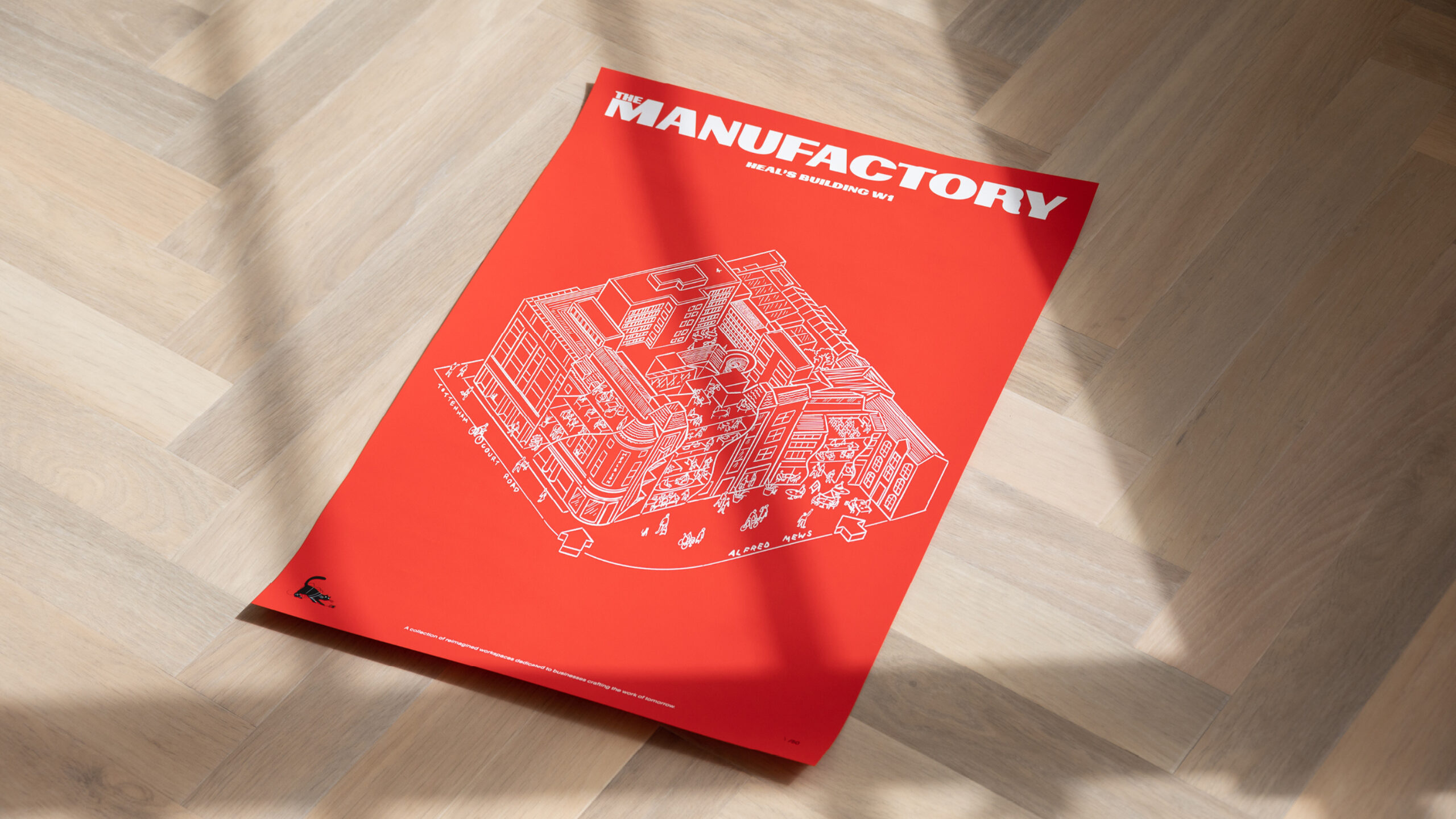
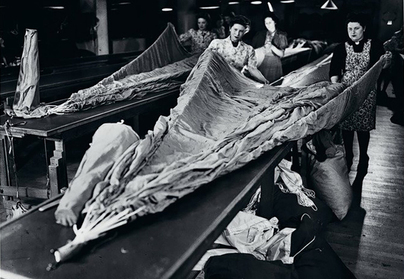
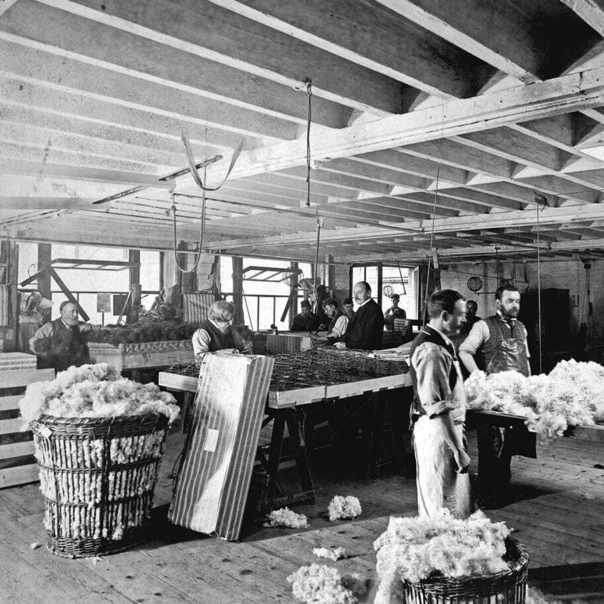
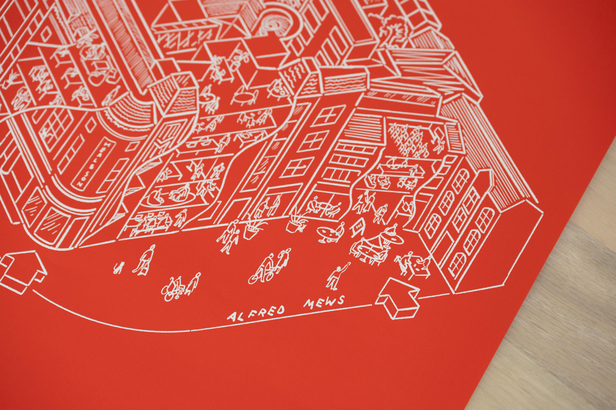
From its earliest days, the Heal’s Building has been a place where attention to detail is paramount. Our original illustrations commissioned for the Manufactory echo this meticulous approach. As well as Abbey Lossing's cat mascot, we commissioned this intricate line drawing from William Luz to unpick this idiosyncratic architecture of this collection of distinctive buildings.
“The Manufactory typifies everything a client would want from a project — with an end result where it is hard to define where the brand ends and the building begins.”
Ben Cross
Development Director, General Projects
