The Royal Docks
Wayfinding
Black and white and crystal clear
The Royal Docks
Wayfinding
Black and white and crystal clear
On the waterside in London’s regenerated docklands, the Crystal building is a landmark of angular glazing — soon to become City Hall, the seat of the Mayor of London.
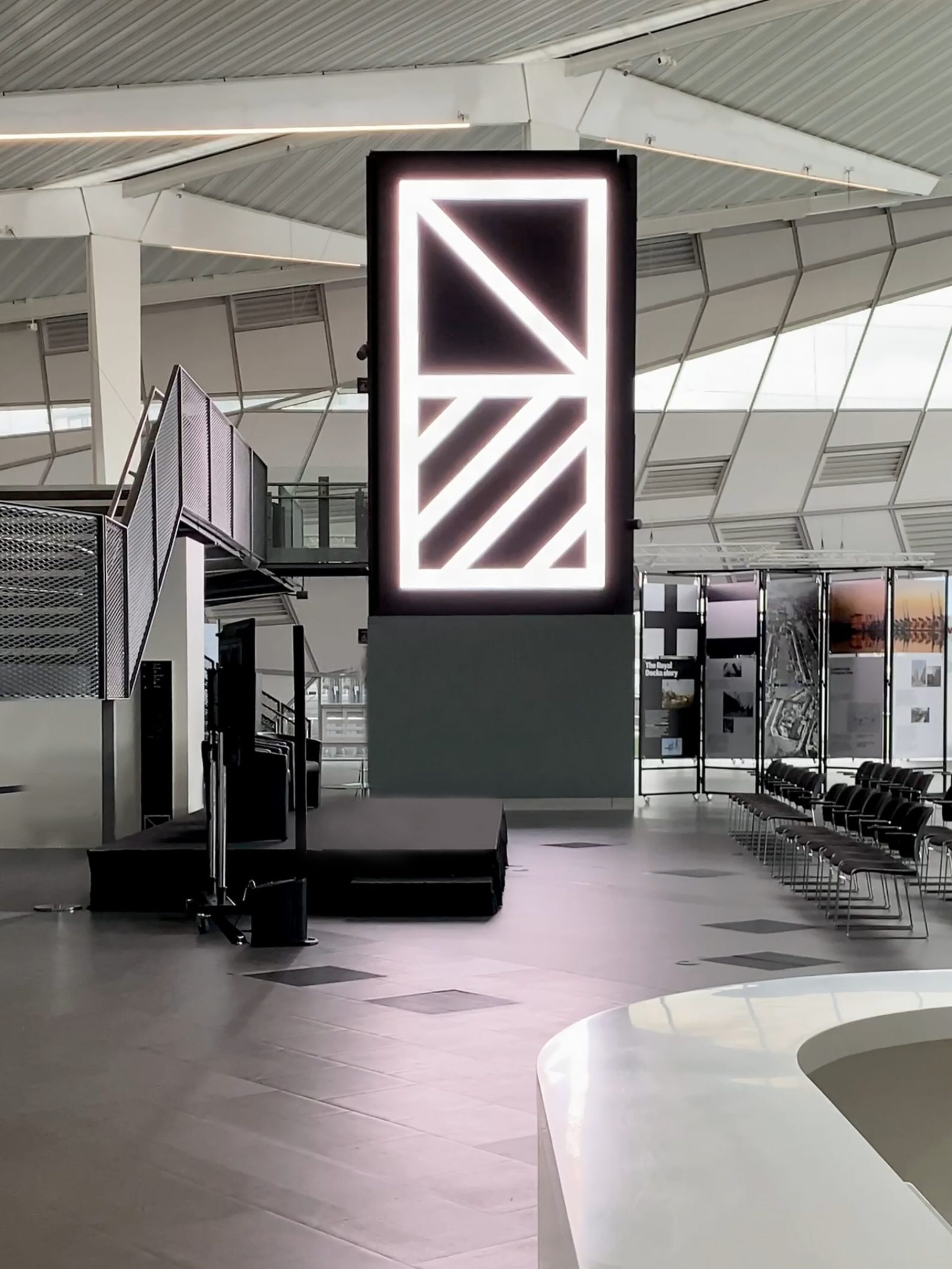
This dramatic architecture called for an elegant solution. In crisp black and white, our signage programme reflects the purity of the Royal Docks brand.
Tactile presence
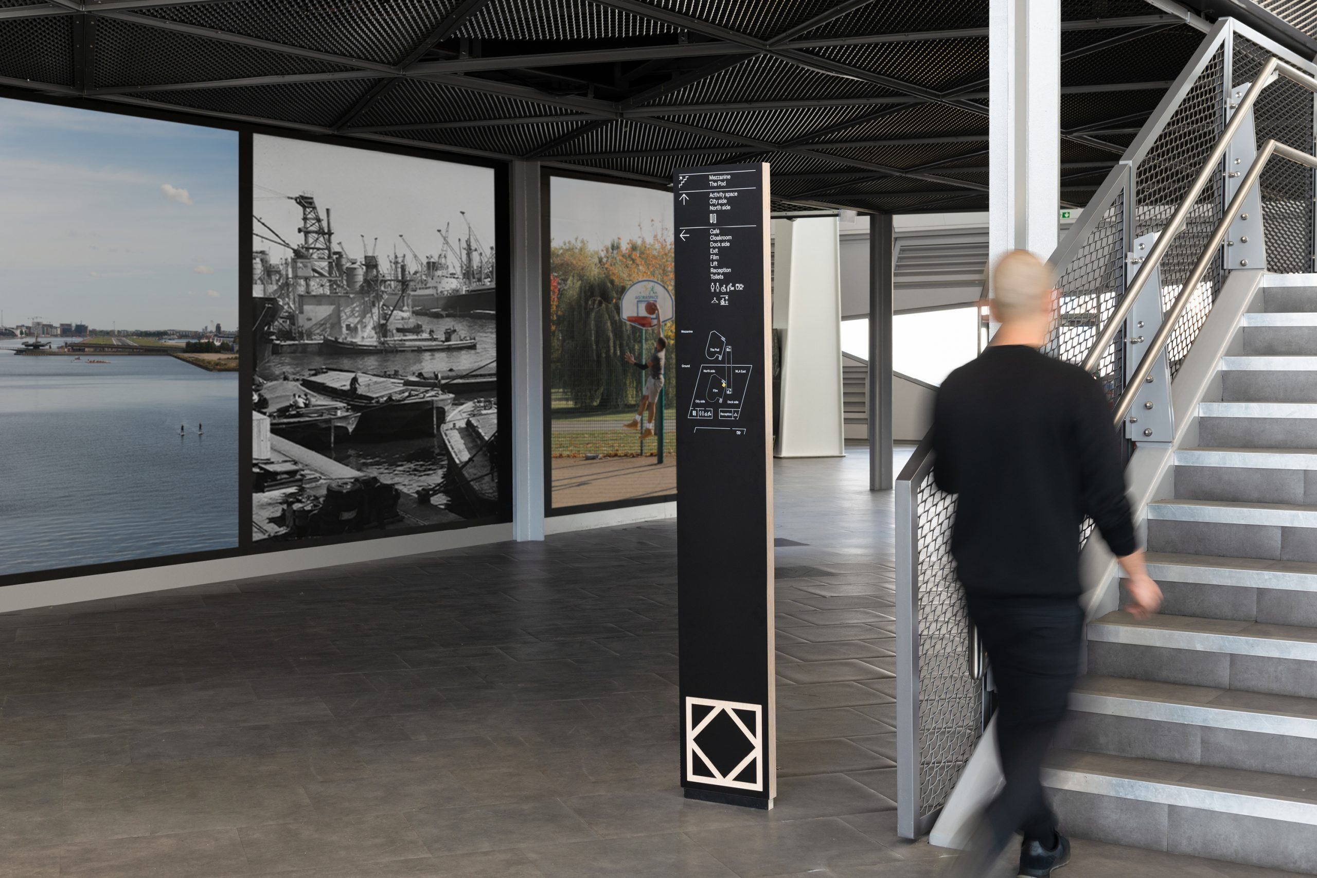
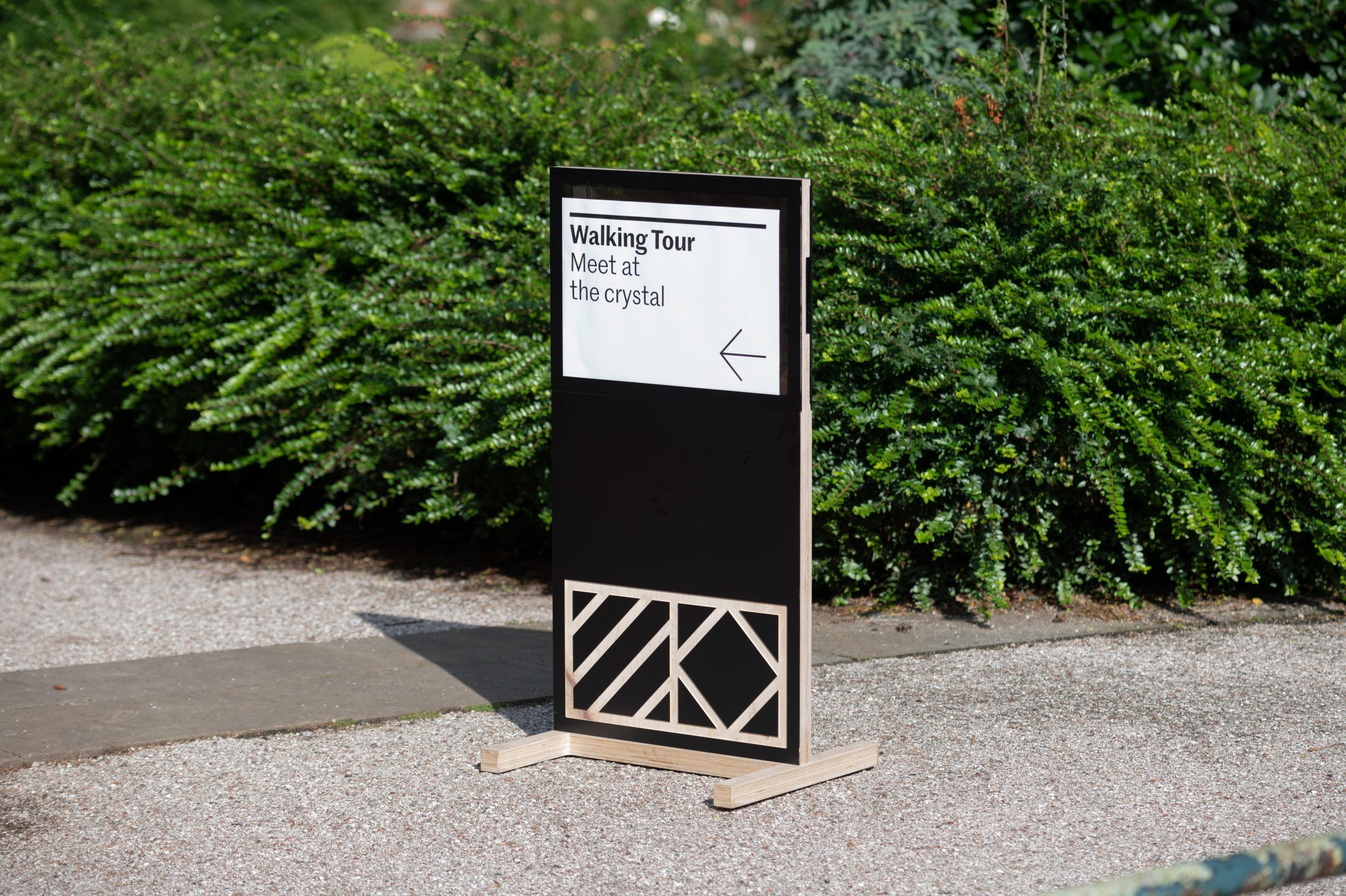
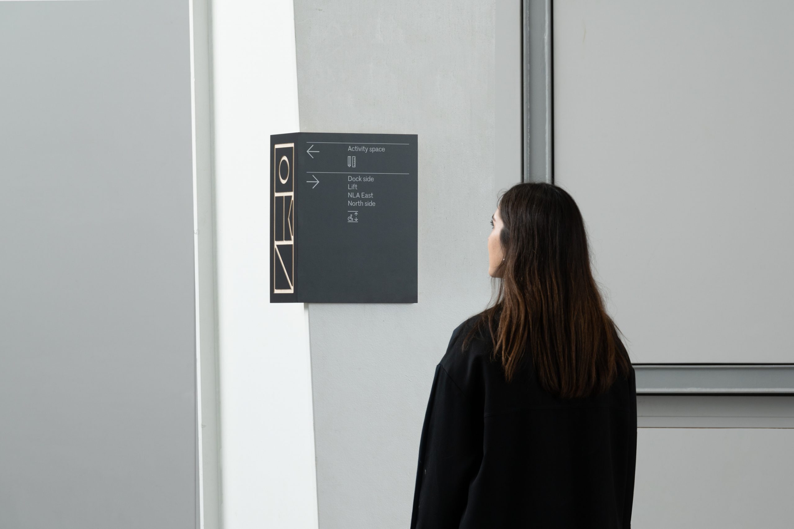
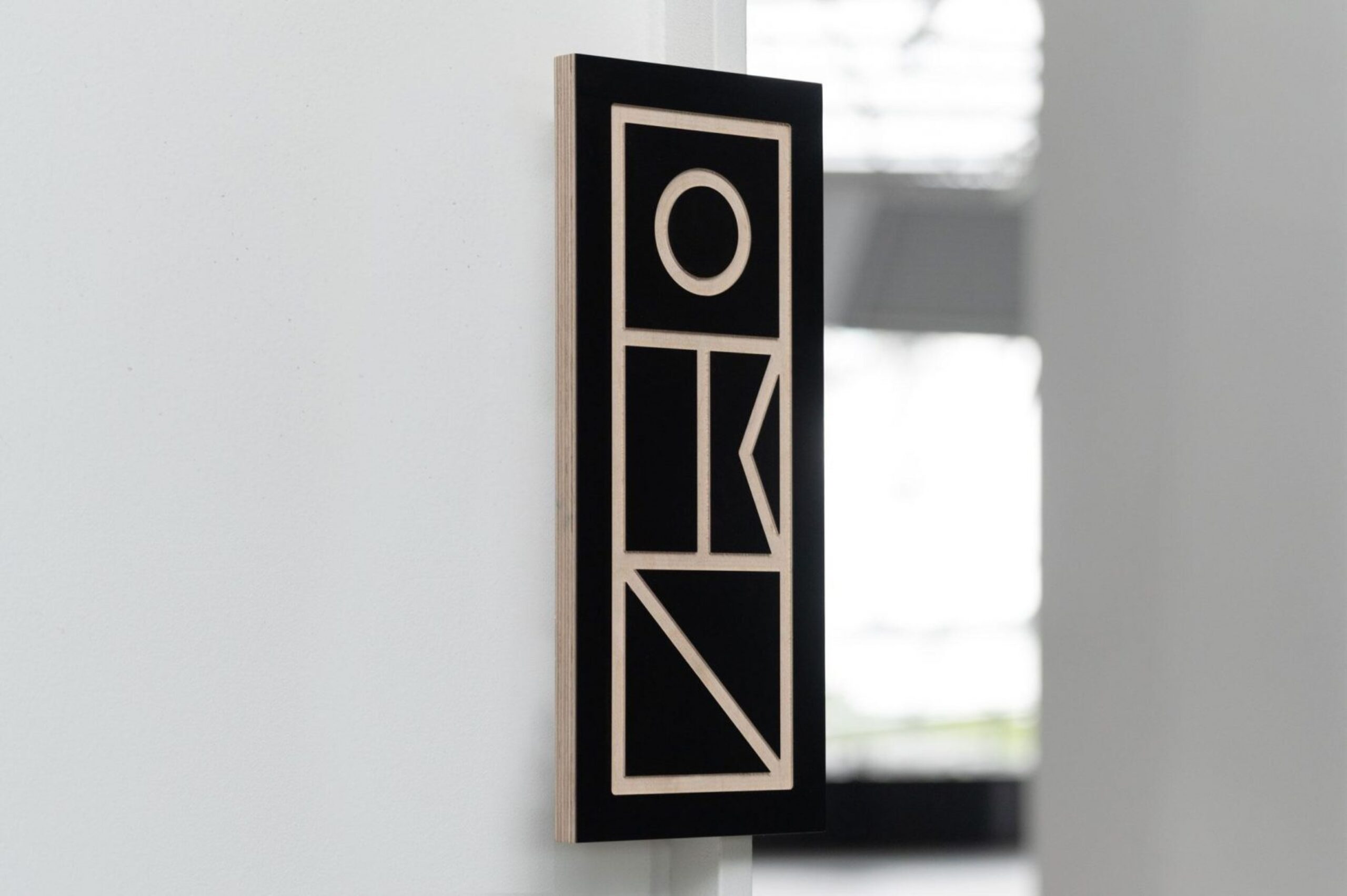
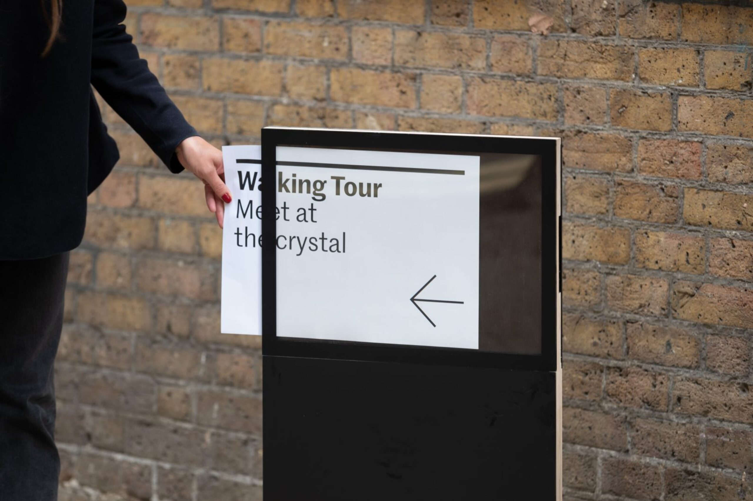
Signs are fabricated from solid marine ply with an expressed edge. Flags from the maritime alphabet (redrawn as part of the brand’s graphic language) are etched through the layers of wood to create a tactile presence and depth, while the architecture of the Crystal itself gives rise to signs that wrap around the steel columns increasing their visibility and helping visitors navigate the space.

Clean and direct icons and plans
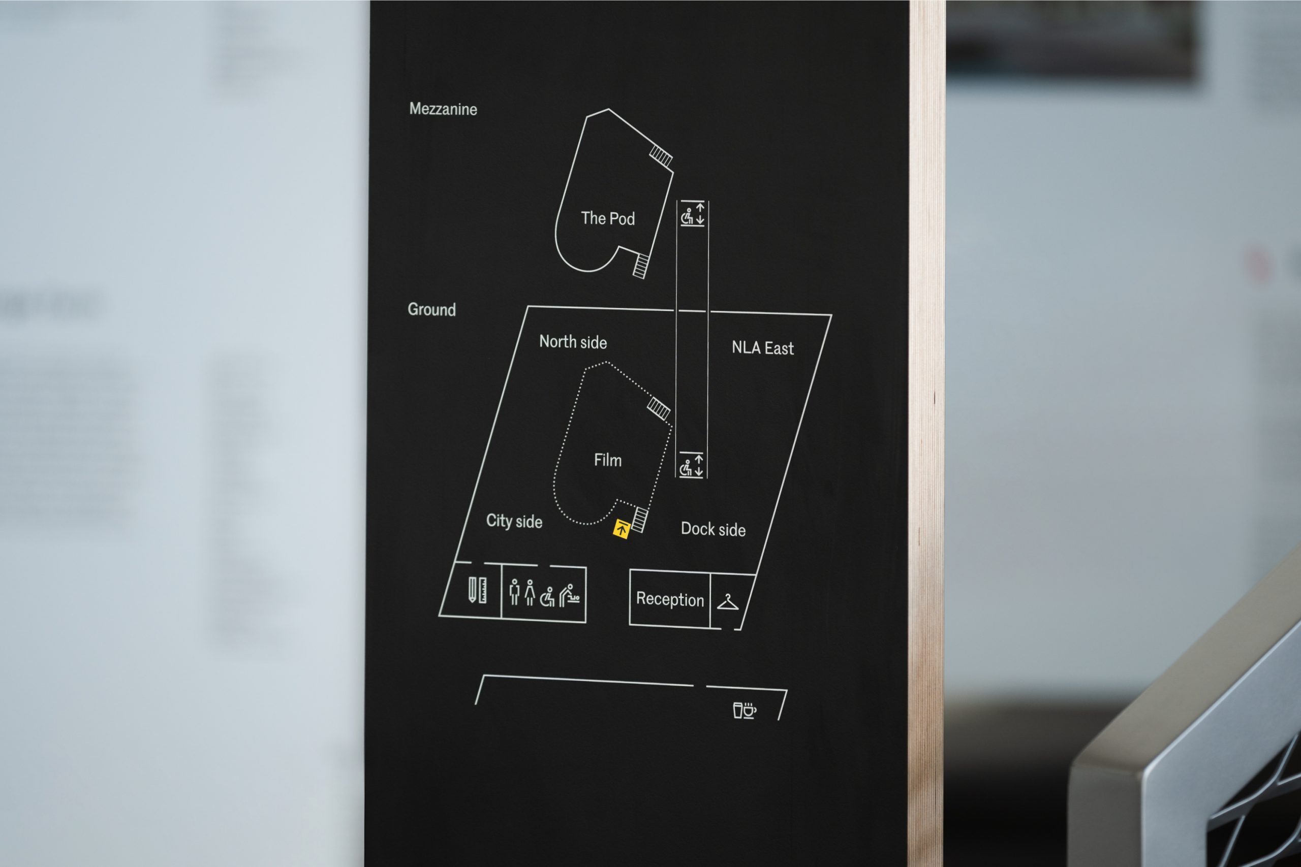
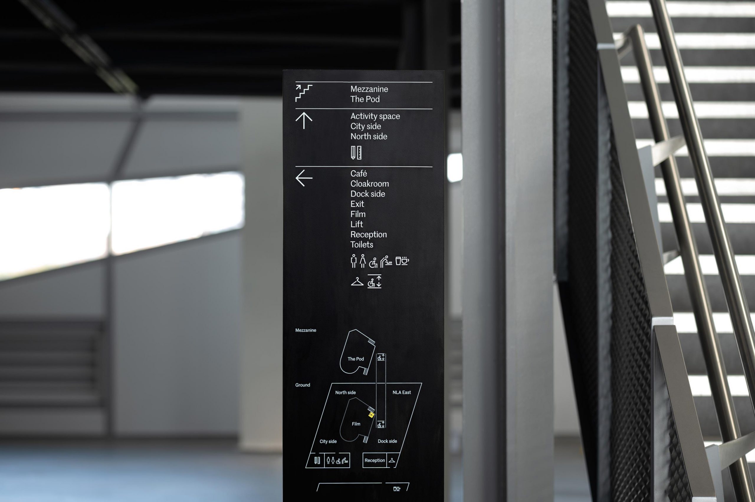
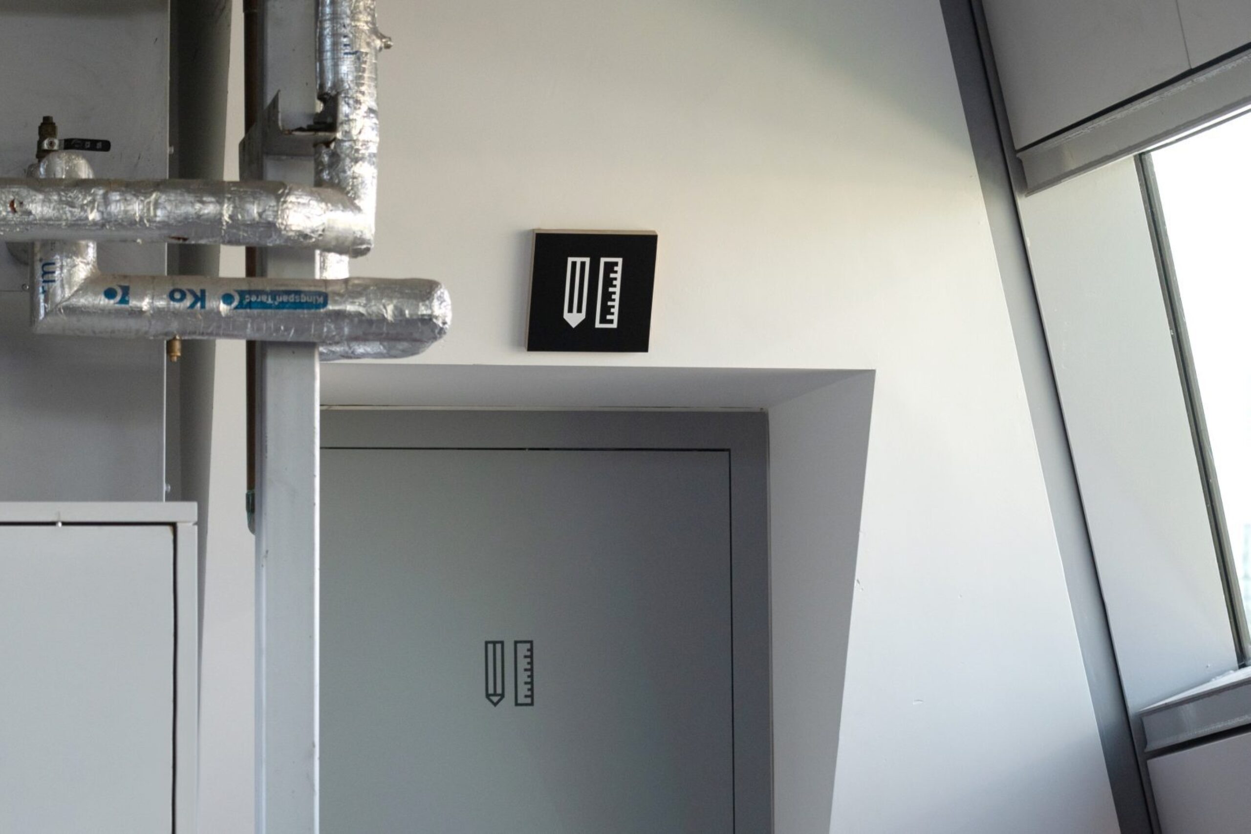
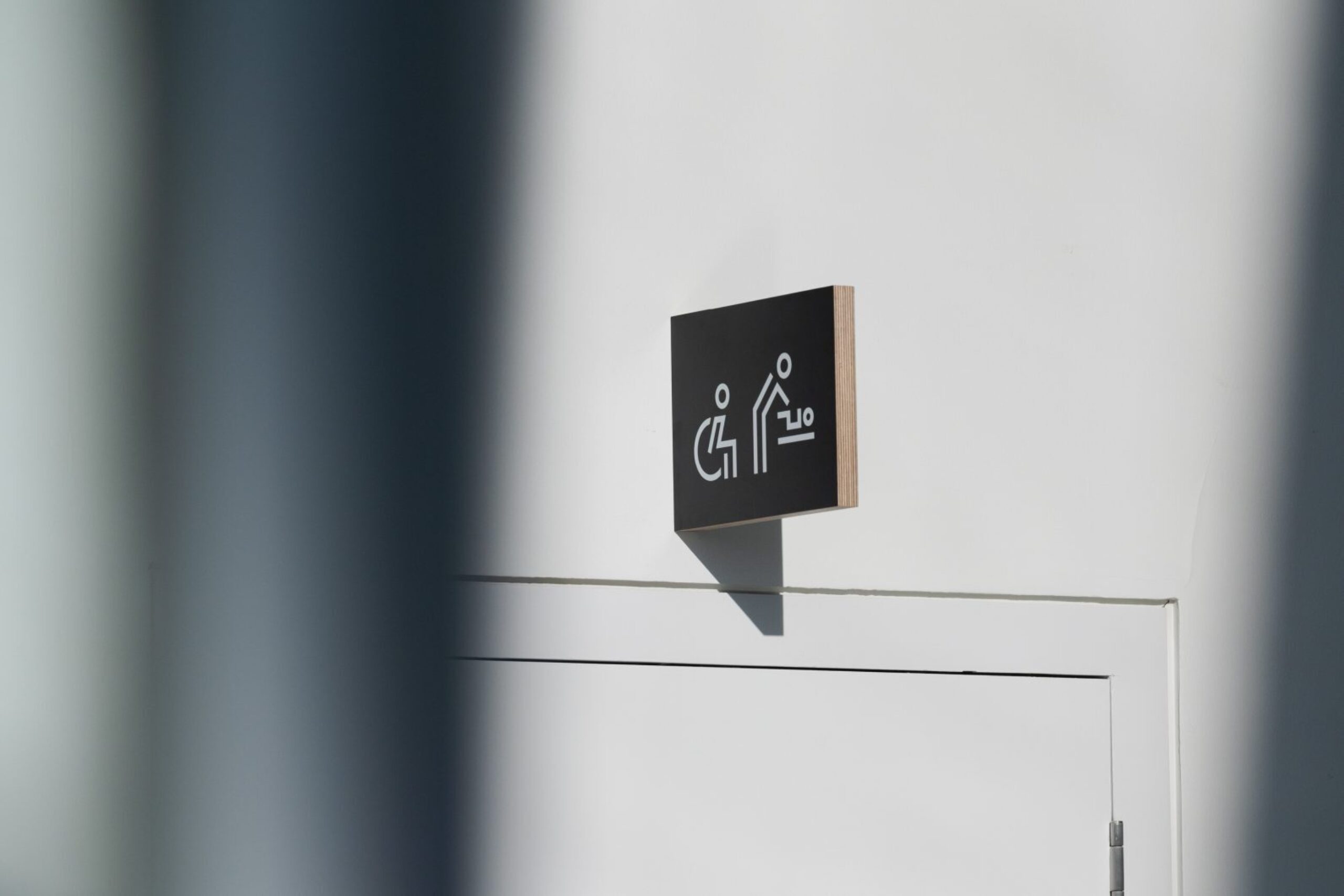
We developed a set of powerful icons in line with the Royal Docks brand and brought a sense of clarity and order to the space along with a user-friendly plan that helped orientate visitors through clear geographical naming.

A subtly branded digital environment
Screen-based elements were also incorporated — digital flag animations and ambient footage showcasing different parts of the Royal Docks act as a subtly branded backdrop to the multi-function exhibition and events space.
