North City
Place brand
The city creating a culture of possibilities
North City
Place brand
The city creating a culture of possibilities
Suburban sprawl has long dominated American cities, creating places marked by separation and car dependency. North City defies this convention with a different way of life.
We created a brand that captures the warmth of Southern California and a story that embodies North City’s distinctive opportunity: ‘creating a culture of possibilities’
Scaling up North City
From a weekly farmers market to a cluster of student housing, North City had started to establish a new kind of urban community. However, it was time to shift its status from campus to city.
Significant milestones are coming its way, including a multi-year investment in public art, acres of green spaces and many more new homes. North City is creating a place where streets turn into stages and walkable paseos come alive with art and music. This is the chance to distinguish the city from the surrounding strip malls and suburban neighborhoods.
Shape-shifting identity
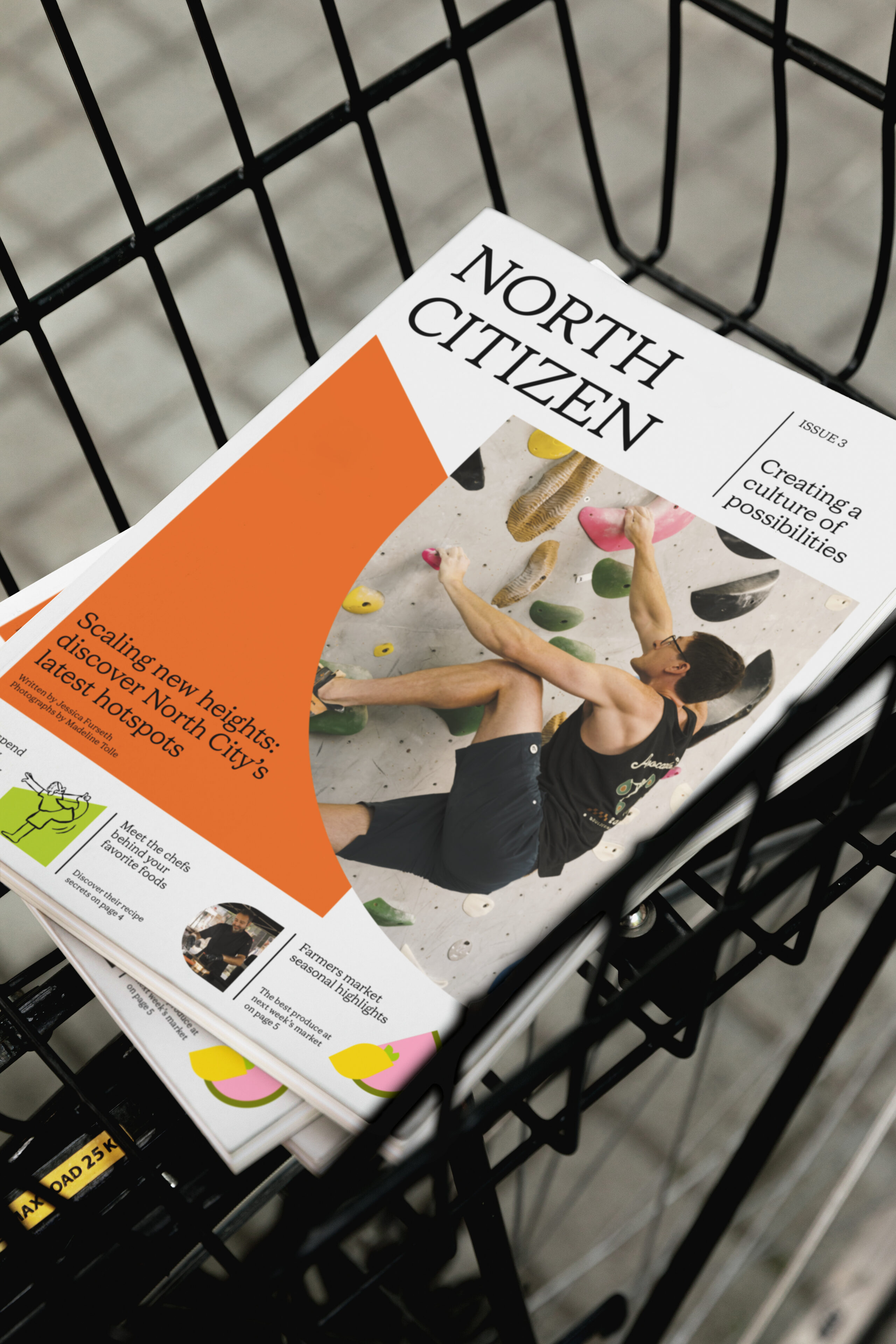
Like the Californian sun, our identity exudes warmth and brightness. The striking palette is inspired by the beauty of the landscapes and together with newly commissioned photography by Madeline Tolle, our identity captures the spirit of North City.
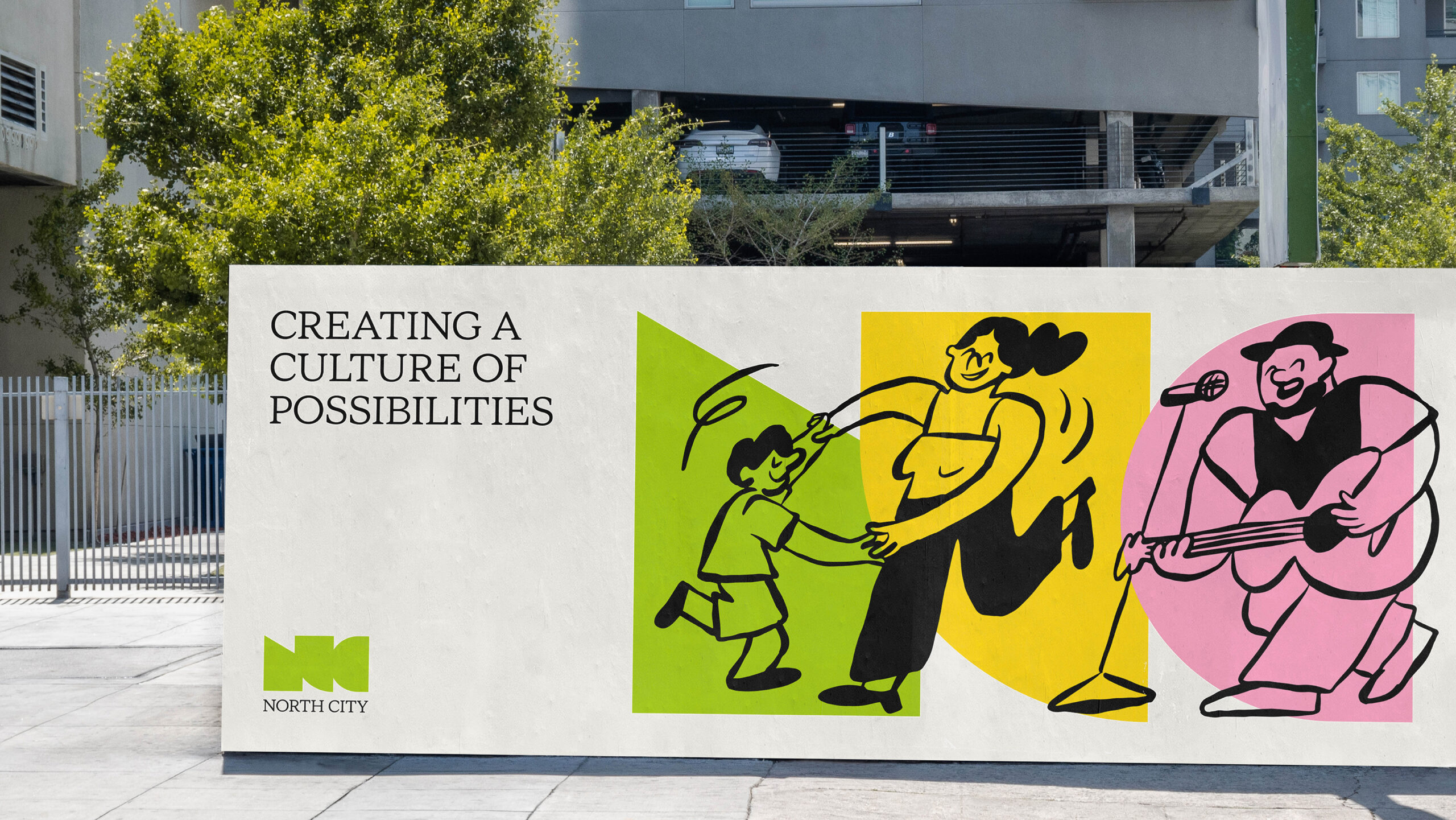
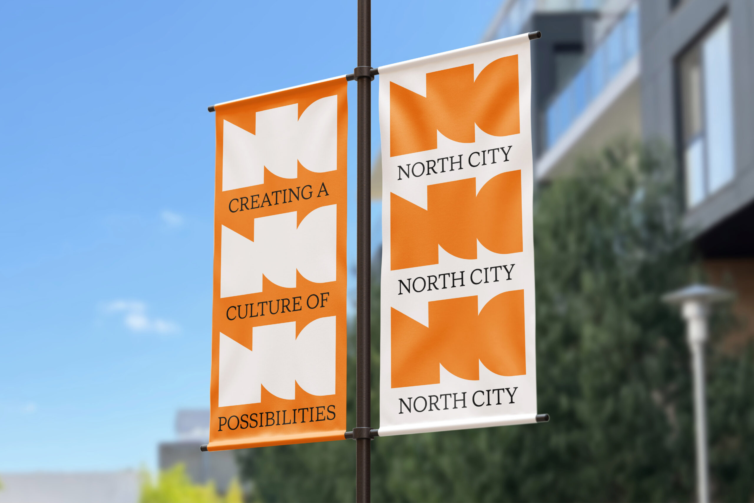
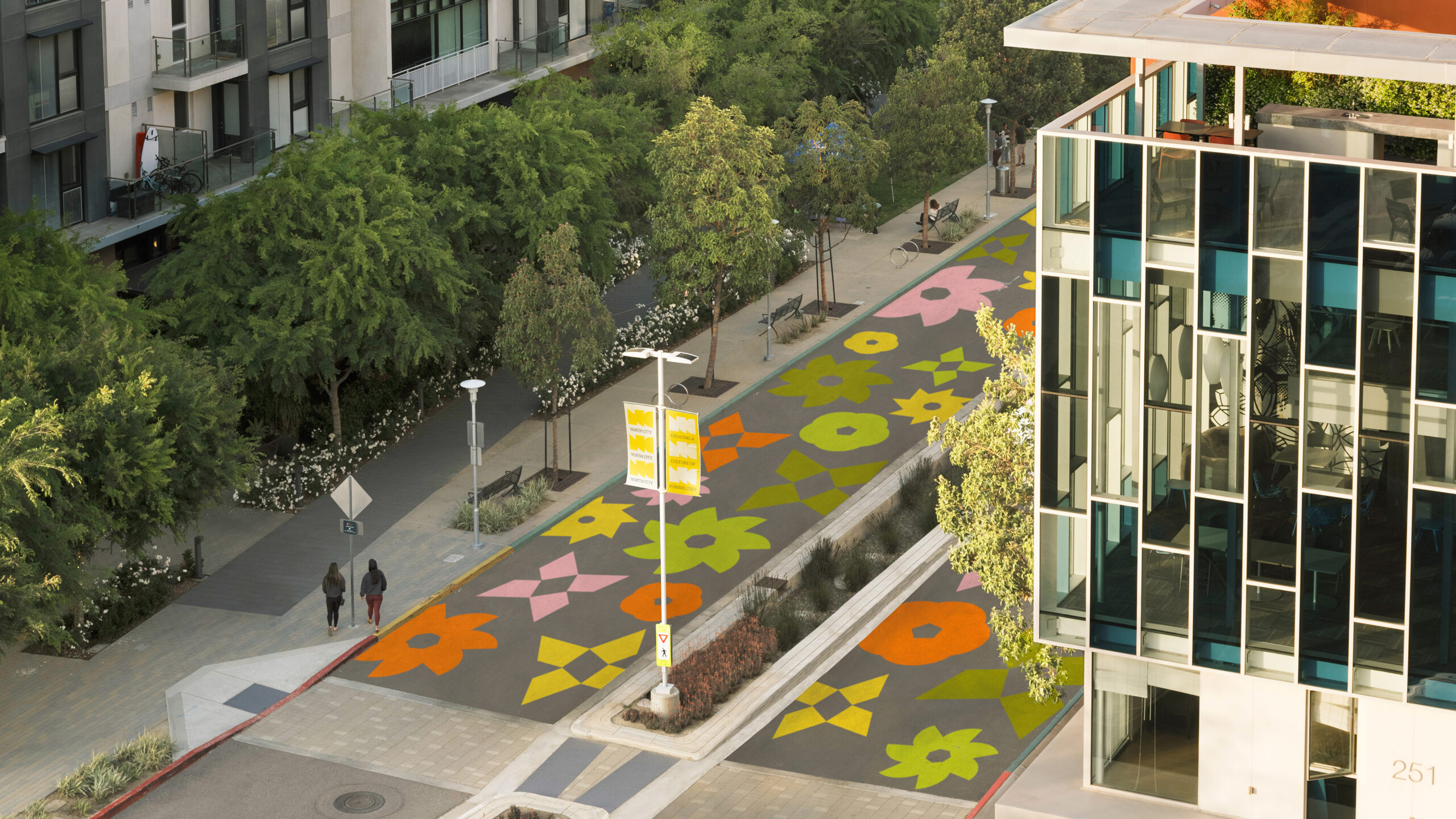
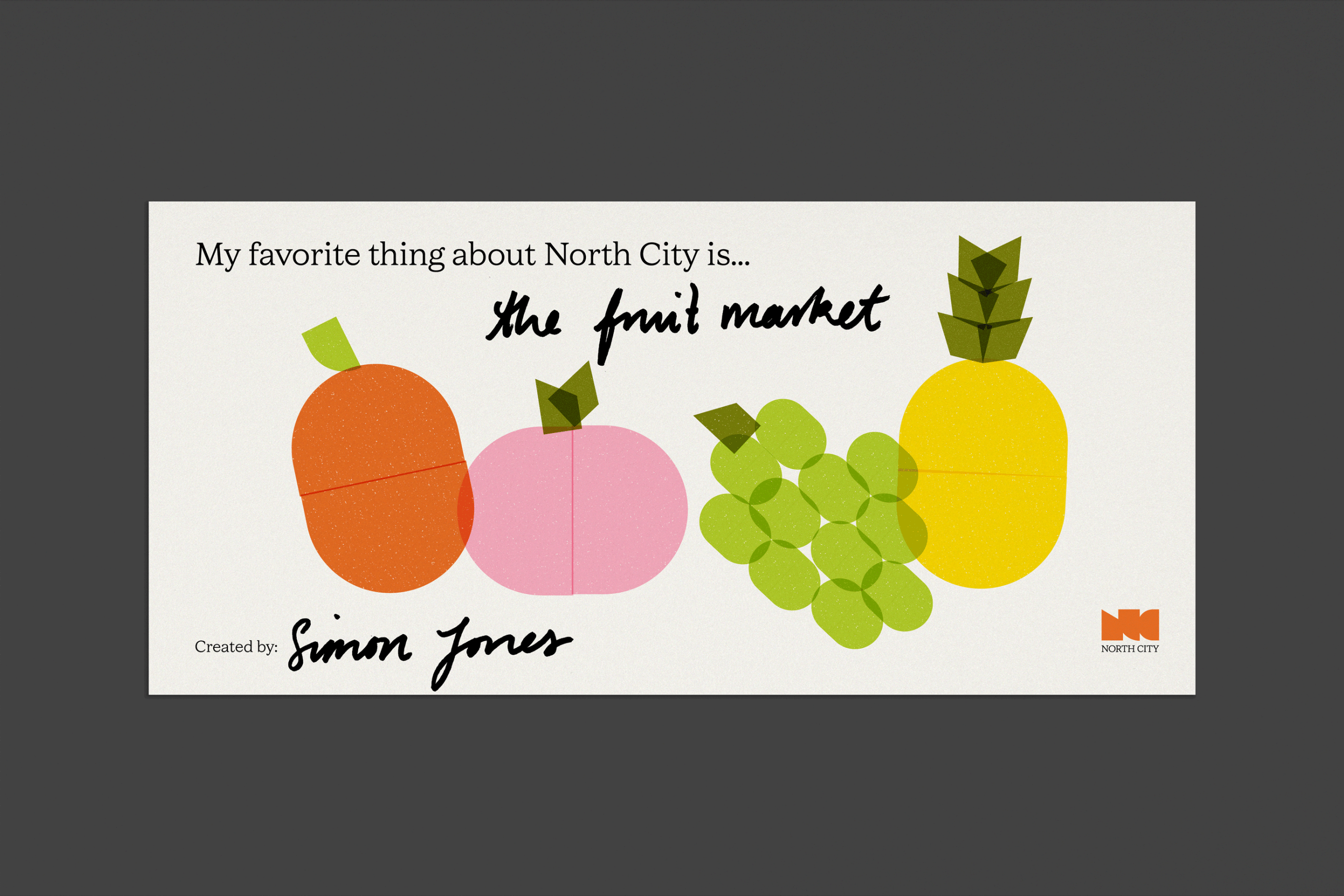
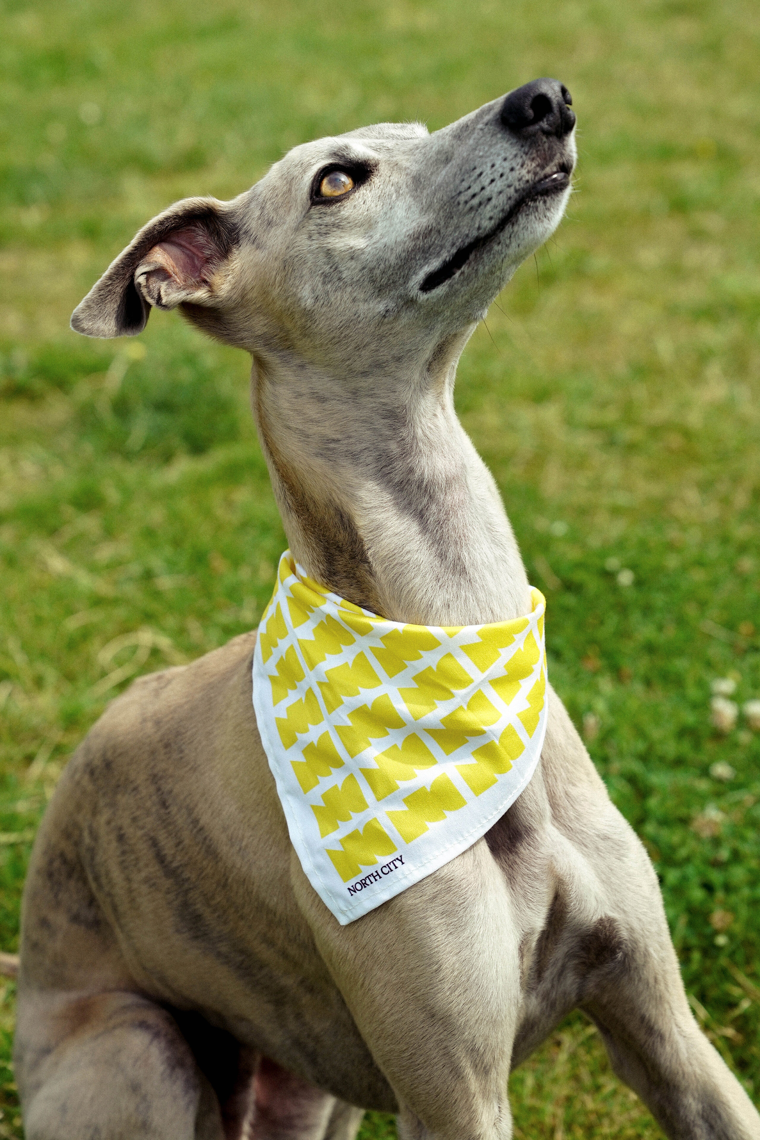
Our logo takes its cues from the city’s most identifiable features: its urban density, natural landscapes and the vibrancy of its street life. The simplicity of the shapes is its power, creating endless possibilities from playful event posters to sophisticated patterns and even large-scale visual markers.
Website as a gallery of live events
To launch the new brand, we created a new media-rich website with editorial stories that featured local entrepreneurs and community members, and a complete directory for all the independent restaurants and year-round events.
We’re continuing to work with the visionary team behind North City on designing and rolling out a new wayfinding system — watch this space.
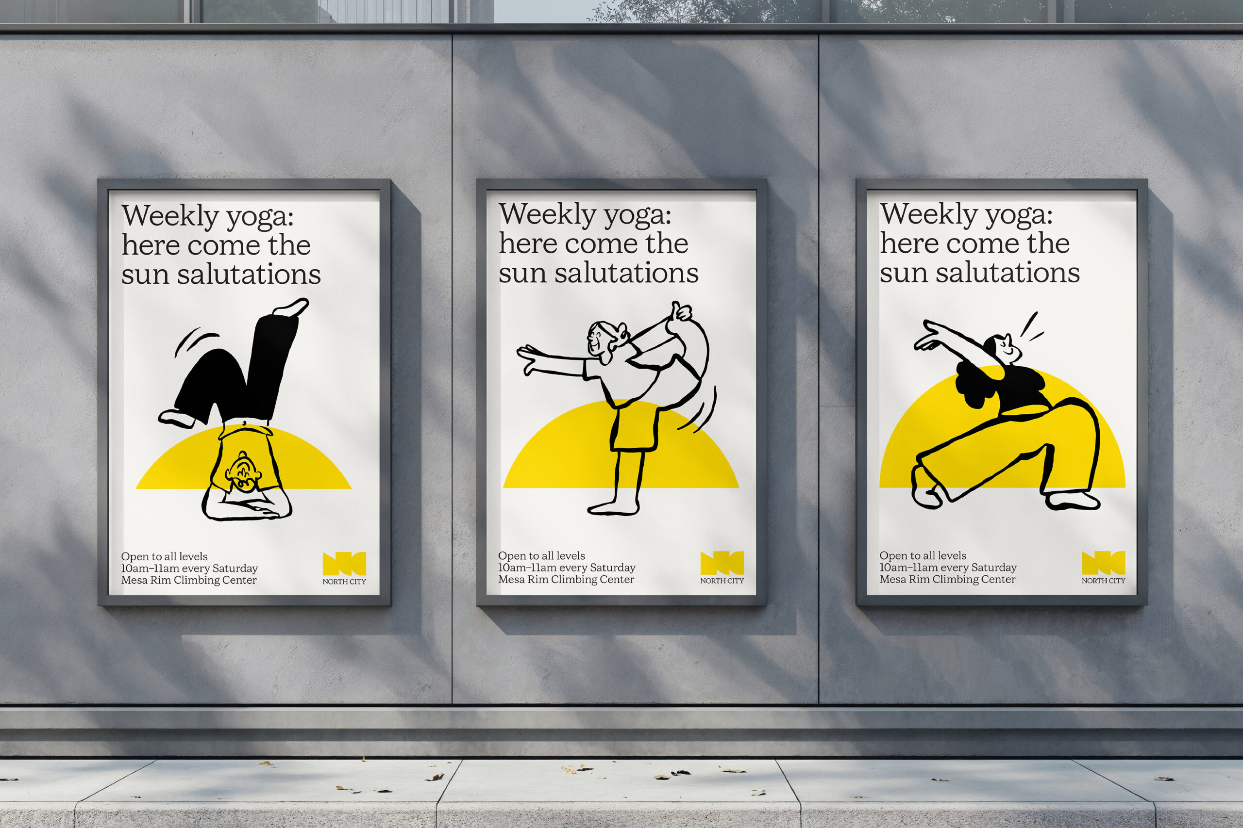
Stepping into character
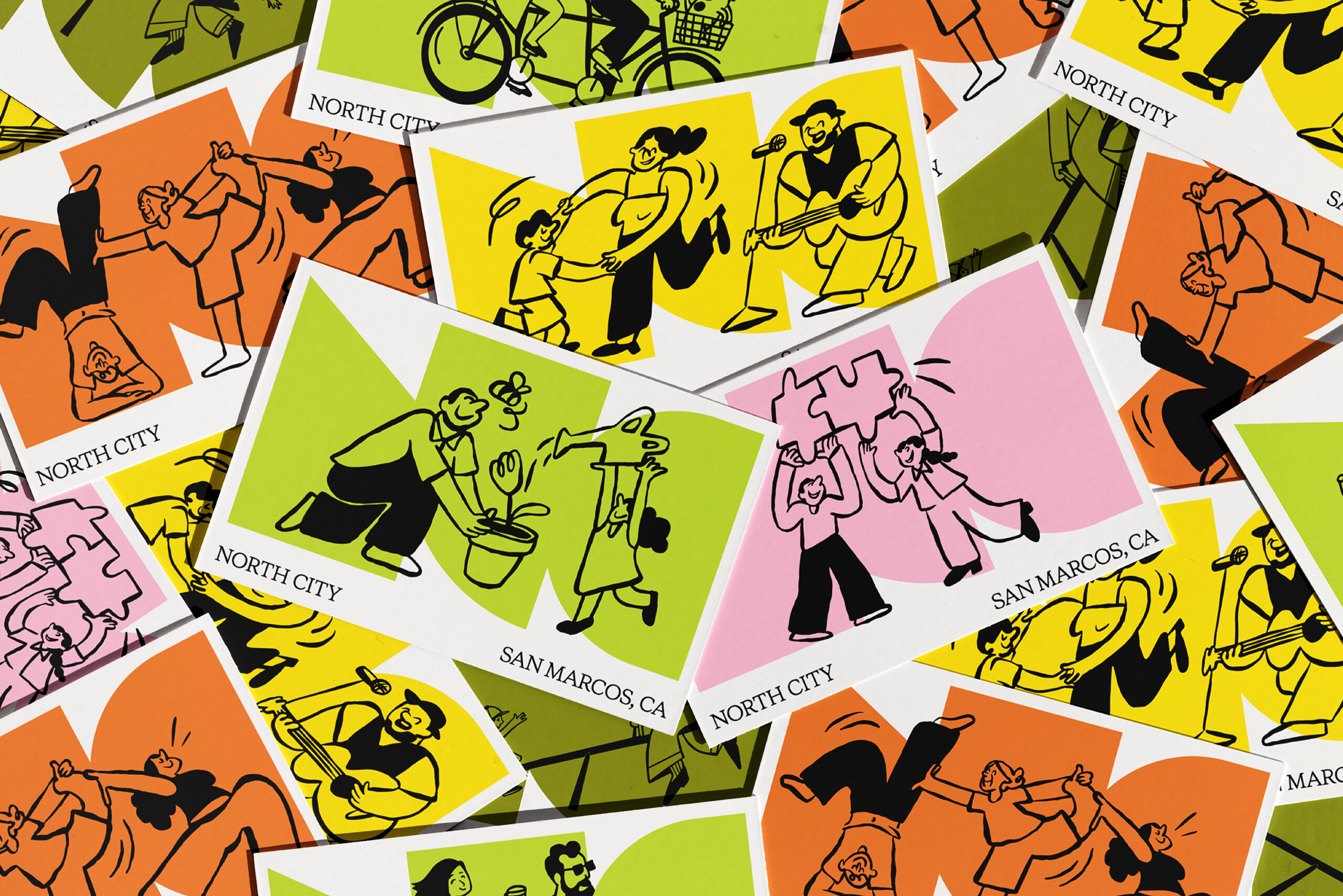
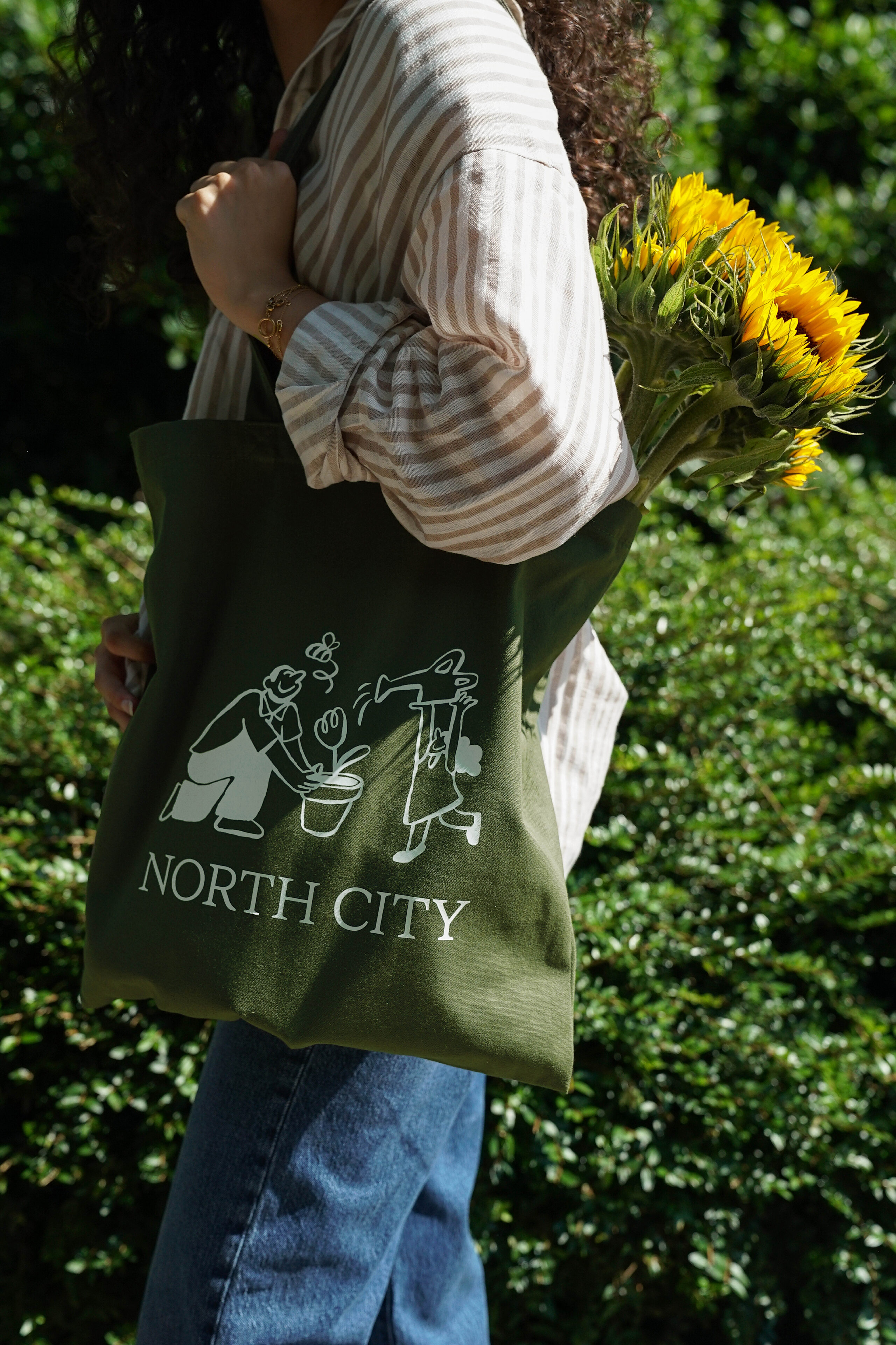
We introduced charming new illustrations by Andrea Hammersley and local artist John Antoski, bringing fun and playfulness into the identity. The characters are often shown as pairs or in groups, and set against the distinctive brand shapes, they create vignettes of what community life looks like. The bright logo shapes, spirited illustrations and elegant typefaces come together to establish North City as a welcoming destination.
“DNCO has been a terrific partner in the creation of a new brand at North City. The team was particularly impactful with the early strategy work and creation of the new identity. We enjoy working with such a diverse and talented team. I would highly recommend DNCO for a brand, website or wayfinding project.”
Lisa Hoeck, Real Estate Strategy
Sea Breeze Properties
