DUMBO
Place brand
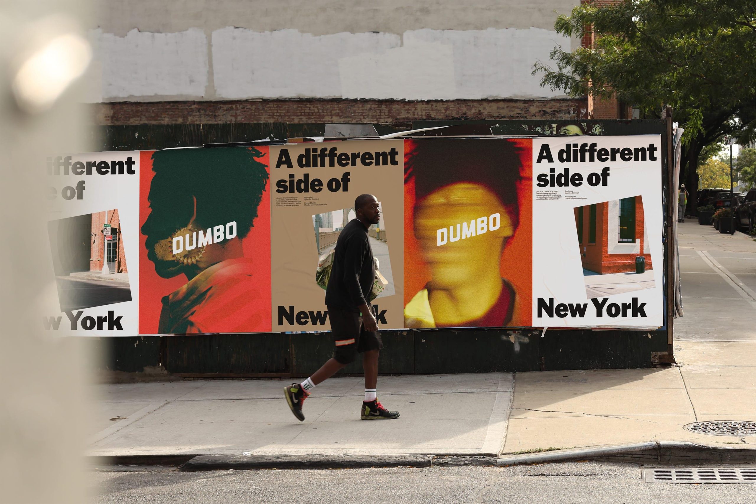
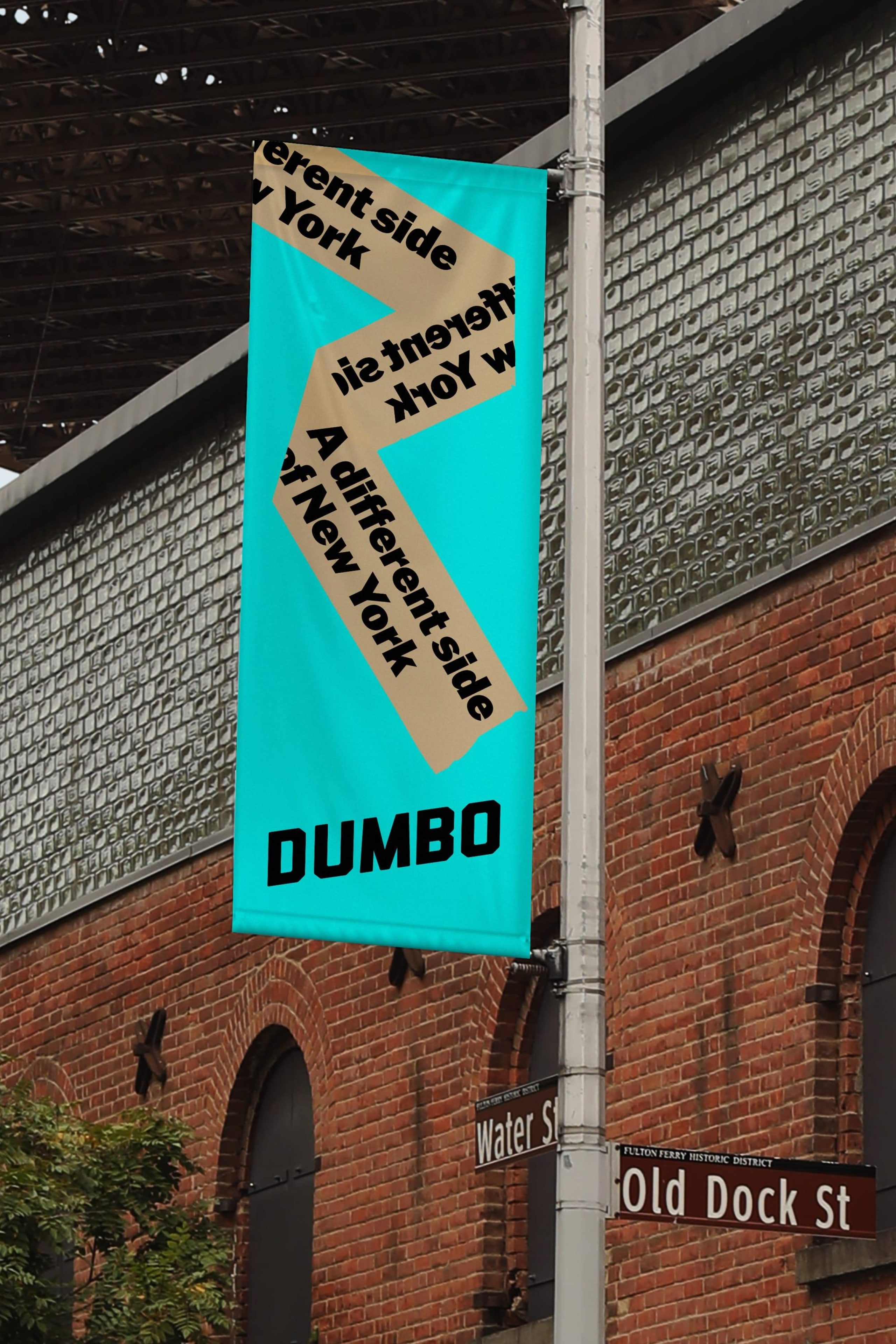
A different side of New York
DUMBO
Place brand
A different side of New York
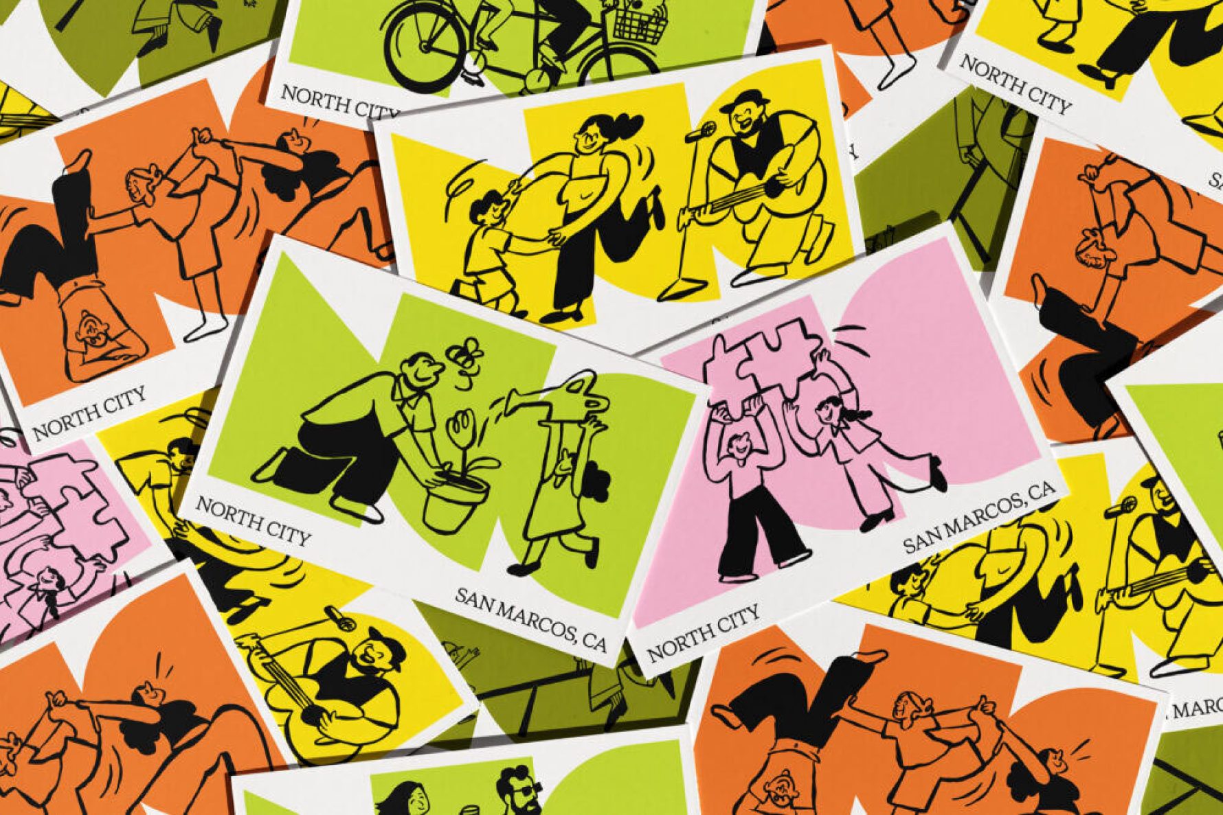
Once a New York enclave of art and industry, Dumbo is now a global hotspot — but mass tourism and narrow press coverage had reduced it to a postcard. Dumbo BID asked for a place brand refresh that challenged those misperceptions.
Our creative district brand celebrates Dumbo’s unconventional spirit and reminds people there’s more to this neighborhood than meets the Instagram filter.
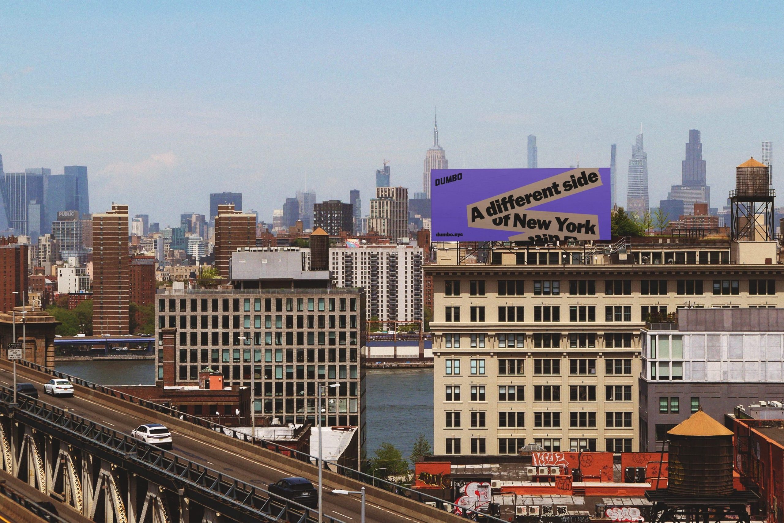
A different side of New York
Dumbo has always defied convention. Even its name — Down Under the Manhattan Bridge Overpass — was a tongue-in-cheek protest by 1970s artists resisting development. That irreverent spirit became the neighborhood’s shield and soul.
In leading the neighborhood place brand refresh, we helped the Dumbo BID preserve that rebellious energy while guiding its evolution. The neighborhood is a place of contrast and curiosity — where a quiet moment at Pebble Beach is punctuated by a train overhead, and where local ceramicists craft pieces steps from tech giants. Dumbo is raw, unexpected, and unlike anywhere else in New York. Our place repositioning strategy reflects exactly that: a different side of New York.
An identity system with a point of view
For the brand refresh, we retained the original diagonal logo — designed by Jon Hecht — a symbol of the neighborhood’s unconventional spirit.
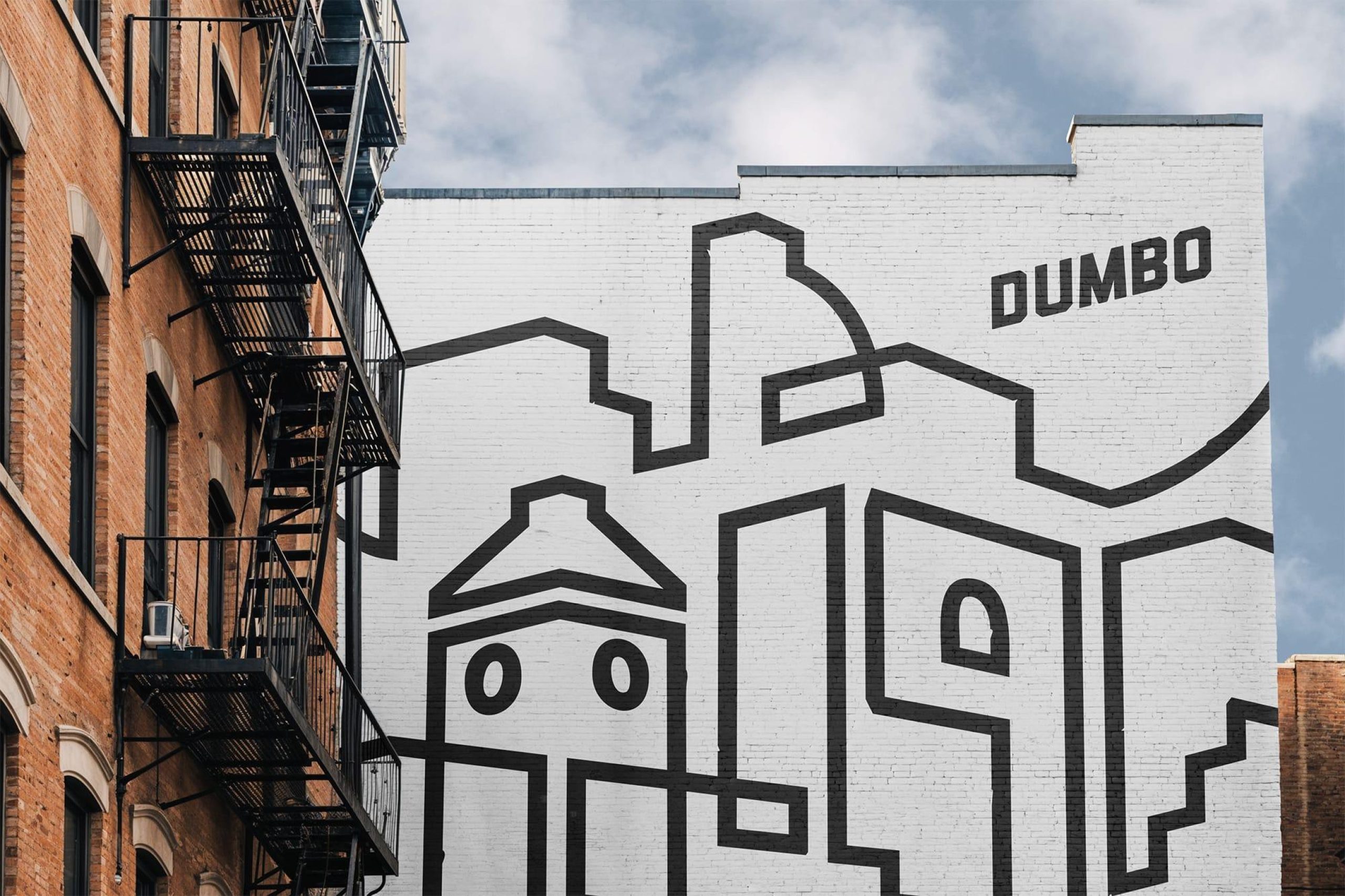
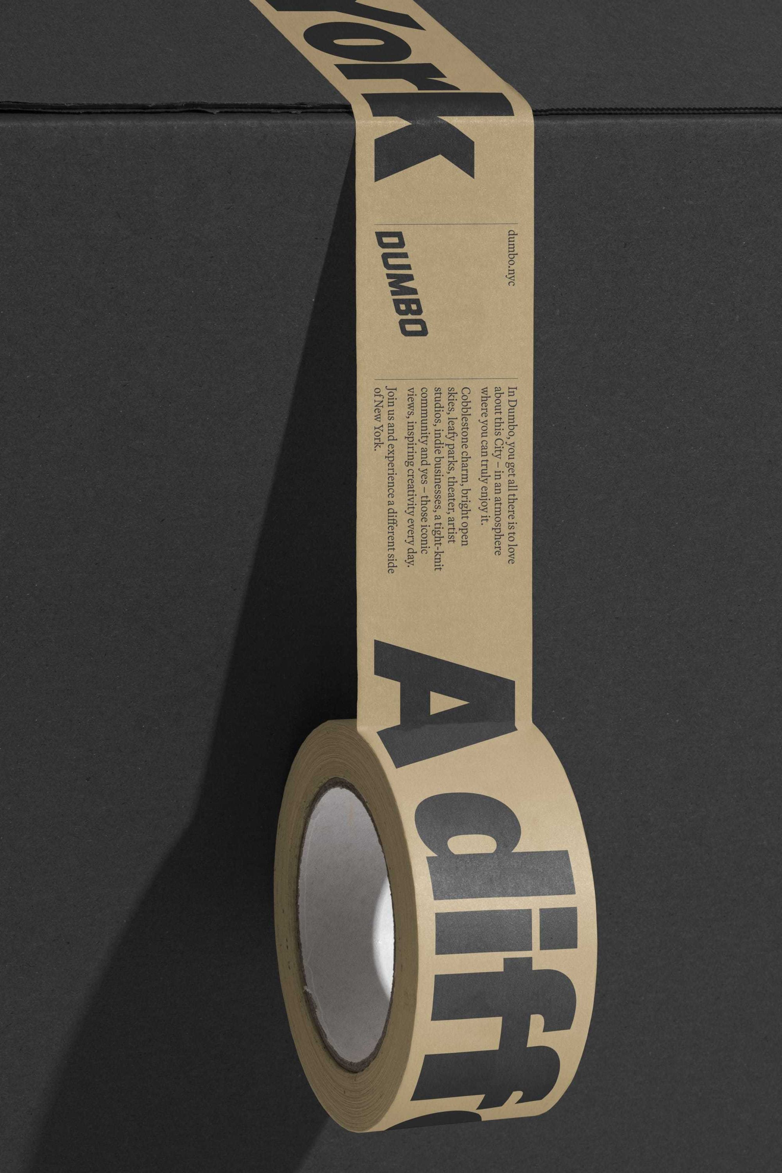
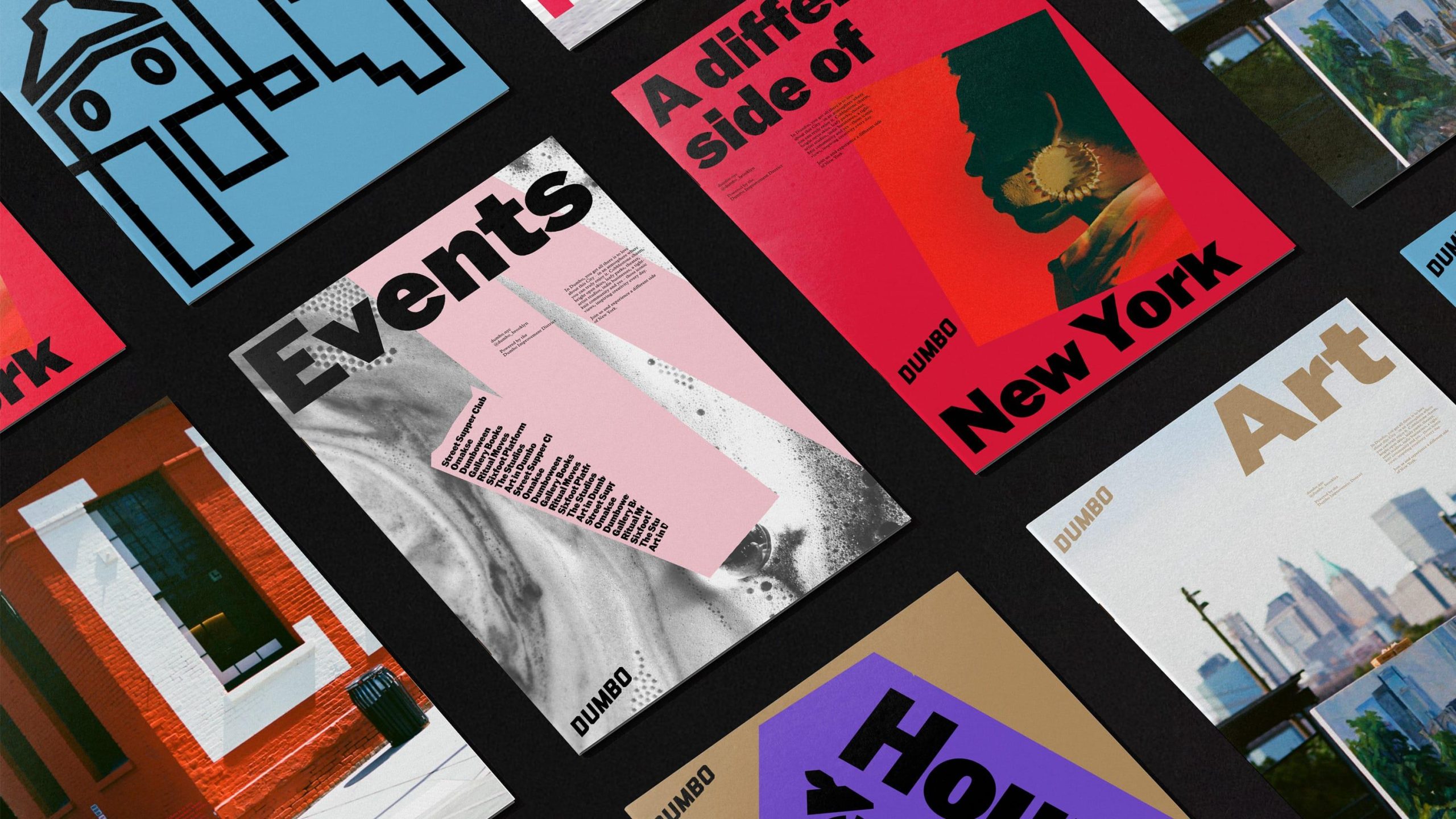
To show a different side of New York, we looked to Dumbo’s history. The humble cardboard box — first invented here — carries a rich world of ‘fragile’ warnings, packing symbols, and of course, tape. Inspired by this, we created a tape graphic that reflects the neighborhood’s ingenuity and creativity. It sticks, twists and turns, moving through space with energy and revealing new perspectives — much like Dumbo itself.
Beginning with an abstract illustrated world inspired by Dumbo’s spirit and architecture, the tape evolved into a flexible system for typography and graphic elements.
Grit meets graphic
Dumbo’s industrial spirit comes alive in the color palette and typography — steel blue mirrors its iconic bridges, deep red nods to brick factories, and bold, vintage-inspired type embody the neighborhood’s gritty strength and modern edge.
From the team that bridges everything and everyone in Dumbo
As part of the project, DNCO renamed the Dumbo Business Improvement District to Team Dumbo, highlighting the real people behind the work. ‘Team’ shifts the BID from a faceless institution to hands-on champions — not just maintaining the neighborhood, but driving public art, events, small business support, and everything that makes Dumbo a different side of New York.
Photography by Chrissie Winter
“We came to DNCO at an inflection point for the neighborhood and our organization, in need of a real strategy to increase awareness of the creativity, history and character that sets Dumbo apart. It’s as if they joined our team during this project — and it was a dream partnership.”
Alexandria Sica
President of Team Dumbo