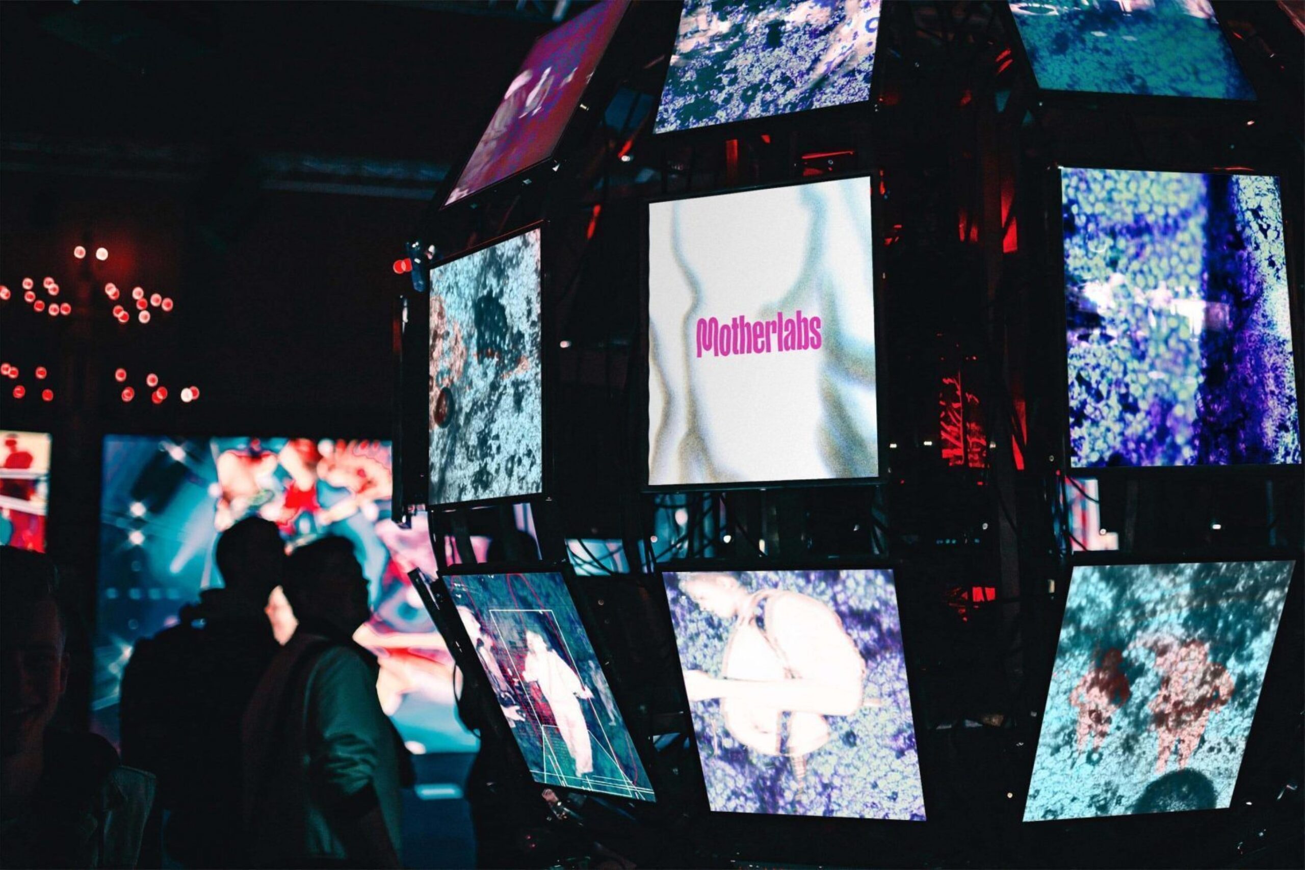
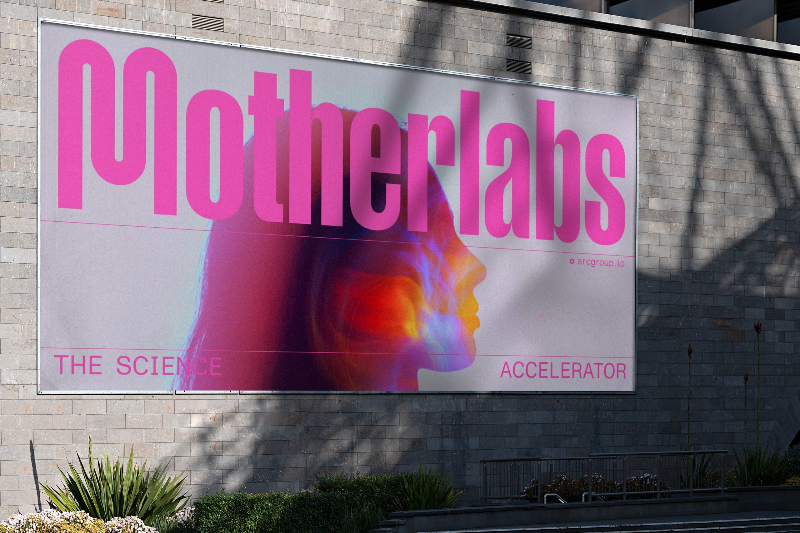
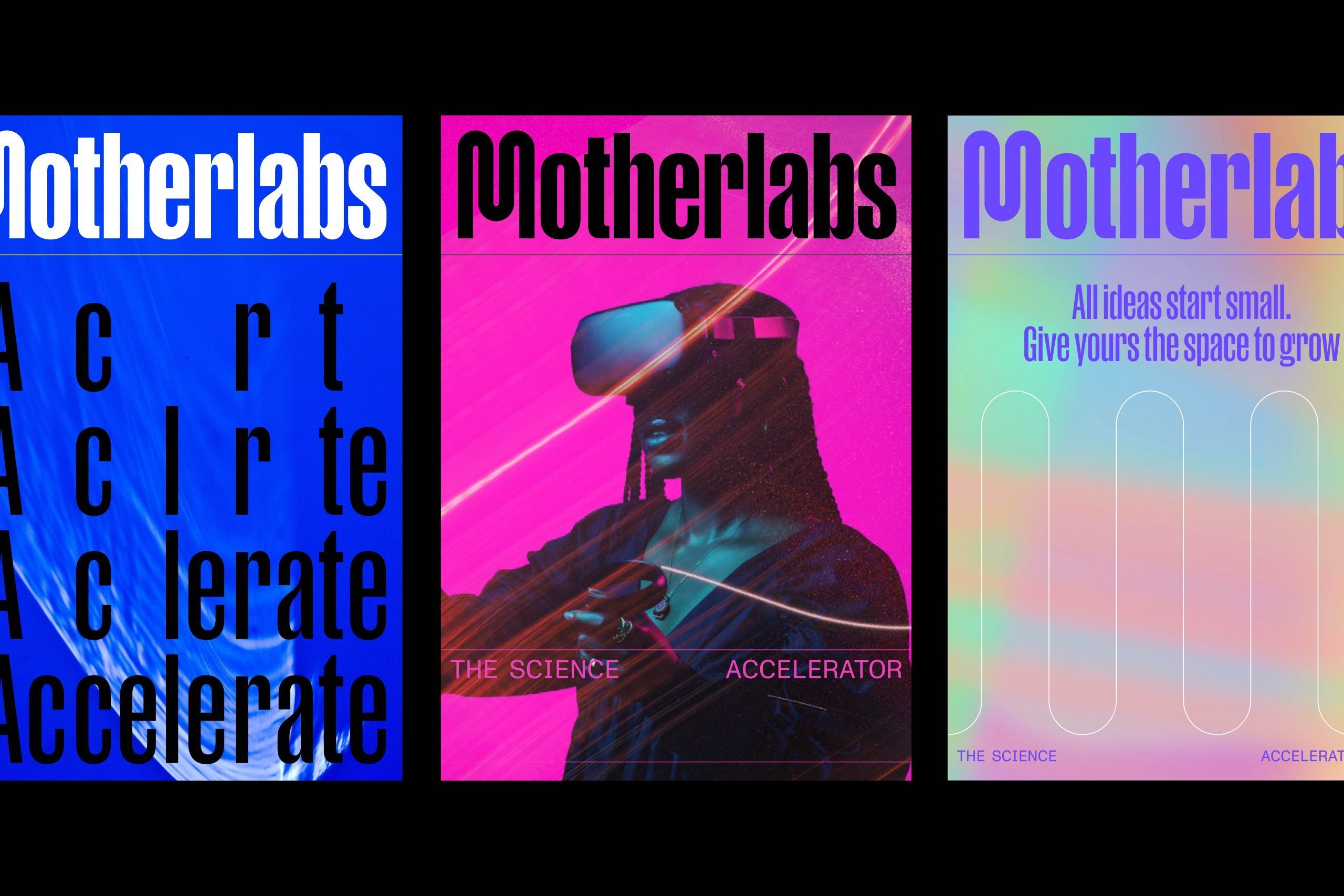
Brand identity for Motherlabs
Where science goes to grow
-
Client
Brookfield -
Location
Hammersmith, London
Expertise
Motherlabs provides accelerator spaces for
small science businesses within the ARC network.
This distinct new identity bears family resemblance
to the parent brand yet fizzes with an energetic
start-up spirit.
Next generation thinking
The number of UK science start-ups grew by 24% between 2016 and 2020. Small science clearly has the will and the means, but a real estate sector struggling to cope with demand is inhibiting innovation: innovation our futures depend on.
We created a distinct identity for ARC’s incubator labs that could speak confidently to a more focused audience while projecting the parent brand’s enviable credentials through clear association.
Name and introductions
The name ‘Motherlabs’ embodies the mission to provide science’s most fragile fledgling enterprises with the best possible start in business life. In ‘The Science Accelerator’, the brand’s purpose and target audience are then neatly packaged. It’s a line in keeping with a defiantly ambitious tone already used successfully by a team envisioning a world network of science and innovation clusters.
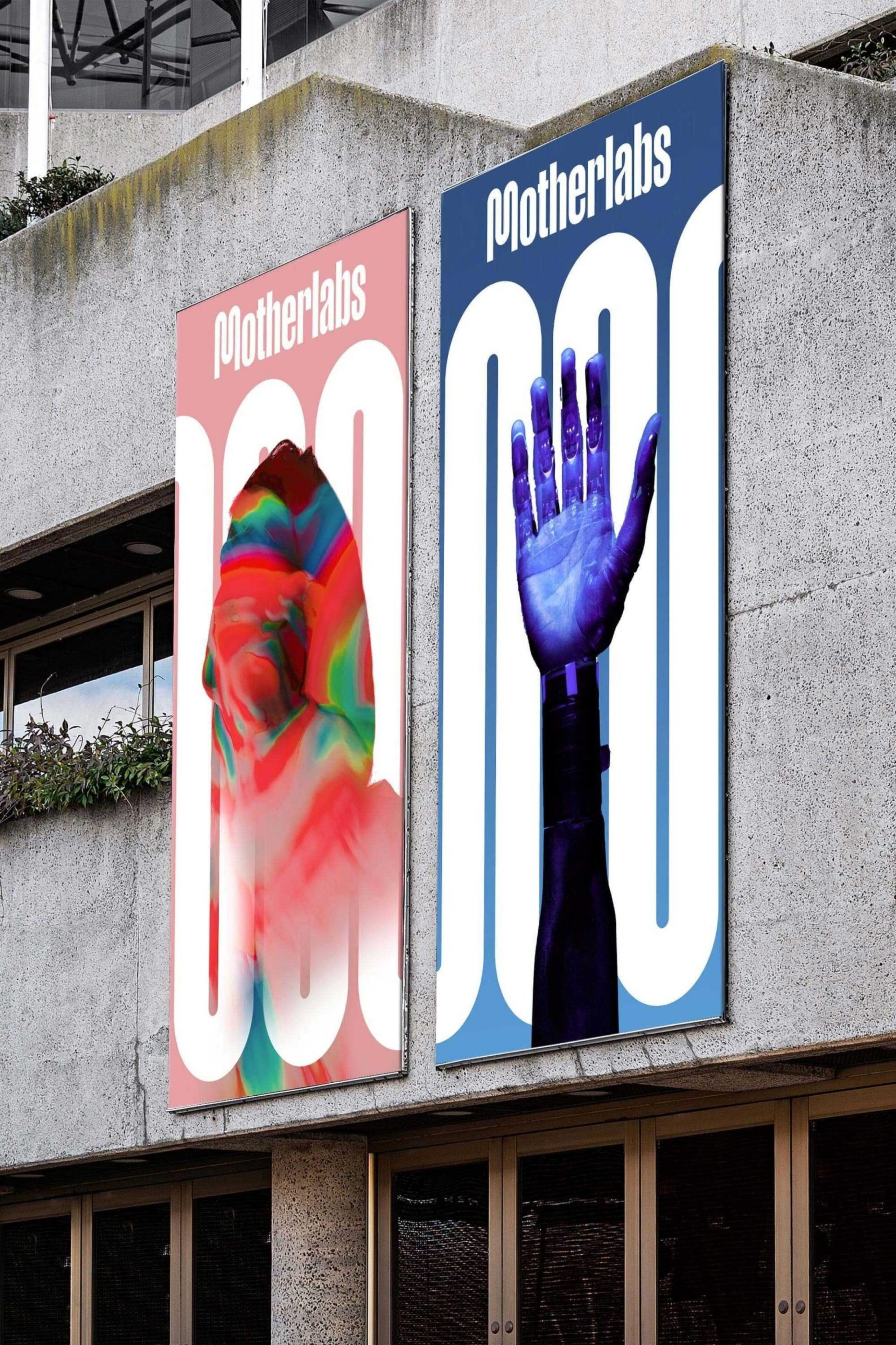
A brand that never stops
The identity we created feels restless, evocative of the tireless way small science has to hustle in order to succeed. The ‘M’ of the wordmark symbolises forward momentum with a looping letterform that rolls on and on and scales up as a supergraphic when required.
We ensured affinity with the ARC brand through common typography, colour and spirit. It was a delicate balance of family resemblance and unmistakable independence that boosts ARC appeal while proving the science network’s ability to think small in order to help its members achieve big.
