Digbeth
Place brand
Birmingham’s creative neighbourhood
Digbeth
Place brand
Birmingham’s creative neighbourhood
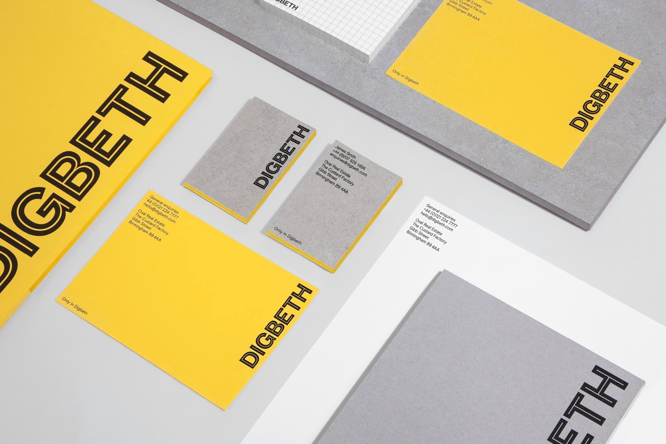
Birmingham’s former industrial heartland is evolving into an enterprising creative hub. The brief was to create a strong voice and place brand that resonated with this industrious community of proudly individual businesses.
Our response is a rich typographic identity inspired by the place and people of Digbeth: a tailor-made typeface that is free to download by the community it represents.
A brand for fearless creatives
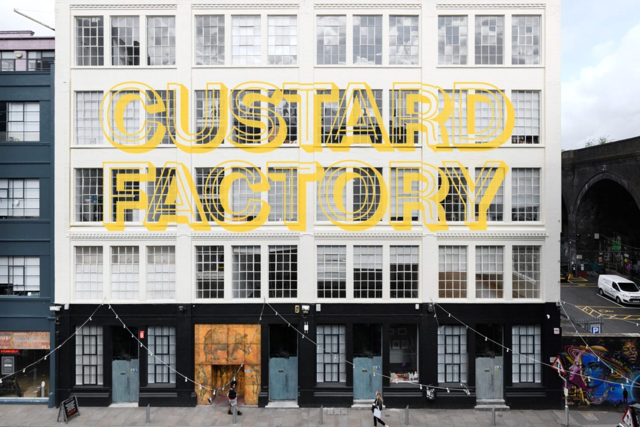
The brand celebrates the area’s industrial roots, while also providing an adaptable font for the individuals forging its future. The unmistakable yellow is a nod to the innovative eggless Bird’s custard powder, invented and manufactured in Digbeth from 1837.
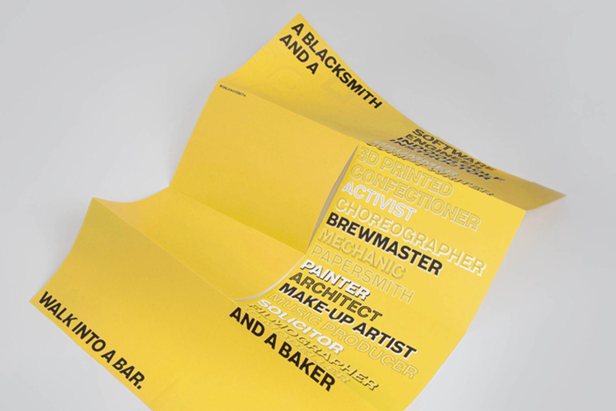
The inventive small businesses that define this emerging area are an eclectic mix — Digbeth is a place where blacksmiths and digital agencies work side by side. So this is a flexible brand, full of personality, exactly like Digbeth itself.
A typeface for the whole community
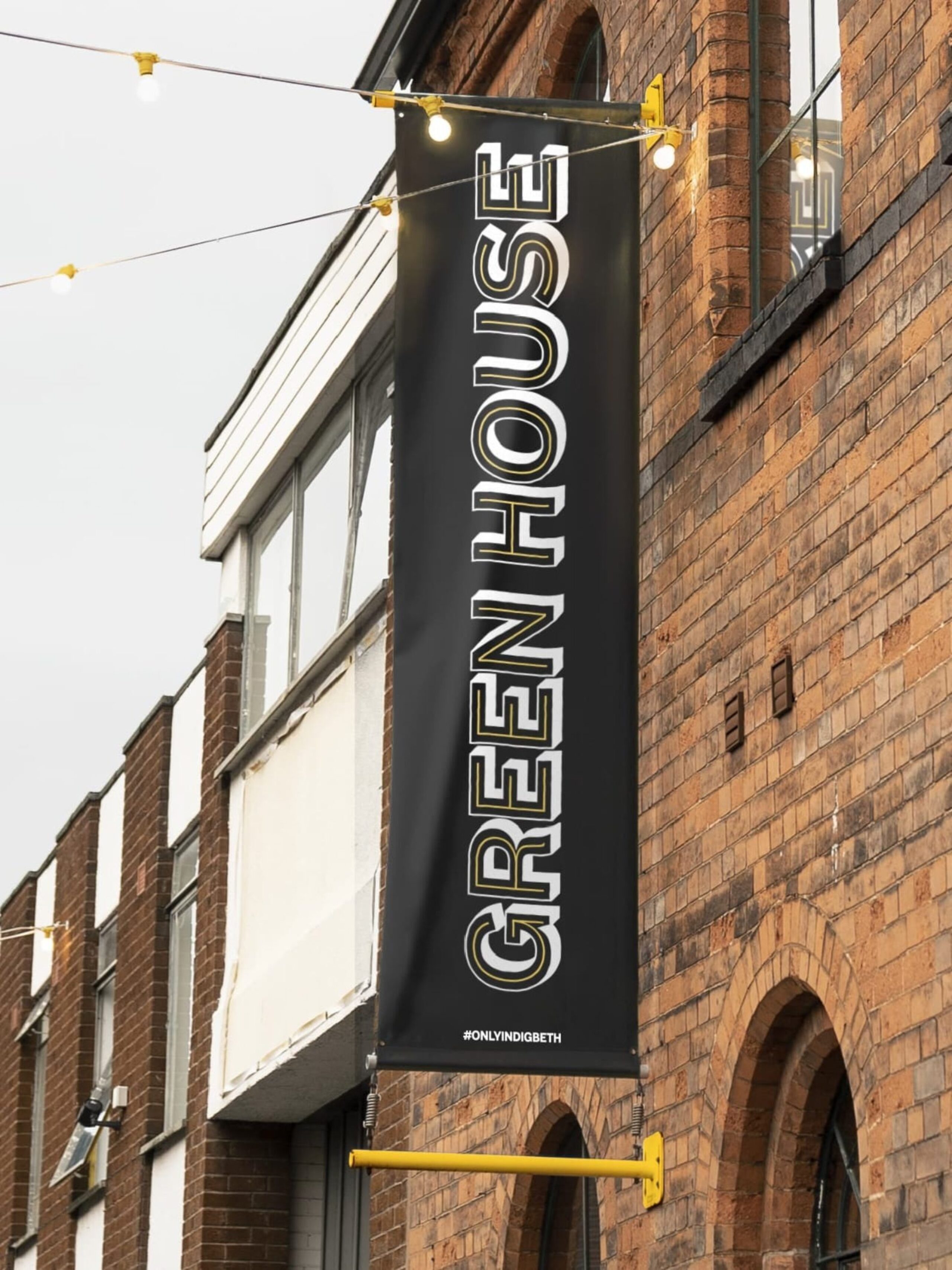
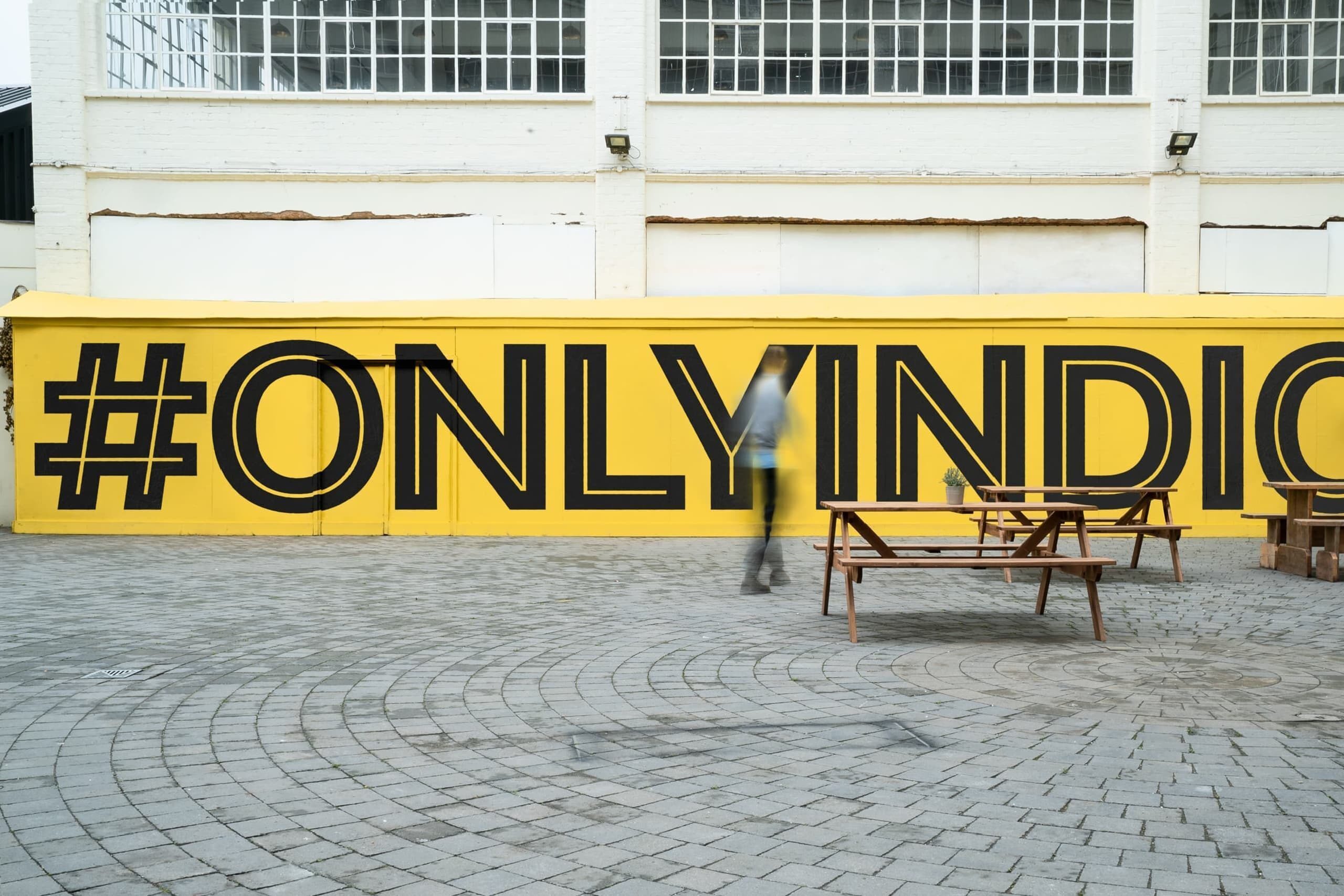
The typeface, Digbeth Sans, was created in collaboration with Colophon. It draws on the lettering of canal boats and the industrial Grotesk type that runs throughout the neighbourhood and its Victorian goods yards and factories. It comes in regular, shadow, inline and outline cuts, meaning expressions can easily be dialled up or down.
