
A wee manifesto: clear toilet signage please
Aug 16, 2023
-
Words
Patrick Eley
If we’re happy with a coffee cup signposting us to a cafe, then why does signage get all coy when it comes to toilets? DNCO’s head of innovation, Patrick Eley, argues that it’s time to de-twee this most urgent of wayfinding.
So I want to talk about toilets. Or perhaps that’s the bathroom, loo, lavatory, facilities, WC, bogs, head, john, jacks or maybe simply the restroom. Whatever you call them, it’s usually pretty important to be able to find them in a hurry. We do a lot of wayfinding work at DNCO — we are fascinated by what places mean as well as how you navigate them — and wayfinding sits right at the intersection of that conversation. Inevitably, how you sign a toilet is a question that gets asked time and again.
Broadly speaking, wayfinding signage can be categorised into two types: signs that direct you towards a destination and signs that indicate that you’ve arrived. It’s a bit more detailed than that of course. Signs might carry instructions, warnings or maps which bridge the two types, but almost all destination signs confirm what you will find at the end of your journey — whether that’s a building, a lift, an elephant or an aeroplane. And on the face of it that makes perfect sense; we need to know where we’re going and where we’ve ended up. But one type of sign goes against the flow. More often than not, toilet signs indicate who is allowed to use the space, rather than what you’ll actually find there. It’s a subtle difference and one we rarely question.
“More often than not, toilet signs indicate who is allowed to use the space, rather than what you’ll actually find there.”
So ubiquitous as to go often unnoticed by the large majority — two or three stylised icons stand in for the huge breadth of human identity and experience. And the issue is; we’re not all the same. Yet these representations have been around for decades and arguably millenia before that — iconic depictions of people are found on cave walls dating back thousands of years. Perhaps toilet taboo means we don’t like talking about human waste or the mechanics of a system we’re all intimately familiar with — but the modernised, anatomically and sartorially incorrect stick figure doesn’t make sense, nor is it particularly inclusive.
All-gender toilets have been standard in many places for a long time — on planes, trains, in our own homes — they’re not a new idea, although in a society where gender identity is becoming ever more fluid they invoke a complex, charged debate. But if a space does have gender neutral toilets then surely we owe it to each other to make them clear. Wayfinding needs to work in high-stress environments such as transport nodes and hospitals; correctly decoding a sign can, at the most extreme, be a case of life or death.
People need to know what they’re going to find behind the door, so how do we indicate what’s there in the simplest way possible? Combining male and female icons into a single figure is a frequent solution, but it feels reductionist and ultimately to be missing the point. People aren’t half of one thing and half of another — they’re complete individuals and tricky to simplify. In a world where many people don’t even identify as one gender or another, a merged set of symbols feels both redundant as well as unclear.
“People aren’t half of one thing and half of another — they’re complete individuals and tricky to simplify.”
So why don’t we go back to basics. If we’re happy with a coffee cup standing in for a cafe, then shouldn’t we also be content with the literal icon of a toilet, however squeamish this makes us feel? Of course, icons need to be learned and human beings need simplicity. A pictogram will only gain universal recognition through standardisation and widespread implementation, but let’s flush the baffling variations and make things user-friendly by showing what’s actually in the room. Just get me to the bathroom quickly.
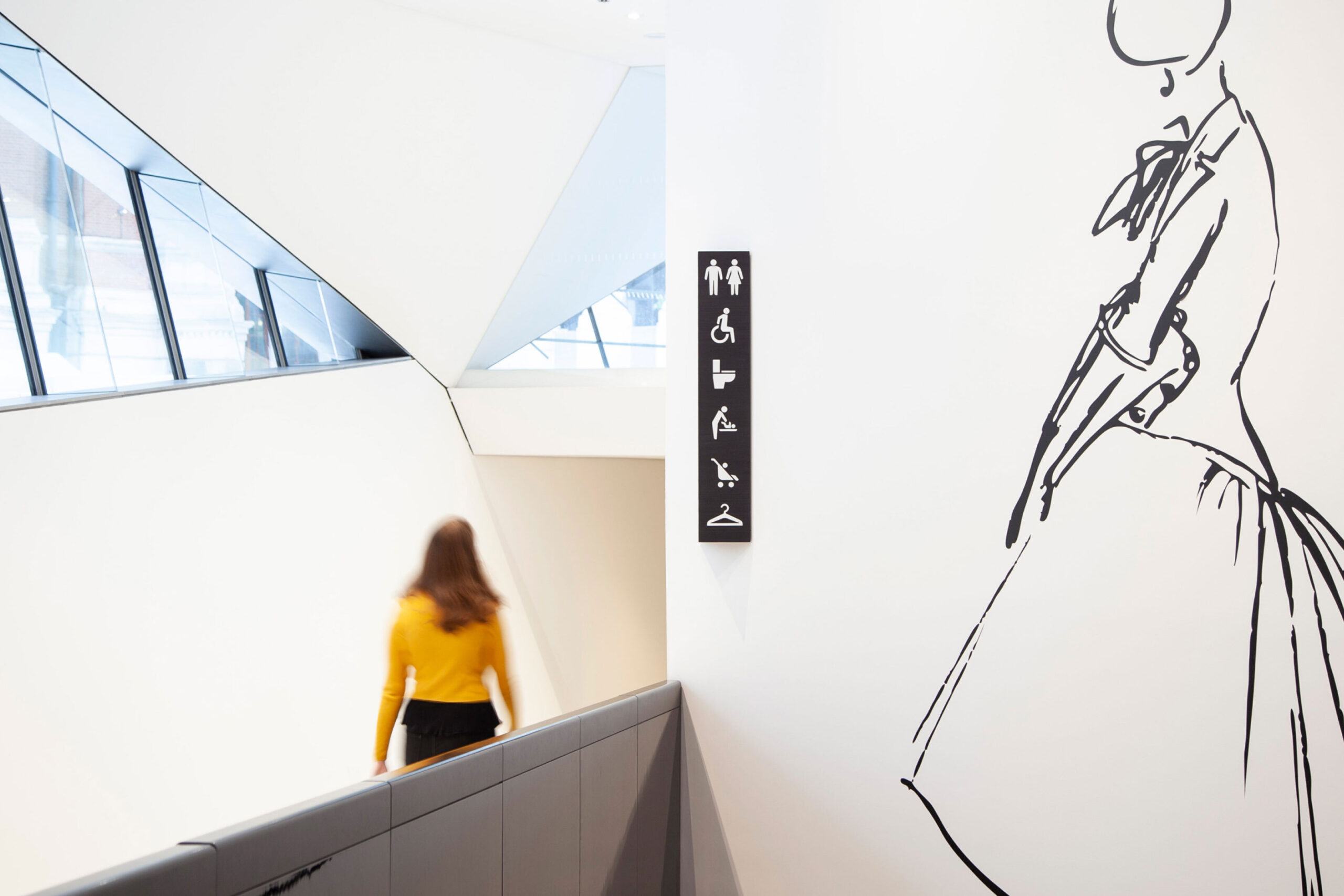
Icons shown were developed for the DNCO’s wayfinding at the V&A. More about our wayfinding work here.