Zudo
Place brand
A new village for Amsterdam
Zudo
Place brand
A new village for Amsterdam

Amsterdam’s business centre Zuidas is synonymous with ambition and global connection — yet it was missing the social atmosphere of the rest of the city.
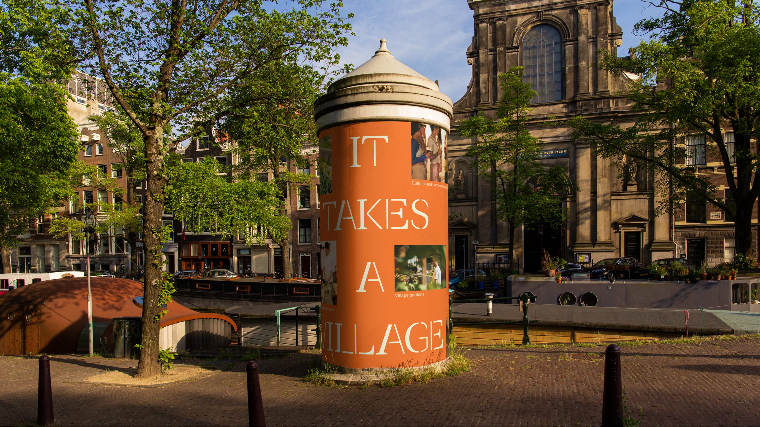
We worked with Victory and LMTD to create Zudo, a village for Zuidas. It will transform the fortress-like ABN AMRO headquarters into new homes, workspaces, streets and gardens. We delivered the neighbourhood place branding, strategy and place naming to capture its multidimensional vision.
Research to define Zuidas 2.0
In order to dig beneath the surface of local perceptions of Zuidas we immersed ourselves in field work: from on-street intercepts to stakeholder interviews, from community workshops to an online survey that captured hundreds of local viewpoints. Many Amsterdammers gave their time and fed directly into the key insights for the project.
It was clear that we needed to help shift perceptions. People told us that Zuidas was “just business” and for “suits, heels and ties”. Now with the team's vision, we had the opportunity to bring an intimate street experience that Zuidas had never experienced before — a narrative for the business district regeneration, rooted in what the area needs next.
A surprising new name and story for the village
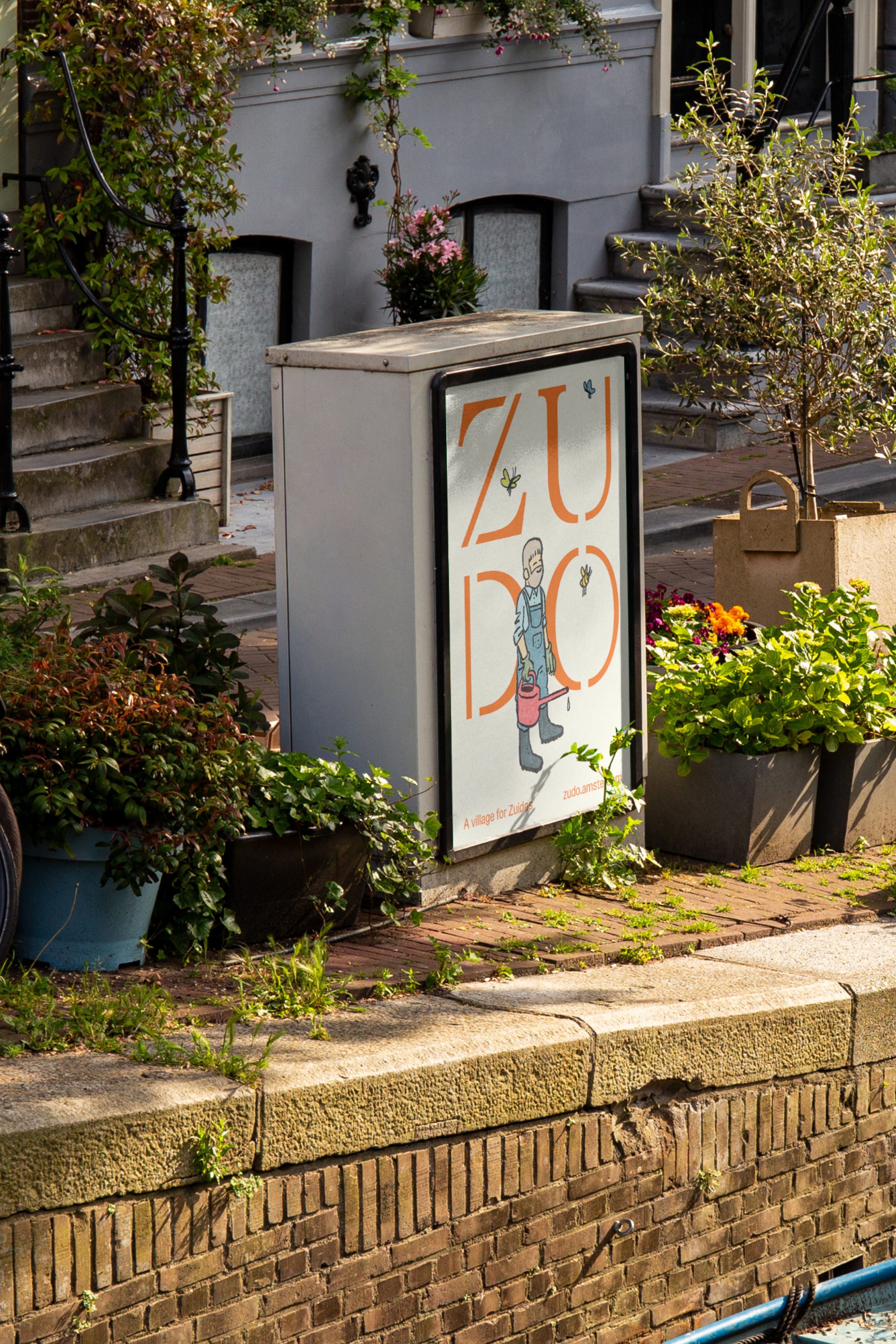
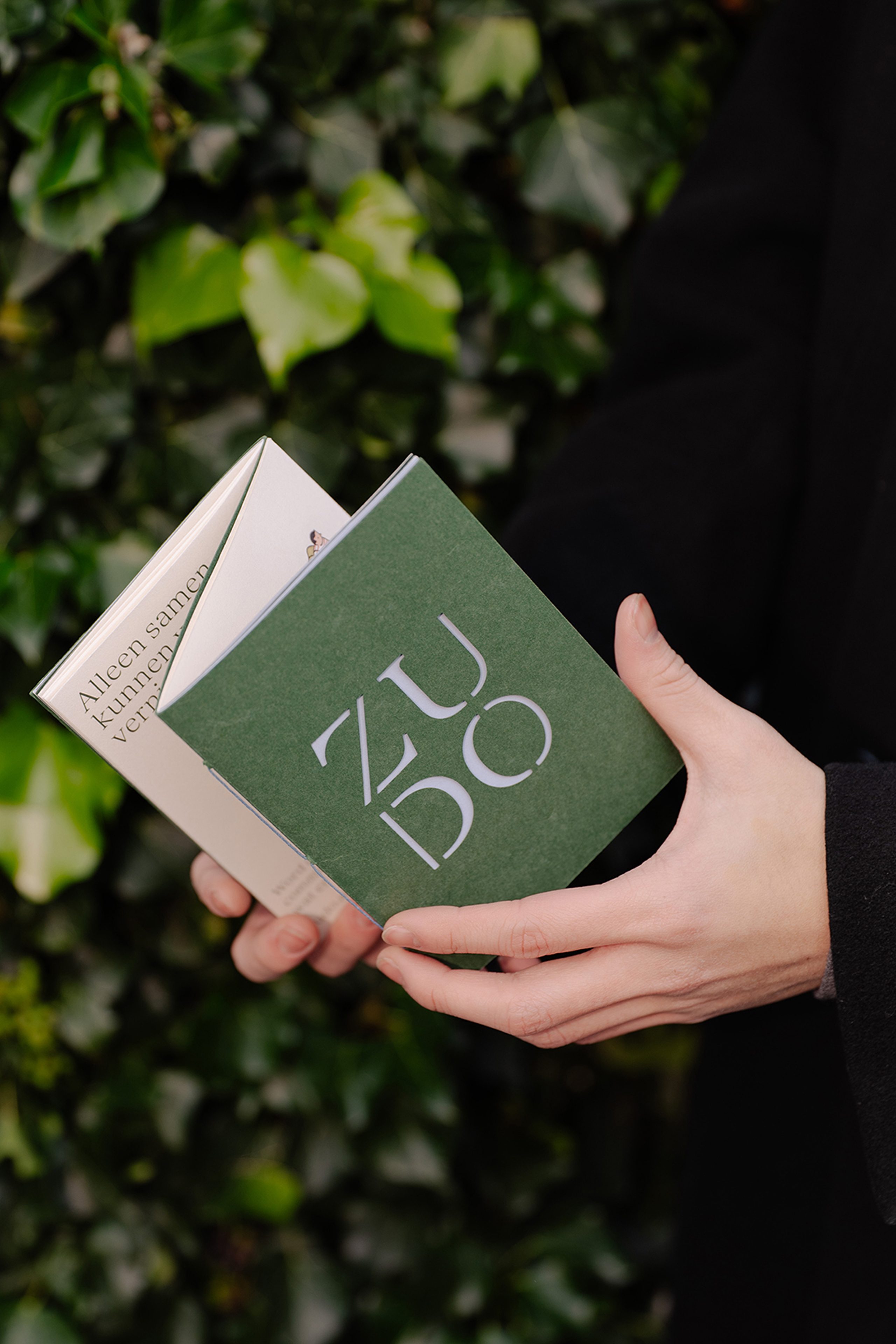
We created a tagline that welded together simplicity and surprise: ‘a village for Zuidas’, capturing the contrast at the centre of the project’s identity. And through this collaborative process, we arrived at a powerfully simple name: Zudo — a neat portmanteau of ‘Zuidas’ and ‘dorp’ meaning village in Dutch. It’s memorable, has a great story to tell and reminiscent of many well-loved neighbourhoods around the world like Soho and Dumbo.
The place brand narrative is delivered in both Dutch and English. We swapped similar sounding words with their counterpart, creating a distinctly destandardised tone of voice that spoke directly to our multilingual audiences.
A characterful not quaint identity
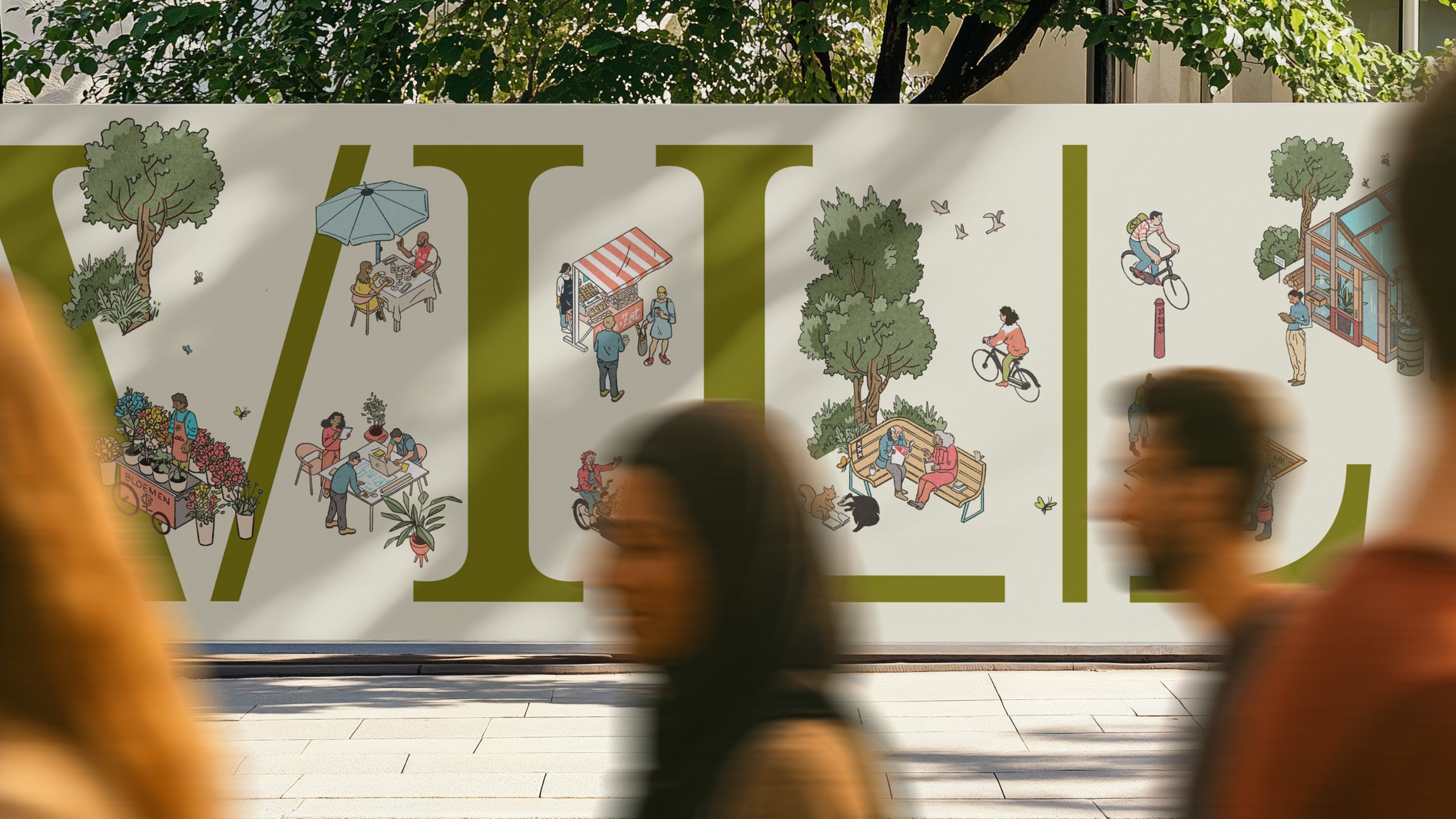
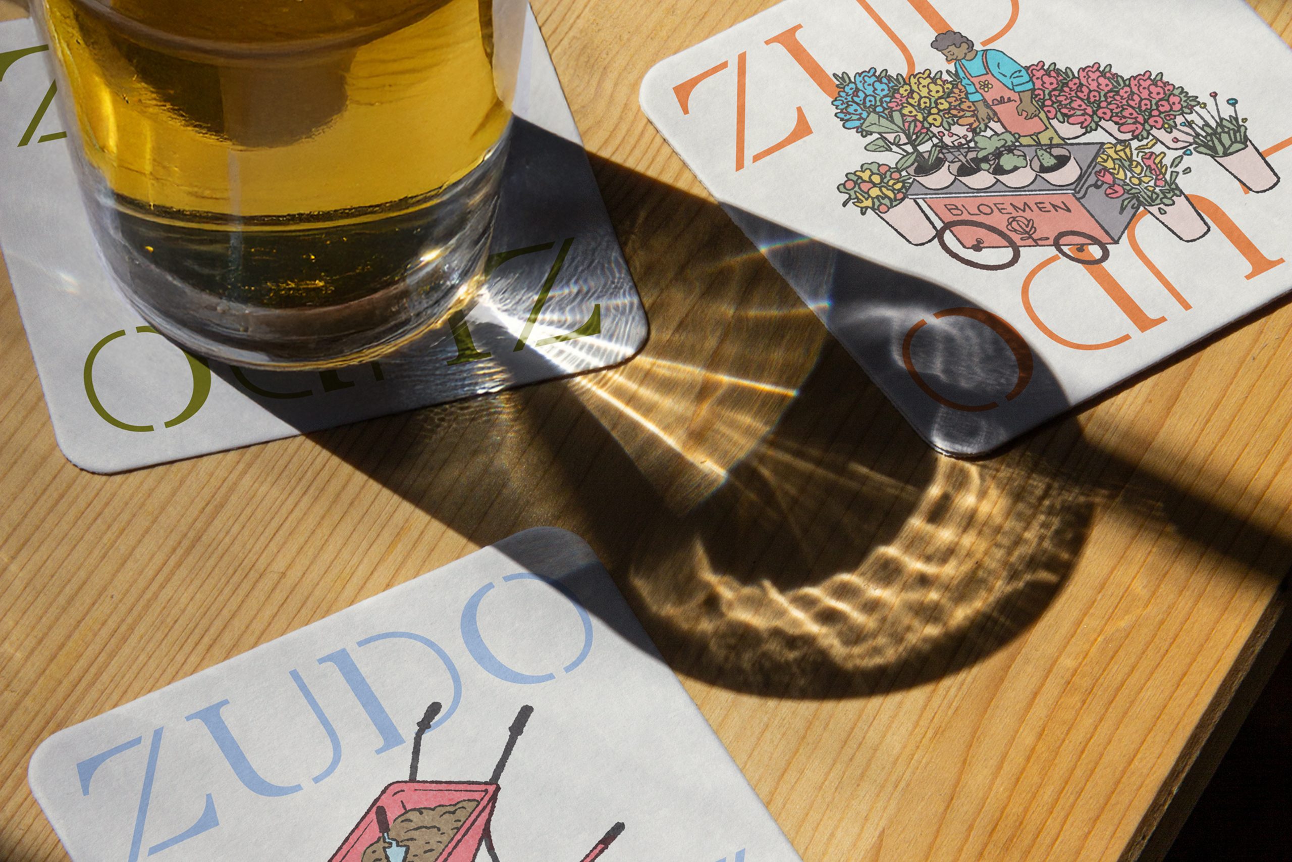
What does a village for Zuidas look like? We created a district place brand as distinctive as Zuidas itself: made of many different parts and full of energy, while still reflecting the refined quality of the design.
By assembling a sans serif and a serif font together, with Amsterdam-born foundry Bold Decisions, we created a bespoke stencil typeface that reflects the way Zudo itself is made: imaginatively adapting buildings, and confidently comfortable with contrasts.
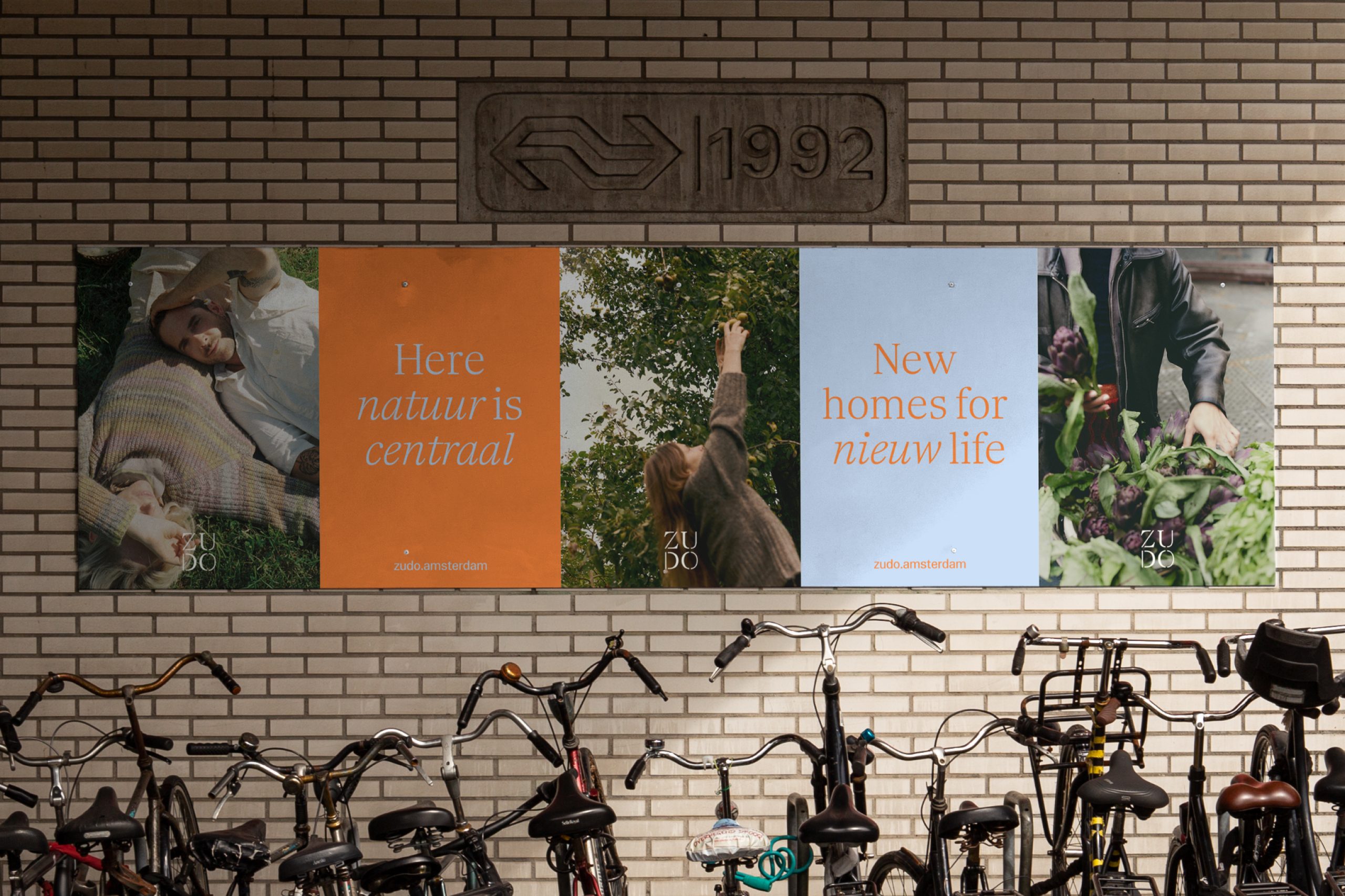
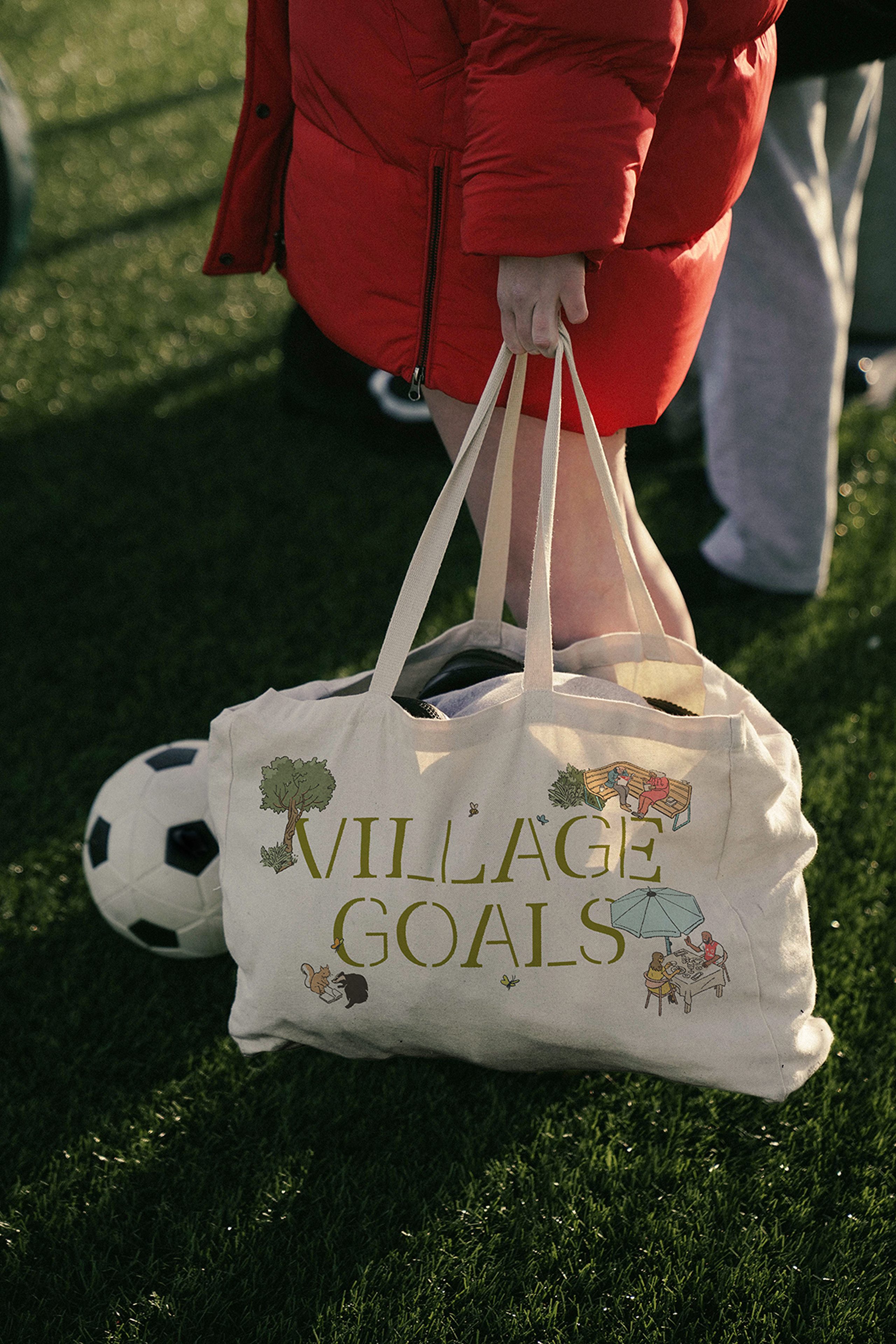
Working with illustrator Luis Mendo, we created scenes to depict village life, but invited viewers to get lost in the richness of Zudo — from picking out tulips to the neighbourhood baker, butcher and bruin café. Our layout system draws on community noticeboards, a typical feature in village life, where we see elements overlap to create depth and intrigue.
Since a soft launch in Amsterdam, Zudo has been warmly received by the local municipality, Zuidas residents and the city.
“The creation of Zudo has been a very collaborative process between Victory Group, our development partner LMTD, and DNCO. While we held a strong vision for the precinct, DNCO helped us articulate it with clarity and confidence. Their disciplined approach and creativity transformed our ideas into a cohesive and outstanding narrative and brand we are proud to stand behind today.”
Erik Moresco, Founder and Managing Partner of Victory Group