Westbund Central
Place brand
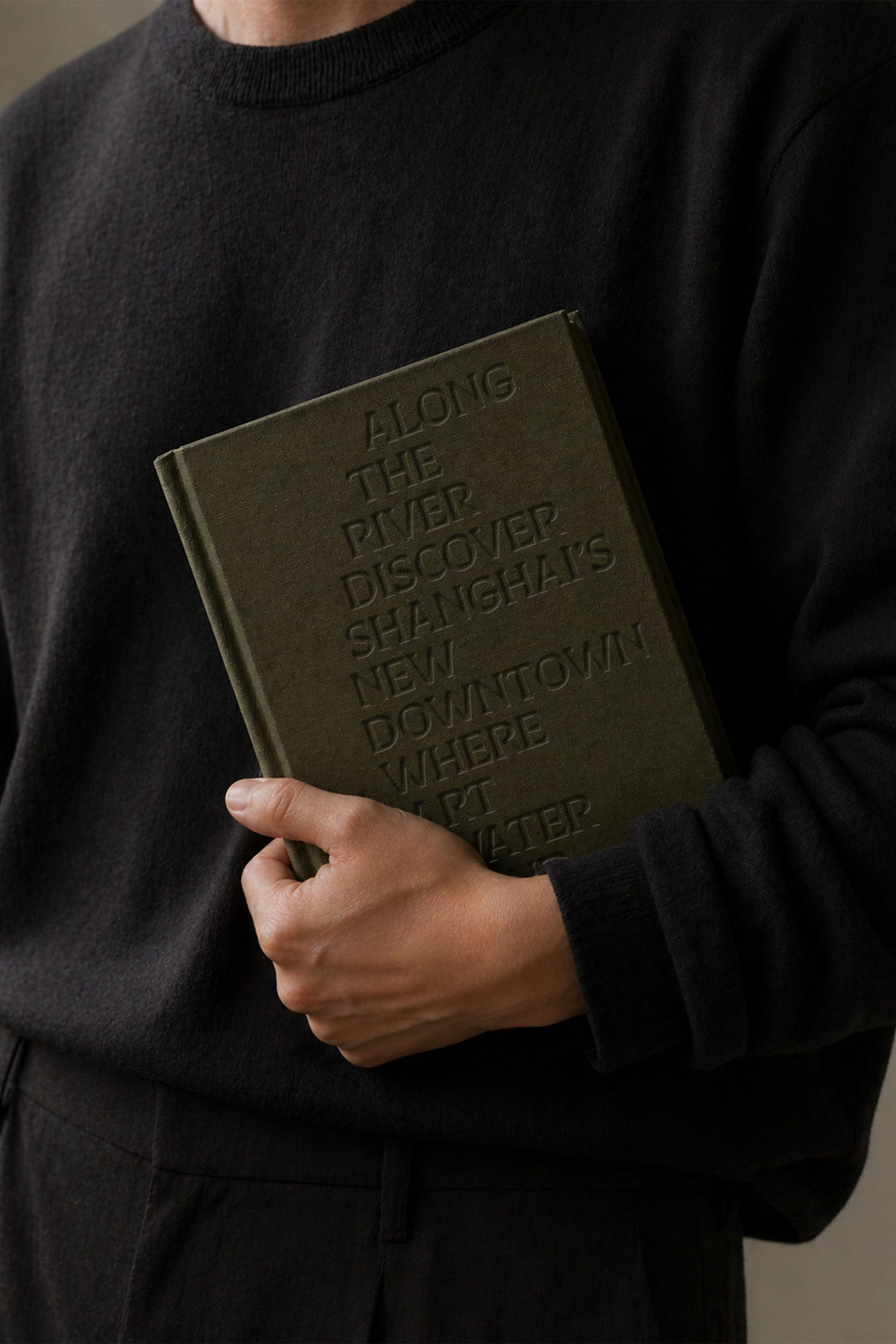
Shanghai’s new downtown
Westbund Central
Place brand
Shanghai’s new downtown
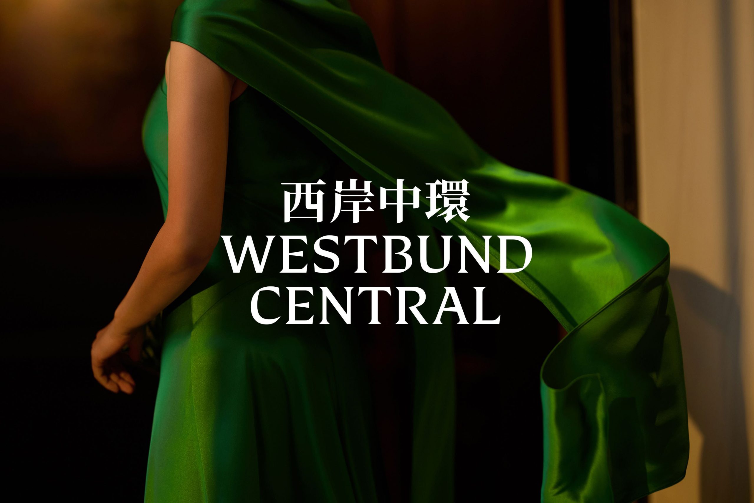
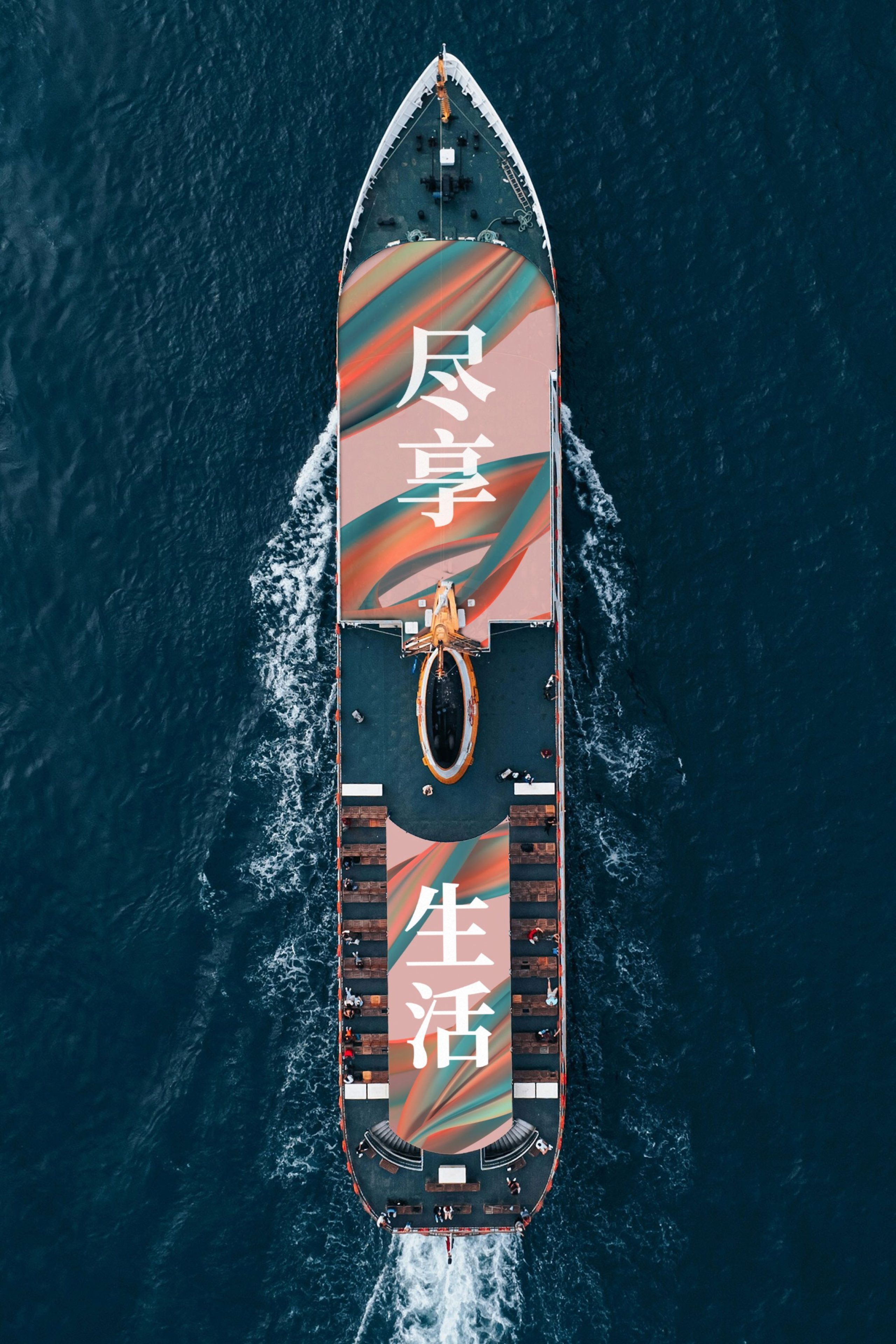
Westbund Central is Shanghai’s new downtown. At 18 million sq ft, our destination brand strategy answers the city’s relentless 996 culture with a prescient invitation to: ‘enjoy life’.
For Hongkong Land’s single largest investment, we led the mixed-use development branding and place naming for its five quarters, main avenue and four cultural venues.
Shanghai’s new downtown
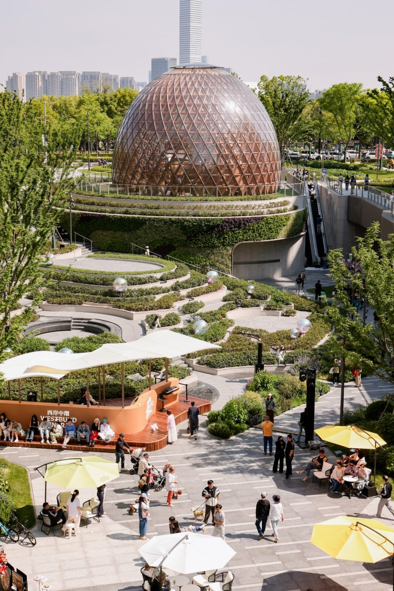
Spanning 18 million sq ft, Westbund Central rises at scale and ambition. 12 office buildings, 600 shopping and dining experiences, 1500 new homes, 2 hotels and a tapestry of parks, riverside trails and four new cultural venues. This is Asia’s largest commercial development currently underway, and Hongkong Land’s single largest investment in its history.
But scale alone doesn’t define a place. One question remains: what should Westbund Central be famous for? We were tasked with creating a place brand in Shanghai that captures what’s special and capable of achieving global recognition.
Antidote to the 996
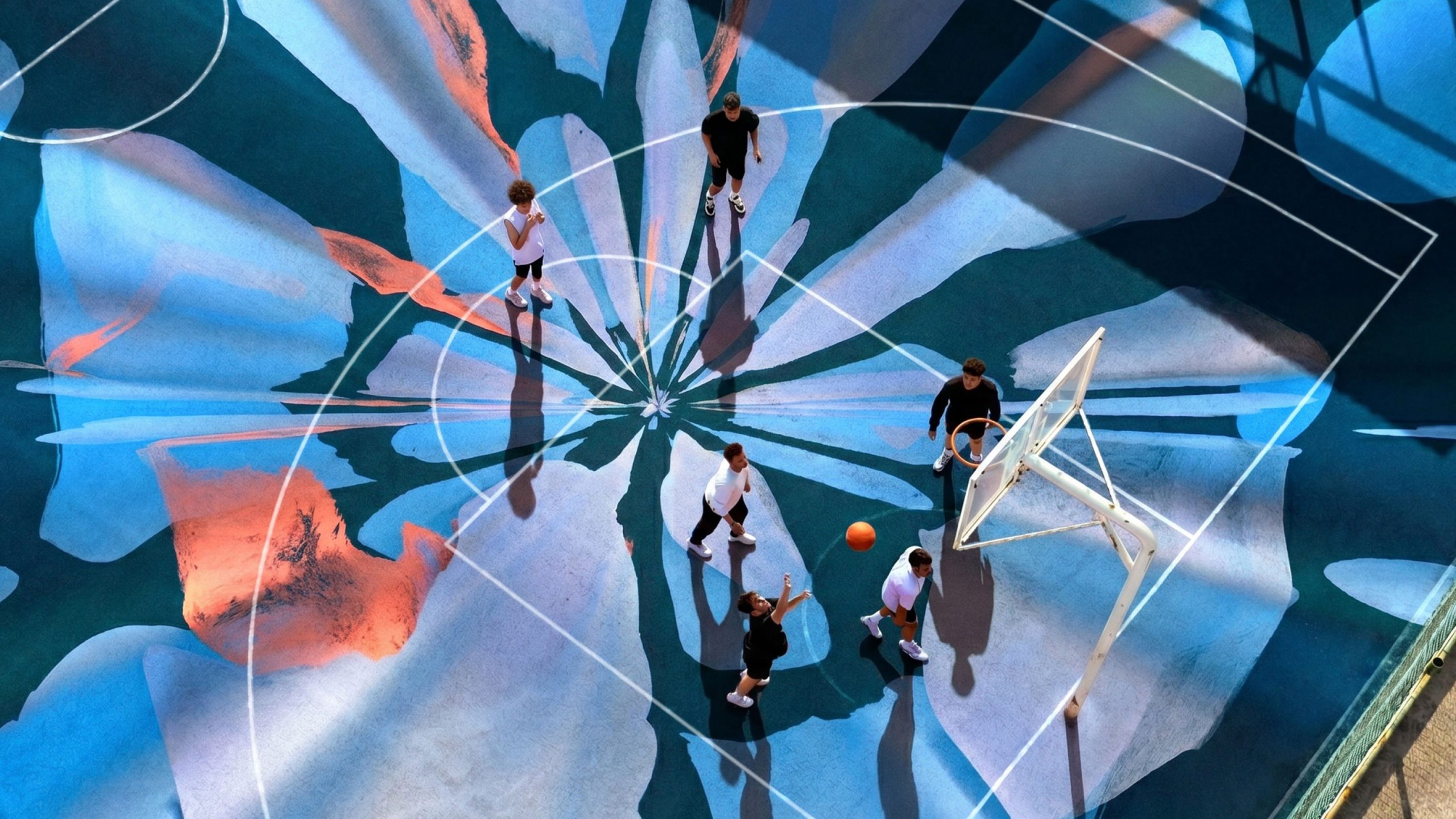
For years, the relentless 996 culture defined success. But the tide had begun to shift. Movements like ‘lying flat’ 躺平 or ‘involution’ 内卷 gained traction and signaled a desire to recalibrate.
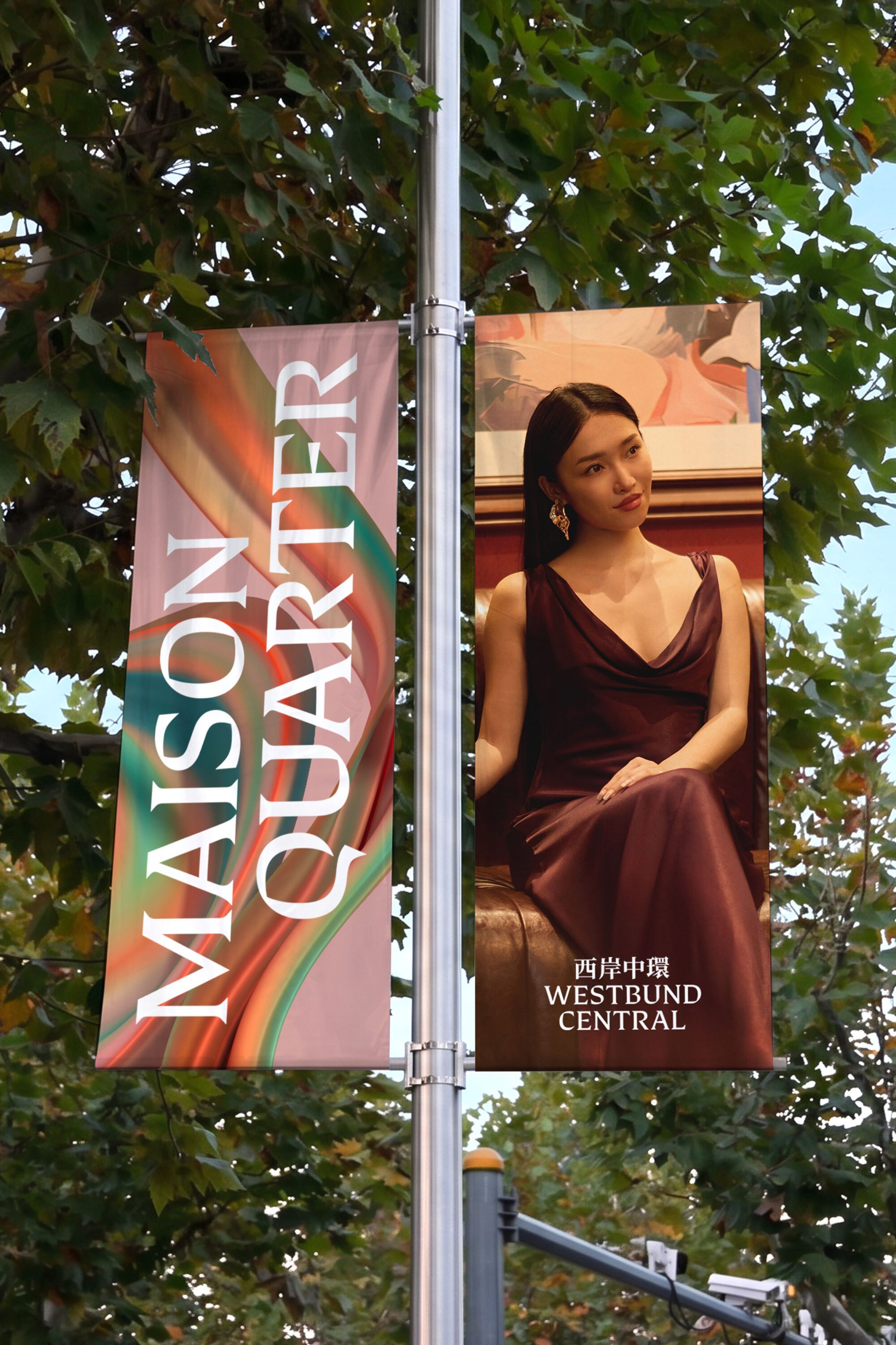
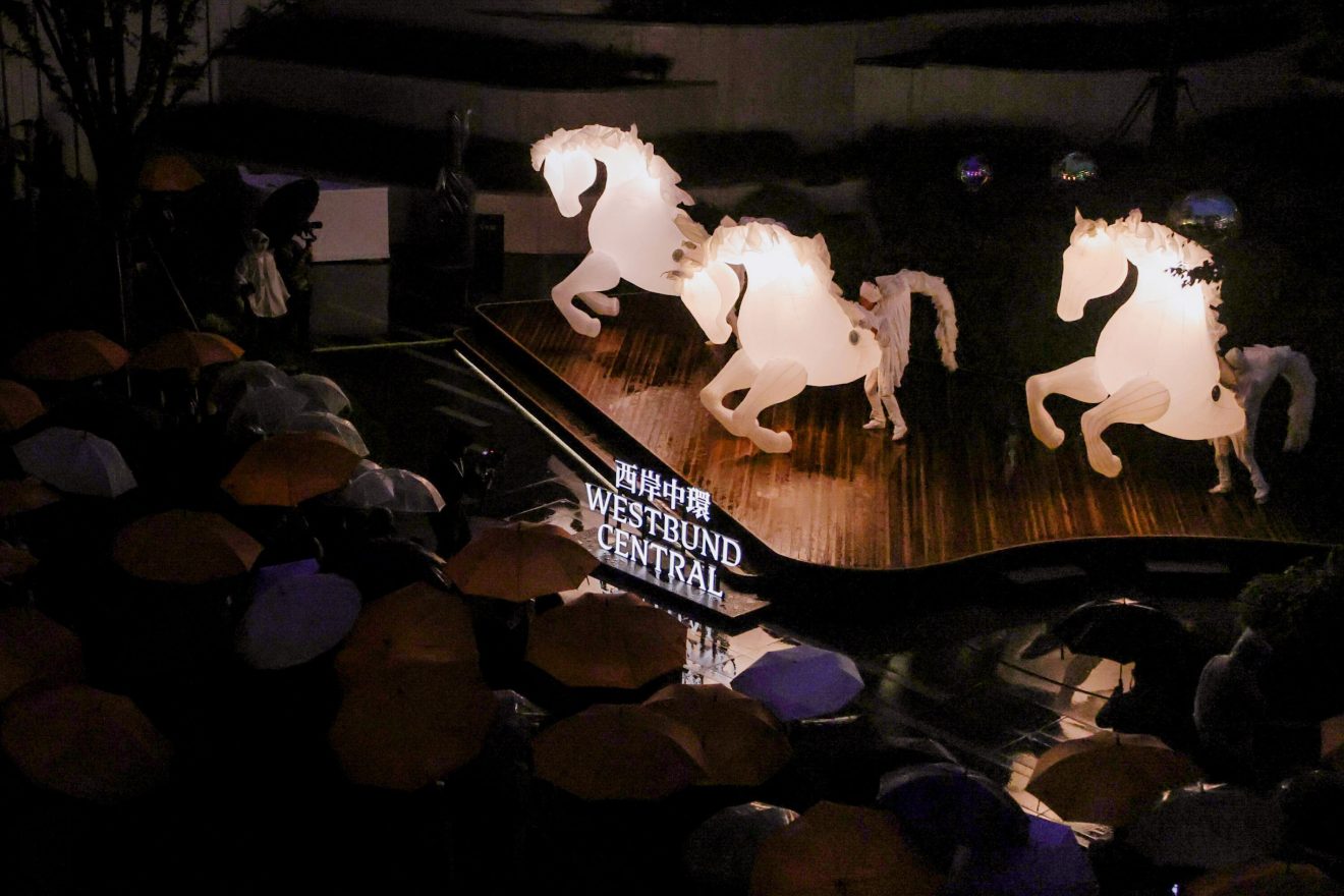
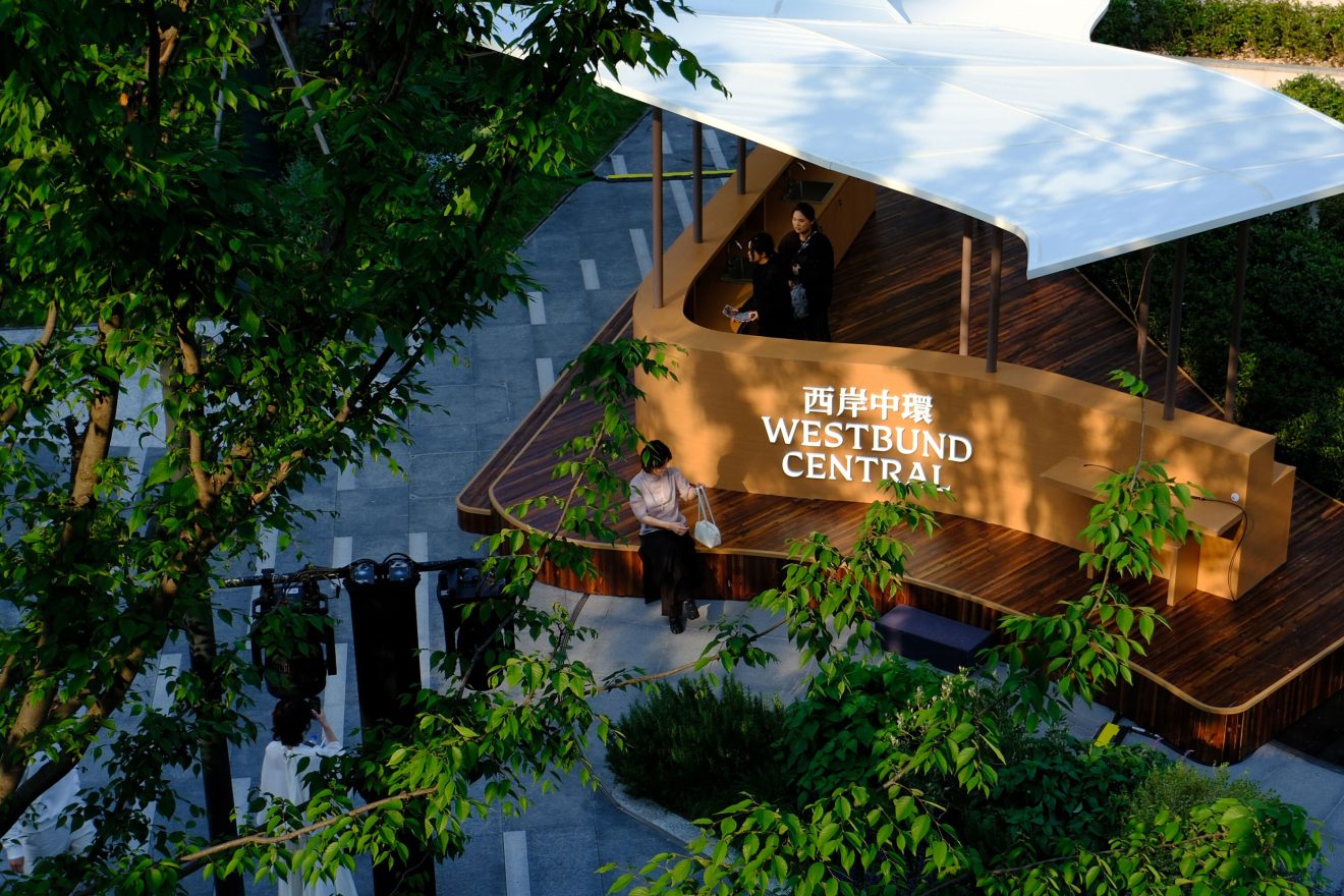
If Shanghai’s traditional CBDs represent the past, then Westbund Central offers a direct contrast. Here, people gather along tree-lined avenues, cycle on riverside trails, and immerse in awe-inspiring exhibitions and performances. We captured this new model in a simple, resonant idea: Enjoy life.
To capture the full story of Shanghai’s new downtown, we crafted a narrative and messaging framework, and named its five quarters, main avenue and various cultural venues.
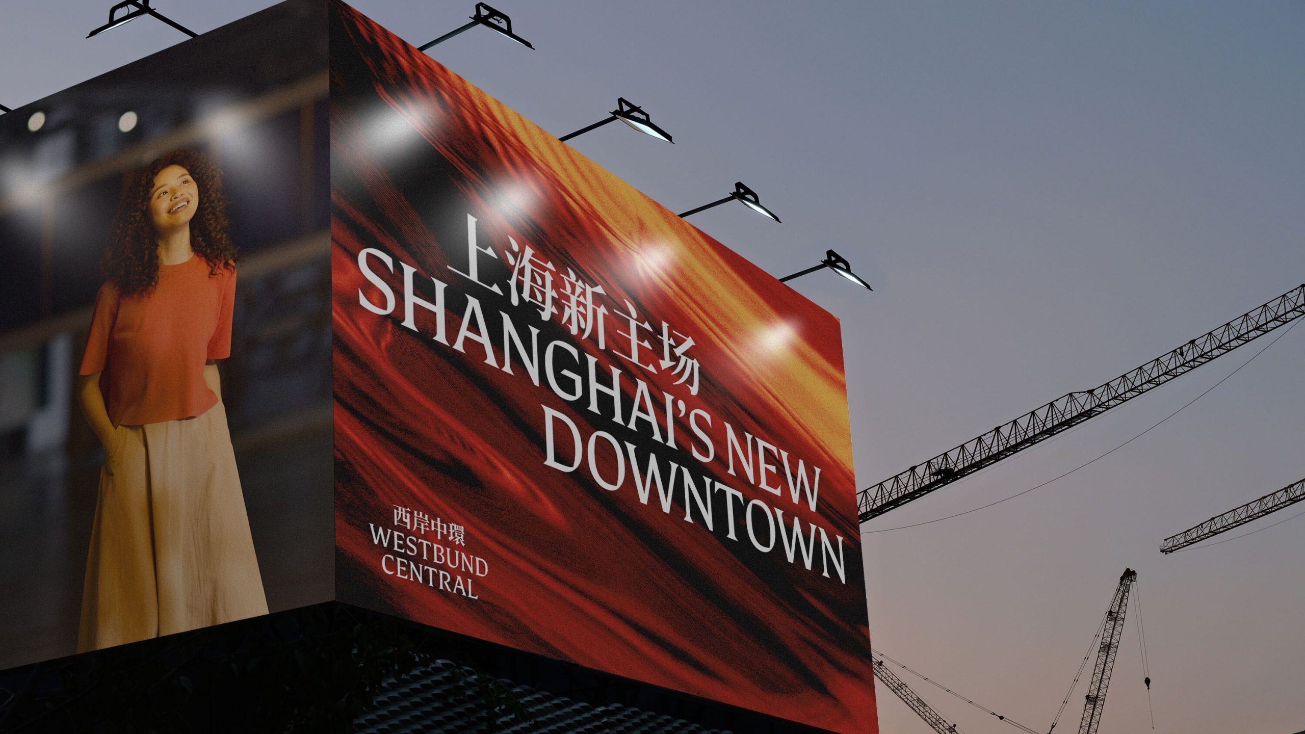
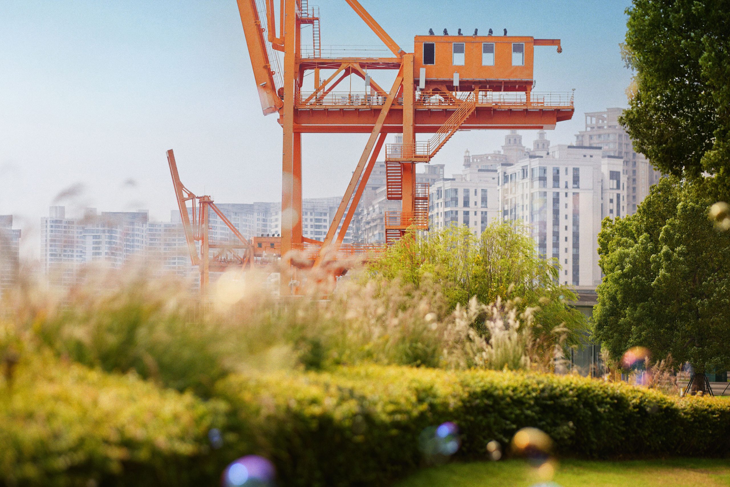
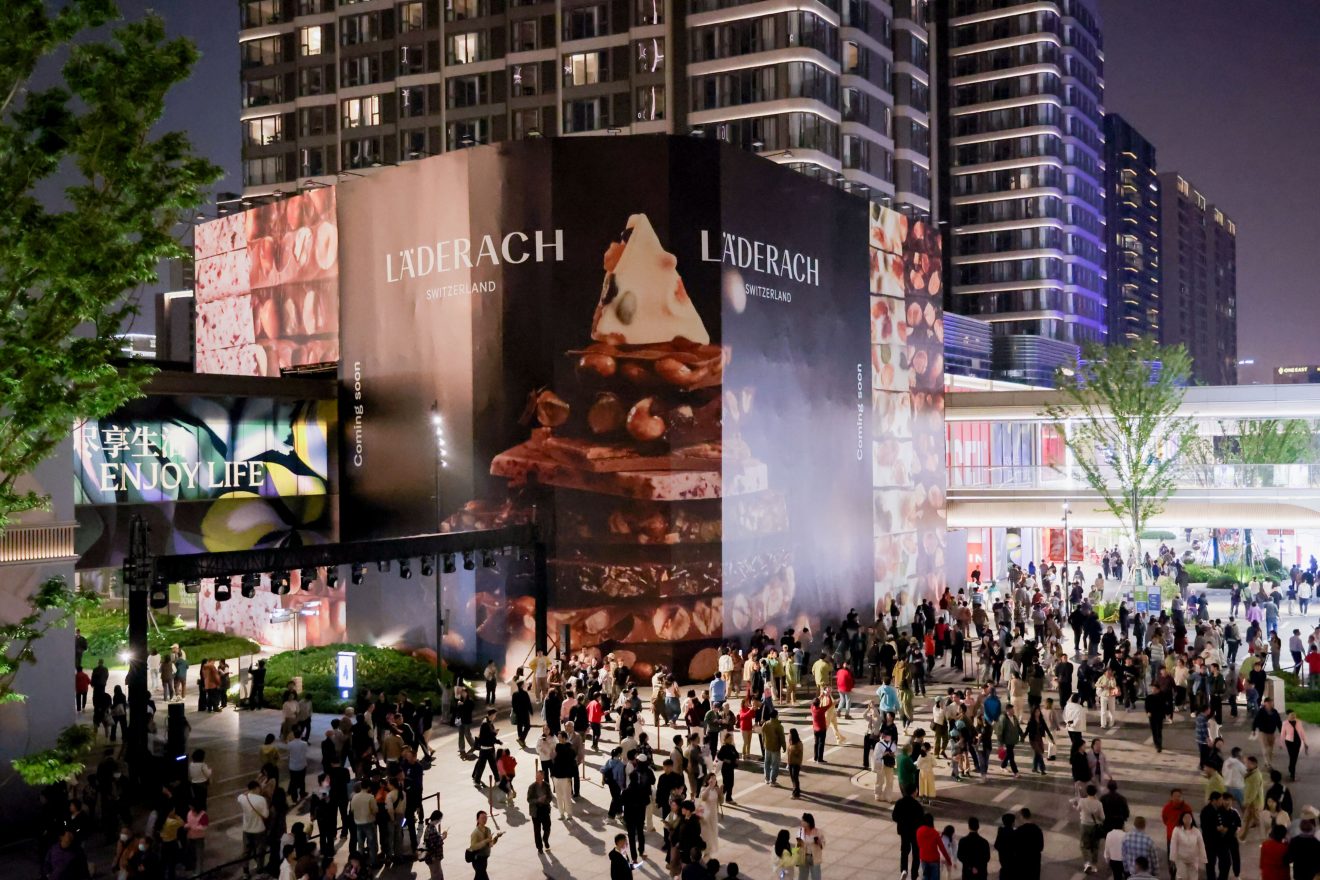
The Terrace Quarter in Westbund Central drew hundreds of thousands of visitors on the first weekend
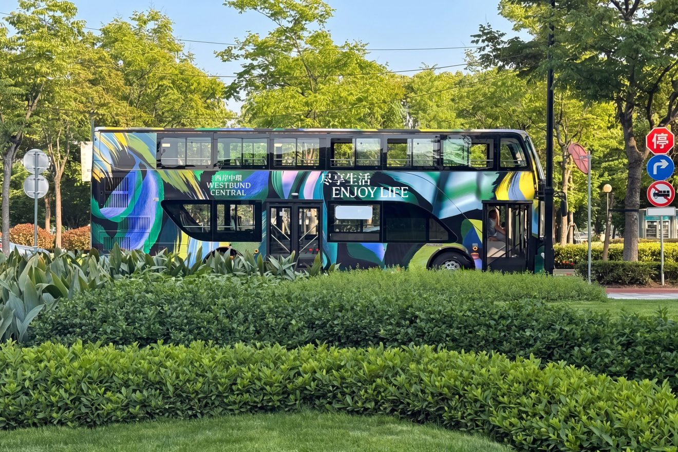
An identity that flows
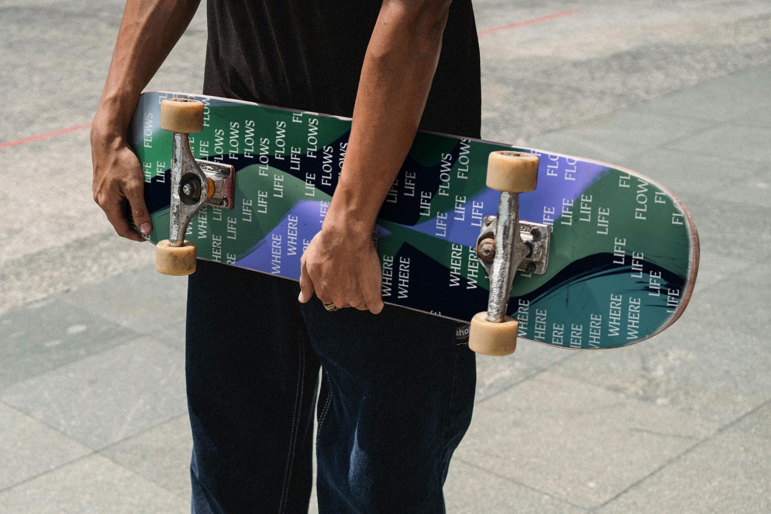
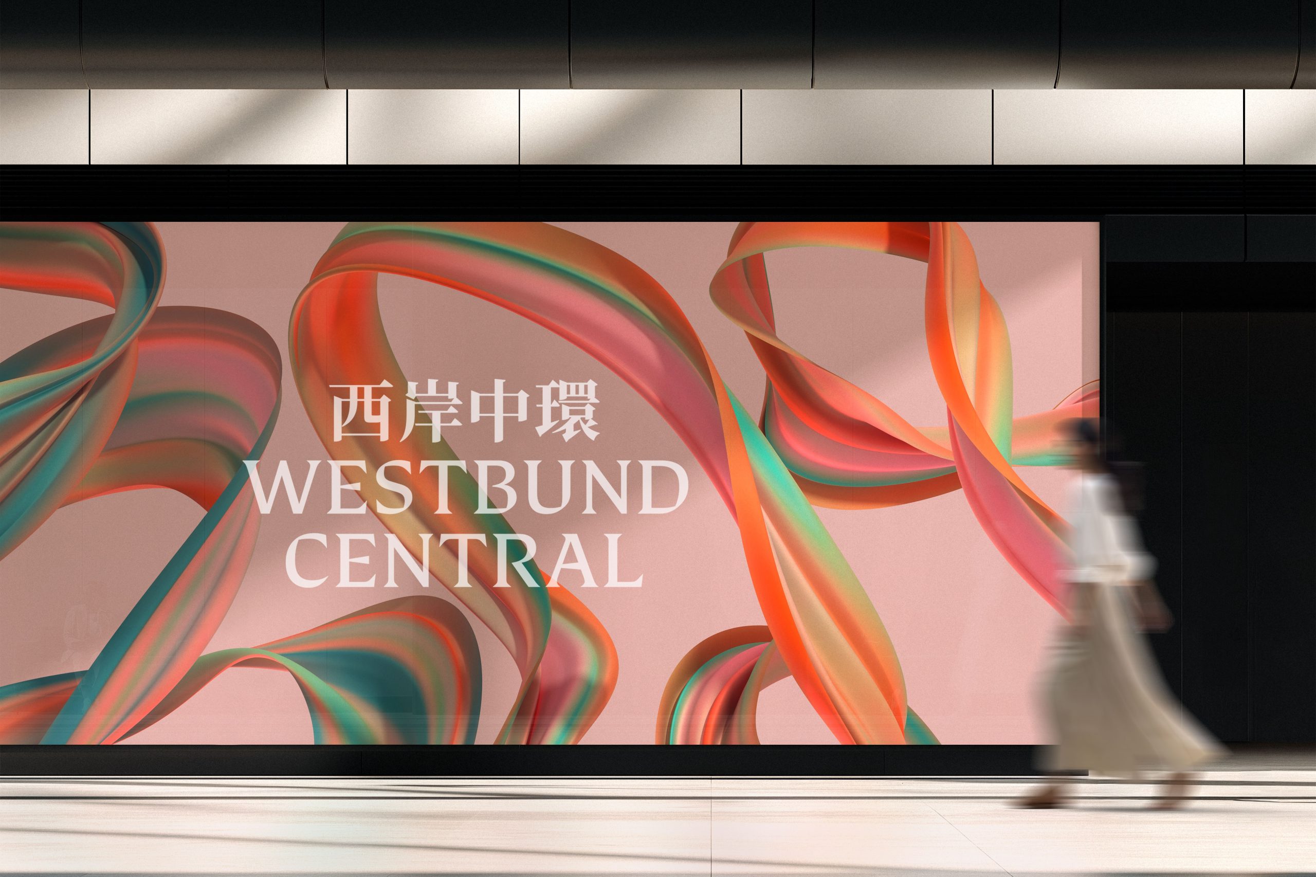
Flow became the organising principle of the identity — drawn from the movement of the Huangpu river, the rounded curves of the buildings and lush landscaping, and captures the sense of ease here at Westbund Central.
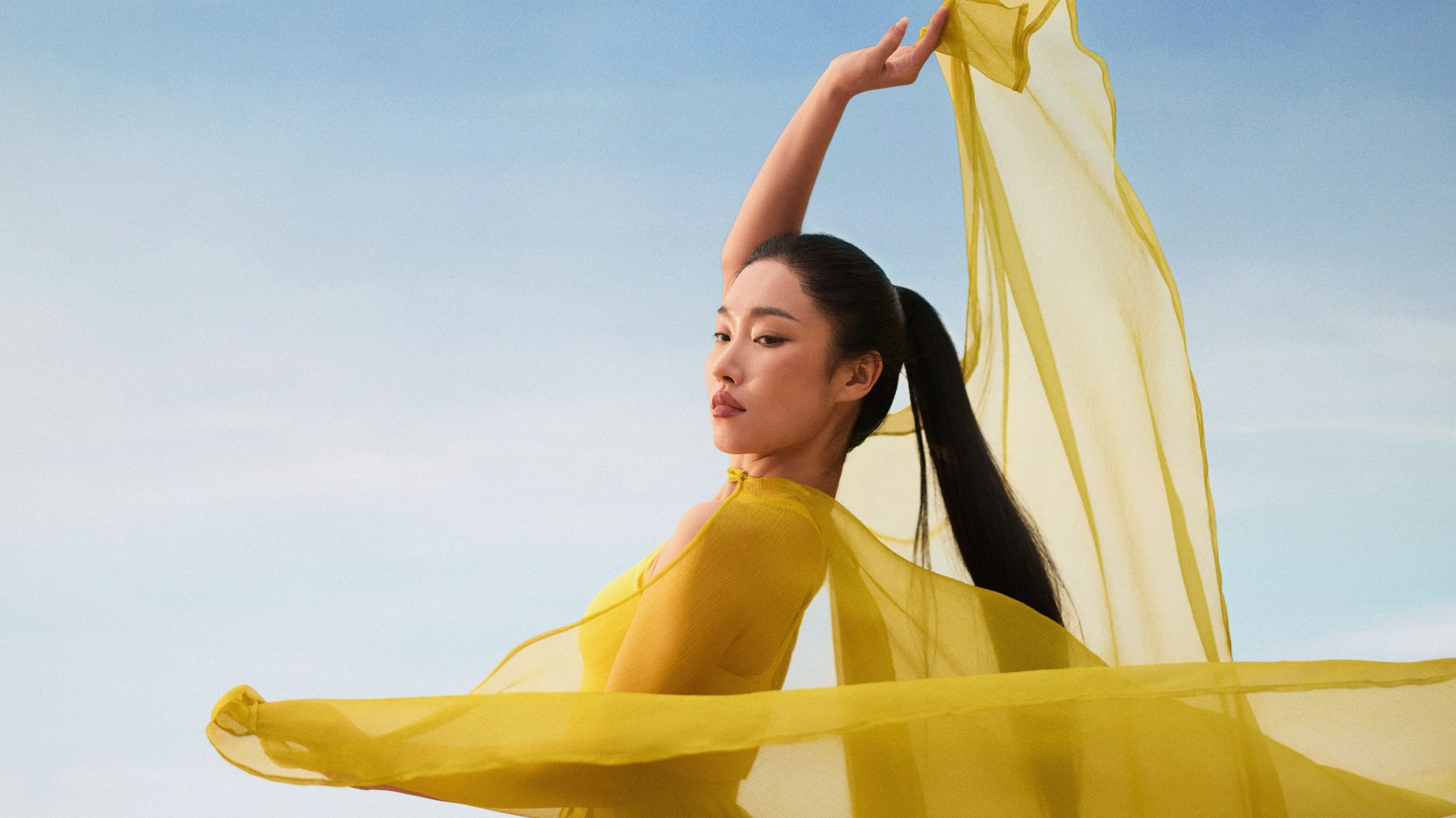
Typography drifts and settles, echoing the fluidity of water. Motion feels natural, never forced. Photographer Yuyang Liu was commissioned to find these qualities in the everyday — a ripple, a fold, a moment of stillness — images that reflect the environment itself.
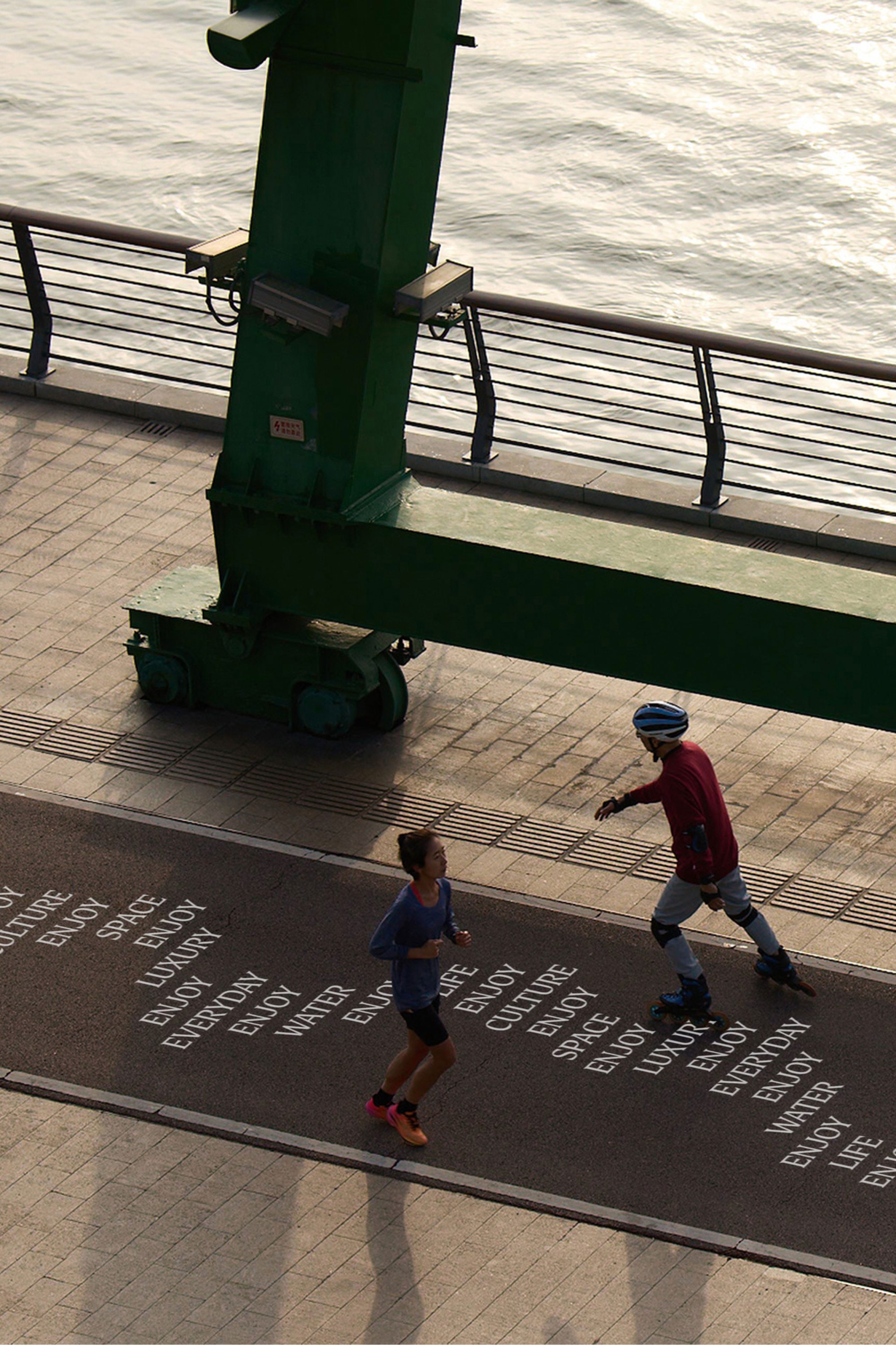
To deepen the visual language, Santtu Mustonen created a series of bespoke textures — each capturing a different energy within Westbund Central. From the calming water to blooming nature and cascading fabric — they add tactility and dynamism to the identity.
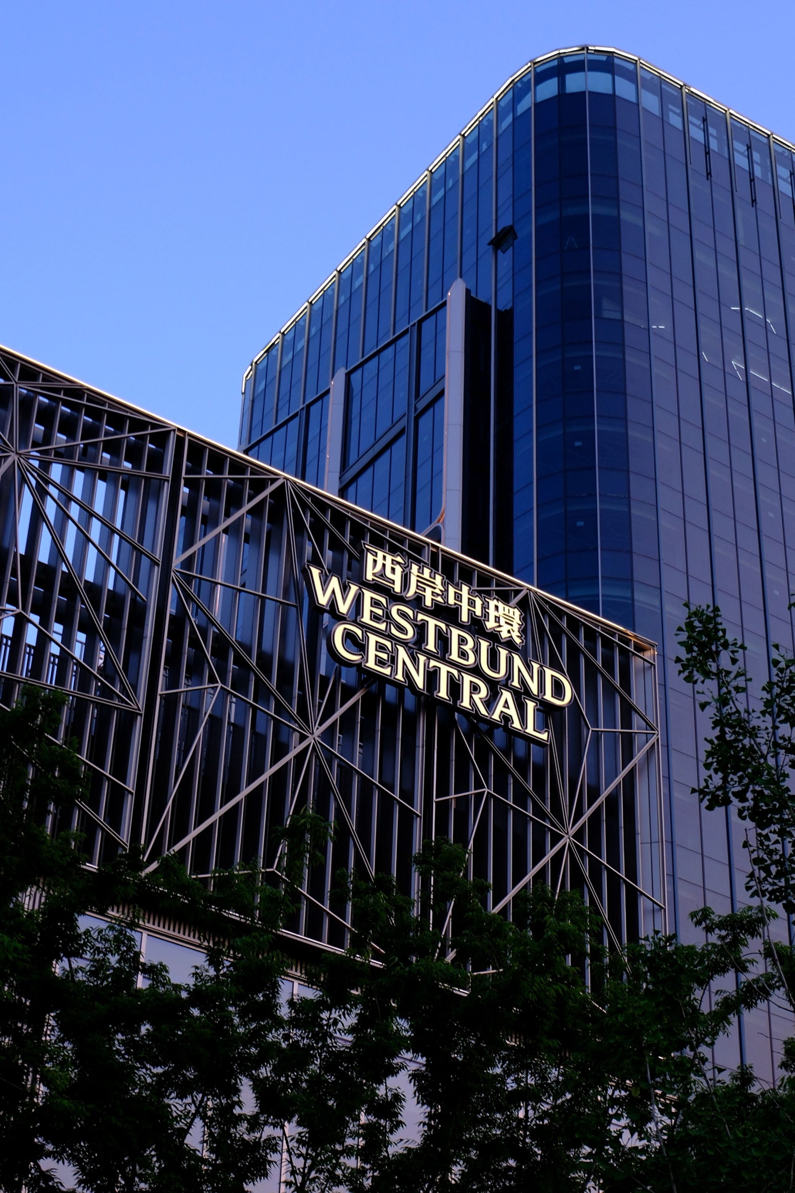
The wordmark balances precision and softness. Where the sharp serifs of Lock Serif meet the smooth curves of Noto, we further refined the mark to enhance a sense of movement in each letterform.
Designed to scale
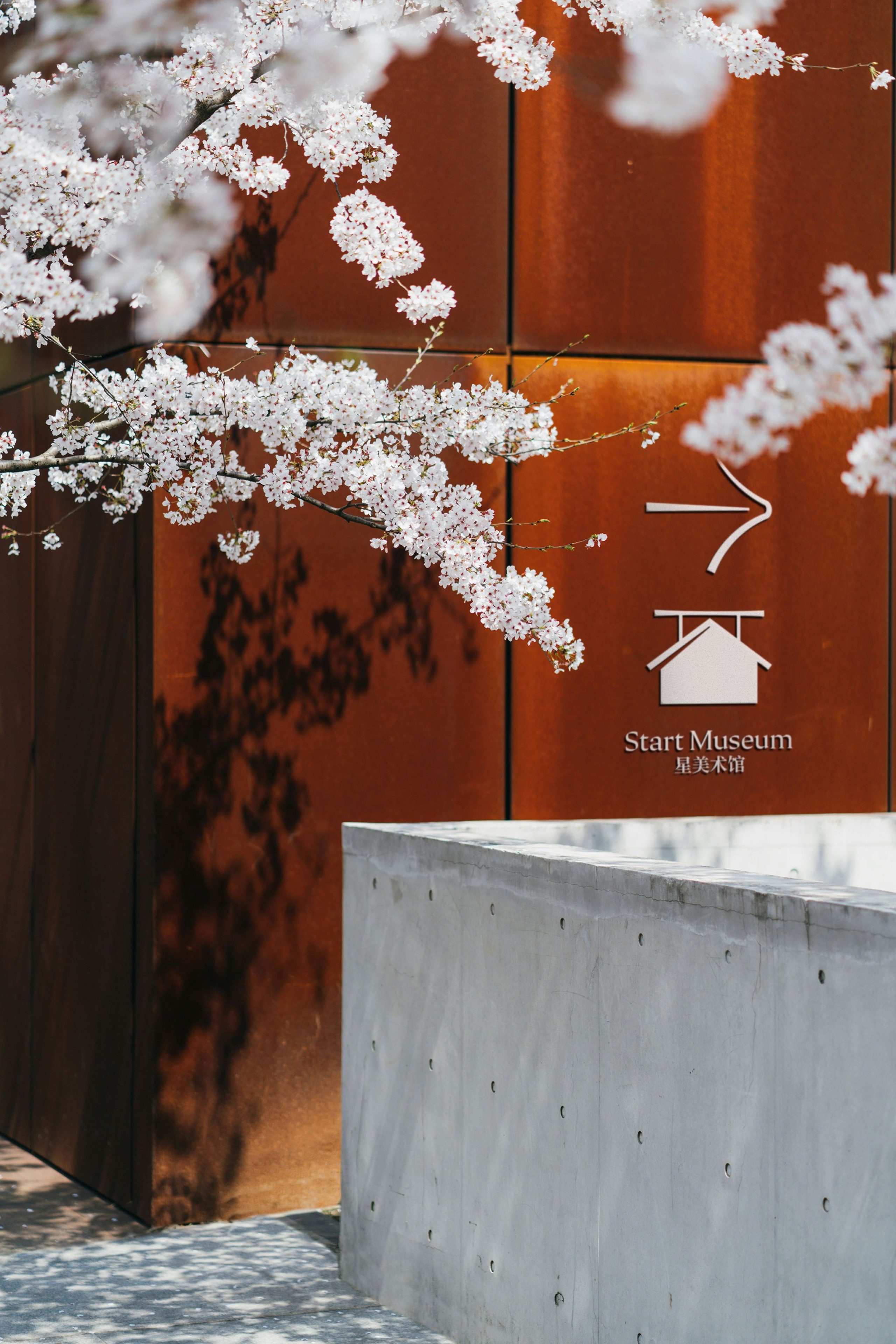
A comprehensive icon system — over 100 and growing — ensures clarity and consistency across digital WeChat miniprograms and physical signage. Simple, fluid and highly legible, the icons extend the language of flow into everyday interactions.
Westbund Central now carries a powerful brand that doubly serves as a leasing strategy. Leading luxury brands find a platform worthy of their cultural ambition, residents find a promise of an inspiring life, and business find a workplace story rooted in wellbeing — one that’s successfully attracted lululemon and Adidas to Westbund Central.
“A development of this magnitude and ambition in a market like Shanghai requires sophisticated positioning. DNCO has delivered a compelling narrative and place brand that perfectly taps into the mood and future of this world-leading city”
Stuart Grant
Chief Executive, Westbund Central