The Francis Crick Institute
Exhibition
Making sense of the enigma
The Francis Crick Institute
Exhibition
Making sense of the enigma

Cancer. A household word loaded with associations. A disease that one in two of us will develop in our lifetime. The Crick wanted to showcase their unprecedented insights in a first-of-its-kind exhibition focused purely on the science.
We were tasked with naming the exhibition and giving it a visual identity that would engage people with the incredible progress being made
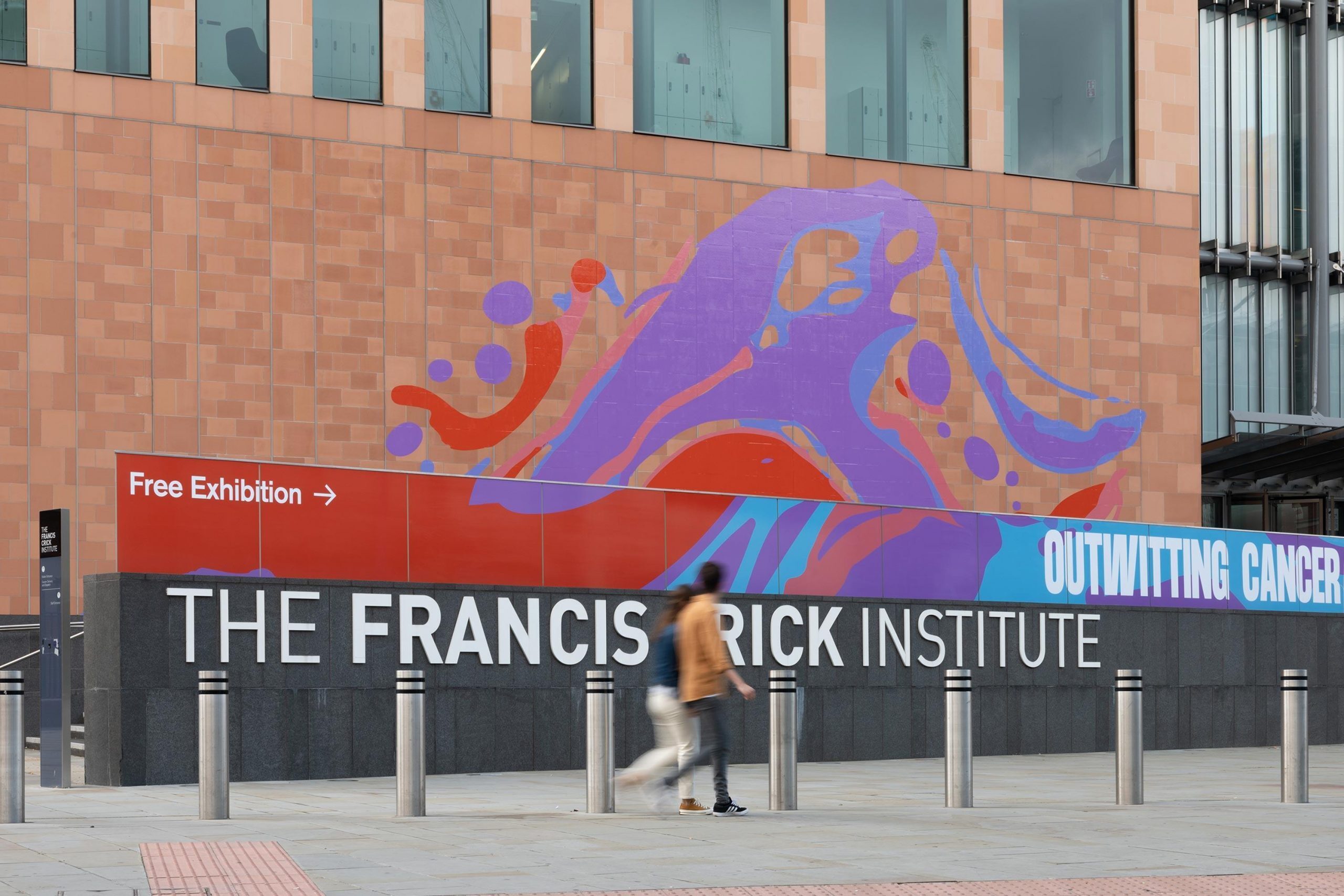
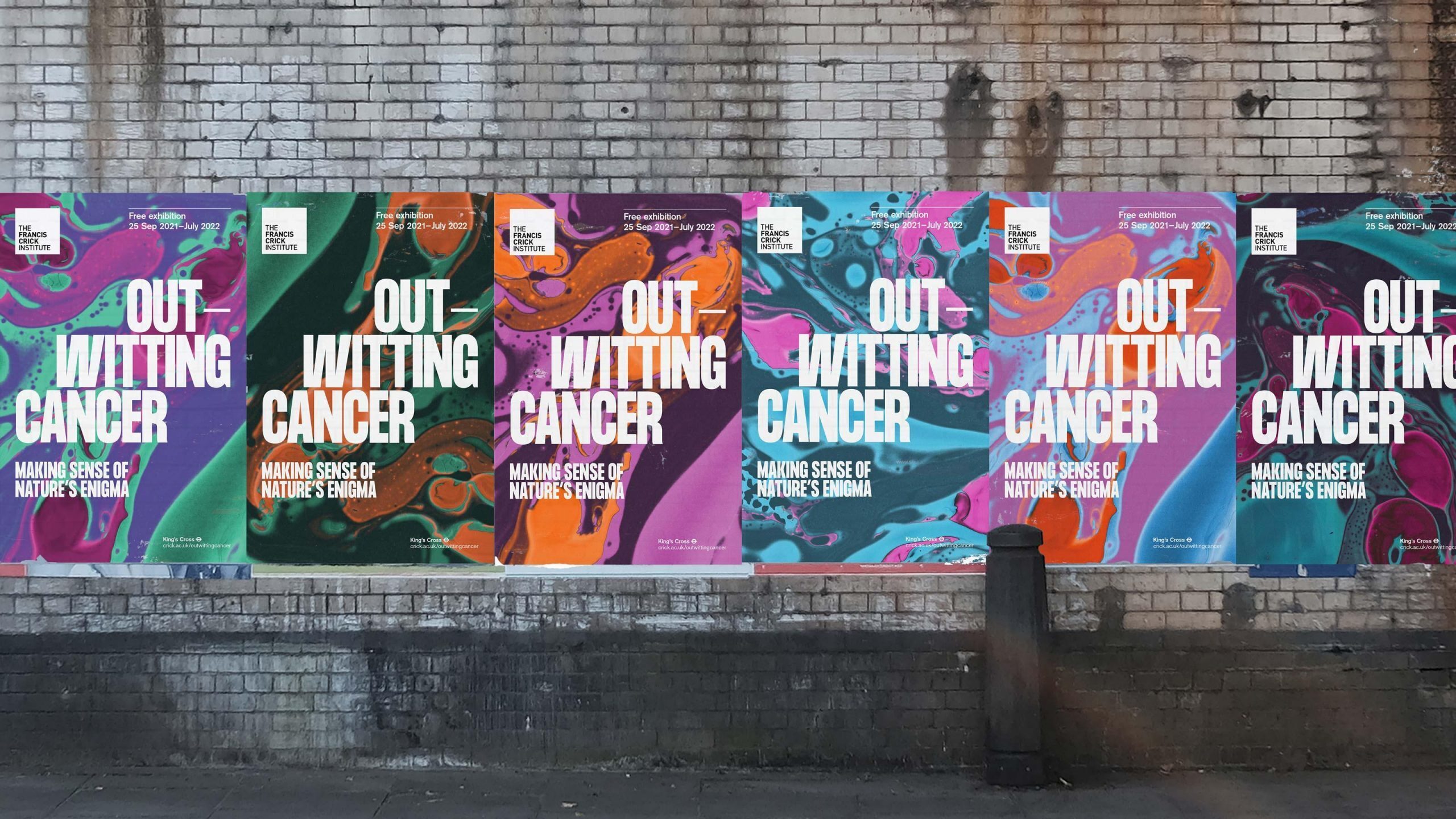
Outwitting cancer
While much of the language around cancer is emotive, this exhibition is a showcase for optimism thanks to world-class biomedical research, unprecedented insights, and science that is constantly evolving and progressing.
Through engagement with patient groups we captured the sense of good news being heralded in the exhibition’s name and strapline — Outwitting Cancer: Making sense of nature’s enigma.
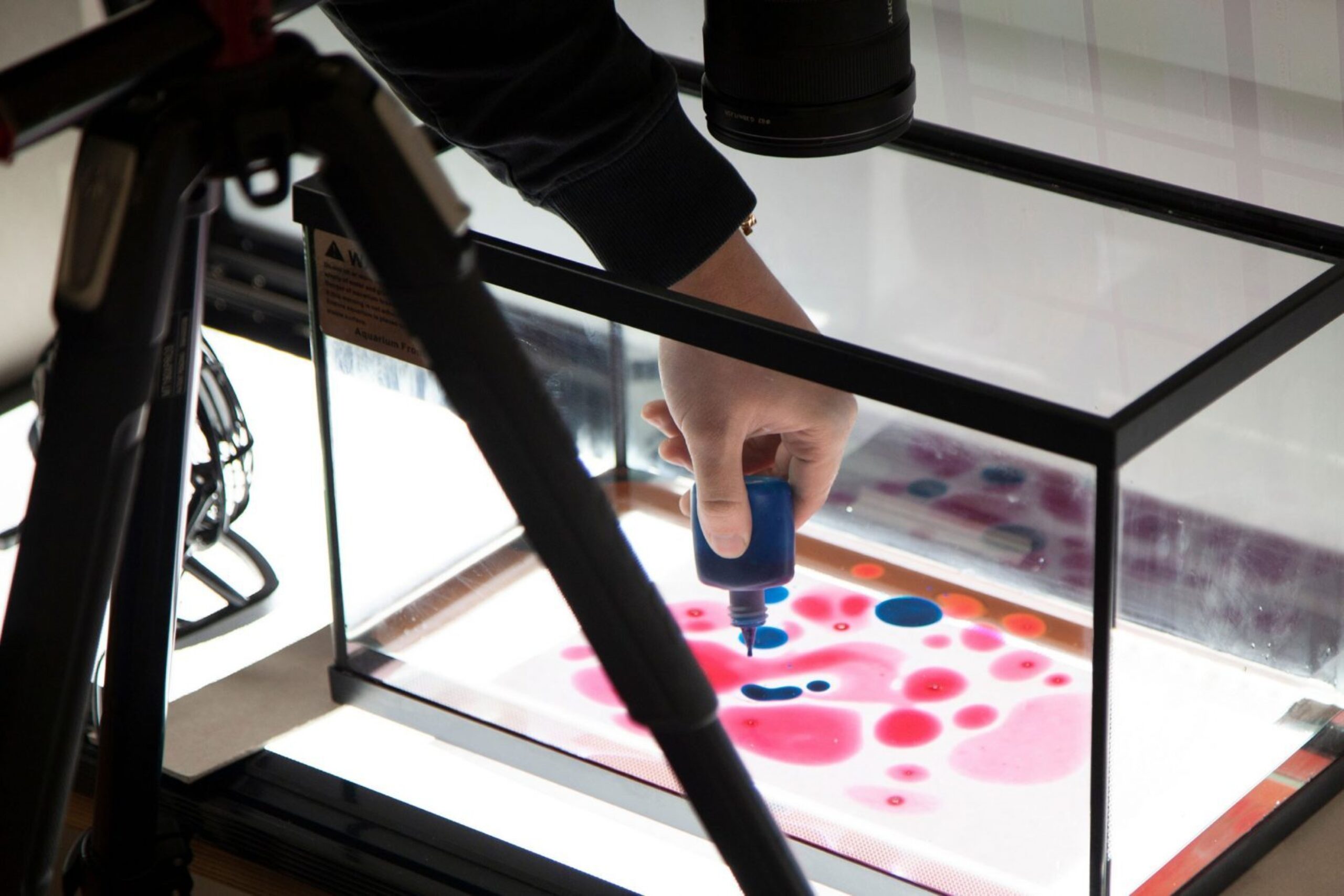
Making the invisible visible
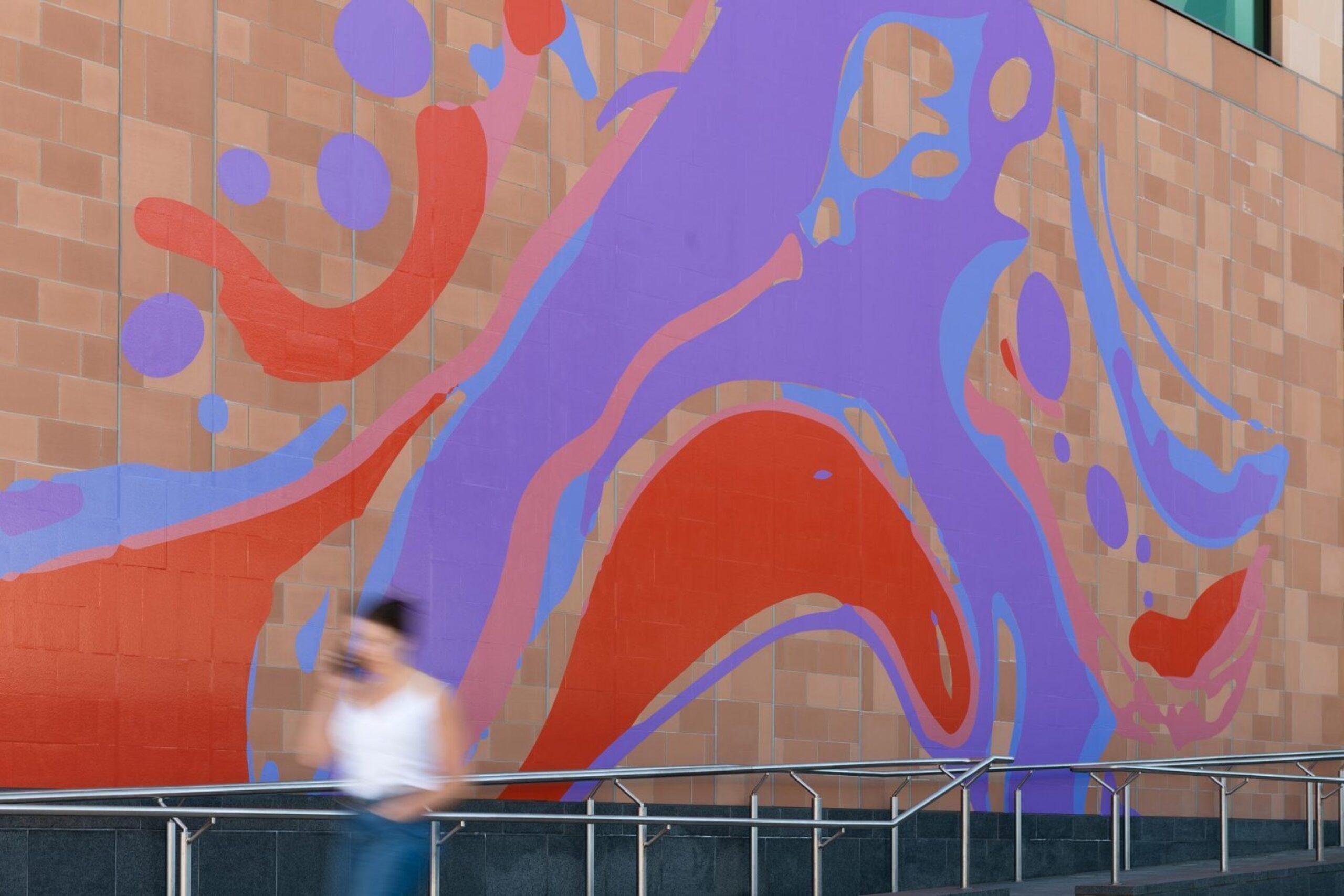
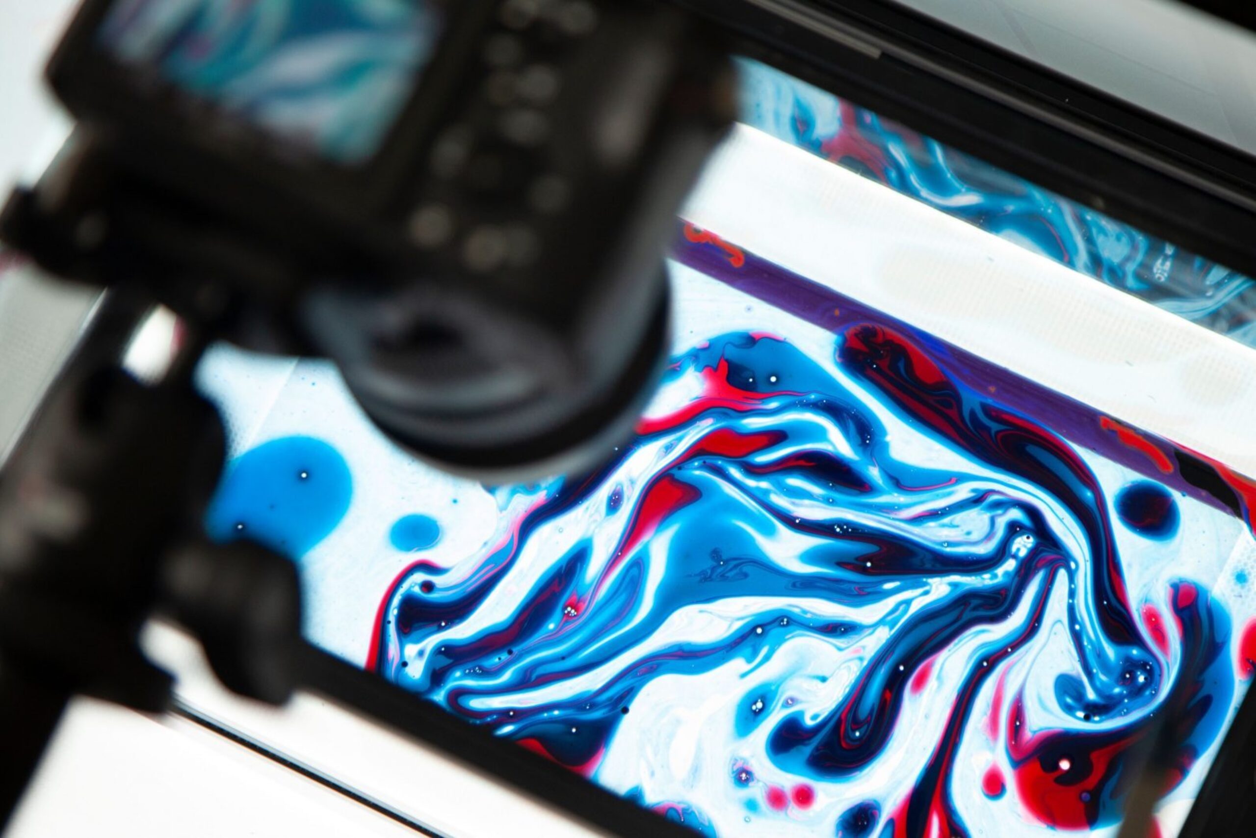
Bright contrasting colours swirled together in marbled inks gave the exhibition a striking visual identity. We took the ‘public health messaging’ colours of blue and white and added a pop of colour — orange and pink — to catch the eye and convey a sense of the excitement and creativity present in the science.
The curls and ovals of the marbling created an abstract representation that also suggested movement and change, as well as being symbolic of histology and cell structures without being diagrammatic.
A moving language
The marbling, combined with the dynamic condensed and expanded typography created a design language that worked on a variety of platforms — from banner ads, through to billboard posters, and a wraparound on the exterior facade of the Francis Crick Institute itself — sweeping, soaring, and hopeful.