Notting Hill Place
Place brand
The neighbourhood workplace
Notting Hill Place
Place brand
The neighbourhood workplace
Notting Hill Place is a rare office development in one of London’s most famous neighbourhoods. We crafted an elegant workplace brand strategy and naming, positioning it as: ‘the neighbourhood workplace’.
Work with a Notting Hill lifestyle
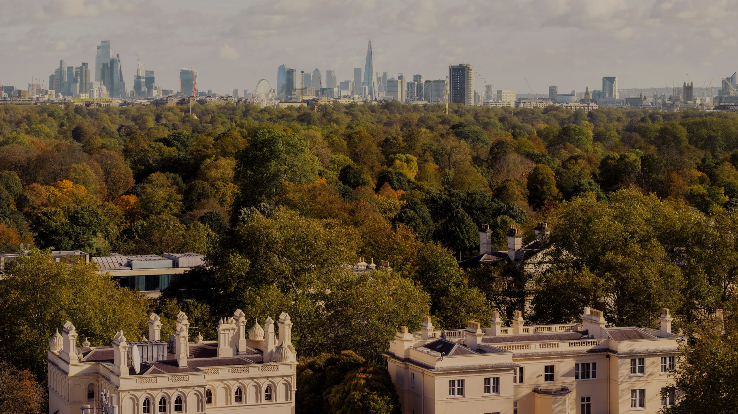
Defined by rows of pastel townhouses, boutiques and a buzzy restaurant scene, for many of us Notting Hill represents the picture-perfect postcard version of London. Our brief was to shift the dial from non-work to the high-end business’ choice.
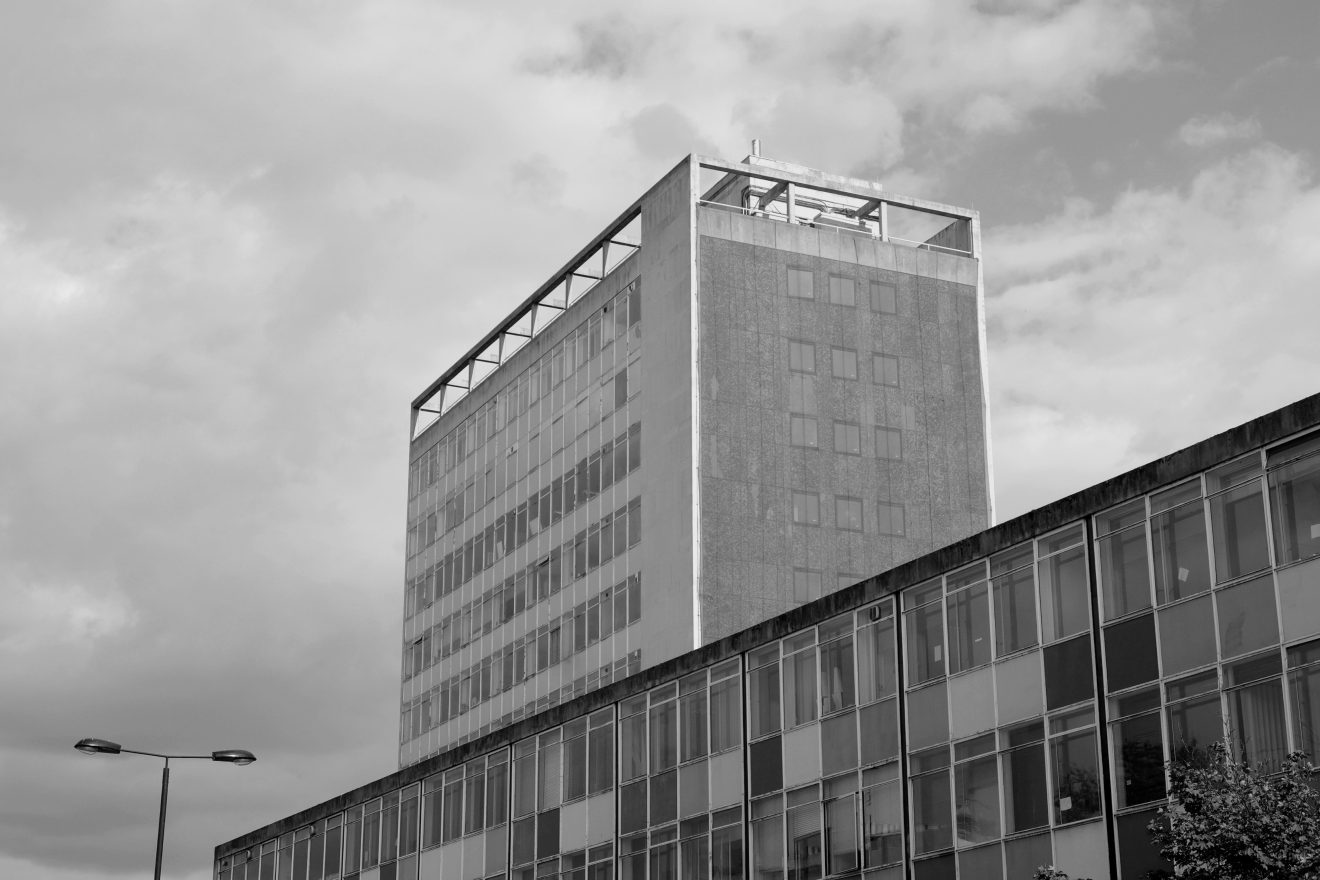
Our strategy was to tap into a universal truth: businesses don’t just choose an office, they choose a neighbourhood. We positioned the two buildings — a rare 15-storey tower and a characterful building with arched colonnades — as ‘the neighbourhood workplace’. It is designed for a heightened experience for talent, where business is rooted in inspiration and led by natural interaction.

Capturing the art and elegance of the neighbourhood
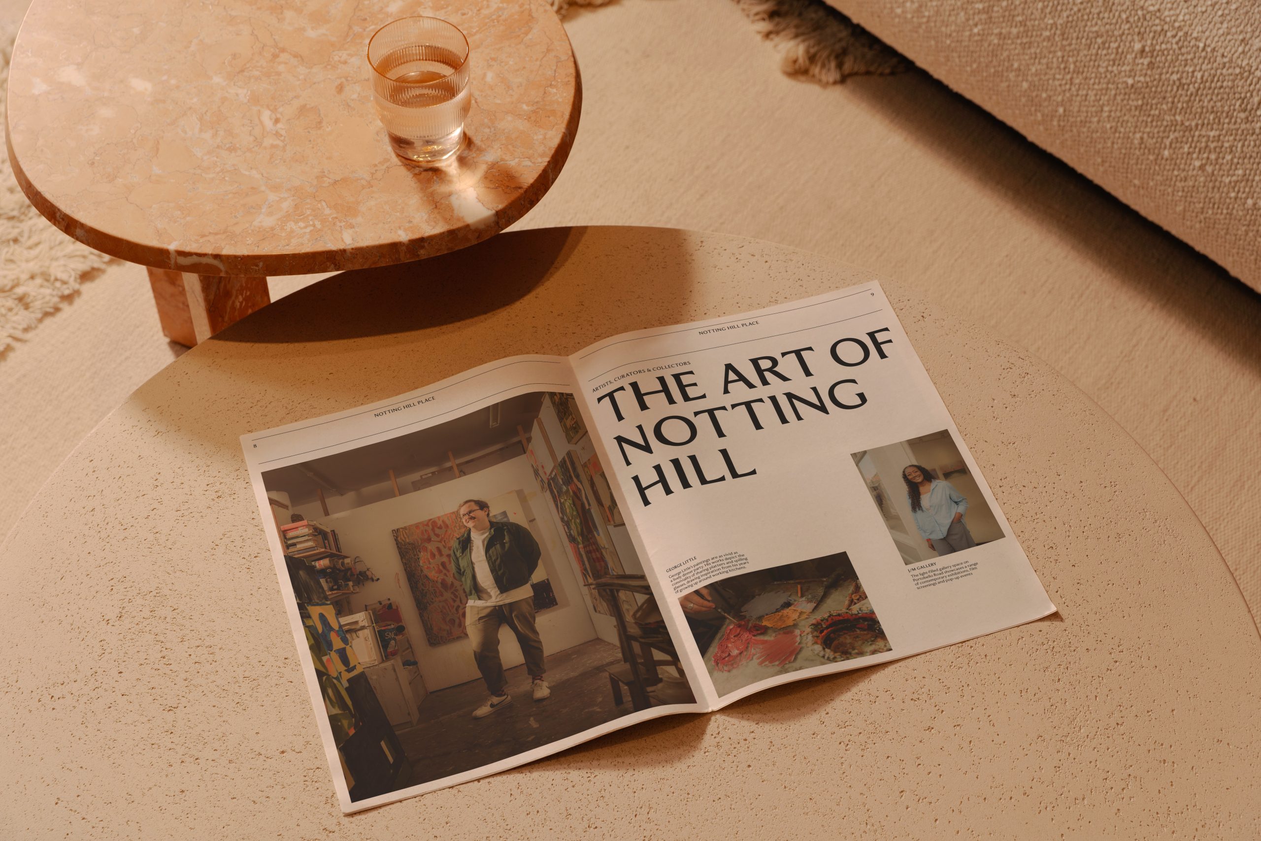
Our place branding for Notting Hill seeks to capture the sophistication and unpretentious charm of the neighbourhood. Editorial-style photography by Max Miechowski basks in the warm glow of natural light, and captures the ease and elegance of what a day in Notting Hill would look like.

Sculptural identity shaped by both past and future
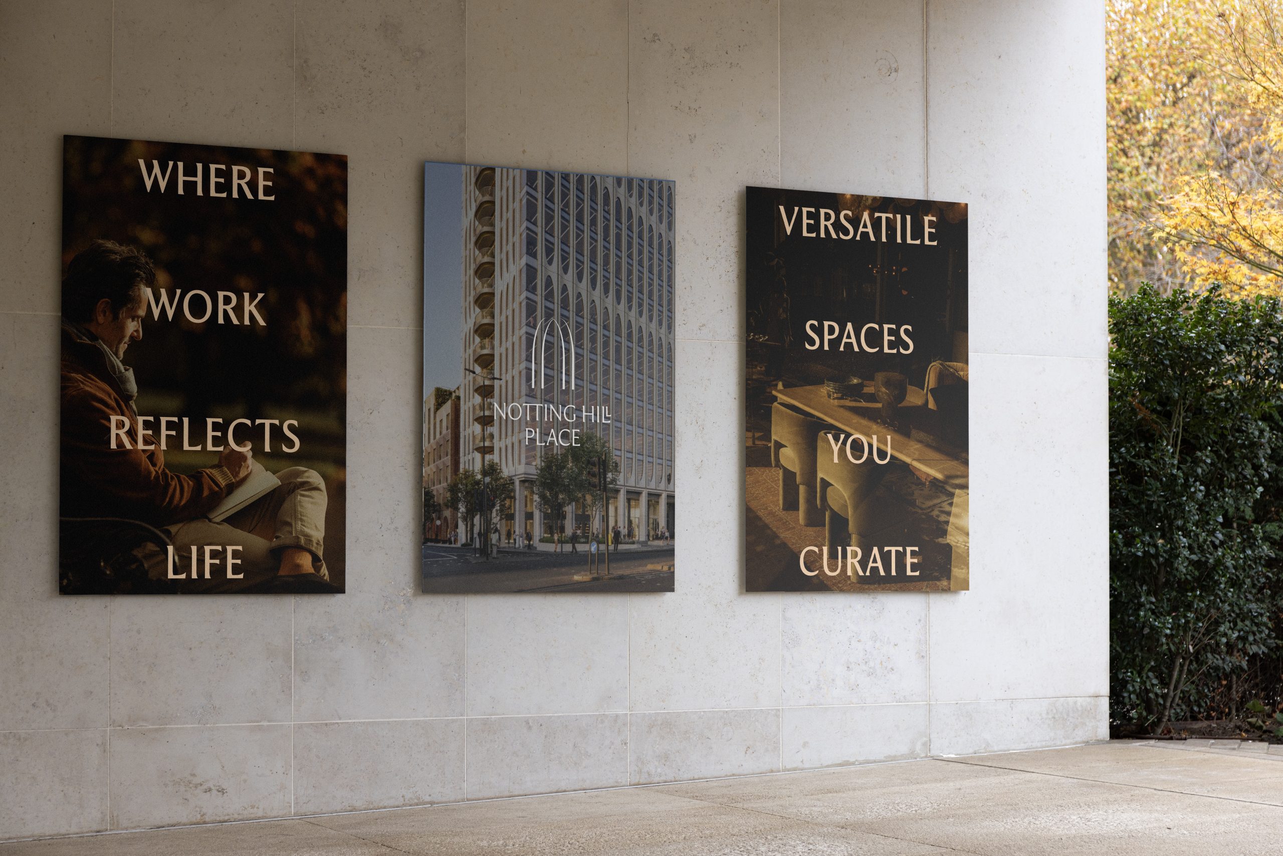
We designed a marque inspired by the tower’s mid-century modern architecture by Squire and Partners, and a nod to the historic Notting Hill gate that once stood on site. The marque expands into framing devices for more energetic expressions.
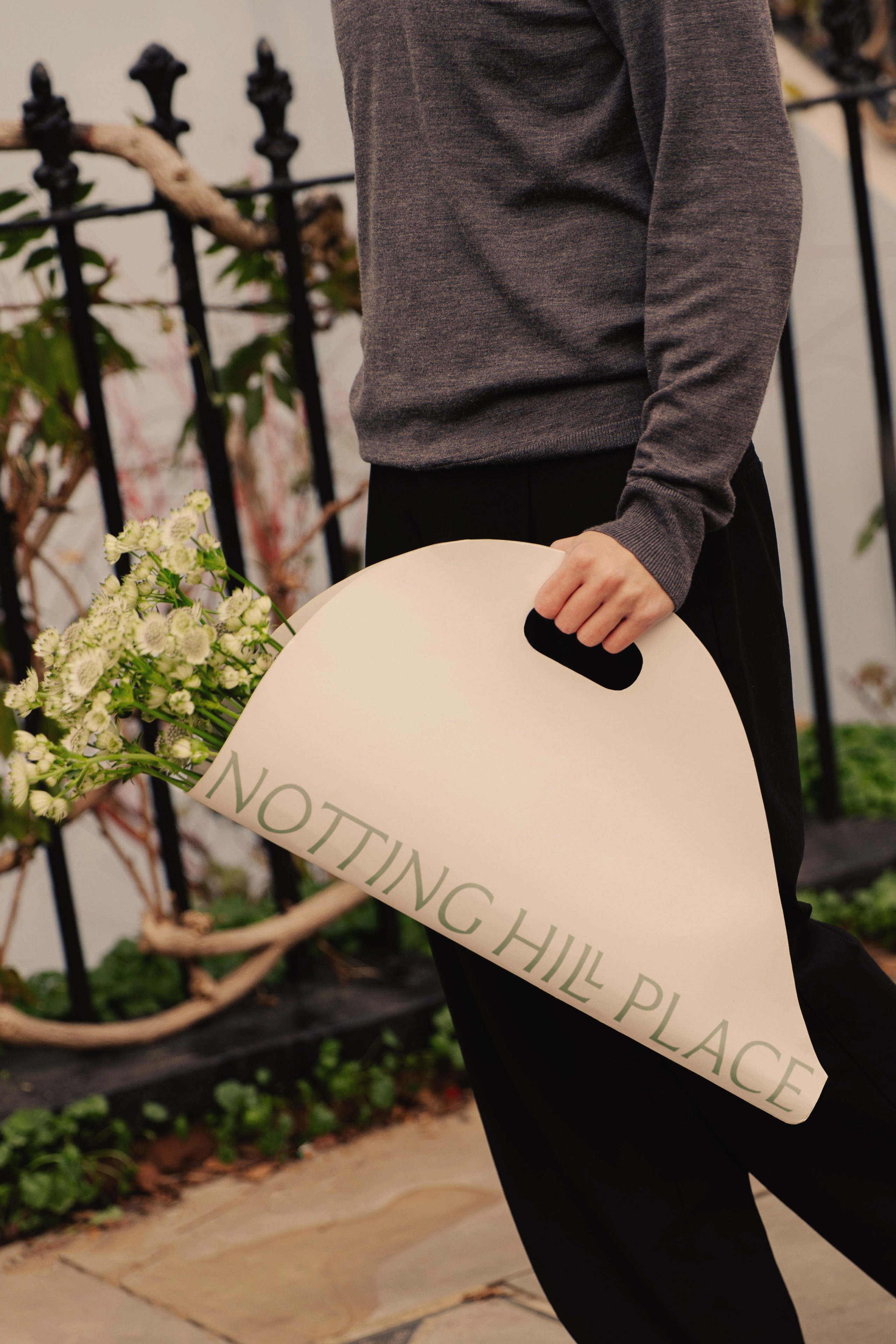
Our chosen typeface, Moulin, with its curved terminals and sculptural forms, brings an elegance to the identity, while the refined ligatures echo the marque and level of craftsmanship evidenced in the building.
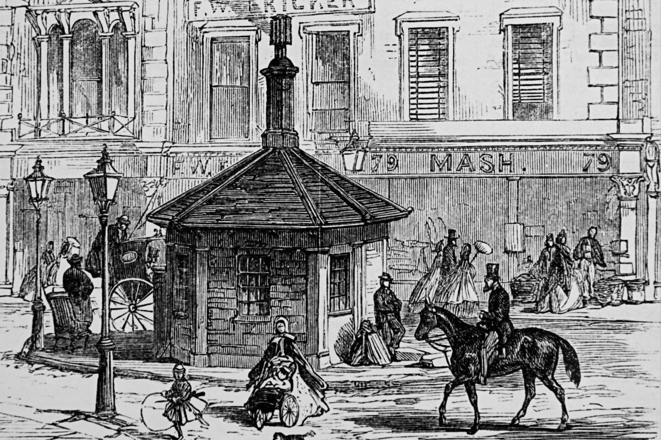
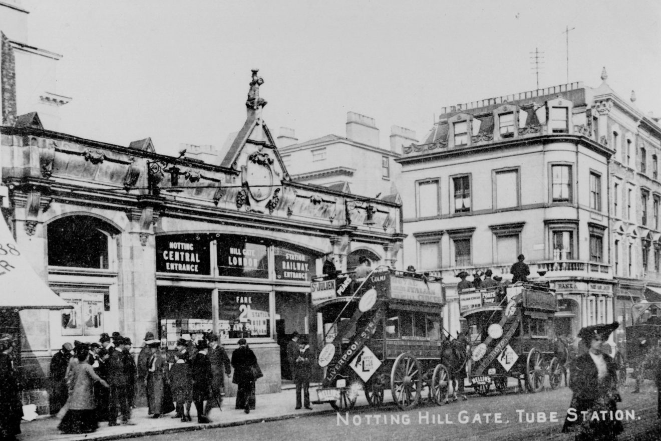
Inspired by history
The gate in Notting Hill Gate comes from a turnpike gate that used to stand there — a predecessor to the modern-day tollgate
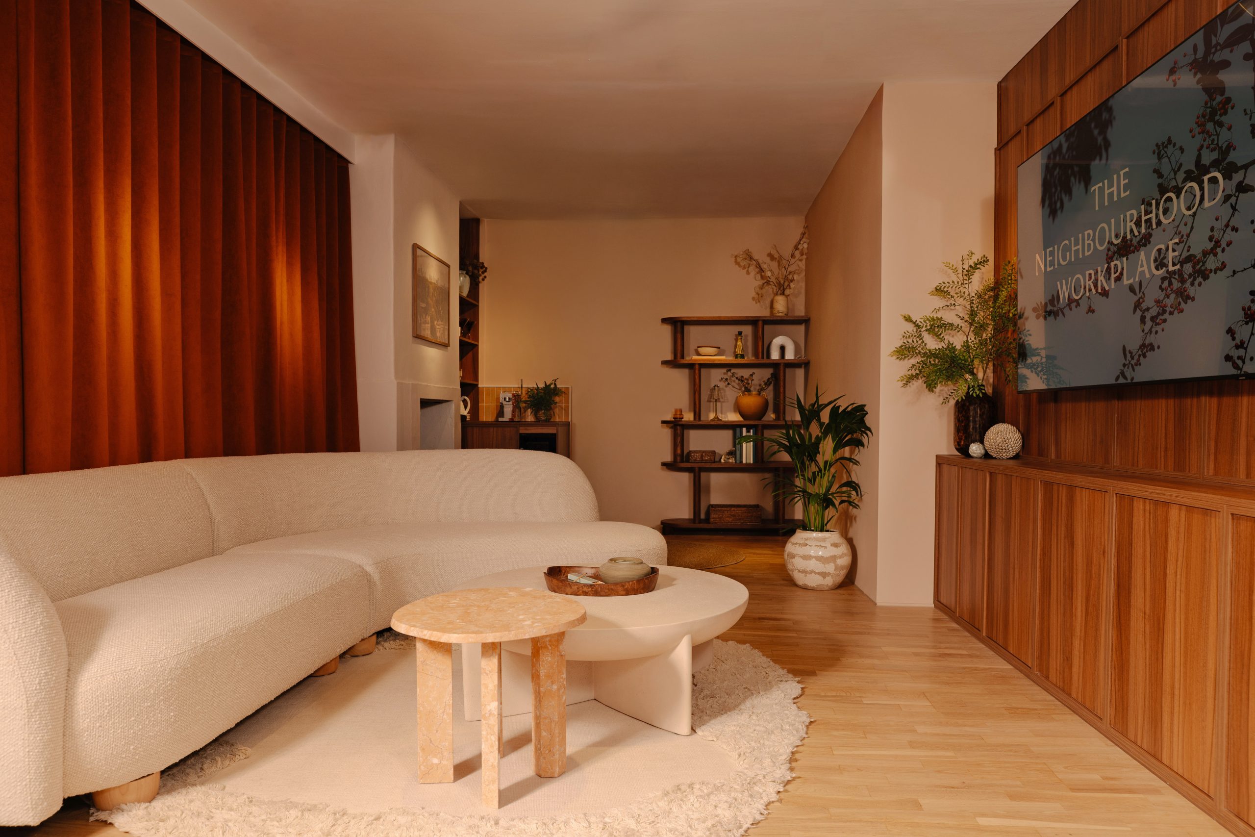
A warm welcome in
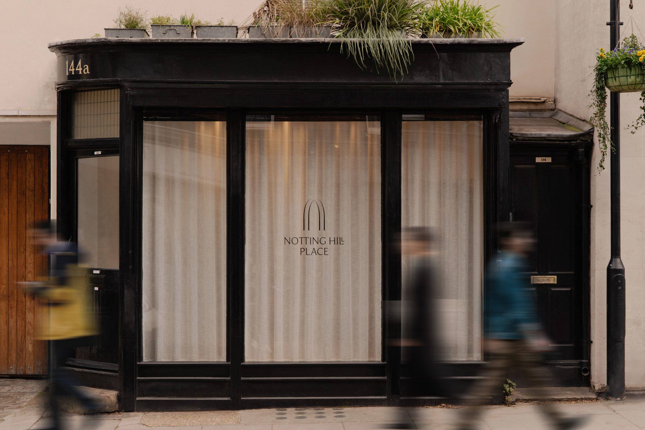
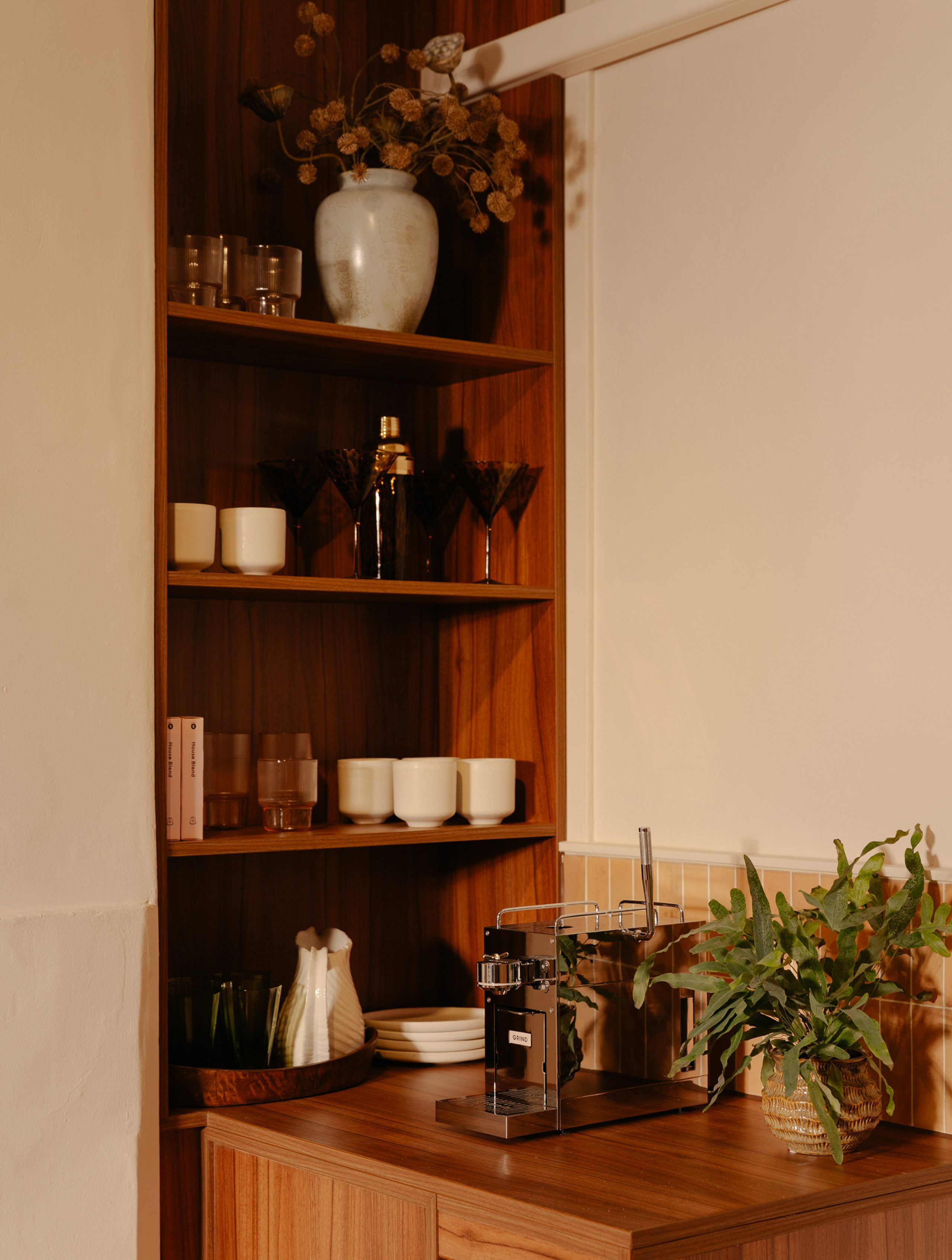
Right across from the site, we transformed an empty boutique shop into a welcoming gallery space. We worked with Gemco to design a space that draws on the natural materials of Notting Hill Place. Wood panelling, draped curtains and bespoke joinery create a relaxed and impactful experience.


Case study photography by George Cudby
“DNCO has been immeasurably valuable in helping us conceptualise, refine and articulate the brand for our landmark Notting Hill Place development. Their creativity and energy have felt completely in tune with the character of the scheme, and the level of insight, discipline and finesse they’ve brought to the process has exceeded expectations.”
Evan Corcoran, Asset Manager, Beltane