National Landing
Place brand
The DC region’s most ambitious BID
National Landing
Place brand
The DC region’s most ambitious BID
Just across the river from Washington DC, National Landing unites Crystal City, Pentagon City and Potomac Yard into one of the region’s most transformative urban communities.
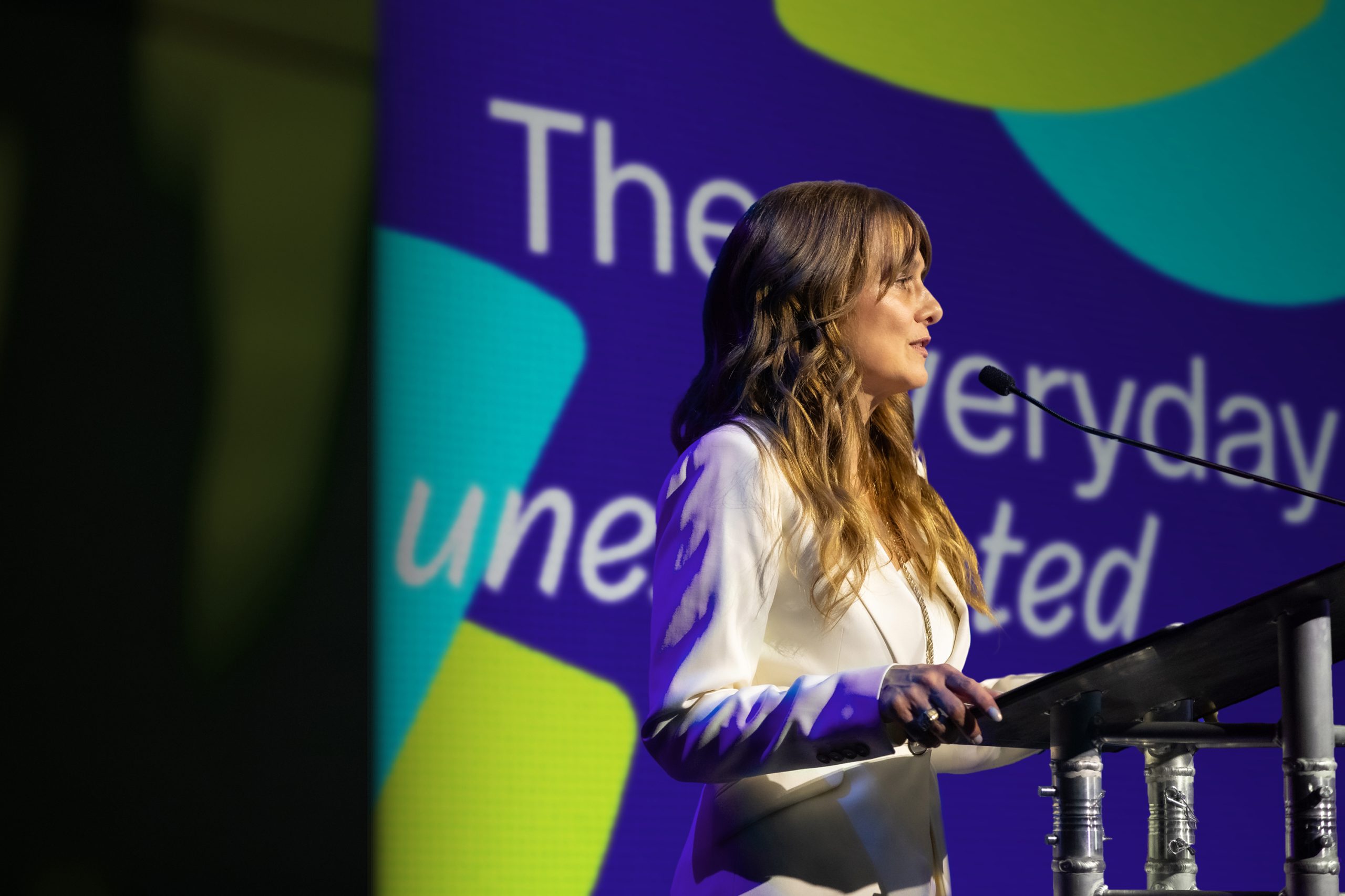
DNCO led the BID branding and repositioning for the National Landing business improvement district, repositioning a place long defined by the Pentagon, Reagan National Airport and Amazon HQ2 around 8,000 miles of interconnected trails and a single invitation: ‘the everyday unexpected’.

A life beyond the 9-to-5
Long defined by its assets — the Pentagon, Ronald Reagan National Airport, Virginia Tech’s innovation campus and more recently Amazon HQ2 — National Landing’s reputation was bureaucratic and corporate, a true 9-to-5 district.
But life was happening here. Walkable streets led to global cuisines. Parks shifted from morning yoga to evening jazz. More than 8,000 miles of interconnected trails linked neighborhoods to green space, while public art folded into daily life.
The gap between perception and reality became the foundation of our place brand strategy, anchored by the line: the everyday unexpected — capturing the contrast between the practical reasons people come (career, transport, safety) with why they stay (events, urban energy, community).
Shaped by the place
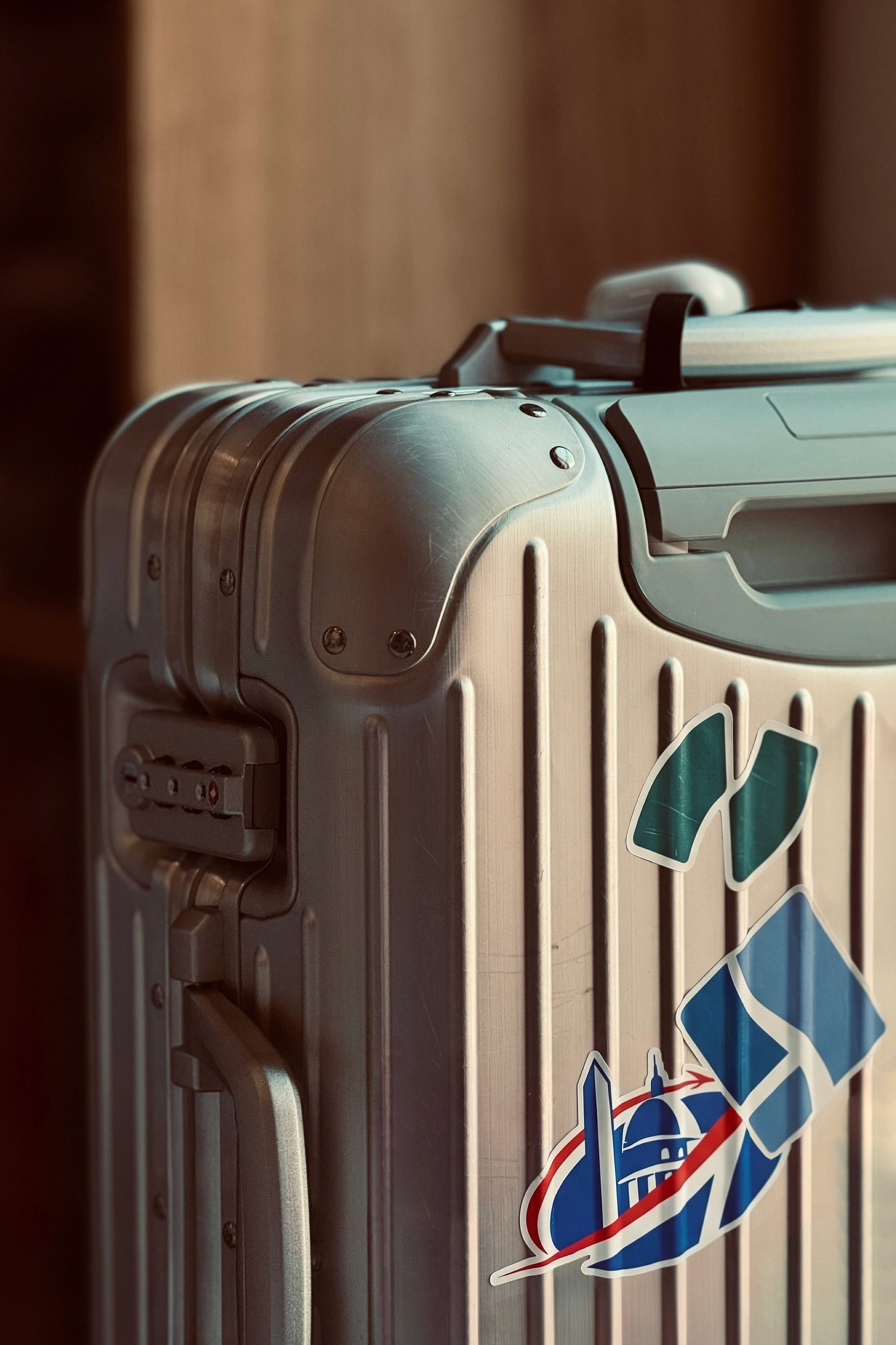
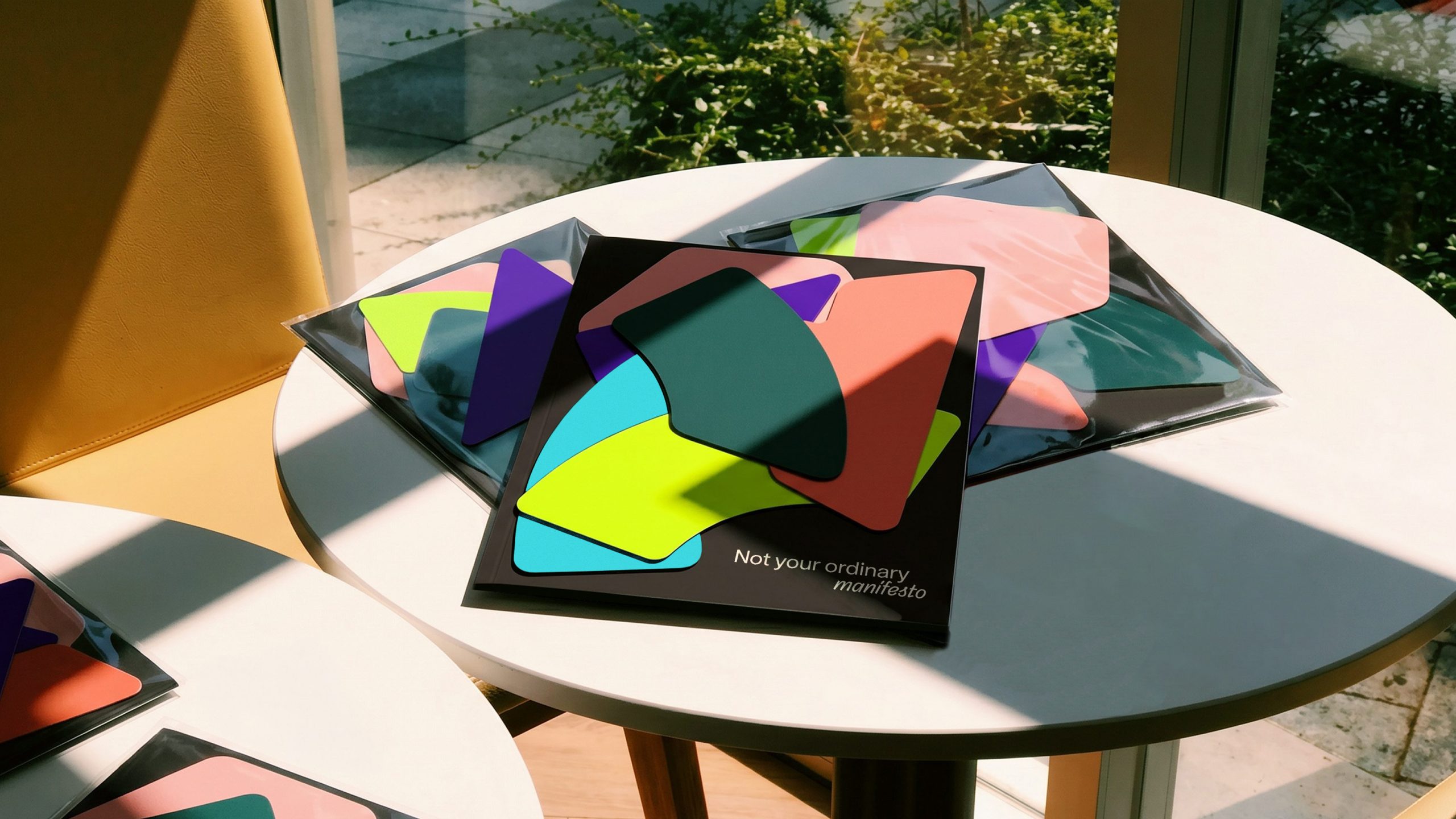
The brand identity system takes its cues from National Landing itself, from the organic curves of its parks, buildings to its everyday interactions. The mark reads as an N while holding a sense of surprise: it opens to reveal content, rotates and lets elements pass through it.
The refreshed color palette reflects the warmth of the community while the typography demonstrates its sense of play, shifting from a structured Rotina to script.


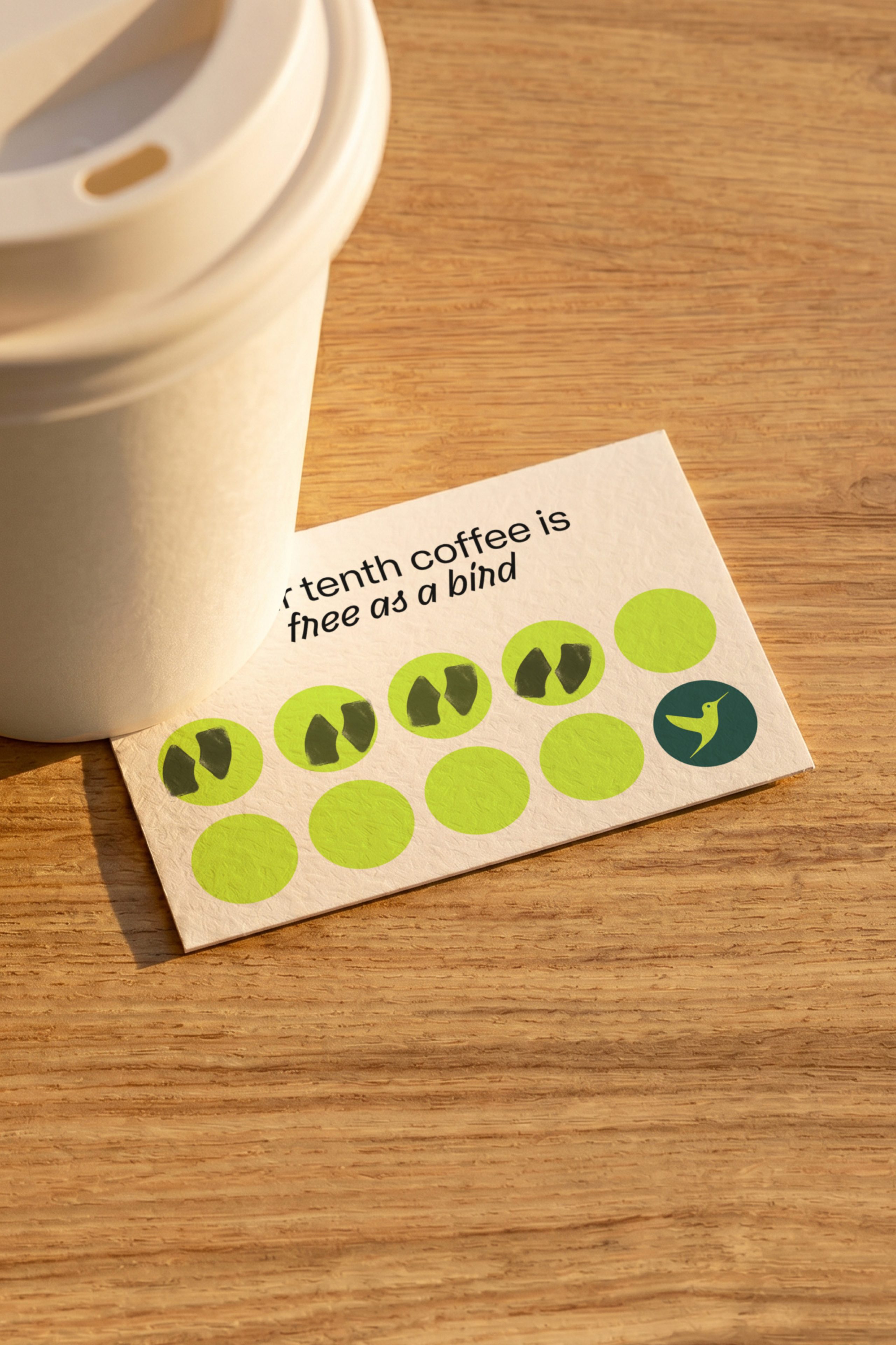
The hummingbird effect
A hummingbird was introduced as a brand mascot. Its shape echoes the BID’s boundaries and nods to the flights lifting from Reagan National. It also fits the character of the place: brilliant, curious, constantly in motion.

A lifestyle-led digital experience
The BID branding extended to a new website — more editorial in feel, with an events calendar, stories spotlighting the people behind the place, an updated data dashboard and a cleaner overall experience that communicates National Landing’s character alongside its practical credentials.
National Landing has a brand that reflects the place as it actually is. Talent sees more than a business district. Residents have a clearer sense of what they’re part of. Visitors arrive with the destination in mind, not just passing through on the way to DC. The everyday unexpected.
“DNCO is an exceptional agency. They led a thoughtful, strategic process that uncovered an authentic brand. They listened closely, challenged us in the right ways and delivered outstanding work. We’ve been blown away both by the results and the experience of working with their team. We’re grateful for their partnership and for the brand they created for National Landing — one that will shape our community for years to come.”
Madeline Long
Director of Marketing & Communications, National Landing