Hongkong Land
Corporate brand
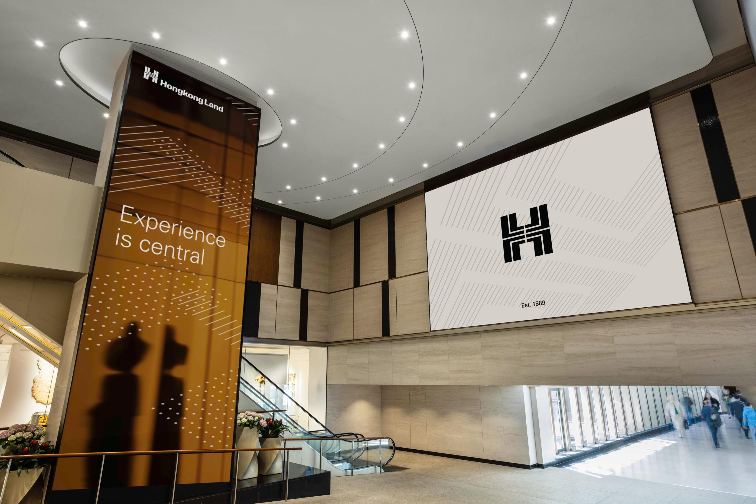
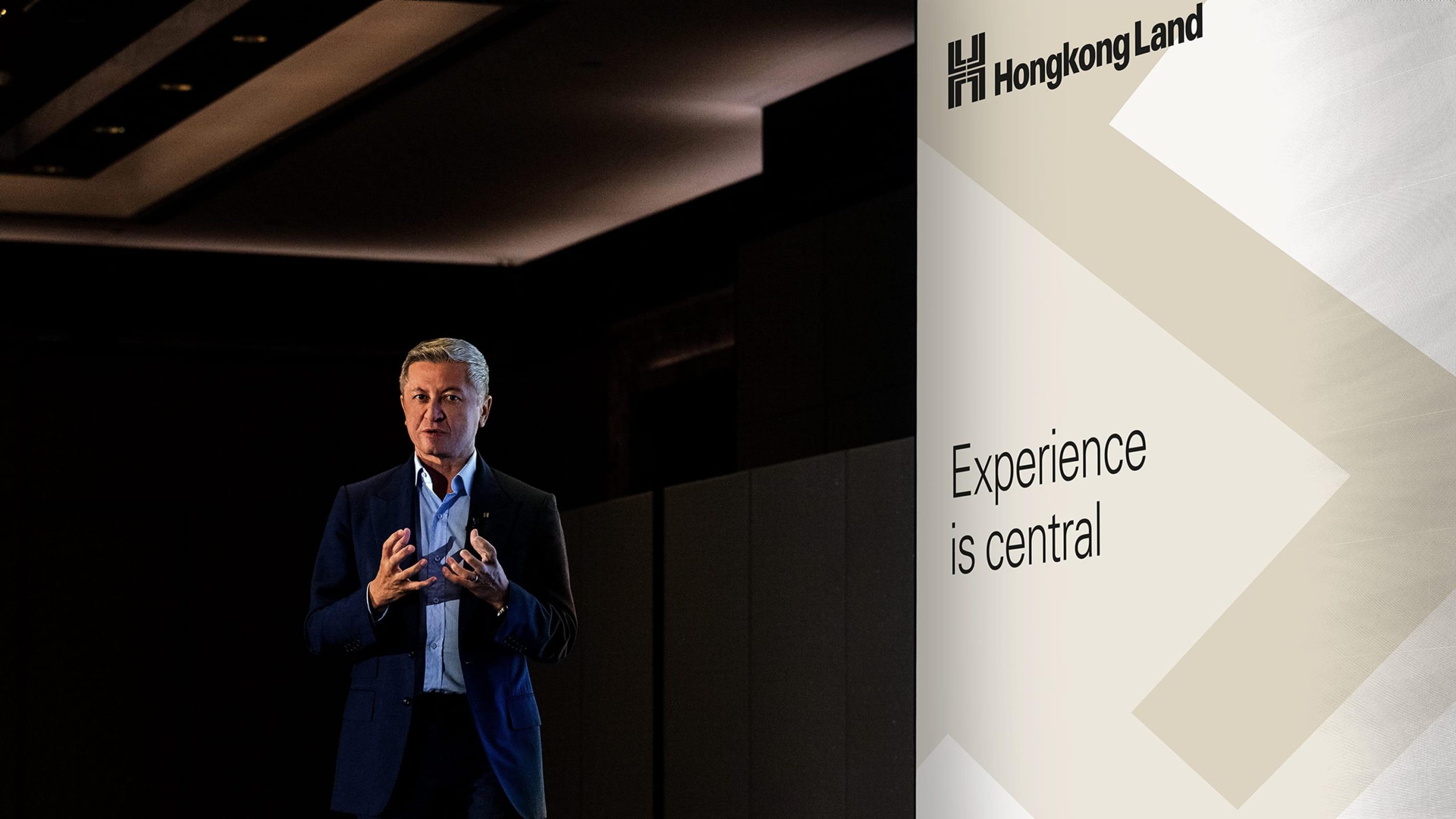
Experience is central
Hongkong Land
Corporate brand
Experience is central
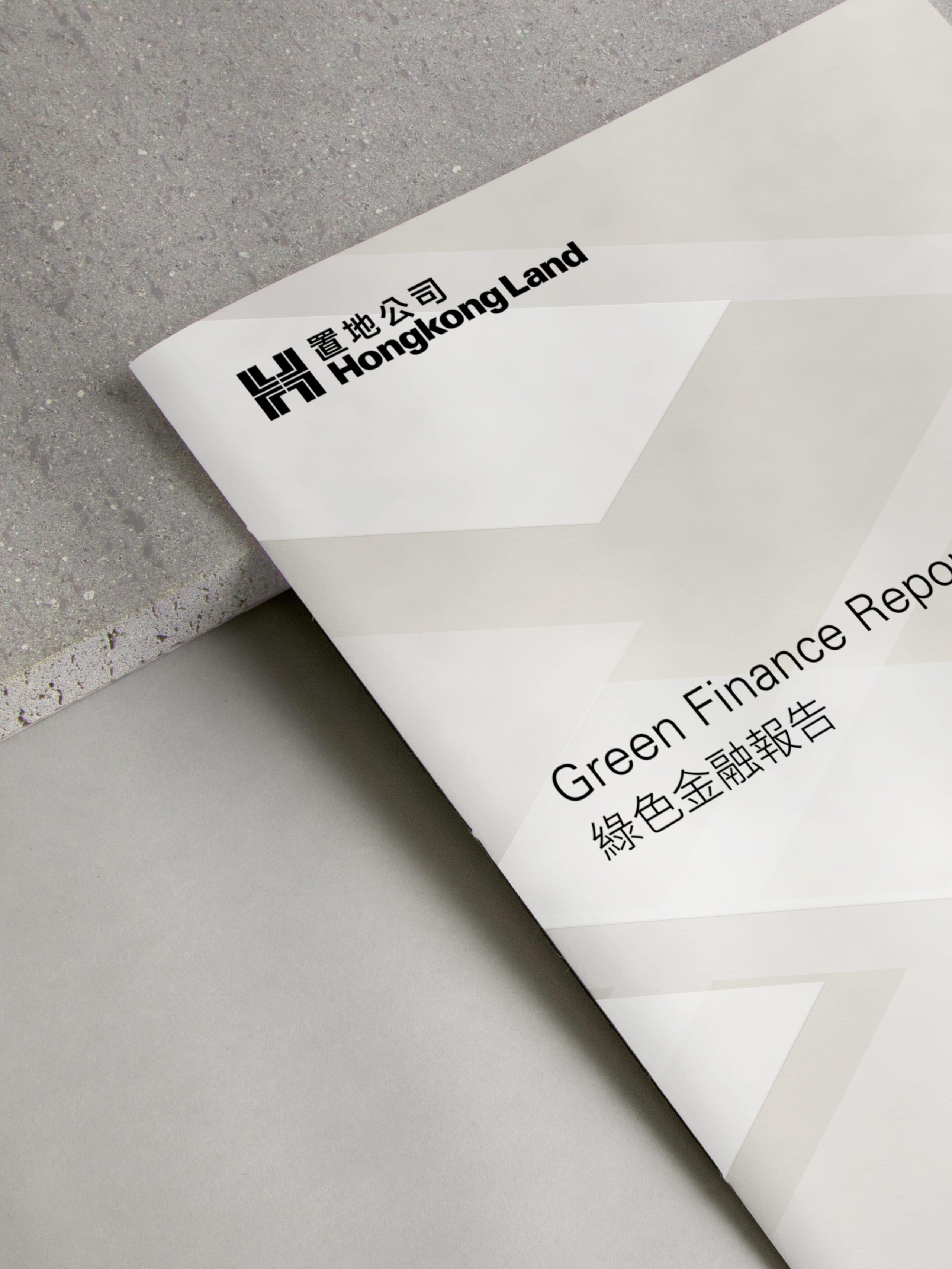
For more than a century, Hongkong Land has redefined the core of Asia’s cities. The major listed company holds US$41bn in assets under management, with a 5,000-strong team across Singapore, Shanghai and more. It was time for a legacy brand modernisation.
We led the corporate rebrand and distilled its strengths in a powerful story and leading line: ‘experience is central’.
A century of innovation
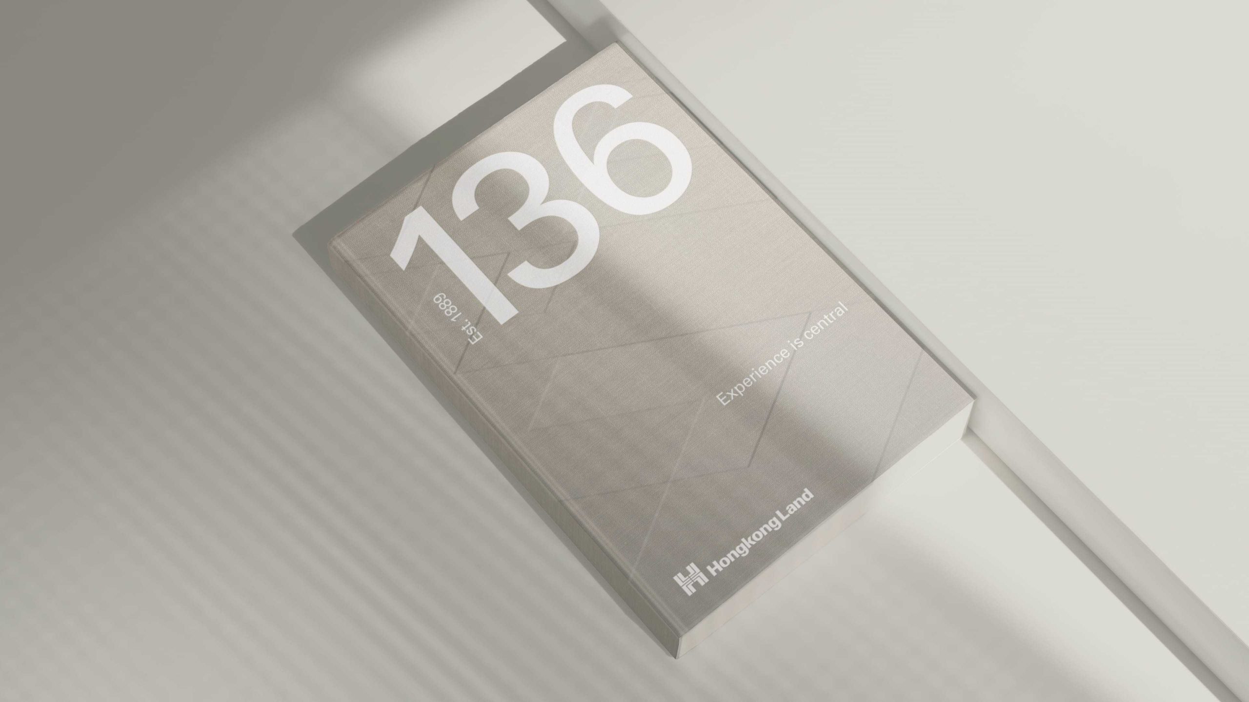
Since its founding in 1889, Hongkong Land has become synonymous with city centre destinations. It began with the reclamation of new land forming the Central district in Hong Kong today to being the originators of the first Mandarin Oriental. These places are transformed into magnets for businesses, award-winning restaurants and luxury fashion houses like Hermès, Louis Vuitton and Sotheby’s. With new leadership at the helm, Hongkong Land was ready to propel its brand into the future, from traditional to unequivocally innovative.
The new story surfaces their core strengths — excellence, innovation and exceptional hospitality. Captured in the line ‘experience is central’, it reflects the trust in Hongkong Land, elevated customer experience and the city core strategy, encompassing the Central district in Hong Kong that many will know and love today.
Excellence since 1889
While Hongkong Land’s approach has been emulated by many others, we reminded the world of their longstanding reputation. ‘Excellence since 1889’ turns their heritage into a unique competitive advantage.
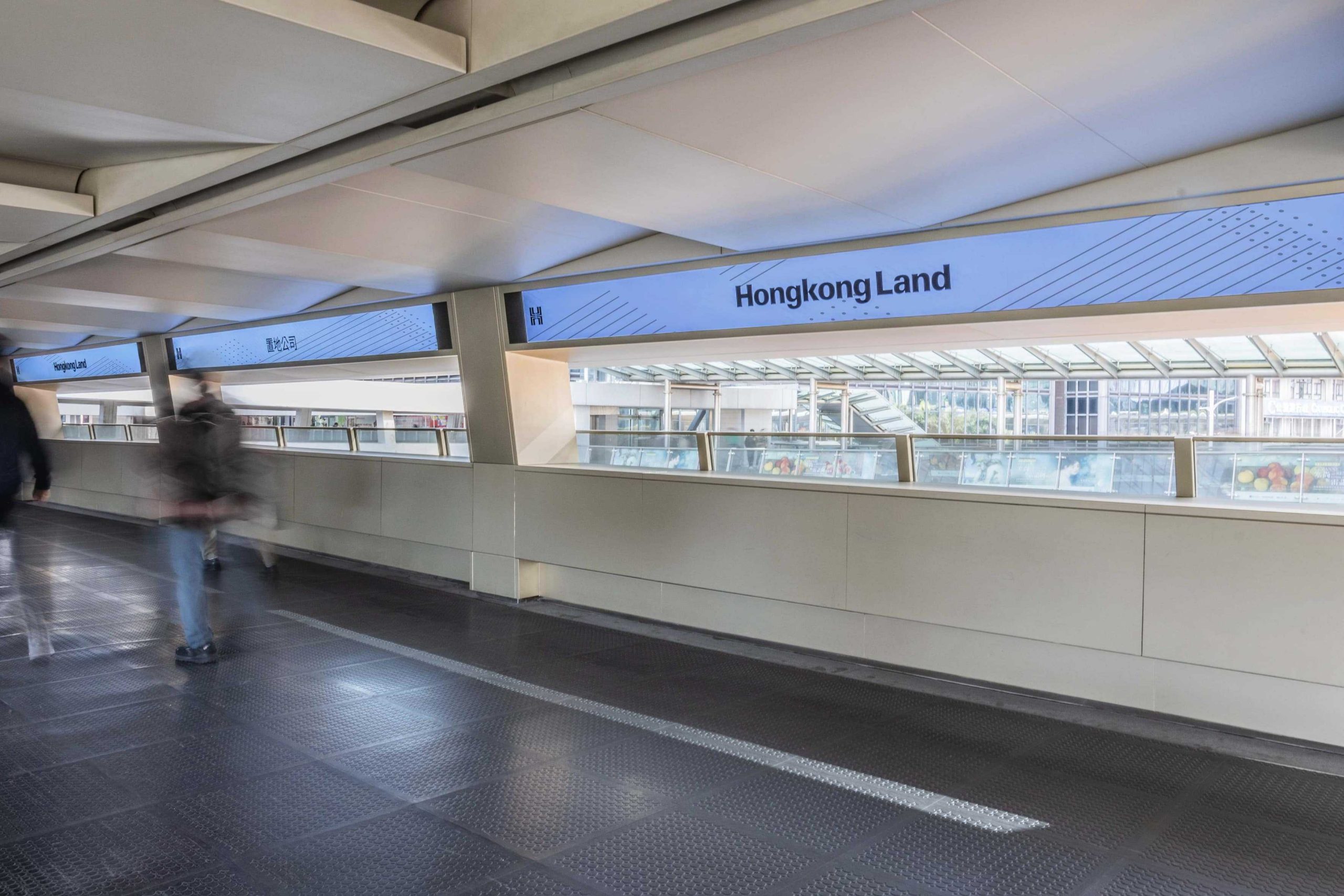
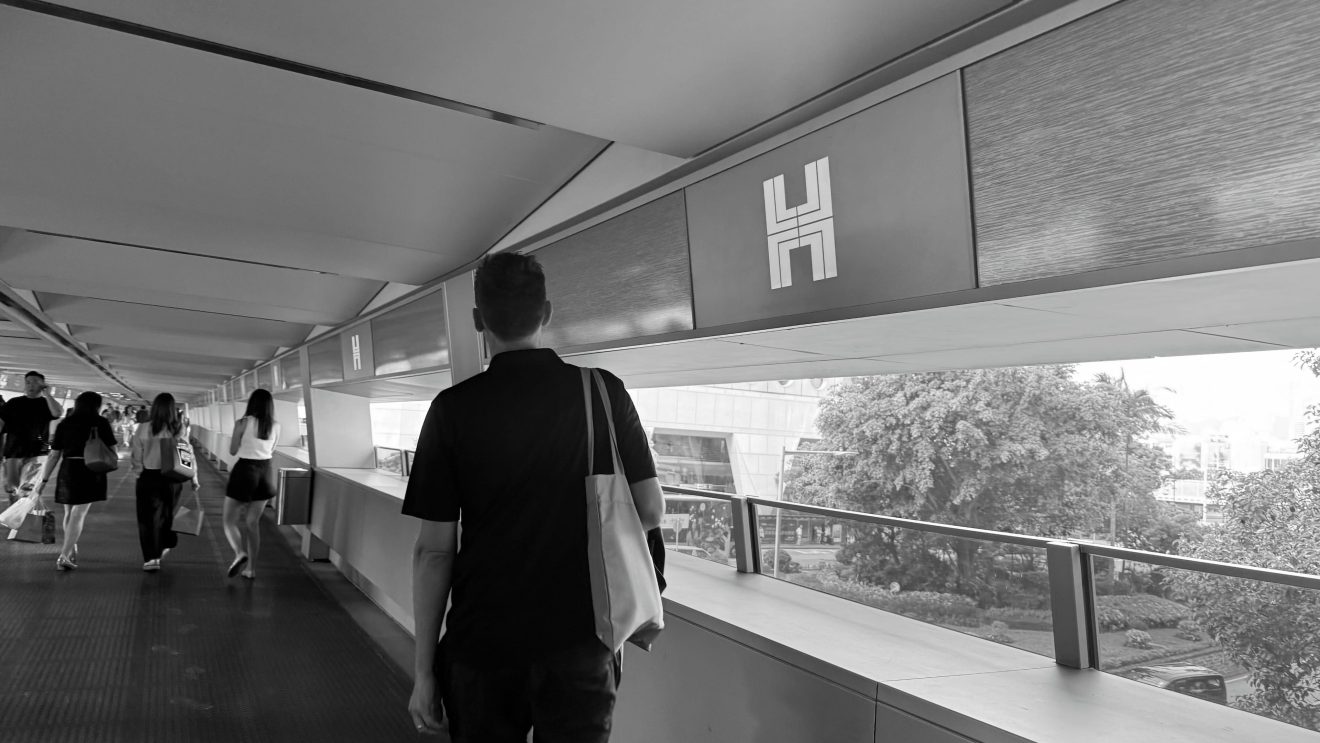
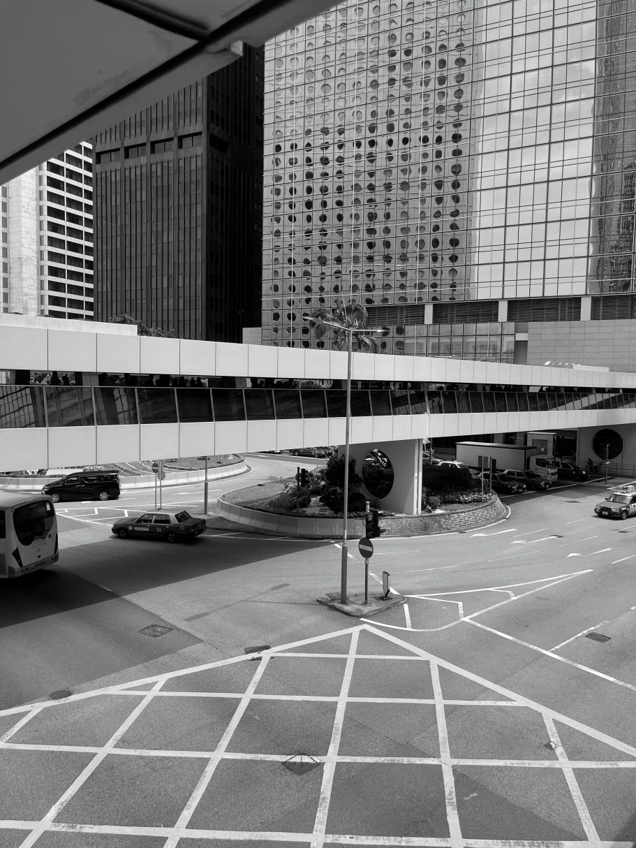
As part of this culture shift, we crafted three memorable values for the team: always forward, think in generations and be a bridge. ‘Always forward’ speaks to the relentless pursuit of innovation, ‘think in generations’ puts craftsmanship and sustainability at the forefront, and ‘be a bridge’ is a commitment to deepening relationships, rooted in the connected walkway system Hongkong Land first pioneered in the city.
Made for generations
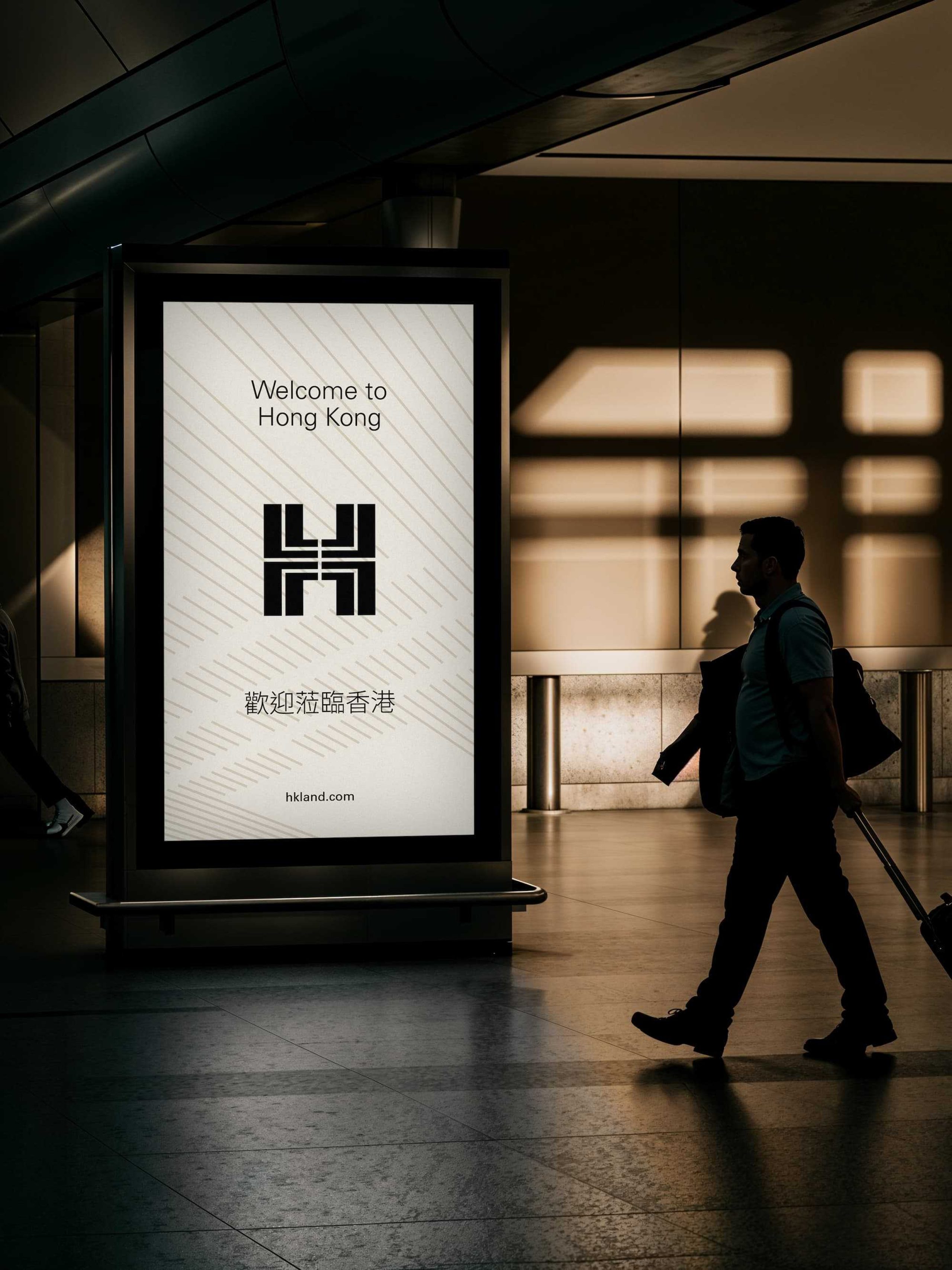
Inspired by the ancient Chinese character 壽 meaning ‘longevity’, the H symbol crafted by famed graphic designer Henry Steiner has become a recognisable feature of the corporate brand identity. We retained the original intent of the historic symbol, updating the shape for a digital world and bringing it into three dimensions through motion.
Putting it in perspective
Rendered in new depth and dimension, the ‘H’ transforms into an immersive experience to step into. Through textures, overlays and perspective shifts, we created patterns reminiscent of the bridges and elevated walkways that Hongkong Land built. Paired with reportage-style photography, we bring a cinematic quality to the brand, placing you right at the core of the city centre experience.
Elegant, experiential and established
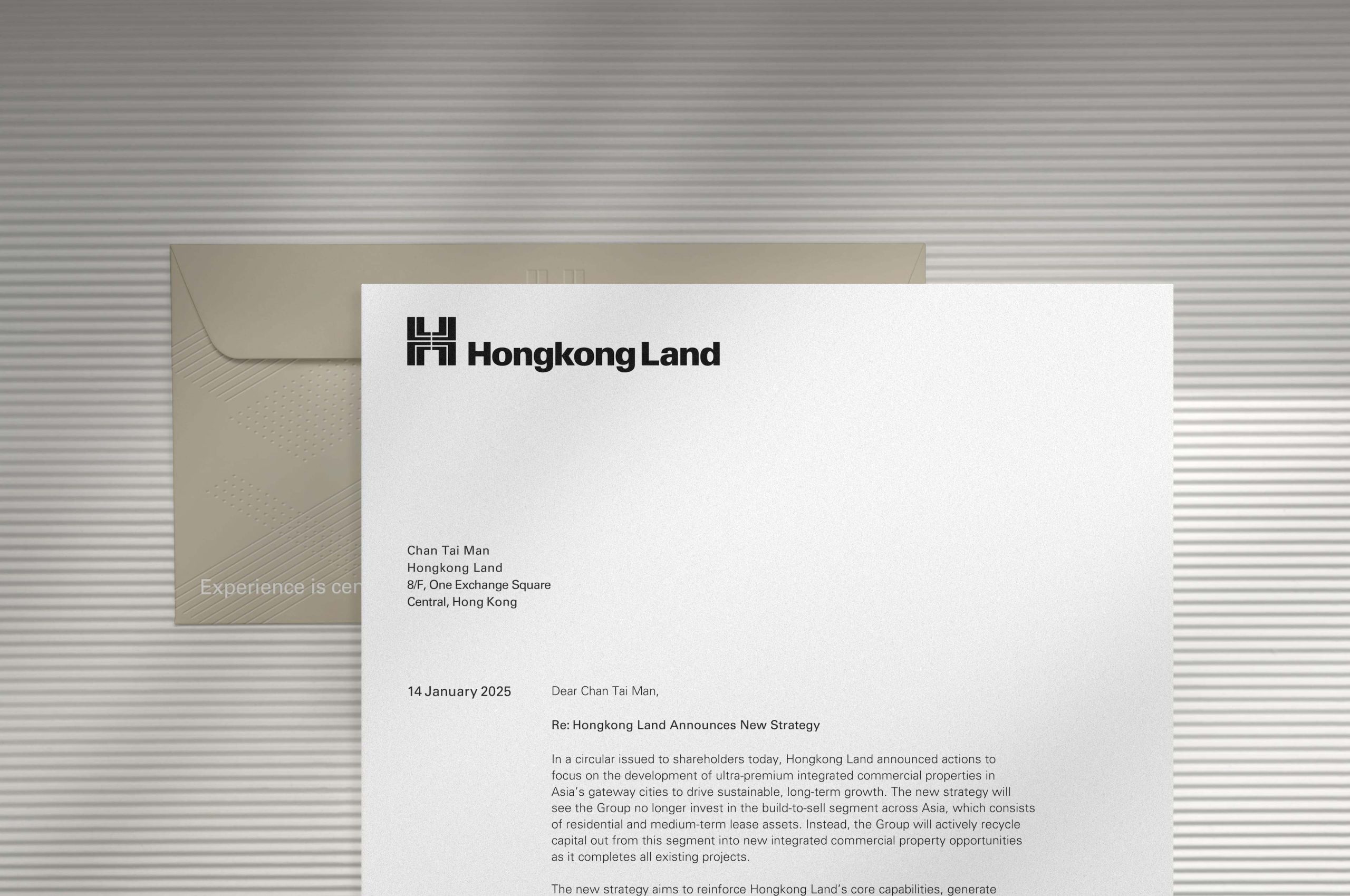
We’ve maintained a timeless and elegant approach to typography. Univers links the company to its history, while Noto resonates globally as a typeface made for over 1,000 languages. A classic neutral base is punctuated with accent colours to bring energy and modernity to the corporate brand.

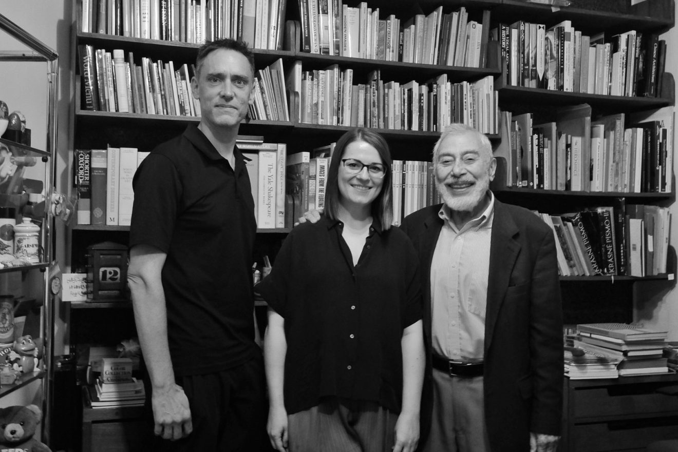
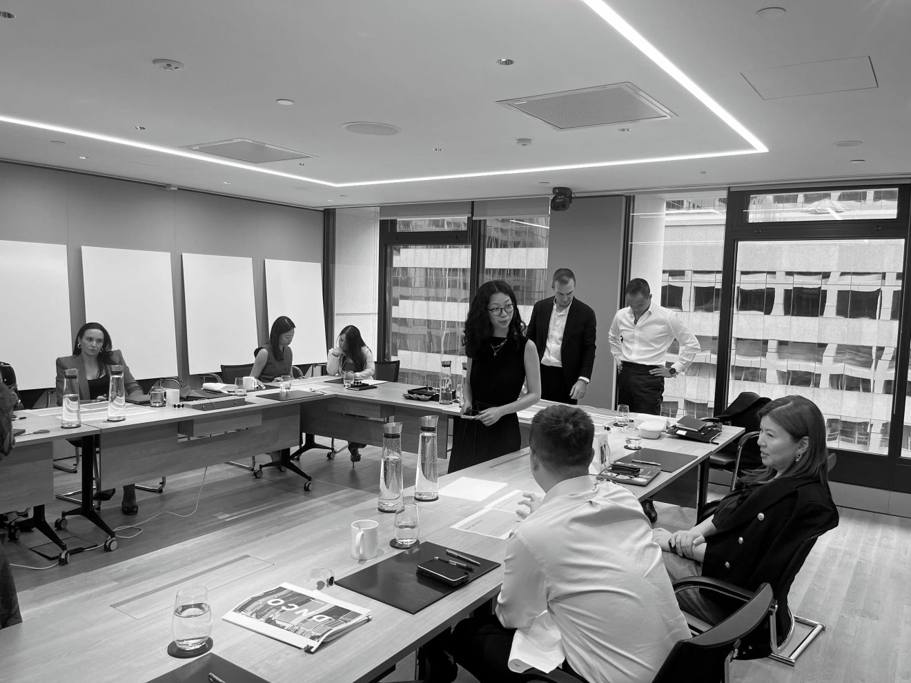
Getting resident
This project took DNCO to Hong Kong, where we interviewed Henry Steiner, visited the corporate archives and bonded with the HKL team
Boosted share price
The refreshed brand repositioning launched alongside a new strategic ambition and within days of the announcement, Hongkong Land saw a 11% share price uplift and £1bn market cap increase. It has since had an ever wider public-facing roll out with a campaign in Hong Kong, Vietnam, Singapore and Shanghai, and we co-delivered a series of brand masterclasses to over 800 employees. A bespoke brand tool and redesigned website are coming soon.
“DNCO has given us a brand language to elegantly articulate our strategy, alongside a visual identity that reflects the premium quality at the heart of everything we do.”
Michael Smith
Chief Executive, Hongkong Land