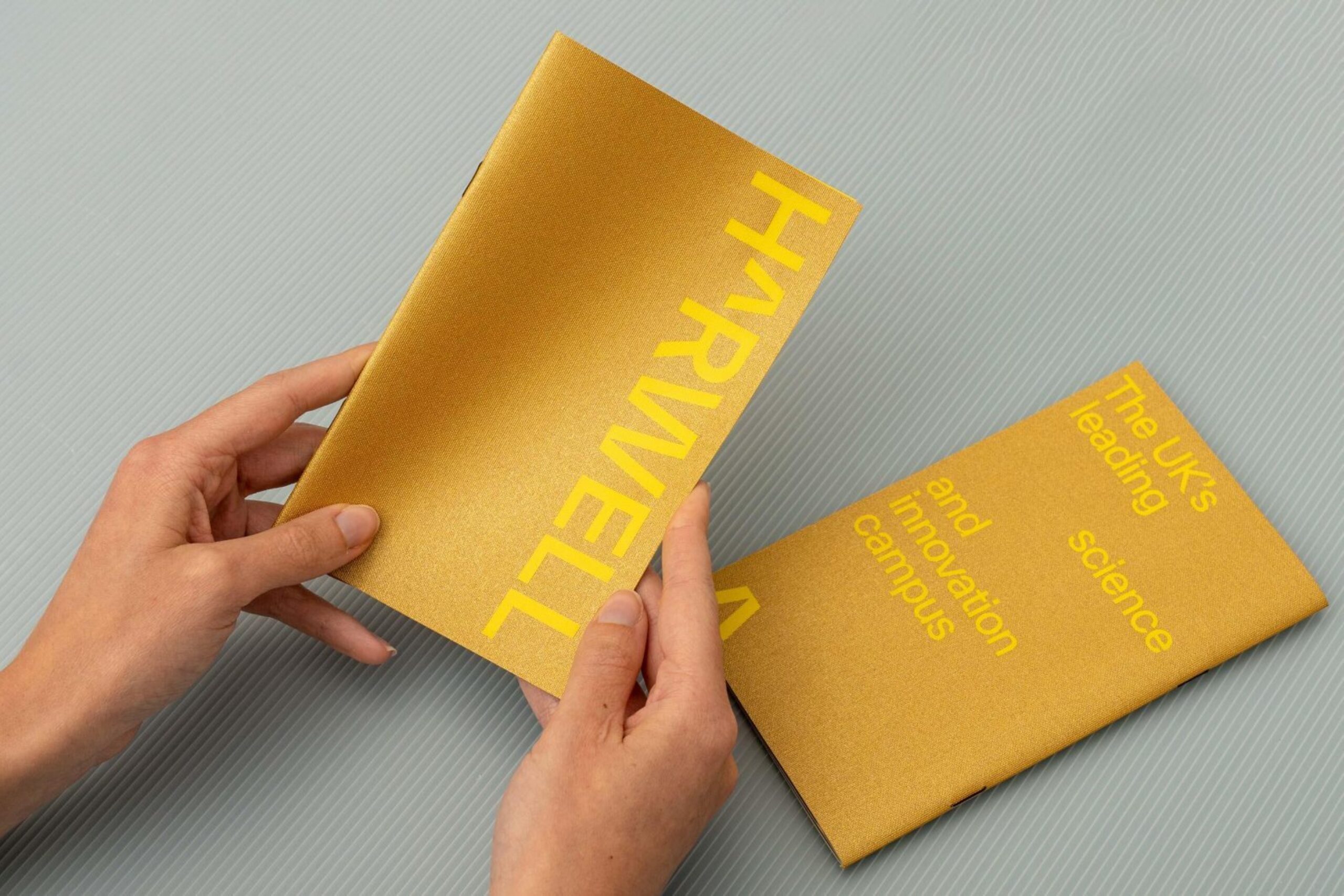
Harwell
Place brand
A capital for UK science and innovation
Harwell
Place brand
A capital for UK science and innovation
There is a place where people prepare for life in space; where electrons generate beams ten billion times brighter than the sun; where the UK developed its covid vaccine response.
Harwell is a world capital for science and innovation — a nation’s campus dedicated to solving the critical problems facing our planet. We proudly created a brand to put this community at the centre of our map for the future.
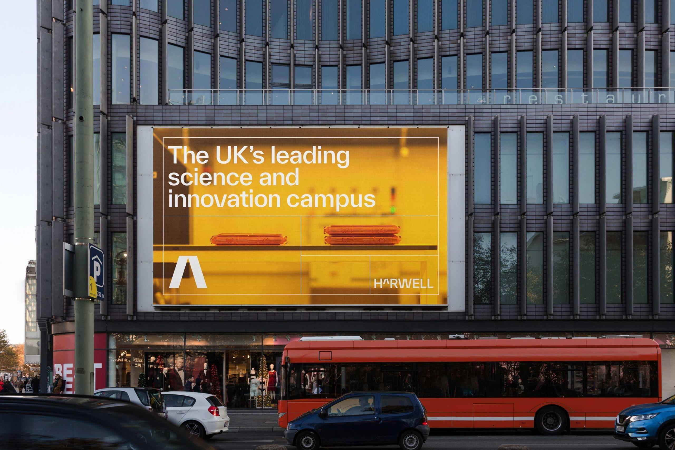
The power to unlock universal progress
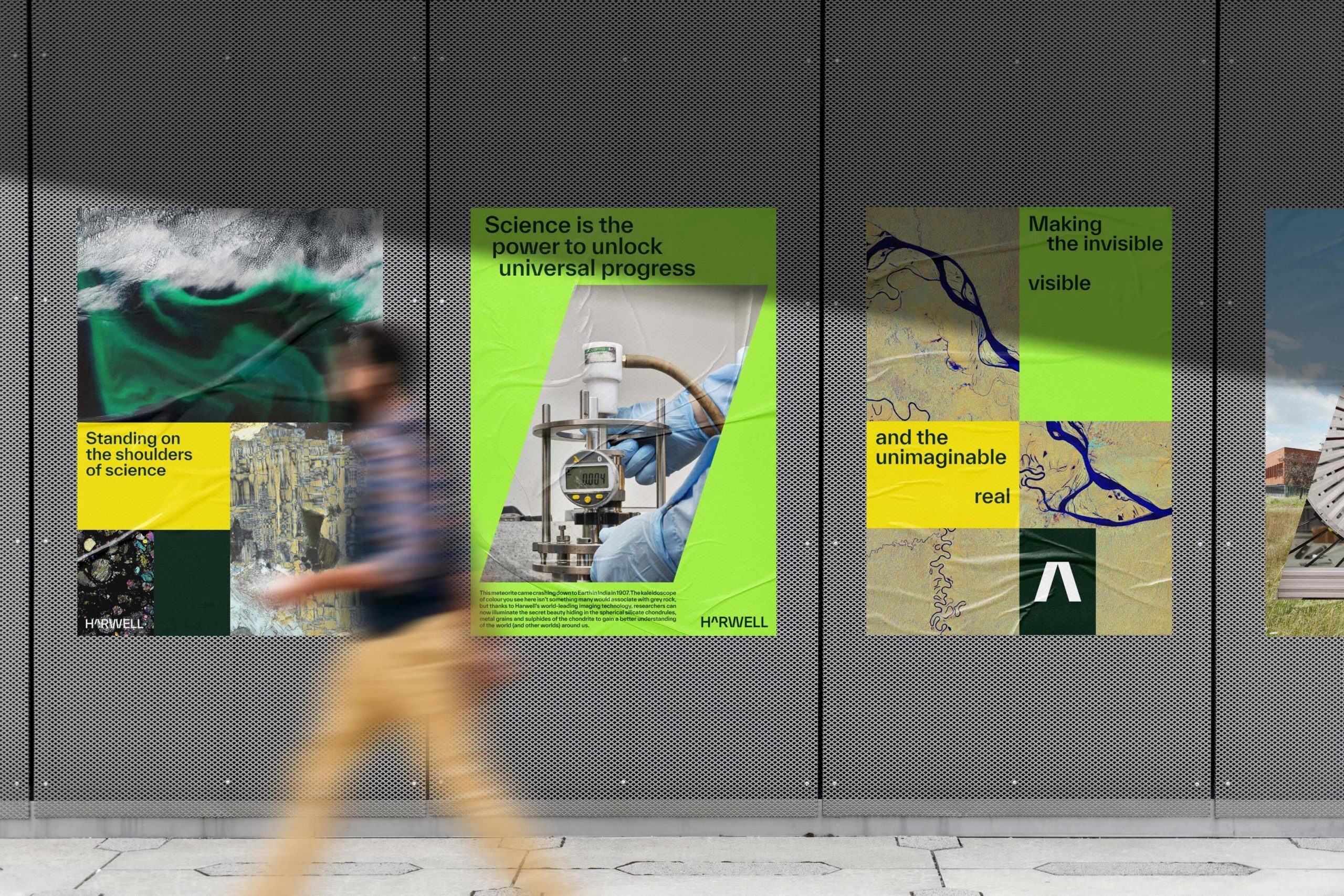
From space to energy, health to quantum computing, Harwell is a dynamic community of scientists turning theory into real world solutions. Working with its clusters, we distilled a powerful uniting purpose for all at Harwell — that science is the power to unlock universal progress. A shared belief that draws the best minds to Harwell in its quest to make the invisible visible and the unimaginable real.
After decades of government secrecy, it was time for Harwell to be recognised and celebrated internationally. The campus is also undergoing its own transformation with a 5 million sq ft masterplan that promises to consolidate its position for decades to come, adding to the £3bn of national facilities already here that serve a 6,000-strong science and innovation community.
More than a description of what Harwell is, ‘capital’ serves as a critical lens for how the campus operates and the role it should play in the world. It is a clear statement of intent, guiding Harwell towards global recognition befitting somewhere that had gifted mankind such incredible scientific advancement for over 75 years.

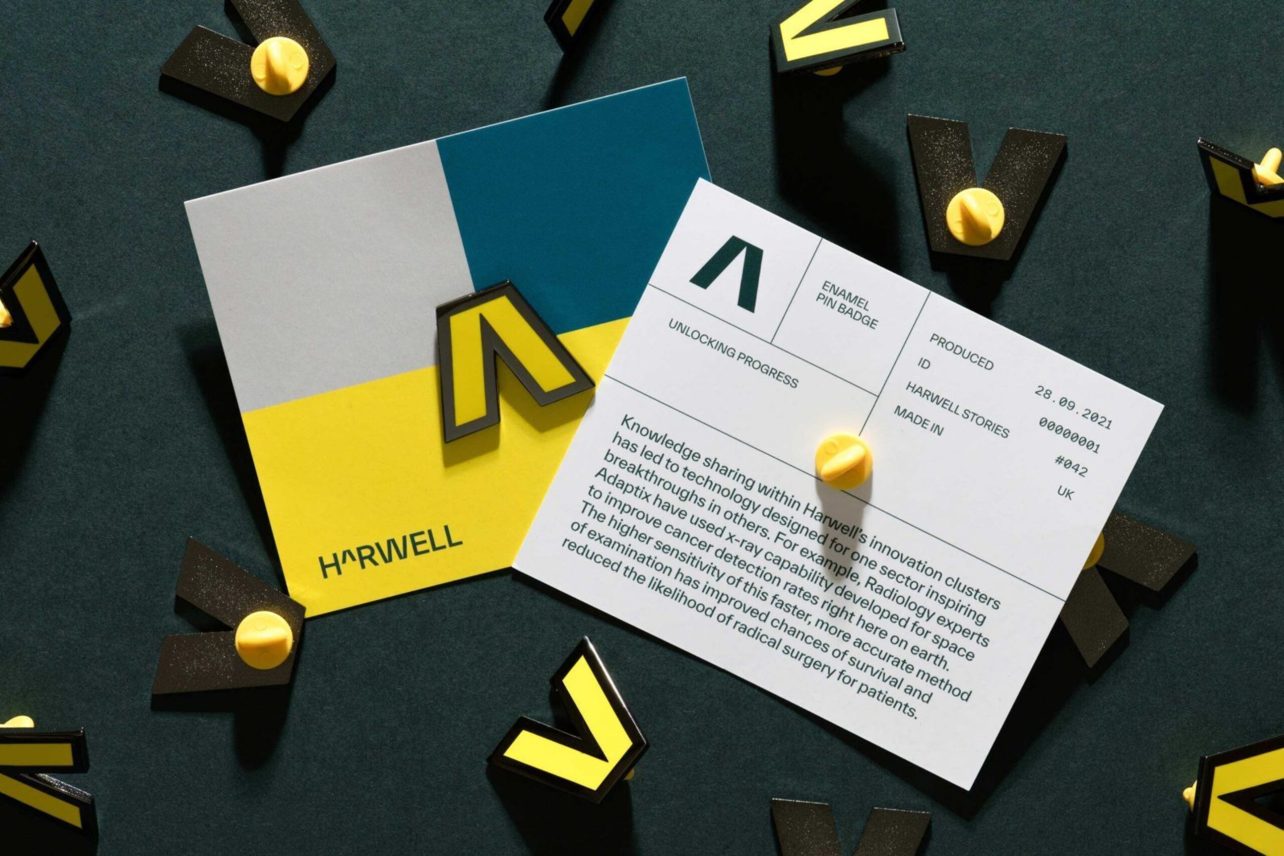
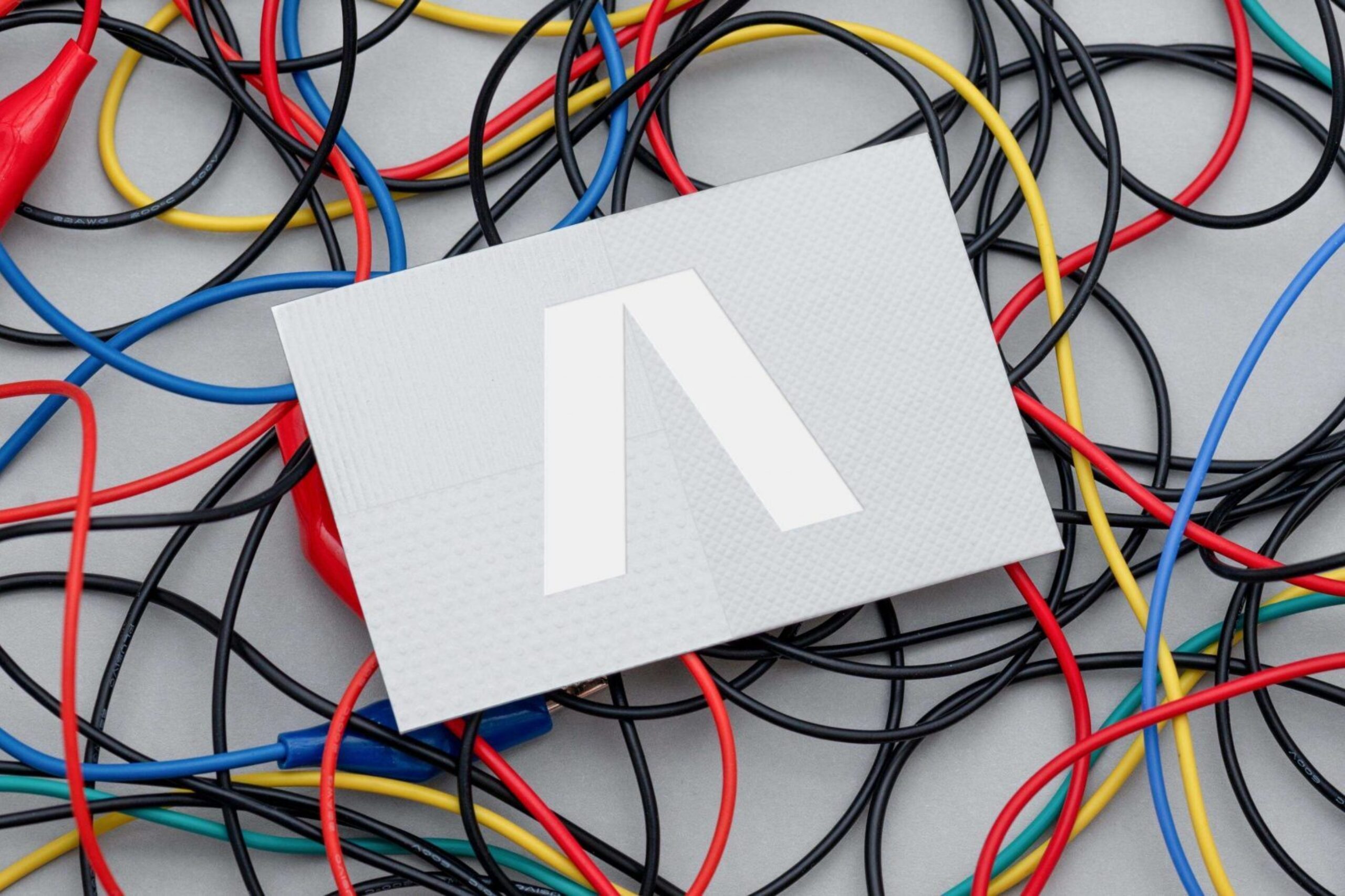
The Harwell Caret
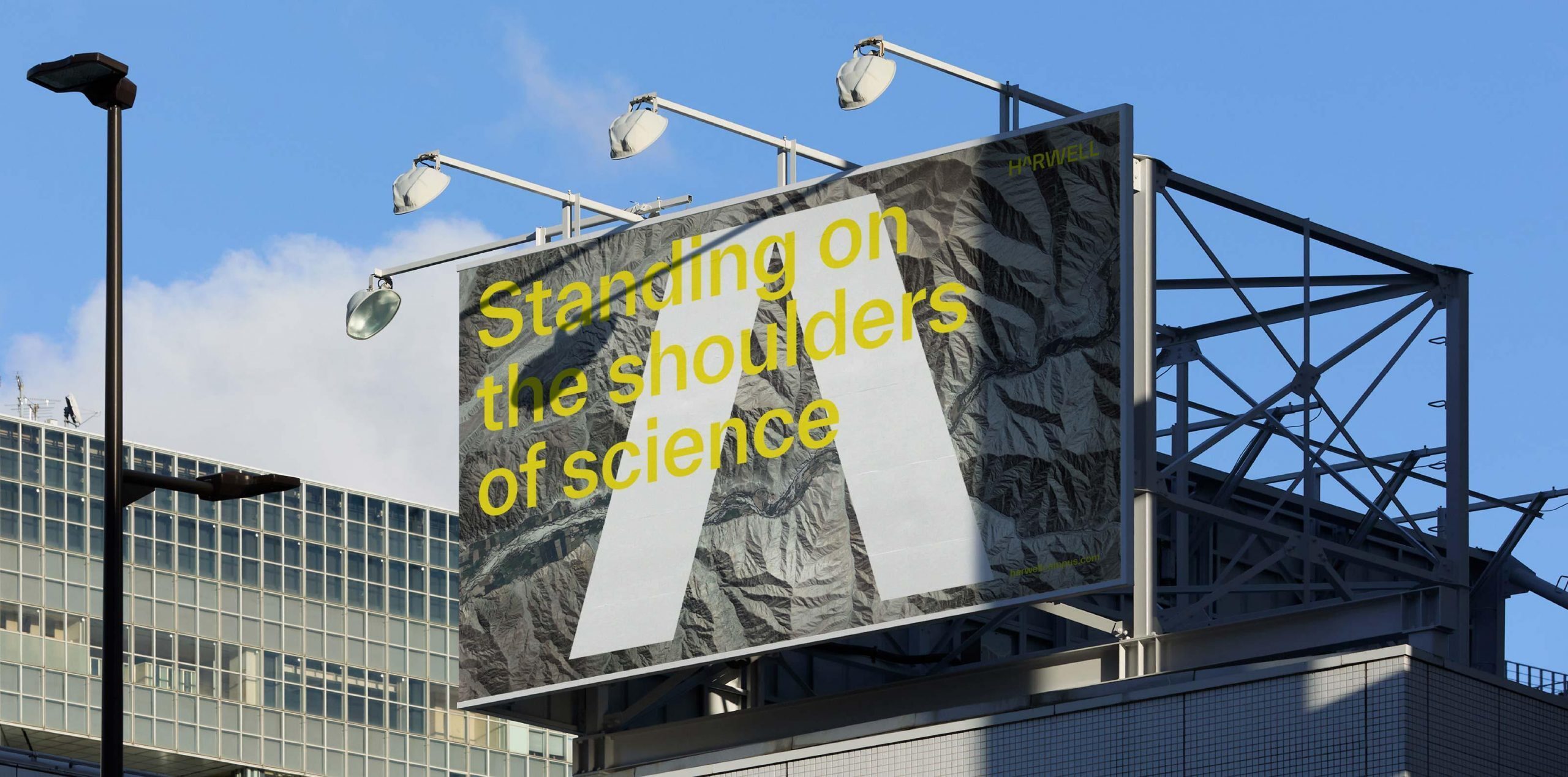
We use science to understand the world around us, and mathematics is its universal language. Inspired by this maxim, we rooted the Harwell brand in scientific and mathematical notation, using a ‘caret’ — a symbol representing an exponent, square, cube or other power — to anchor the visual identity. It encapsulates Harwell as a place that brings people and ideas together, supercharging growth: an exponent to solving the critical problems facing our planet.


The language of exponential growth
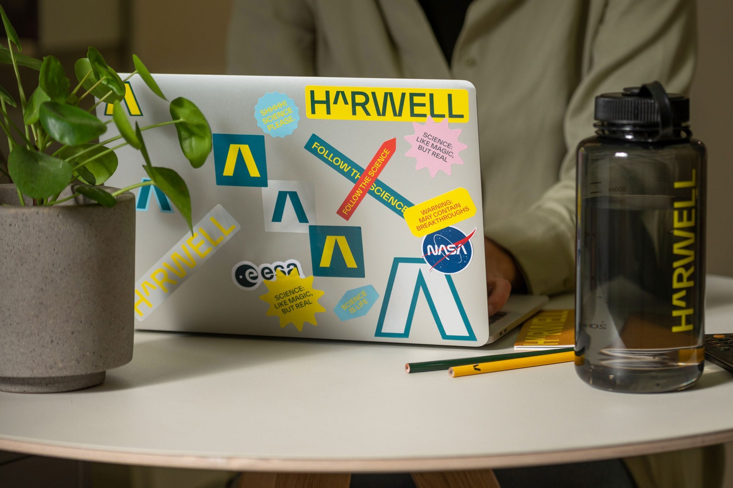
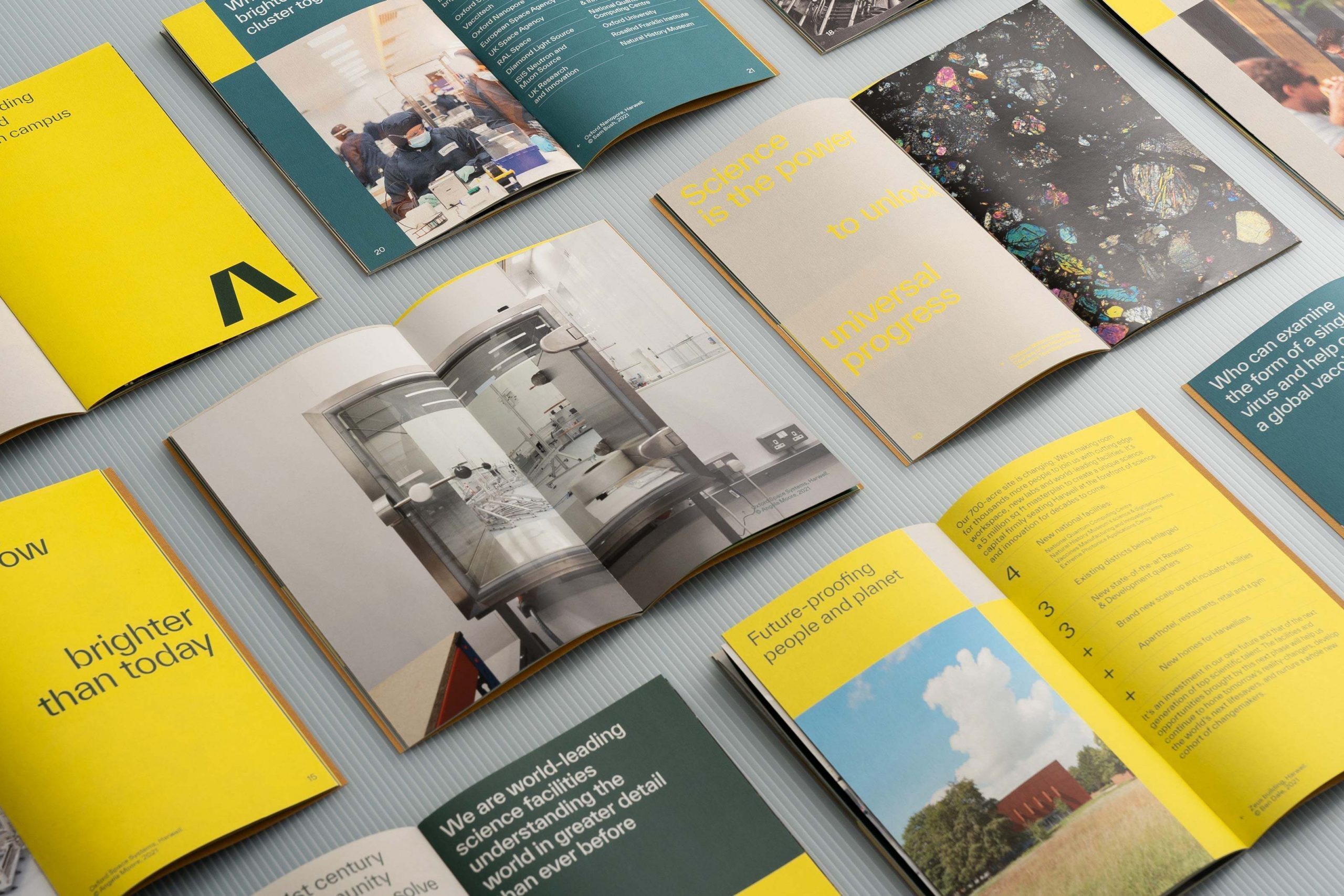
The vivid, energetic visual identity we created matched the strength of our conviction. The colour palette shines with bright, distinctive greens and yellows, while the typeface’s symmetrical structure and deep pinch points mirror the acute angles of the ‘caret’, evoking the rigid forms of scientific computer coding without feeling straightlaced.
The society-raising power of science also informed the grid system for Harwell’s visual communications. Blocks that increase in size created a sense of growth and progress across dynamic layouts with a clear hierarchy of information. All the while, four tone of voice principles — proud, provable, plain-speaking, people-focused — helped us uphold our lodestar belief and speak in a way that both celebrates Harwell and decodes its complexities so they can be meaningful to many.
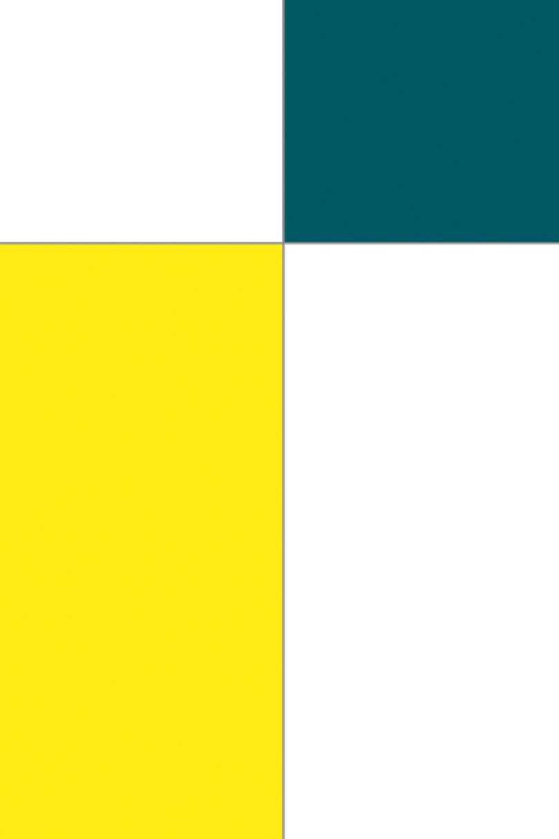
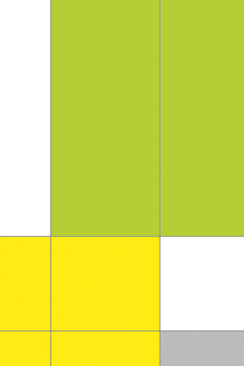
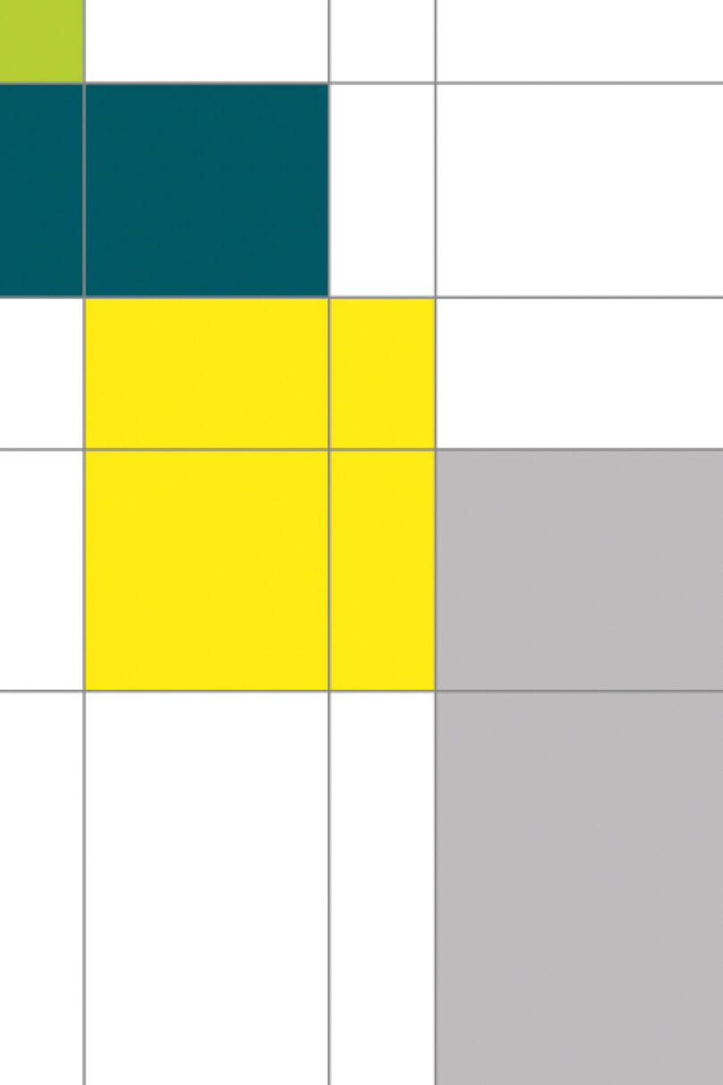
Harwell's grid system
Blocks that increase in size create a sense of growth and generate endless dynamic layouts for creative expression


The sound of exponential growth
Reflecting the dynamic movement lent by its modular graphics and typography, Harwell’s acoustic identity is formed of different layers of sound. We worked closely with partners Coda to Coda to ensure each layer amplified the concept of exponential growth — echo and delay building a sense of infinite momentum, while reverberation constructed space in sound to evoke a sense of Harwell’s sheer scale.

Bright futures
Instilling pride in Harwell’s remarkable past, restoking belief in the power of science, and communicating the exponential potential of new labs, homes and civic spaces for future international talent, we successfully positioned Harwell as a science capital on the cusp of even brighter things to come.