70 Hudson Yards
Place brand
Launching the lifestyle office
70 Hudson Yards
Place brand
Launching the lifestyle office
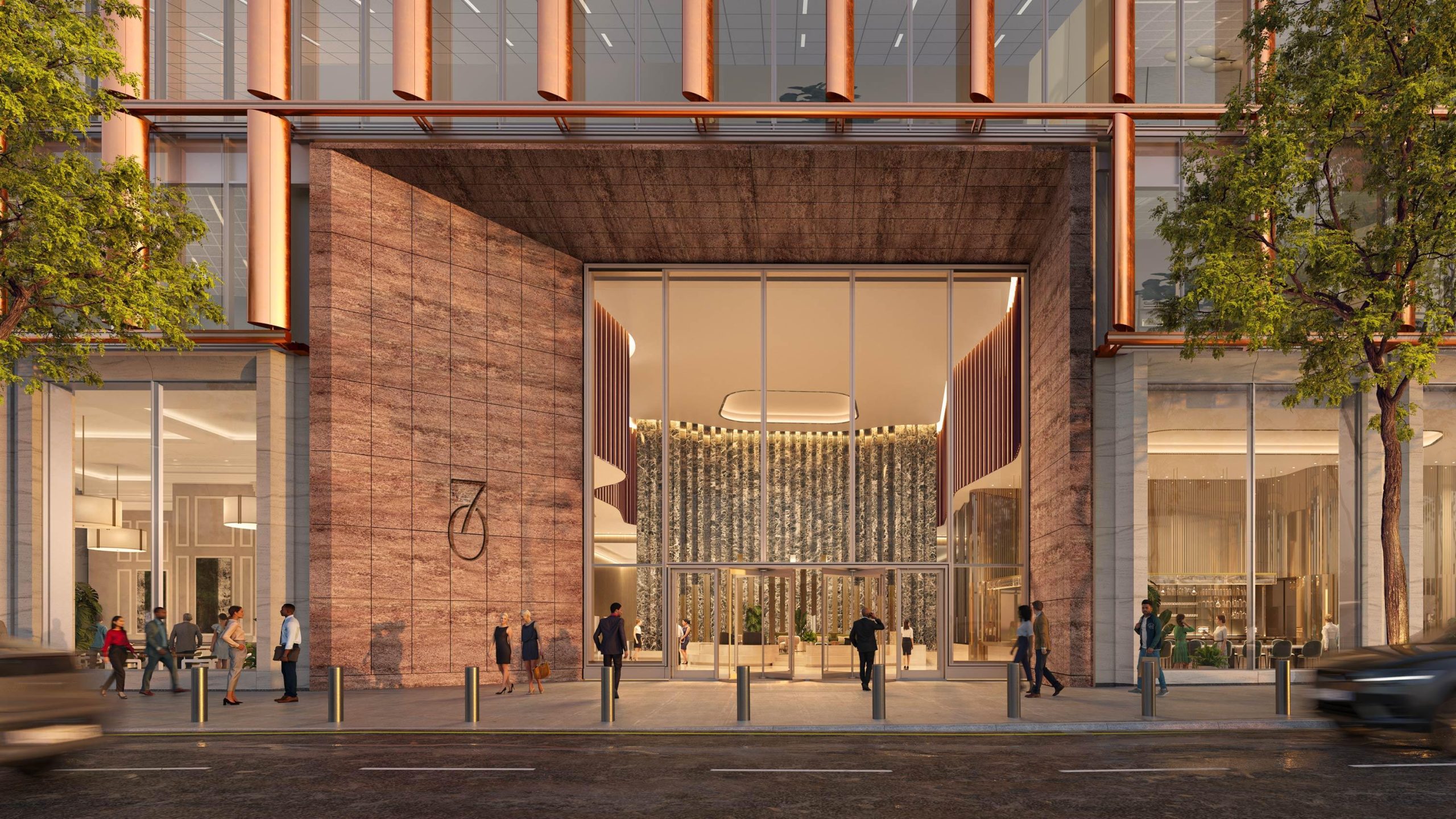
The next headquarters in New York’s new commercial neighbourhood, 70 Hudson Yards is the culmination of everything developers Related Companies and Oxford Properties Group have learned.
Our workplace branding captured this redefinition as ‘the lifestyle office’ — a strategy built to draw next-generation talent and usher a new era of work.
Defining a workplace evolution
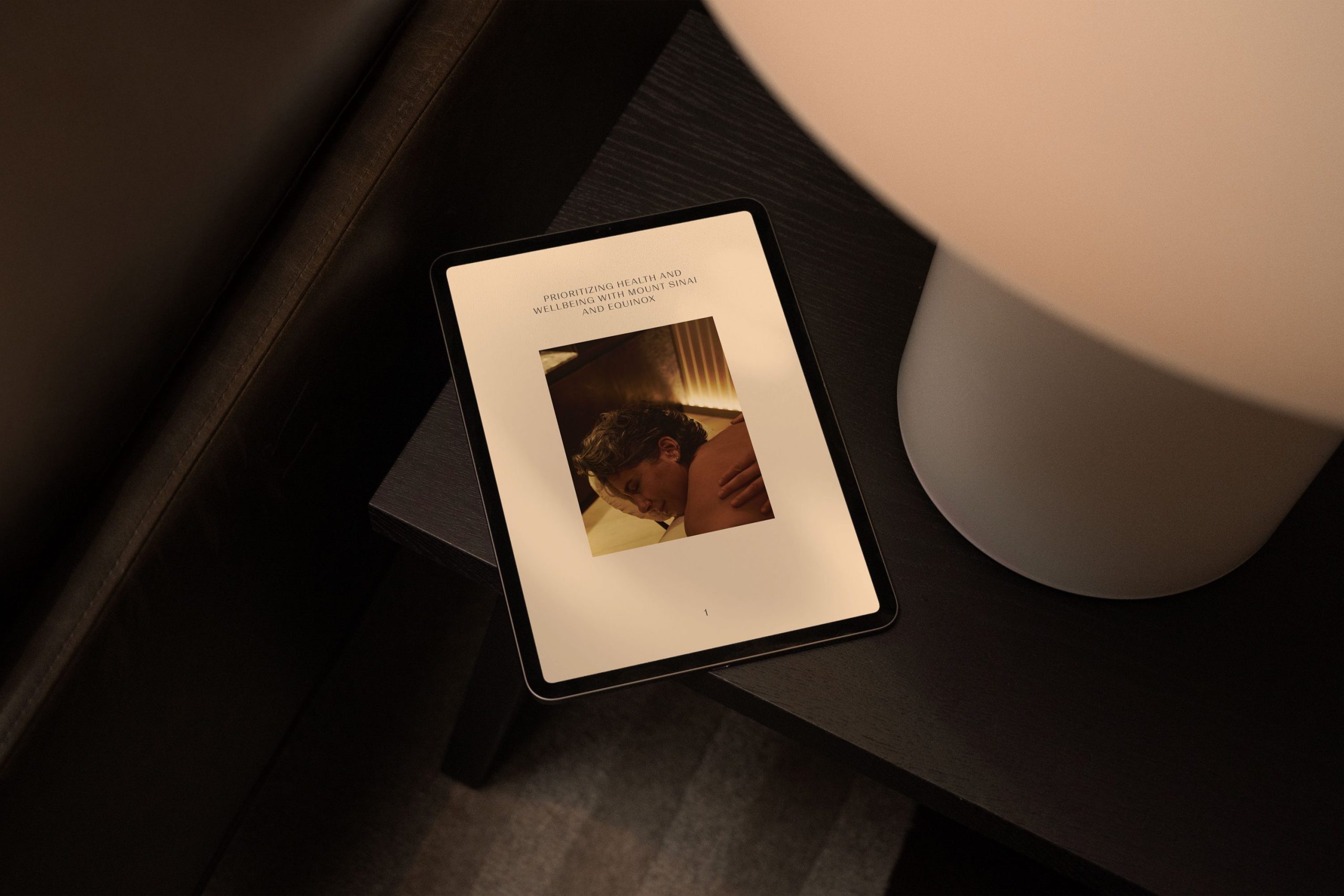
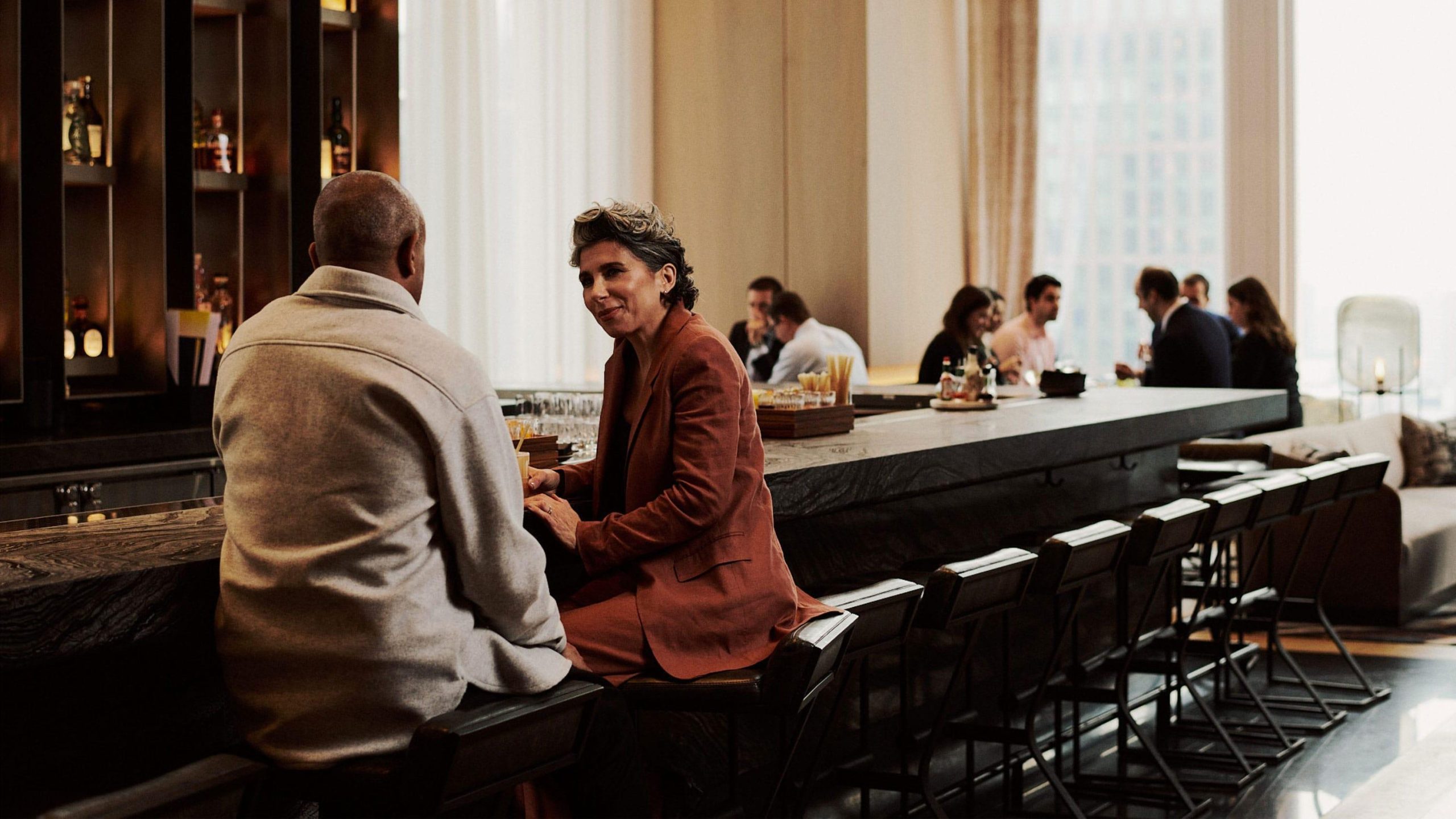
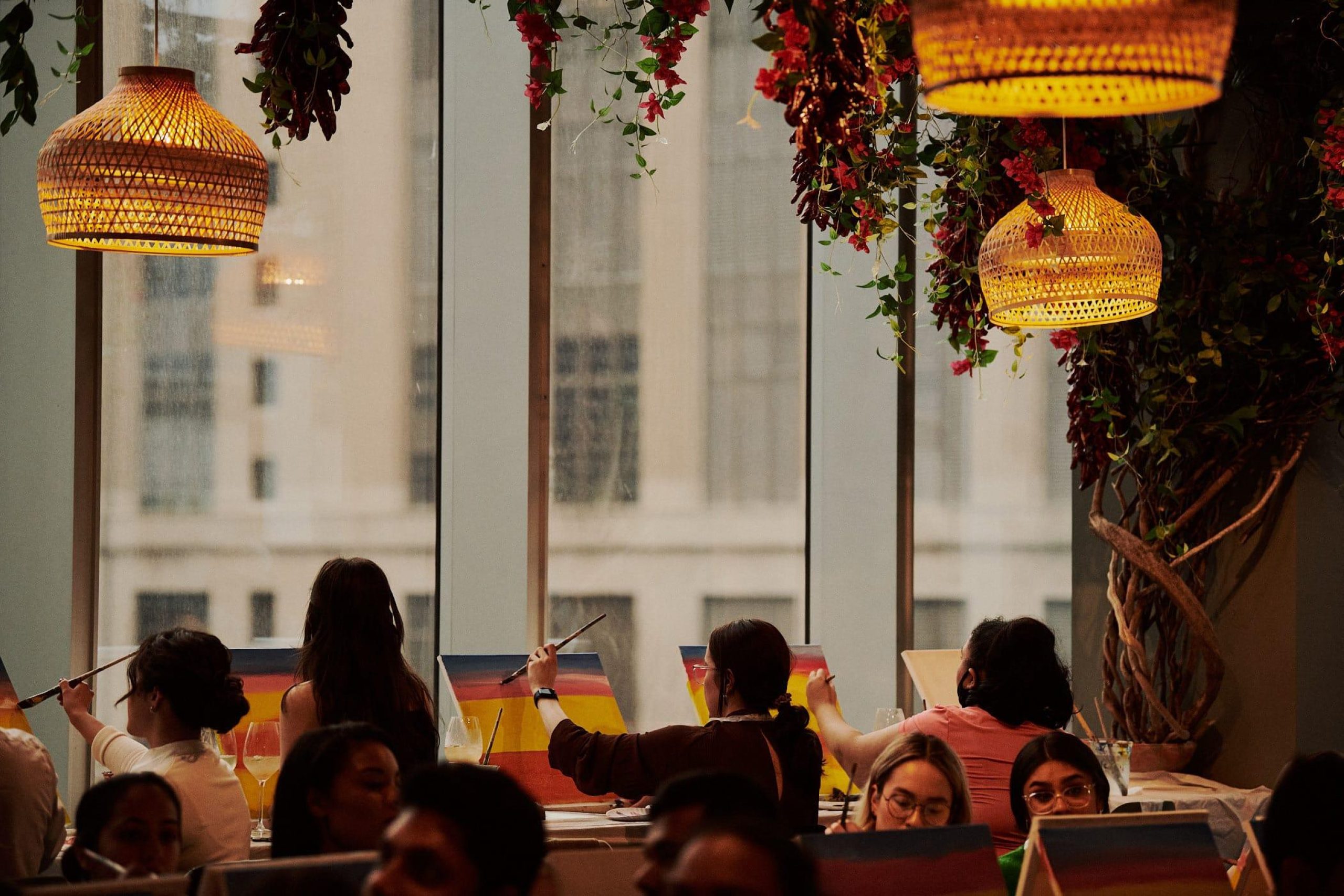
Far ahead of many, Related leads the way in creating amenity-rich workplaces. Their ecosystem at Hudson Yards is built on layers of services that look after every detail of modern life — from convenient childcare to world-class healthcare, transcendental fitness to flexible working spaces.
After years of refinement across many skyscrapers, their next headquarters is a testament to an approach that pushes the boundaries of what an office looks like. Our office brand strategy not only helped them crystalize this approach but also articulate its benefits to businesses. Introducing: the lifestyle office — an environment designed to draw, inspire and boost the very best talent by providing the very best worklife.
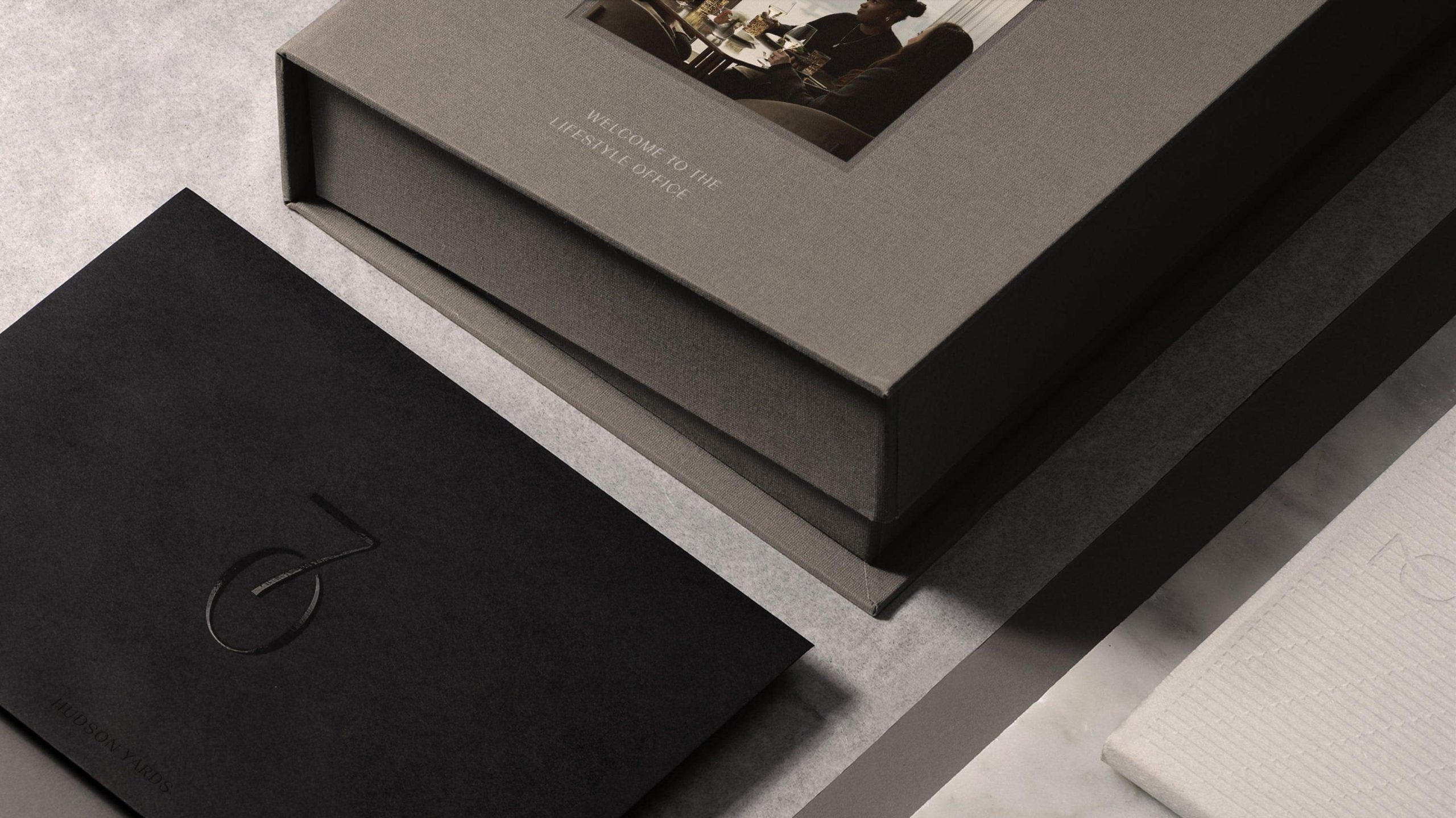
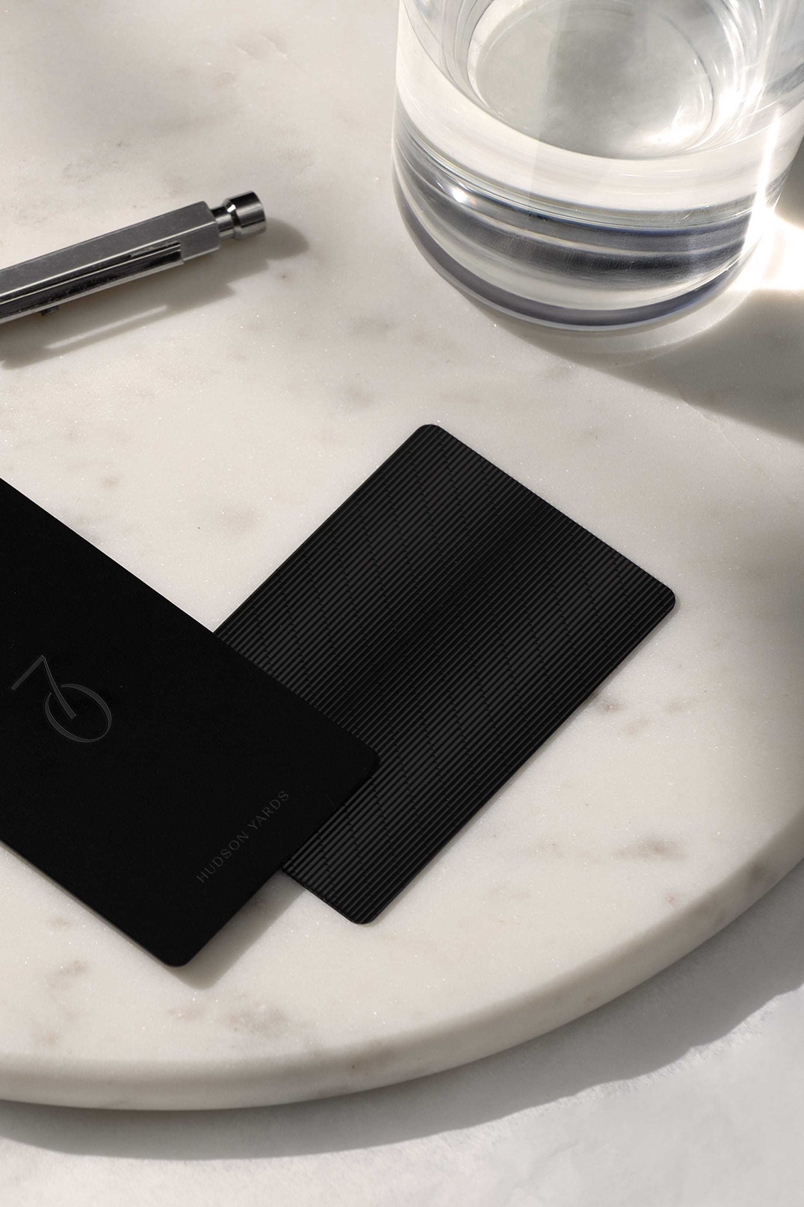
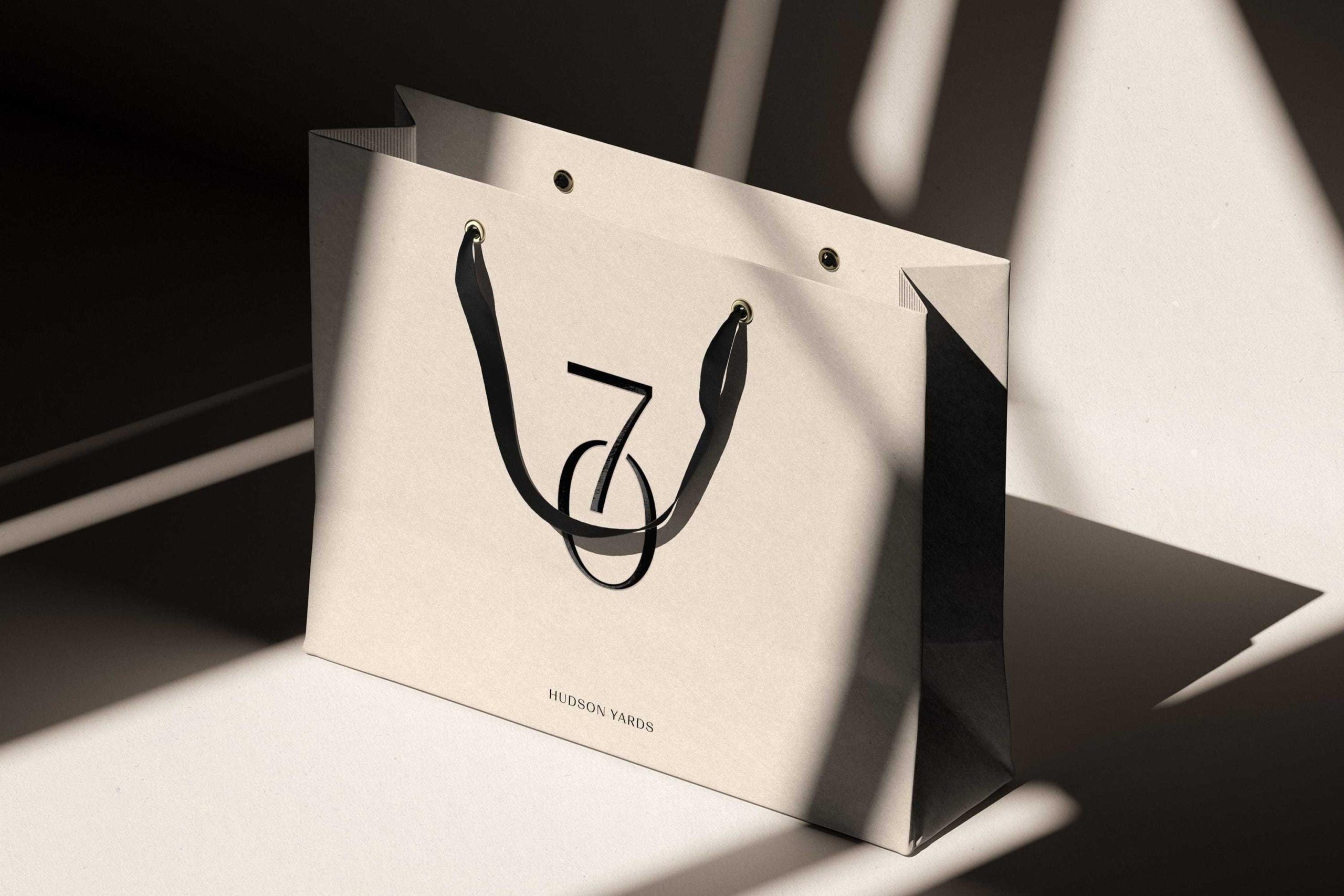
The signature of 70 Hudson Yards
At the core of our workplace brand identity for 70 Hudson Yards’ brand is its logo – its most visible and enduring identifier. Inspired by its signature finned facade, the beveled logo signifies the building’s commitment to precision, high performance and elevated service, and embodies the sophistication of the overall 70 Hudson Yards experience. The logo extends into a supporting pattern, created from the shadows cast by the fins, adding depth, rhythm and texture across both the physical and digital applications.
The color palette, drawn from the architecture’s warm copper tones, signals a deliberate departure from corporate coldness to a space designed for life. Complementing this, the typography combines modern structure with bold contrast, mirroring the materials and the dynamic experience of the building itself.
Framing the 70 Hudson Yards experience
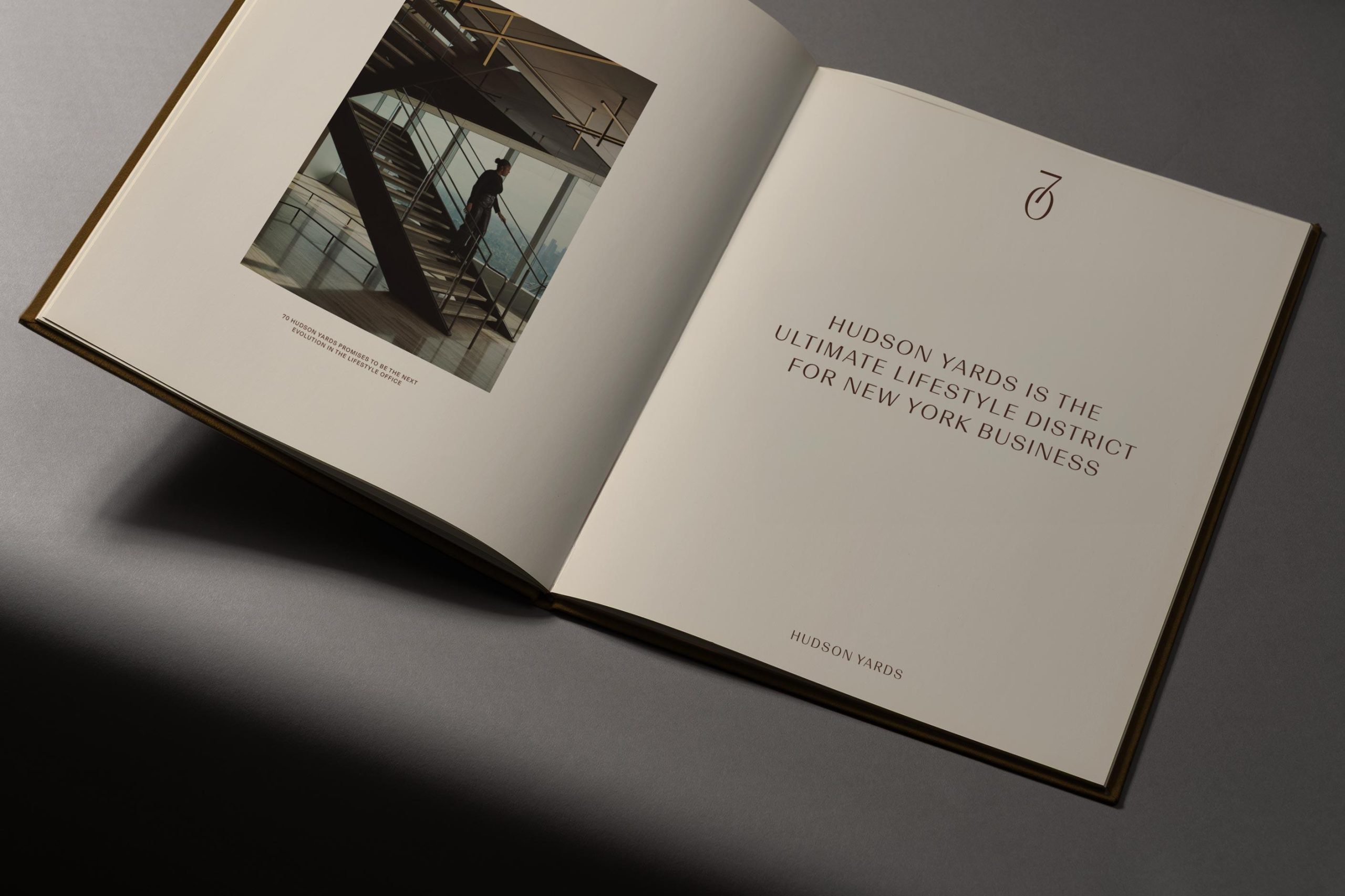
To bring 70 Hudson Yards’ vision to life, we collaborated with photographer Ryan Lowry to create a visual language that moves beyond typical, sterile imagery and embraces a warm, refined tone that mirrors the experience of the lifestyle office. By combining striking location shots with abstract, mood-driven visuals of future spaces, we developed a visual toolkit that puts lifestyle front and center.

Establishing a nationwide vision
What began as a singular vision at 70 Hudson Yards has been so successful that our commercial real estate branding now reaches further: 'the lifestyle office' has been expanded to describe Related’s entire national office portfolio.
Every element of the lifestyle office — from hospitality-level service to next-generation wellness amenities to signature culinary offerings — is thoughtfully designed to create environments where people and businesses perform at their highest level.
Through this, we helped Related position themselves as the trusted partner for forward-thinking companies seeking to inspire, nurture and develop top talent into high-performing, world-changing teams.
Case study photography by George Cudby