Milton Glaser’s beloved ‘I ♥ NY’ logo in the post-emoji world
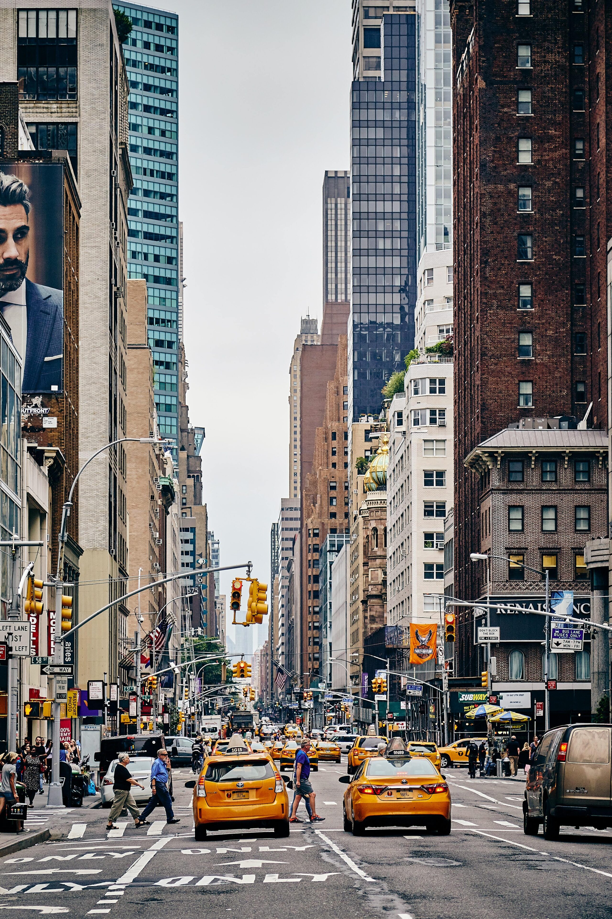
I came to New York embarrassingly late. Thirty years of expectation and anticipation weighed down as I paced the sidewalk in the warm September air. I was filled with a soaring emotion that rose as high as the towering architecture; the dazzling cacophony of concrete and glass (progress!) colliding with the gaping expanse of water and sky (freedom!) never far from sight.
I went to the park. I went to the Met, the Whitney, the Guggenheim. I went up the top of the Rock. I went on the Staten Island ferry. By day I was overwhelmed by an energy I didn’t usually possess and come night felt a deep satisfaction tinged with just a little melancholy. I couldn’t help thinking that this reaction was the result of an idea lodged in my brain long ago, pre-loaded in my vocabulary. Wasn’t this the greatest city in the world? Hadn’t I been told so — hadn’t that song been sung to me — again and again since birth?

“Glaser’s heart still seems to contain the very emotion I felt the first time I came to New York to see what all the fuss was about.”
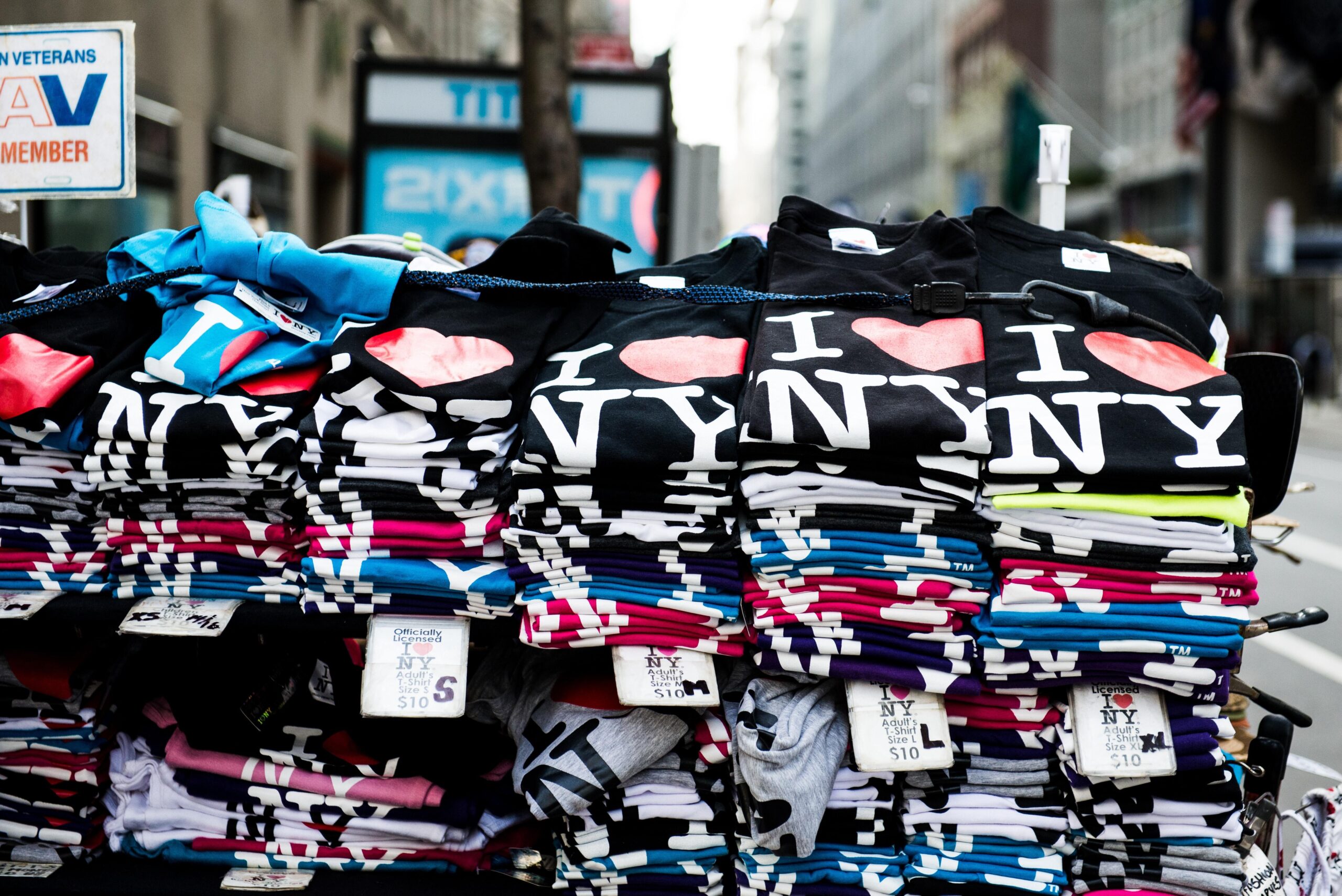
Milton Glaser’s I ♥ NY logo was designed to turn around the fortunes of a floundering state but is often wrongly assumed to belong to New York the city. Since its first appearance in 1977, it has been commandeered by a host of competing cities around the world. Used initially as a sign of allegiance to a specific place, the logo has since been hijacked to celebrate pretty much anything else people hold dear.
When Glaser created the logo, he not only penned a love letter to an ailing state, he established a new shorthand with which humans could express affection for their world. The backbone of I ♥ NY is a puzzle: first, the abbreviation of New York to NY; second, the then groundbreaking use of a noun (the heart) in place of a verb (to love). The echoes of this simple but brilliant visual cue resound in the unstoppable profusion of I♥ s today — from I ♥ Liverpool to I ♥ Justin Bieber, and poignantly at the time I search, I ♥ consent.
Has one of the most imitated logos ever created lost its original authenticity, and crucially, its heart? I don’t think so. Though I have more than a dozen hearts on my emoji keyboard to choose from when proclaiming my love of anything from my lunchtime sandwich to the city I live in, none of these appear as bright and full as his. Glaser’s heart seems to contain the very emotion I felt the first time I came to New York to see what all the fuss was about.

Glaser’s heart: a symbol of optimism so squeaky clean it seemed to hide New York’s complexity at its core. A mass of chaos and beauty, struggle and magic, held taut within. Until it didn’t. The 2001 ‘I ♥NY More Than Ever’ version acknowledged New York’s vulnerability and its resilience. Glaser’s logo is an encapsulation of one man’s belief in the irrepressible greatness of a place, and its far-reaching imitations reflect the rest of the world’s hunger for the fantasy of New York City. Is the hype around brand New York unfounded, overrated?
As an enthralled tourist, it is not my place to say. But I’m fairly certain the emotion Glaser’s logo has the power to conjure is unique to New York: the original recipient of the I ♥ treatment. For years I felt the tangible pull of the place in anticipation, and I still feel it in the afterglow of having been. Yes, beneath the surface, we are all fragile, knotty messes. We are trying to hold it together. But, no matter what, we love.
Originally published as part of the City Identities exhibition by Place Press, a publisher exploring the intersection between people, places and culture. Photos by Artem Zhukov, Dan Calderwood and Fabien Bazanegue.