
It’s ‘Straight Forward’ for our new book on wayfinding
Jun 22, 2024
-
Words
Patrick Eley
-
Book photography
George Cudby
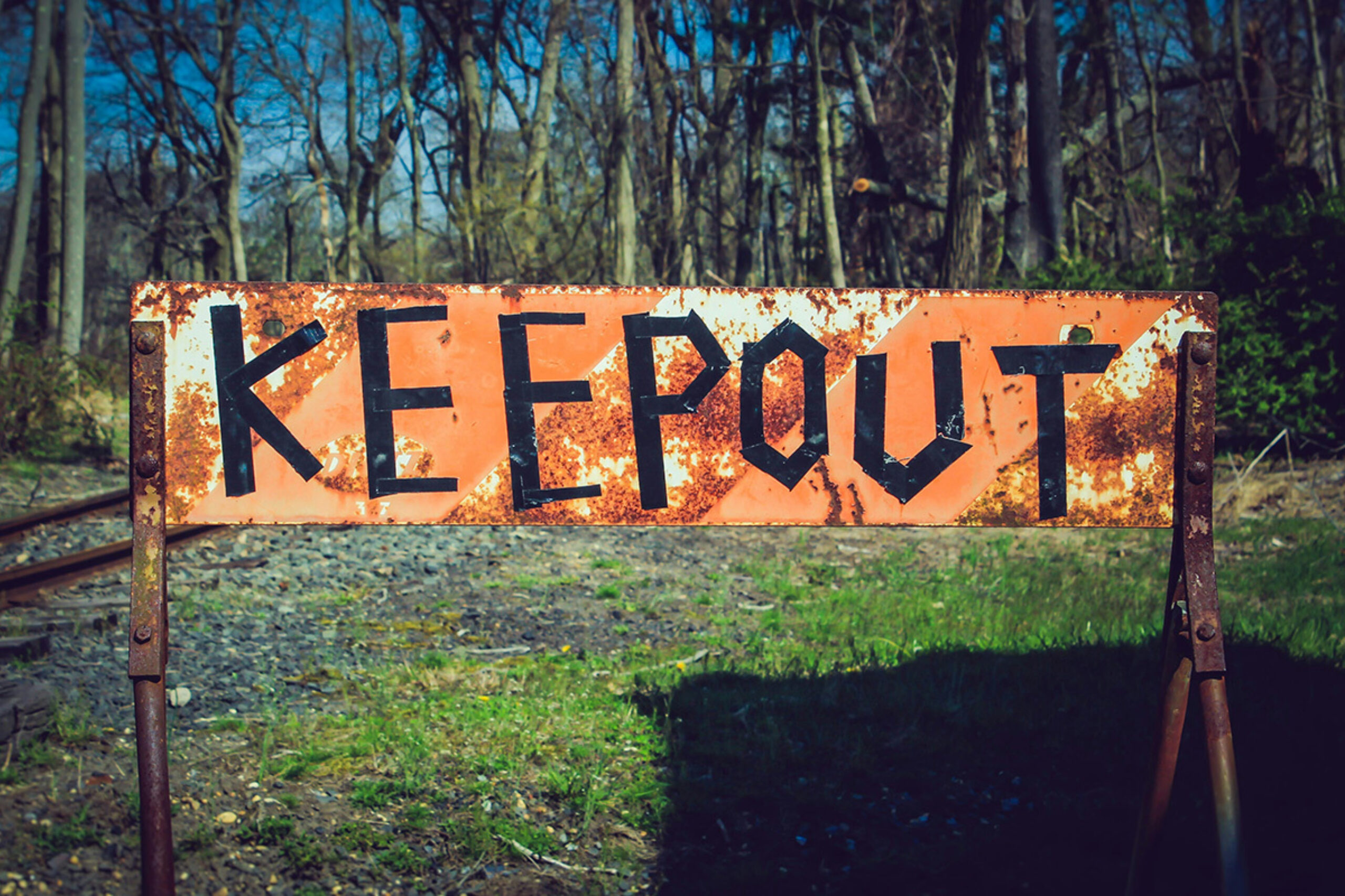
Wayfinding is the unsung hero of the built environment. It’s as integral to a place as its roof or foundations, and yet people only seem to notice it when it doesn’t work.
Signs are conversations between people, and like all conversations they can be quiet and discreet or loud and abrasive. They can be funny, uplifting and kind: a gentle nudge in the right direction and a guiding hand on your elbow through the confusion. Or they can be sharp, threatening and mean. From a passive aggressive fridge note and the stomach-churning instructions of border control to the ‘welcome home’ on a door mat, signs engender all sorts of emotions and have a very real effect on how we feel about a place.
Signs are conversations between people, and like all conversations they can be quiet and discreet or loud and abrasive.
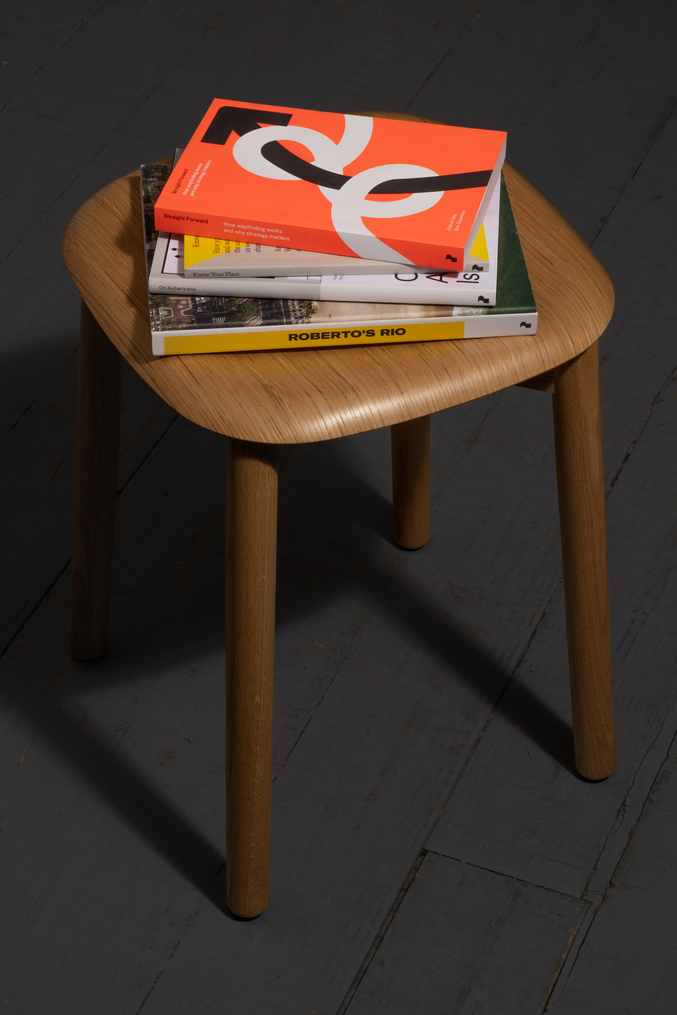
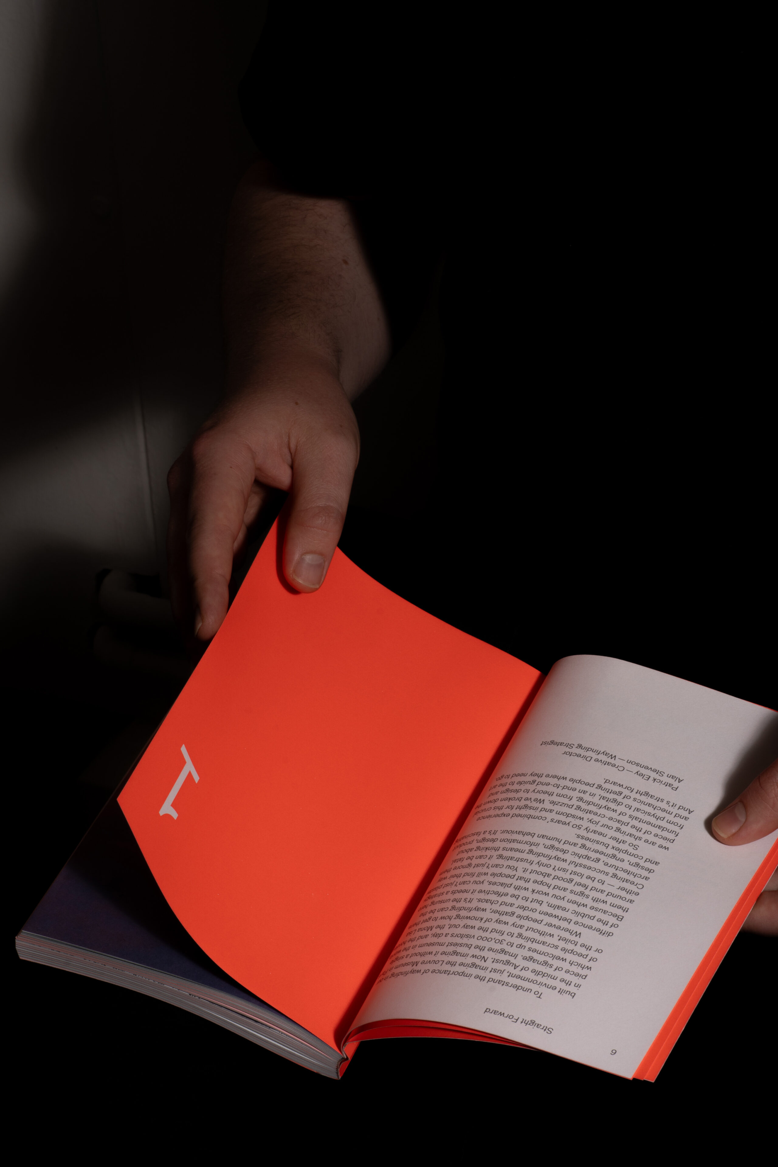
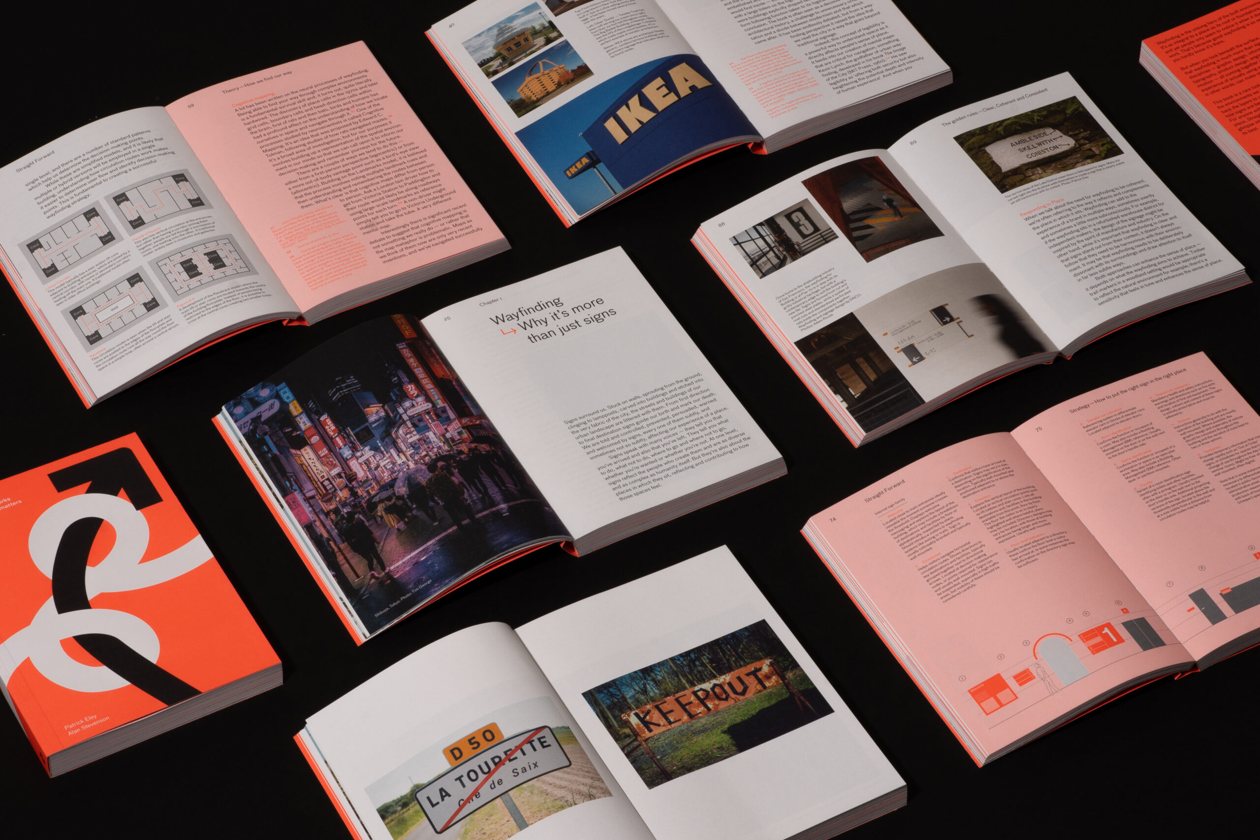
Our publishing imprint company Place Press has just released Straight Forward: How wayfinding works and why strategy matters by Patrick Eley and Alan Stevenson. It condenses 50 years combined experience into an easy-to-read guide to the art and science of wayfinding. But why did we write it?
Most wayfinding books fall broadly into two categories — cute picture books of past projects on the one hand, and on the other, books covering the entire process from soup to nuts. What was missing — we felt — was a book focusing on strategy which explored how wayfinding affects a ‘sense of place’. That’s the feeling you get about a place that makes you long to come back, or never return. And that felt particularly relevant to what we do at DNCO — we’re a studio obsessed with place. We want to understand them, figure out their stories, see how they fit into the world. And ultimately make them better.
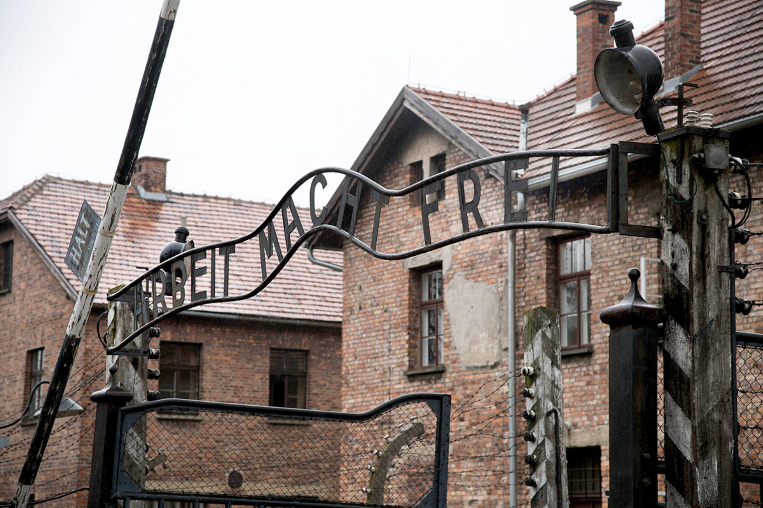
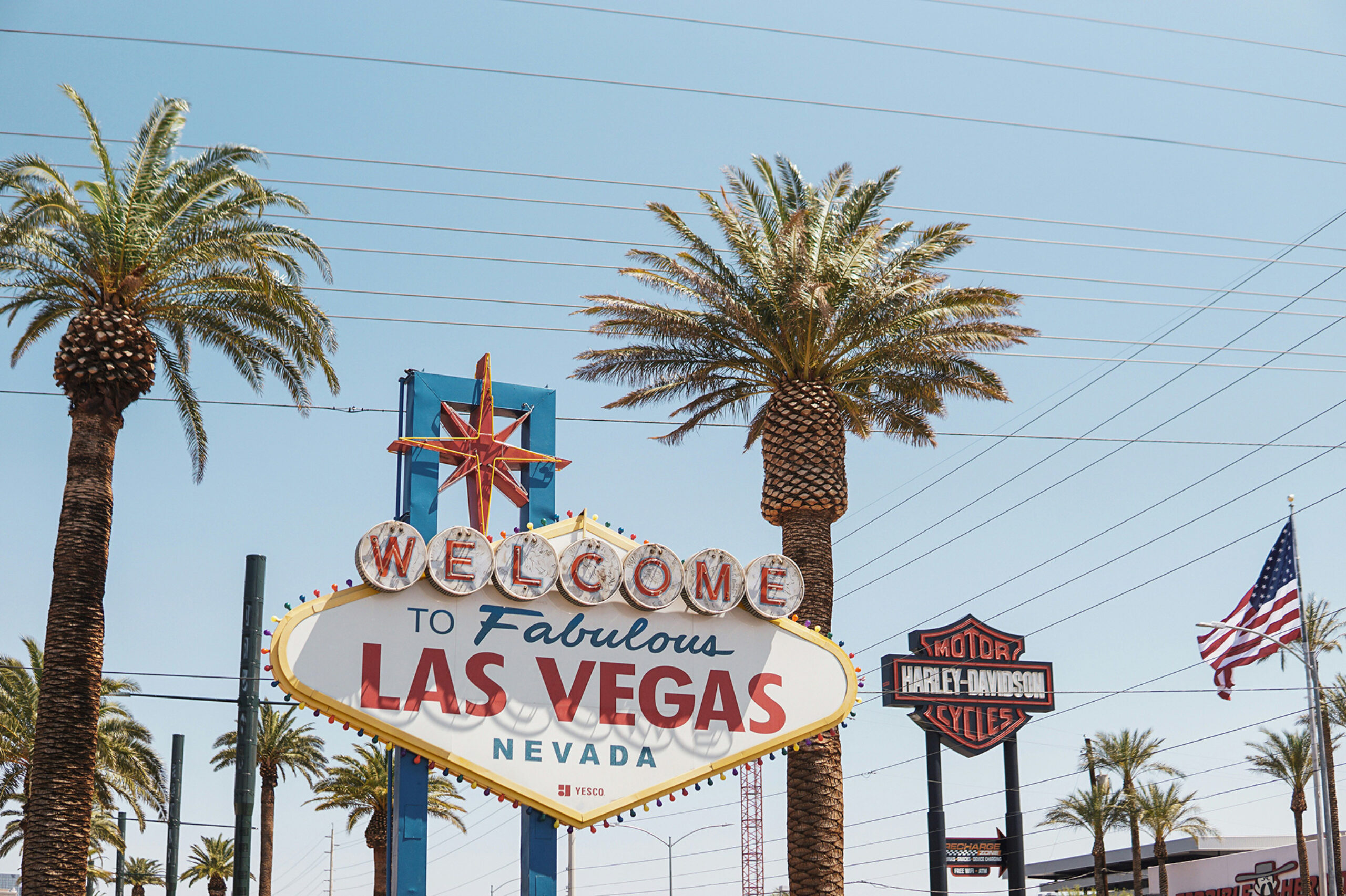
It turns out that signage and wayfinding has a huge effect on how you feel about a place — think of the sign above the entrance to Auschwitz and compare that to the Welcome to Vegas sign and you begin to see how powerful they can be.
Signs create a sense of place
We often describe wayfinding as one of the least subjective areas of design. It either works or it doesn’t. People can either find their way around a space or they can’t. That’s quite a binary way of thinking — wayfinding is of course more subtle than that — but it’s a good way to understand that there needs to be some solid thinking behind a wayfinding system for it to function properly.
You can’t just plaster a place with signs and hope that people will find their way around and feel good about it. You can’t just ignore them either — being lost isn’t just frustrating, it can be fatal. In fact being lost is such a fundamental human fear it’s a recurring theme in our fairytales — from Hansel & Gretal to Snow White to Kristoff from Frozen — being lost is a terrifying feeling.
So how do you avoid that? How do you create wayfinding that encourages visitors, nudges them in the right direction, makes them feel good about a place — but does so without shouting at them? Well — creating successful wayfinding means thinking about architecture, graphic design, information design, product design, engineering and human behaviour. It’s a complex business, but if you think about it logically then it all becomes pretty straight forward. And that’s what we set out to cover in the book.
Creating successful wayfinding means thinking about architecture, graphic design, information design, product design, engineering and human behaviour
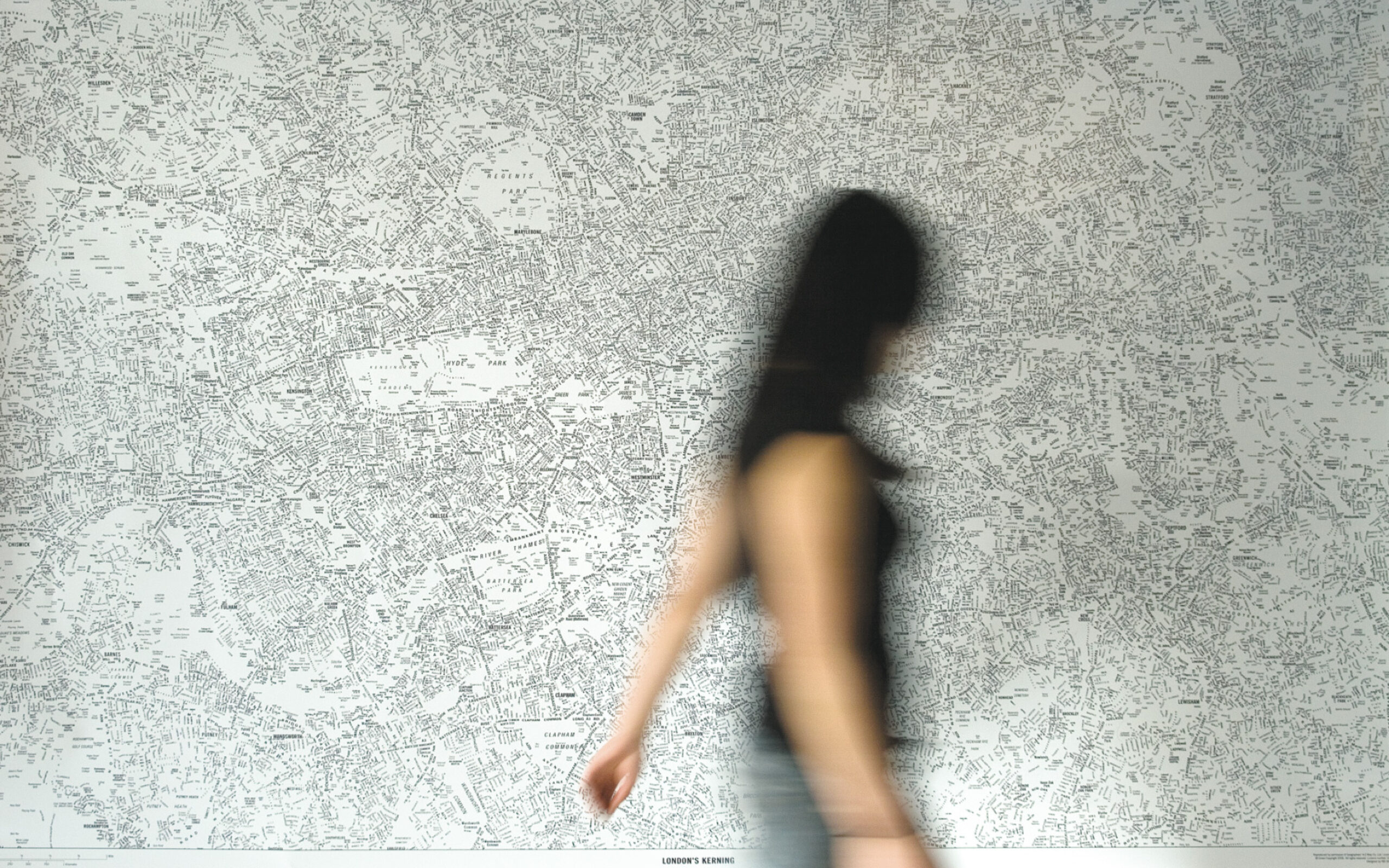
The book starts with discussing what wayfinding actually is before looking at some of the theories behind how we find our way. It’s peppered with interesting (and slightly niche) facts — did you know for example that the Hollywood sign used to read Hollywoodland before the ‘LAND’ fell off and the rest of the sign was rescued and rebuilt by porn baron Hugh Hefner and Alice Cooper? Or that the hippocampus — the part of the brain that’s responsible for helping us navigate — is actually bigger in London taxi drivers than it is in other people due to their learning of The Knowledge? — the internal map of the city they have to hold in their head.
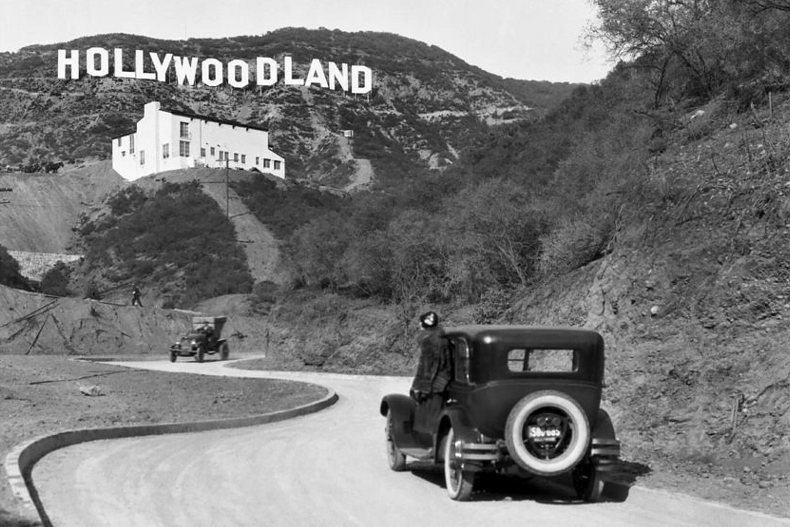
The sign was erected on 31 October 1923 and intended to last for just 18 months
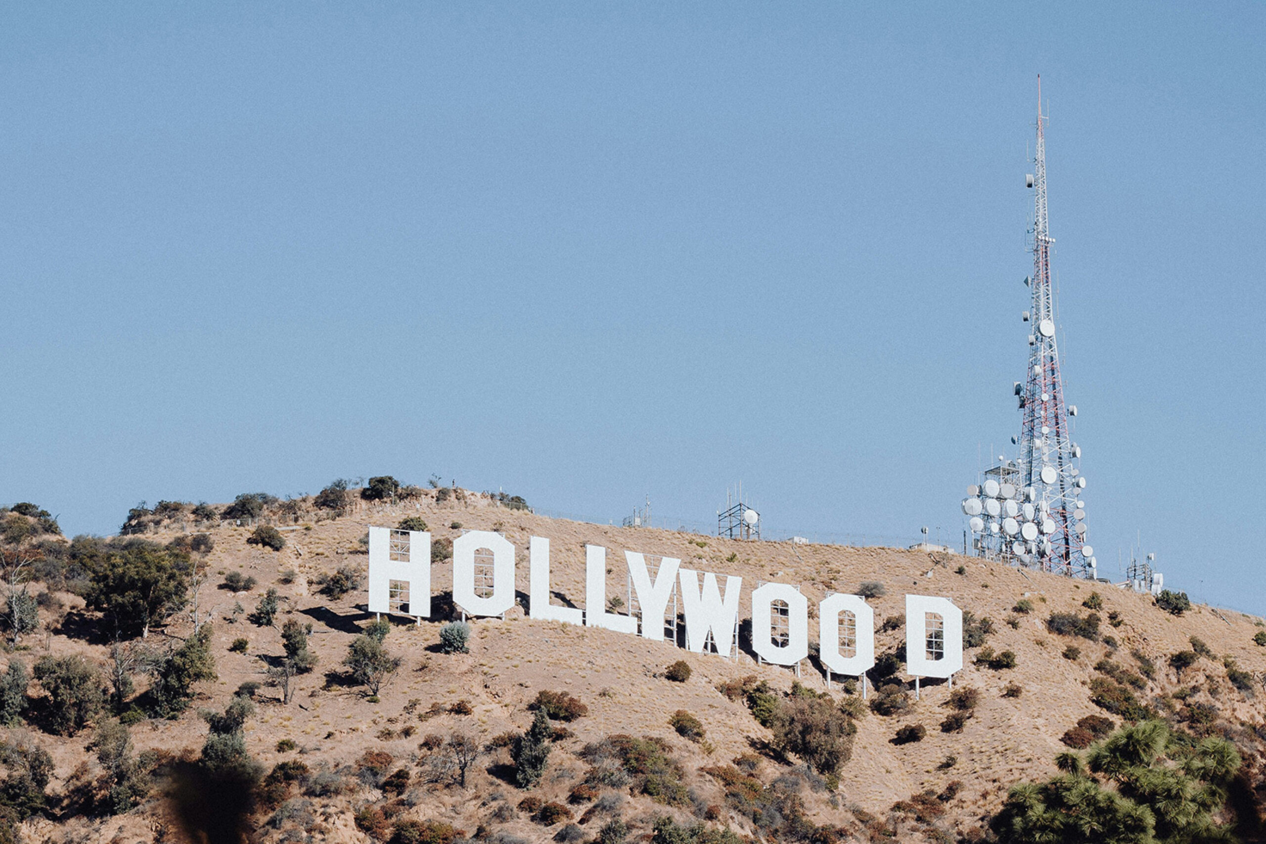
It has lasted for more than 80 years
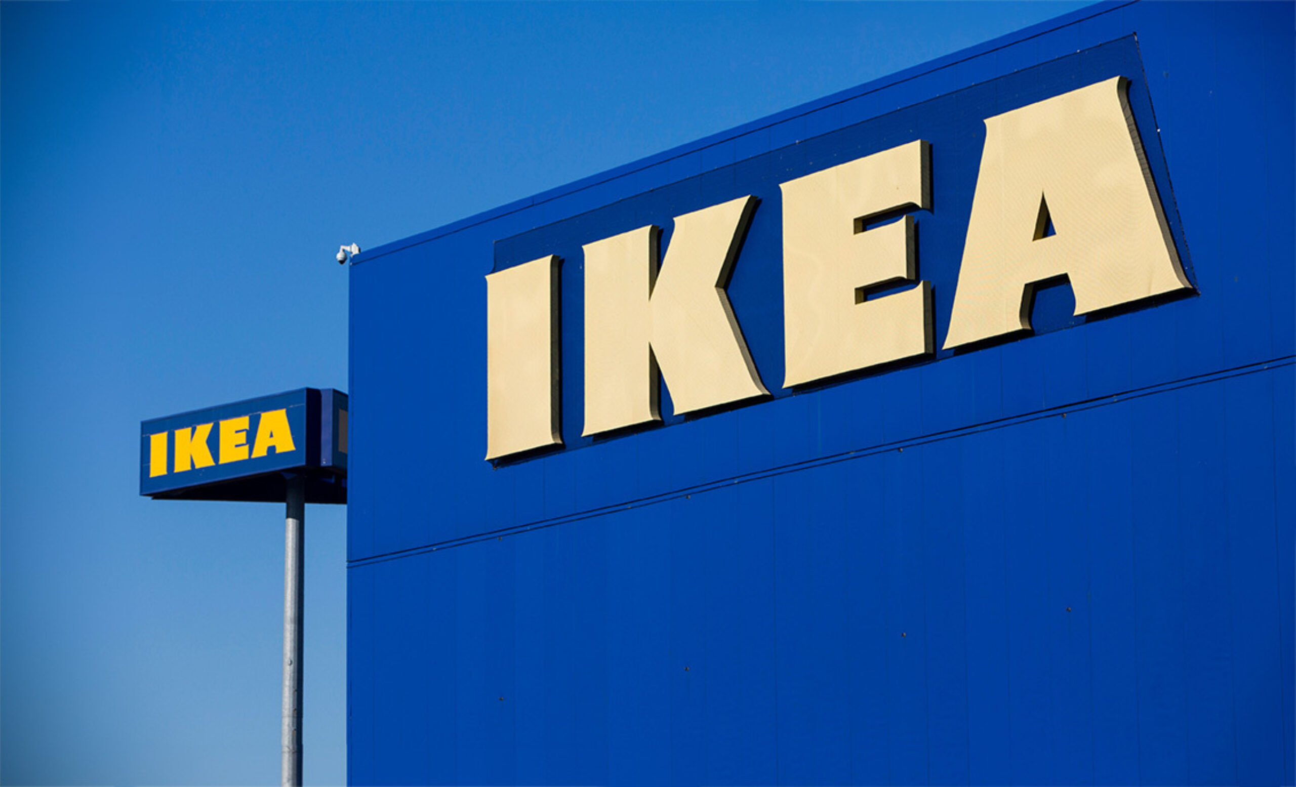
Along with that there’s plenty of practical information — geeky details like guidance on type sizes and light reflectance, but more importantly we talk about the way to think about strategy. That’s the ‘where do signs go, and what do they say’ part of the process. It’s also the overarching objective behind the system. The needs of wayfinding in a hospital will be very different than they are in a shop like IKEA.
One of the things we don’t do is talk too much about design. We talk about the things that affect how you design a sign, but we don’t say you have to do this, or you have to do that. Design is contextual. It varies depending on what you want to convey, how a place already looks, or your personal taste.
What we do discuss is our three Golden Rules. We believe that wayfinding needs to be Clear, Coherent and Consistent (we love alliteration!). We want people to understand that wayfinding is a coded system and that people approach it with intuition and expectations, but you need to reduce the confusion along the way.
We dedicate a chapter to maps — how to think about creating them and the fact that all maps lie. And we talk extensively about accessibility — that you really need to understand your users in order to create something that will be useful. The saying that ‘to understand someone you need to walk a mile in their shoes’ has a particular resonance with wayfinding. But we want you to understand that not everyone will be walking, or even wearing shoes.
Lastly, we tackle sustainability, flexibility and the future. Digital wayfinding is an alluring prospect — endless possibilities, flexible for ever and with you every step of the way. Google Maps revolutionised how we navigate — that little blue dot at the centre of the screen is a compelling confirmation that we’re at the centre of our world.
But while it can broaden our horizons, it can be a myopic way of interacting with the places around us. Chance encounters disappear, advertising takes over. It sounds dystopian, but it's already happening — where we go will increasingly be reliant on the technology we use. The beauty of paper however is that it doesn't crash and it’s likely that analogue wayfinding will continue to exist even as digital technologies continue to evolve. Alongside that is the power that signs have to affect and enhance the sense of place. And that's an opportunity that is too good to waste.
Buy your copy of Straight Forward here