
‘Love is the running towards’: homage to London Fire Brigade
Nov 24, 2022
-
Words
DNCO
-
Design
Chrissie Winter
Our posters for London Design Festival celebrate the heroism of firefighters and 150 years of fire brigade design
In London, sirens are like punctuation. Eerie and impersonal, they become a background sound of the city that triggers a vague unease — a wail that means that somewhere else, something bad has happened.
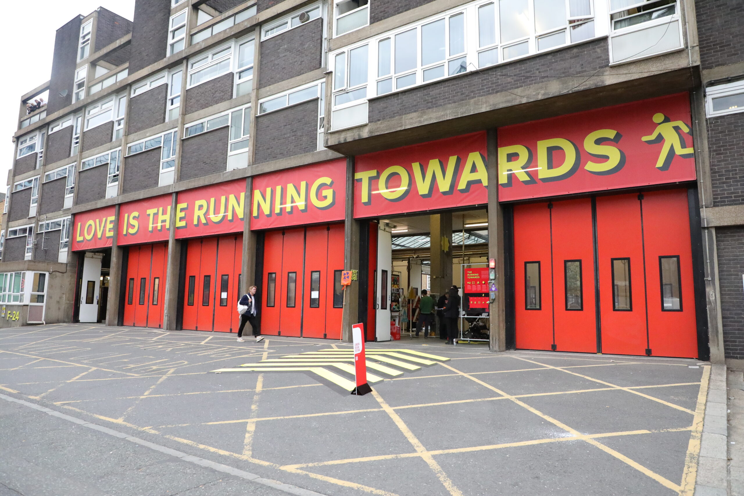
The Running Towards is a campaign for the London Fire Brigade that challenges us to hear those sounds a little differently. After all, sirens don’t mean danger; sirens mean that help is at hand. Listen carefully and that wail is “a protective call of reassurance, a community chorus of ‘we are running your way’. What we do when we get there comes from training. Love is the running towards.”
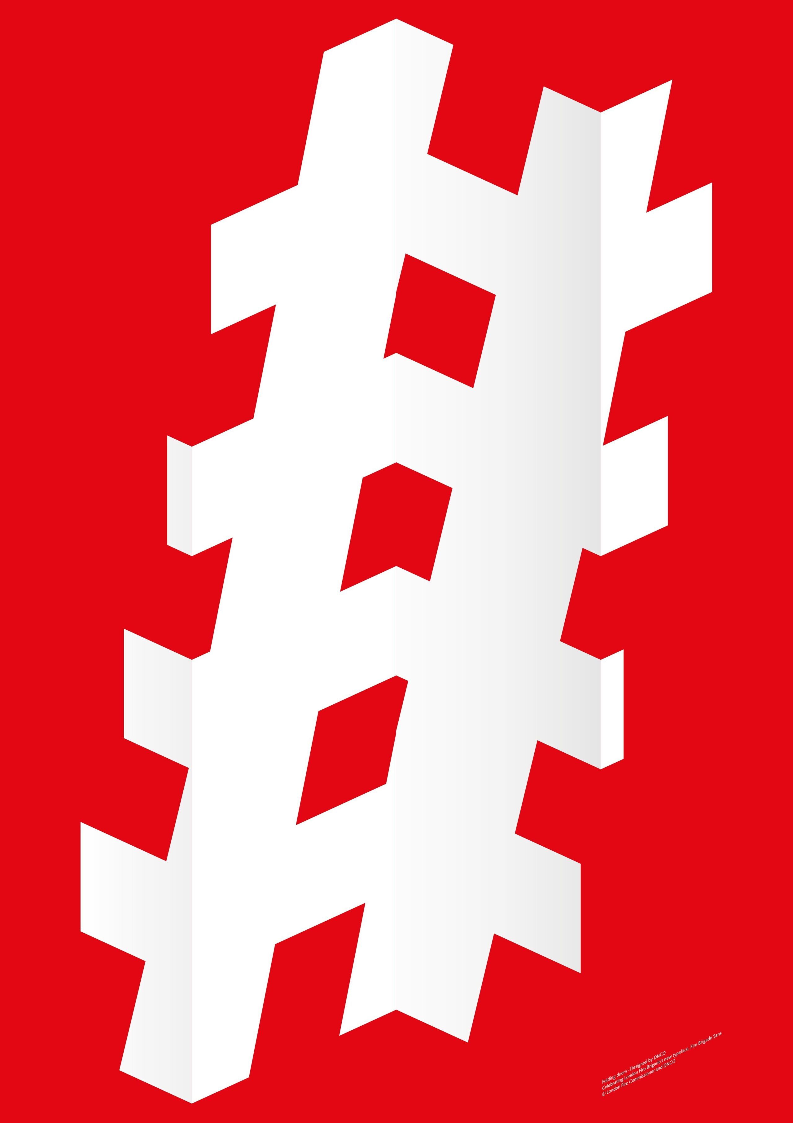
For London Design Festival, creative studios across the UK were invited to come up with posters inspired by this phrase. The posters and an exhibition at Shoreditch Fire Station celebrated the service’s new font, Fire Brigade Sans, created by The Foundry to echo the drop-shadow lettering on vintage fire engines.
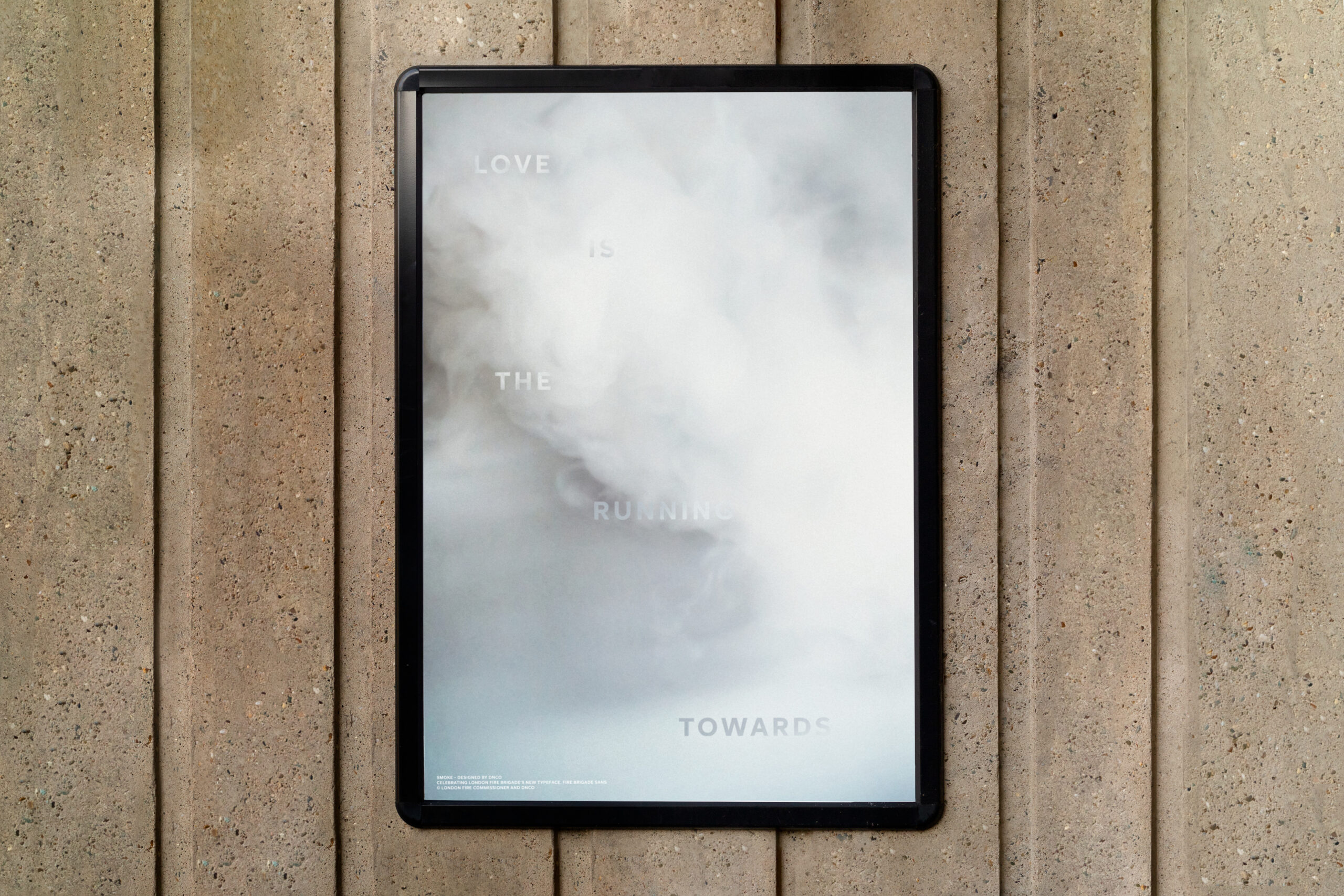
Chrissie Winter's final poster
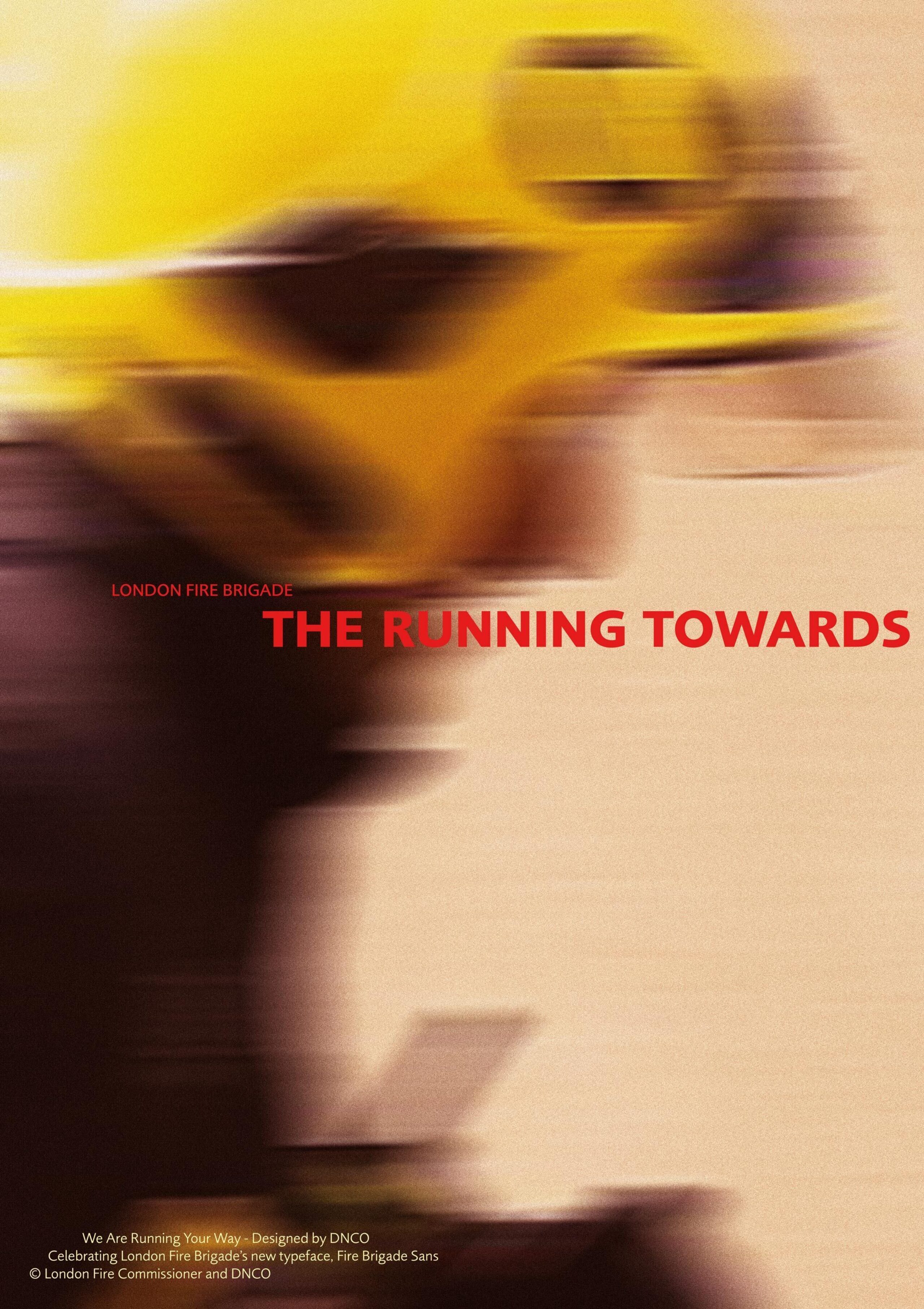
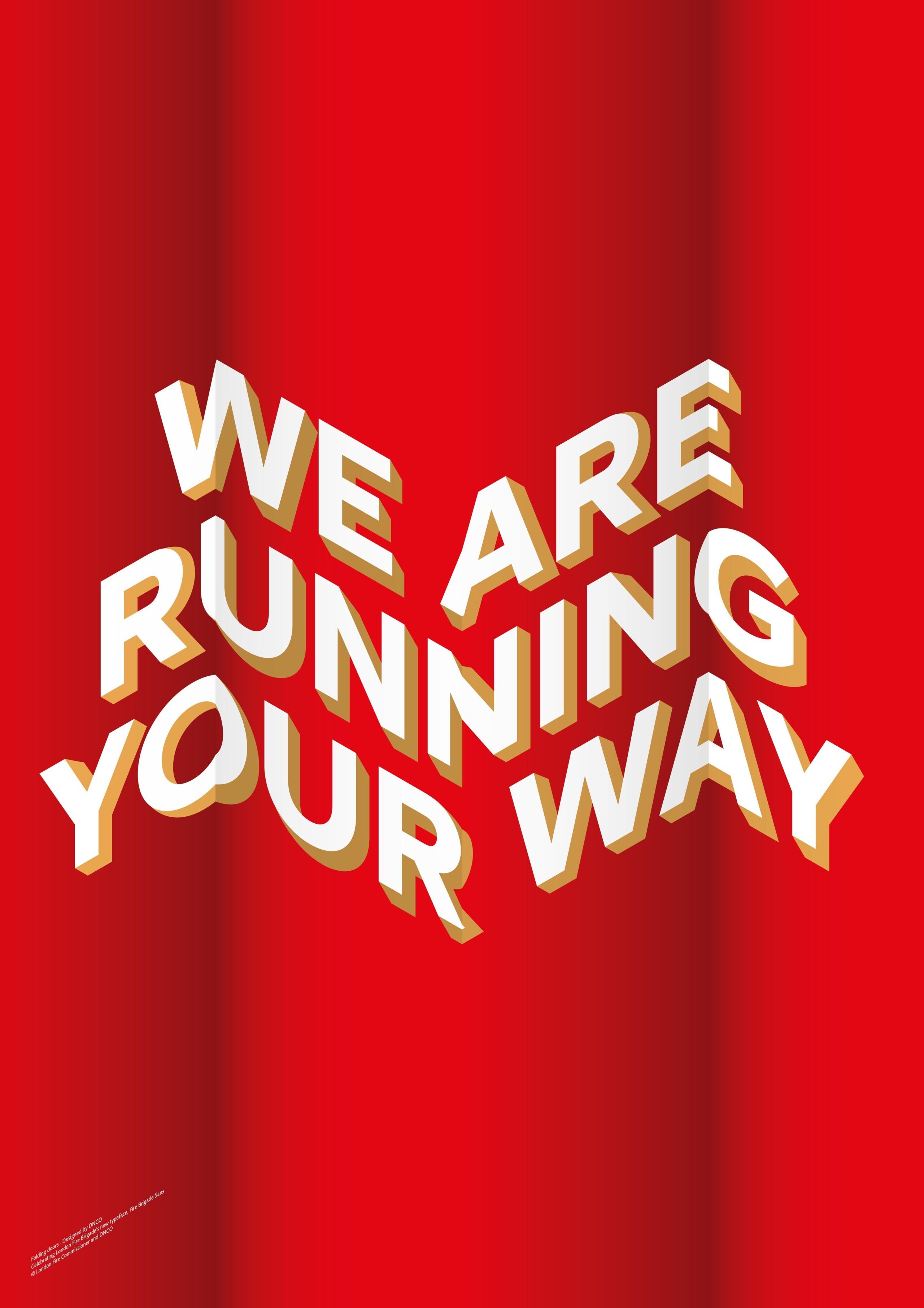
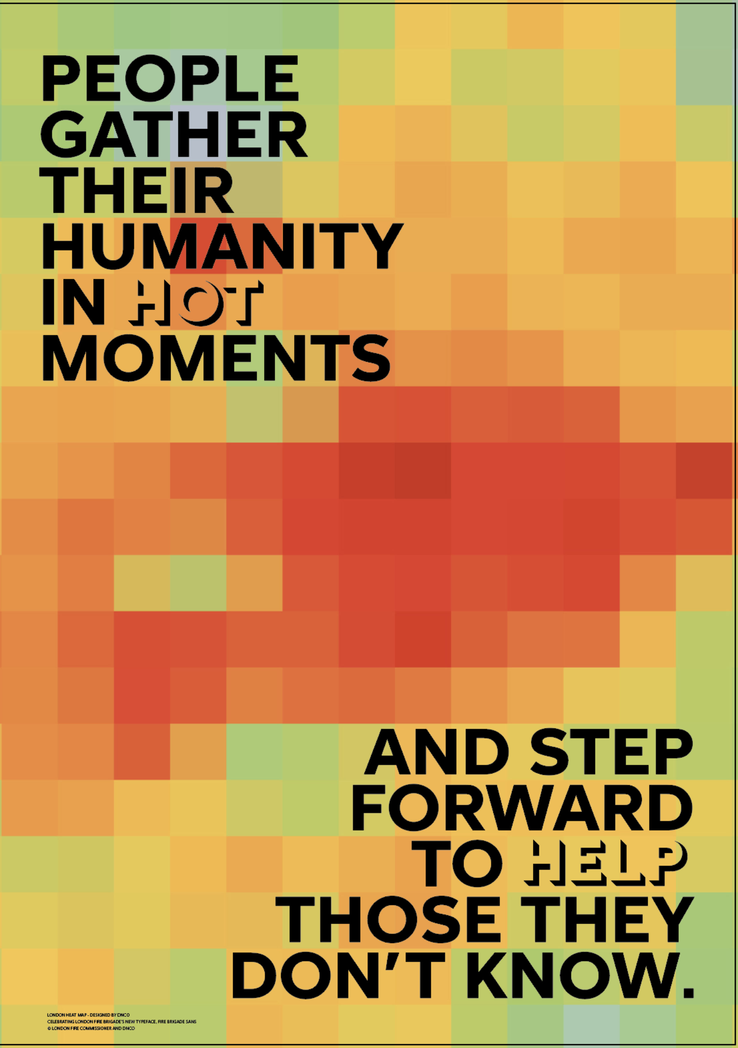
One day, anyone walking into DNCO’s printer room would have stumbled upon a glorious mass of colourful paper pasted up on the walls. These vibrant reds and yellows were each of our design team’s interpretations on the theme, taking inspiration from the bold colours and impactful font of the campaign. But our final entry was quite different.
Our designer Chrissie Winter’s poster (above) shows menacing billows of smoke with the words “love is the running towards” half-submerged in them, perhaps emerging or perhaps disappearing further into the fug. It’s claustrophobic, evocative and a little frightening. It’s an unexpected, even subversive, response to the brief. Like the campaign itself, it prompts you to take a second look. She explains: “The brief was to celebrate the typeface, but we’re pushing it back and hiding it. It makes you look closer and pay attention to the type forms because they’re hidden.”
“The brief was to celebrate the typeface, but we’re pushing it back and hiding it. It makes you look closer and pay attention.”
Design: Nathalie Shores
Design: George Cudby
To create this image, first Chrissie needed the right kind of smoke. “Our design director Peter suggested that we start a little fire in the courtyard, but I reminded him that our neighbours’ cars are parked outside.” In the end, she turned to her partner and his vaping habit. “He had multiple vapes in his mouth at the same time and I just took a ton of photos.”
What you see there is not any single photo from that shoot. Instead, the images are meticulously layered to build up the billows of smoke. And, looking closely, you’ll see that the letterforms themselves are masked sections from the same photo, carefully positioned to be just the right amount of legible.
Design: Holly Moxham
Design: George Cudby
“Listen carefully and that wail is a protective call of reassurance, a community chorus of ‘we are running your way’.”
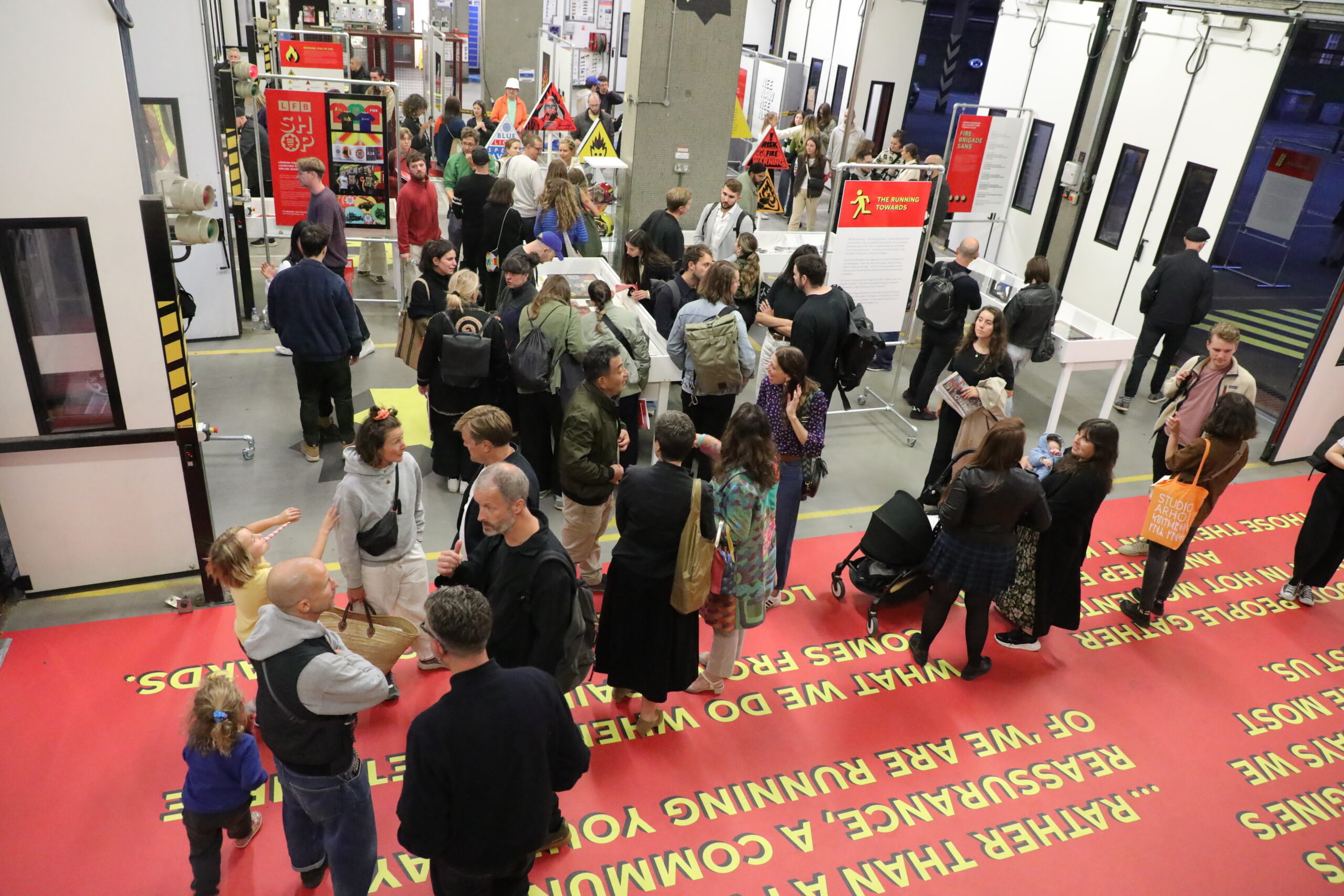
For the exhibition, Shoreditch Fire Station was transformed by striking supergraphics from Studio Sutherl&, heroing the new typeface. Visitors could also enjoy a display of vintage fire engines, creative reinterpretations of the flammable icon, and London Fire Brigade objects and ephemera. Fire stations are never closed. Shoreditch remained in use throughout the exhibition, with emergency response vehicles going out: a constant reminder of what London’s firefighters are running towards every day.
As a studio, it’s a joy and a privilege to take part in projects like this. Creative director Patrick Eley said, “It’s a really exciting thing for a designer to do: let’s do something for the sake of it. You get to make something, you get to be part of something seen in public, it’s a good cause.”
Shop the London Design Festival posters and pictograms til the end of November to support London Fire Brigade’s mental health and wellbeing initiatives.
The exhibition and Running Towards campaign was created by KesselsKramer, Thomas Sharp, Studio Sutherl& and the fire brigade team.