London’s logos, decoded
Jun 23, 2018
-
Words
Patrick Eley
Each of our 32 boroughs has its own logo. But what does this municipal clipart tell us about the capital’s identity?
I’m a reluctant Londoner. Not because I don’t love this city, but because other cities always sounded so much better.
America has all the great ones — the Windy City, the Mile High City, the City of Angels; they even have the City that Never Sleeps. These cities sound like places of endless adventure and opportunity; the homes of gods and monsters.
It’s not easy to brand a city. Michael Wolff, co-founder of Wolff Olins, said it was like trying to eat a dinosaur. That never stopped our neighbours across the Atlantic, who seem to have cracked it.
London was already a thriving city while many of these American counterparts were little more than early trading posts, pioneer settlements or virgin swamps. But somehow it lacks a definable identity, let alone a brand that everyone stands behind. ‘Blitz spirit’ is about the only memorable descriptor and it’s 60 years old, and worryingly close to the mustn’t-grumble- stiff-upper-lip-loveable-Cockney caricature of Londoners that’s trotted out the world over. So why the disconnect?
“It’s not easy to brand a city. Michael Wolff, co-founder of Wolff Olins, said it was like trying to eat a dinosaur.”
Like many big cities, London is a collection of separate villages that outgrew themselves by growing into each other. Centuries ago places like Marylebone, Hampstead, Highgate and Dulwich were collections of houses separated by farmland and wild spaces. Their names often derived from geography, both natural and man-made†, and it was perhaps then that London’s real identity began to form. Not as a singular self-contained city, but as a fractured and multi-faceted personality.
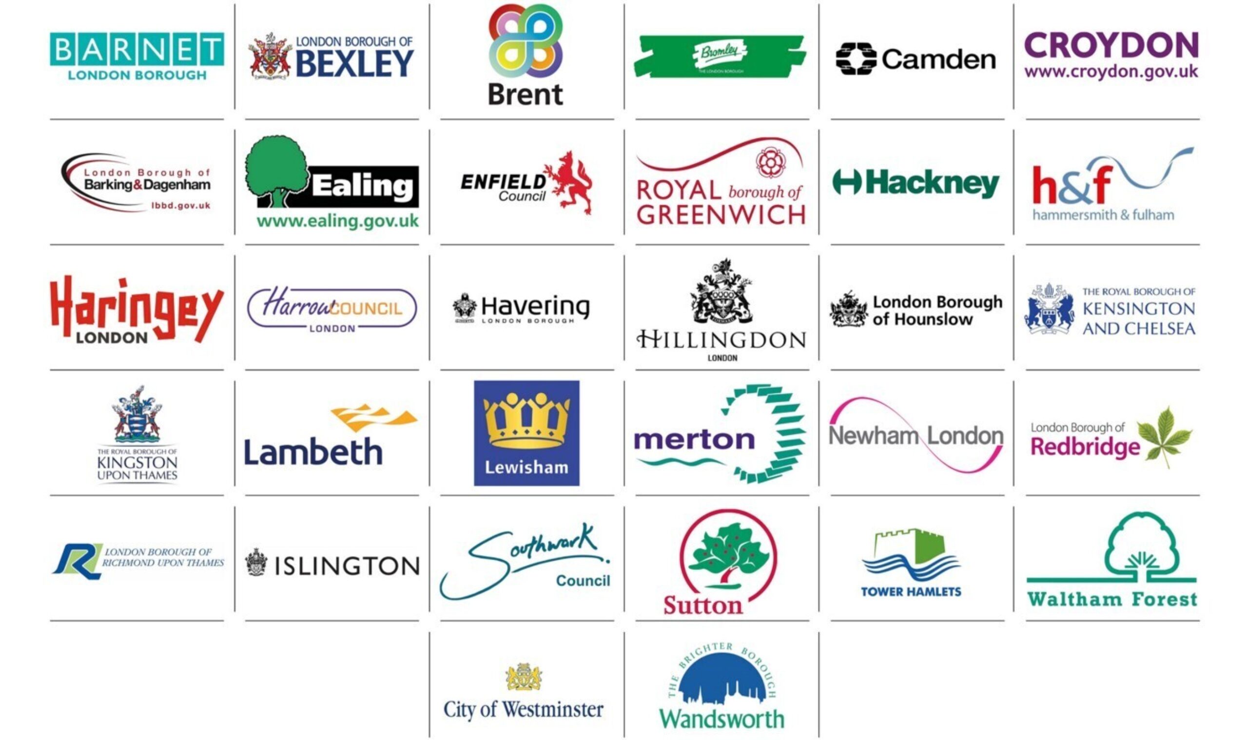
The lines of the modern city are drawn along those old village boundaries and the administrative boroughs that divide the metropolis follow the same trodden paths. There are 32 London boroughs, each a standalone miniature government with its own brand, values and logo. Like the villages before them they have always had clearer identities than the city they form.
Many of them are versions of a crest — amalgamations of coats of arms belonging to the long gone lords of ancient manors. No fewer than eight of the 32 are represented by shields held aloft by a variety of woodland beasts.
Most are simply not very well designed — faux signatures, hokey illustrations of leaves and trees, and stylised rivers make up much of the rest. Thankfully there’s only one that opts for that most mundane of metaphors, the city skyline.
“One or two logos stand out amongst the municipal clipart: Hackney and Camden are clean, purposeful and contemporary.”
One or two logos stand out amongst the municipal clipart. Hackney and Camden — both designed in 1965 and dating from the boroughs’ inception — are clean, purposeful and contemporary.
Hackney’s identity — a circle with two opposing rectangular bites taken out of it forming an ‘H’ — is simple to the point of being rudimentary. Originally designed by Alec Davis, the typography has since been updated and now clashes somewhat with the marque, but its reductive form is still powerful.
The logo for Camden, formed when three smaller boroughs merged, is different again. After establishing that the Frankenstein heraldry that stitched together the original boroughs’ former crests was outmoded, it called for a new logo. Designed by Main, Wolff & Partners it’s the perfect blend of lofty modernist ideals and hard-edged 60s identity design.
Four pairs of hands clasp each other in an endless circle — part recycling symbol, part ouroboros, the ancient symbol of a snake eating its own tail representing nature’s infinite cycle of construction and destruction. Apt for a city, perhaps. Camden states that the hands represent voting, giving, receiving and unity. They look a little like geometric mittens.
“Perhaps London doesn’t need to rely on a single, overarching identity. Perhaps its identity is simply that; one made up of many, and therein lies its strength.”
But such strong logos are the exception rather than the rule. And while the individual boroughs are clearly branded, what’s also clear is that London is a somewhat schizophrenic city, without a single unified identity that represents the place as a whole. True, the mayor’s office has a logo, but it is one that remains deliberate and studied in its neutrality.
Perhaps London doesn’t need to rely on a single, overarching identity — we’ve certainly been fine for the last thousand years without one. Perhaps its identity is simply that; one made up of many, and therein lies its strength.
†Marylebone is a corruption of St Mary at the Bourne — the name of a church on the banks of the River Tyburn. Dulwich gets its name from two old English words ‘dill’ and ‘ whis’ which together mean ‘the damp meadow where dill grows’.