A cautionary tale of I AMsterdam’s success
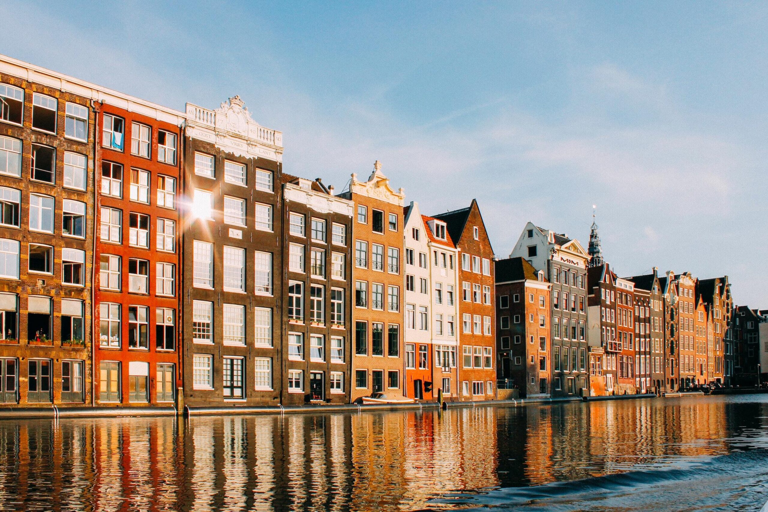
When a Venetian gondola sailed past on a canal in Amsterdam, residents knew the tourism industry in their city had gone too far. Shops for locals are being replaced by shops for tourists. Ordering food in their mother-tongue is becoming a rarity. One woman told the Guardian she was tired of visitors throwing up in her plant boxes, “you can’t rinse it away — you have to scoop it out.”
For the Dutch capital that prides itself on innovation, a rich history and a design culture — what happened?
In the early 2000s, Amsterdam’s perception problem could be boiled down to three things: sex, drugs and partying. Amsterdam Marketing CEO Frans van der Avert watched as the city plummeted in ratings and global city indexes. They had to take things into their own hands.
They invited agencies to pitch on a new project to straighten out the Amsterdam image. According to van der Avert, three out of four agencies pitched the exact same concept: I AMsterdam. They hired KesselsKramer and went with it. Amsterdammers were sceptical at first, asking, why not “We are Amsterdam”? But that’s not the point — “We are” isn’t a proud, inclusive declaration that everyone could be part of. It also doesn’t lend itself quite so nicely to the visual pun.
I AMsterdam took off. The words were emblazoned in strategic locations around the city that reinforced the three pillars of its DNA: creativity, innovation and spirit.
“Amsterdam’s perception problem could be boiled down to three things: sex, drugs and partying.”
“How do you succeed to get everyone to use it?” asks van der Avert, “That’s called blackmail and dictatorship.” When events and exhibitions receive funding from the city, they have to attach the I AMsterdam logo. “People started to see it as a seal of approval.”
Where they showed the letters was just as important as where they didn’t. Taxis and garbage trucks, for instance, don’t have the logo as they don’t do much to bolster a narrative of Amsterdam. “I have one person in our company who says no all day, that’s her job.” So when they were pitched a campaign to recruit paramedics (“I AMbulance”) the answer was no. Ditto the souvenir stands selling “I AM stoned” T-shirts.
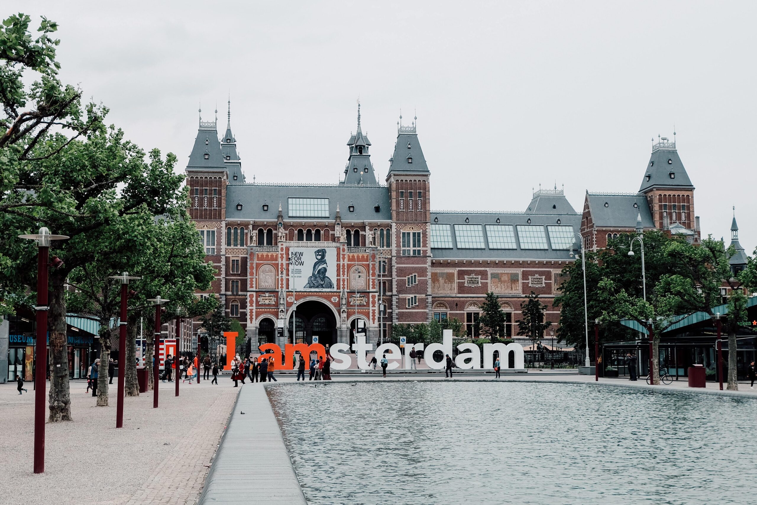
The logo was manufactured into climbable red and white letters and installed outside the Rijksmuseum. In the shadow of an old one, a new landmark was born. People loved it — when van der Avert’s team tried to move the letters as per their original strategy, they were met by such an outcry that the plan was abandoned. Two more sets of letters were made, one lives at the airport, the other is used for key events, while the letters at the Rijksmuseum have stayed put.

The tourists arrived in droves, which in the last four years upset the balance of the city. The latest count showed 17 million visitors per year, dwarfing the population of 800,000 residents. For scale, London, a city of 8 million people attracts only 15 million visitors. Today, the ratio of visitor to local is higher than Disney World.
The truth is, the city’s evolution is bigger than a few letters outside the Rijksmuseum. It has seven new museums and two new theatres. But people love a scapegoat and the blame was neatly pinned onto Amsterdam Marketing. The letters became a symbol of both the city’s troubles and its success.
“Tourists are not what make a city — inhabitants are.”
Tourists are not what make a city — inhabitants are. They can take action where tourists can’t: they can cast a vote. The day after a local election, van der Avert received a text message from the new vice mayor, asking him to change the name of Amsterdam Marketing and to remove the letters.
The logo was never meant to be just for visitors, but for residents and businesses, too. It doesn’t feel likely the letters will be removed, they’re just too embedded in the fabric of the city. When the tram approaches the nearest station, it announces “next stop, Van Gogh Museum, Rijksmuseum, Amsterdam letters.” Van der Avert laughs, and says if they do remove the letters, he’d have to hire an entire call centre to field the complaints.
The quotes in this essay are from Frans van der Avert’s speech at the City Branding conference in Liverpool, June 1 2018. Photos by Javier M and Jennie Ramida.